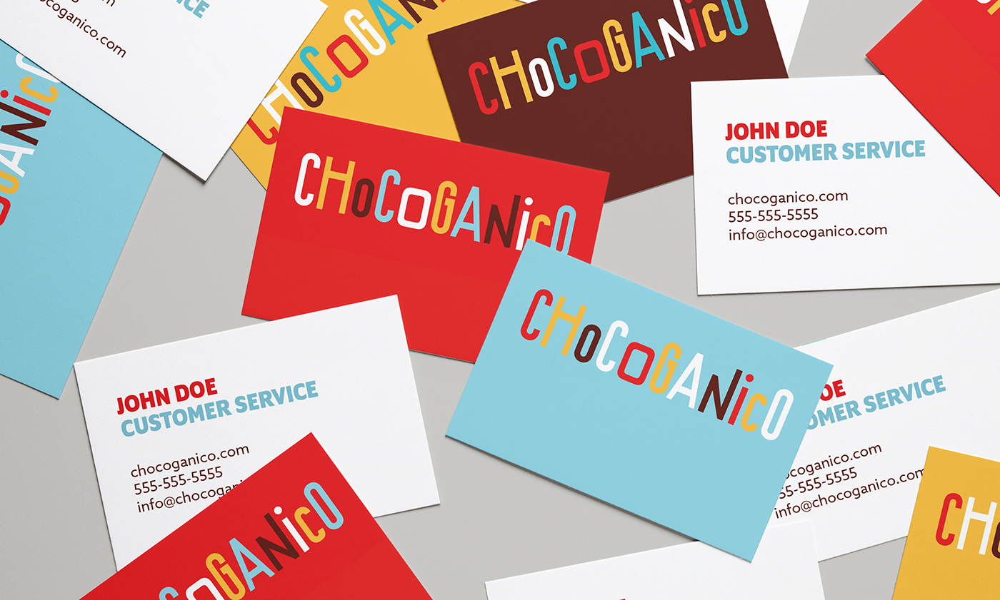
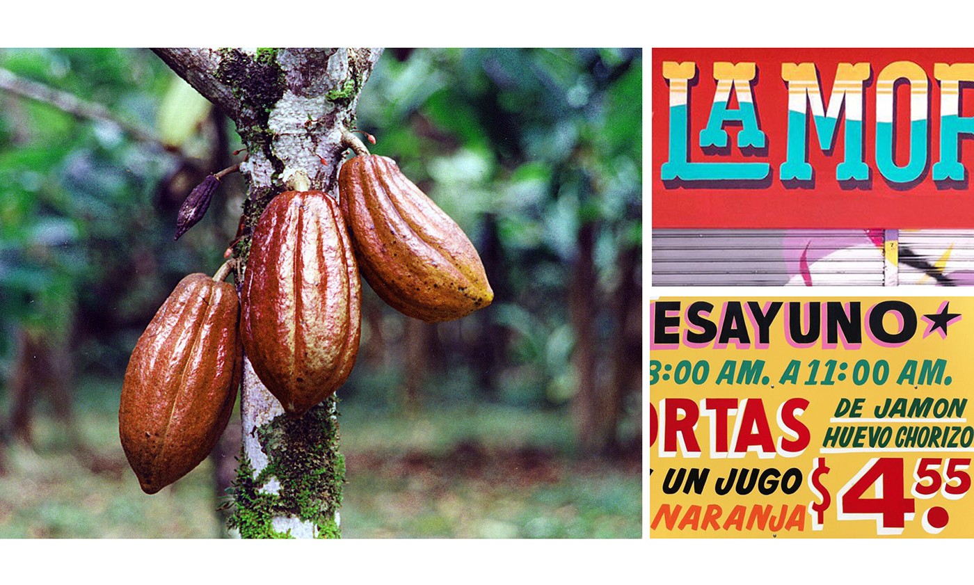
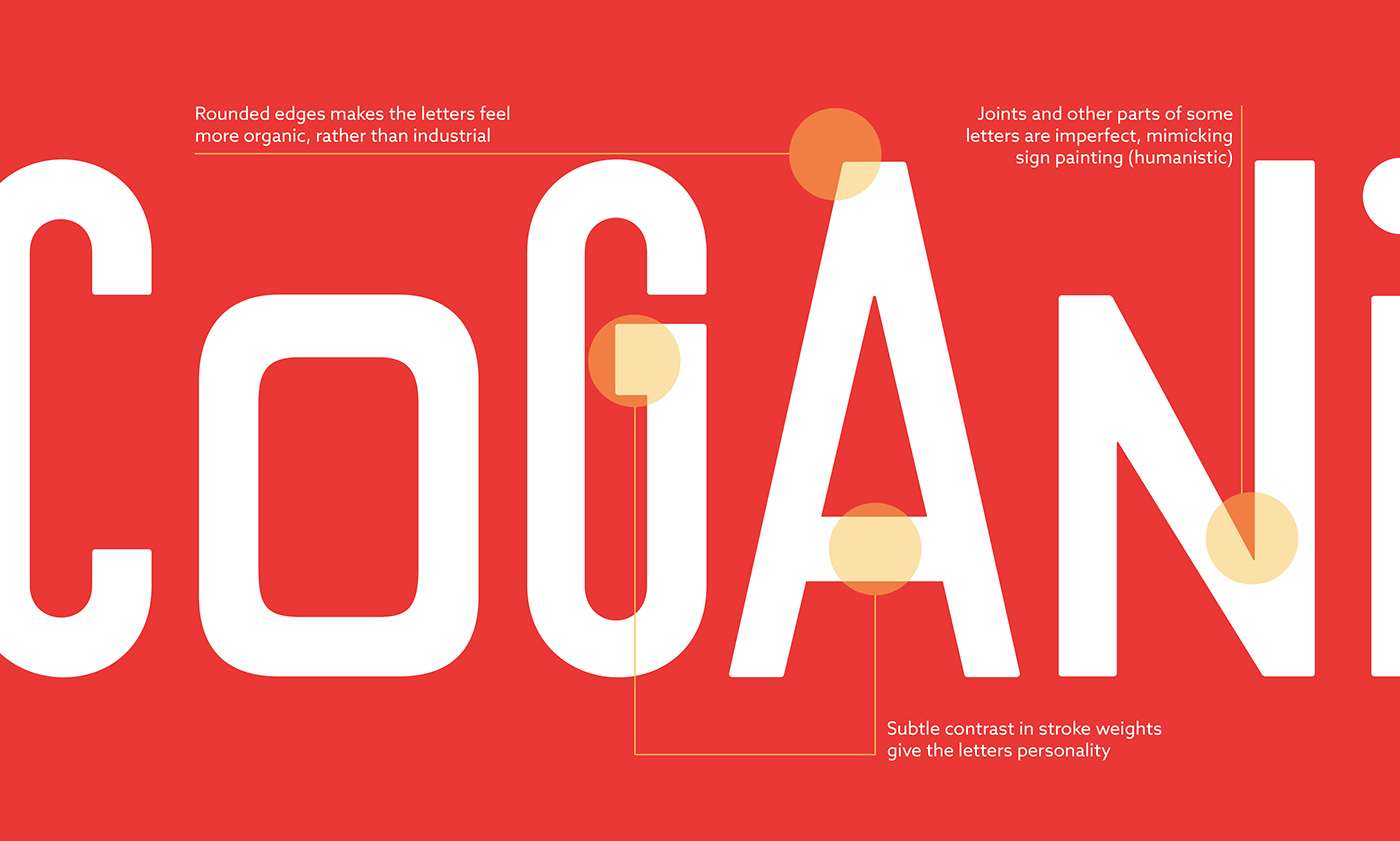
Chocoganico is an organic chocolate company, harvesting natural ingredients and producing chocolate in Mexico. The logo and identity were inspired by hand painted signs common in Mexico, and the organic ingredients in the chocolate.
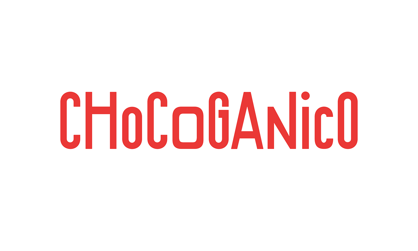

Logotype Flexibility
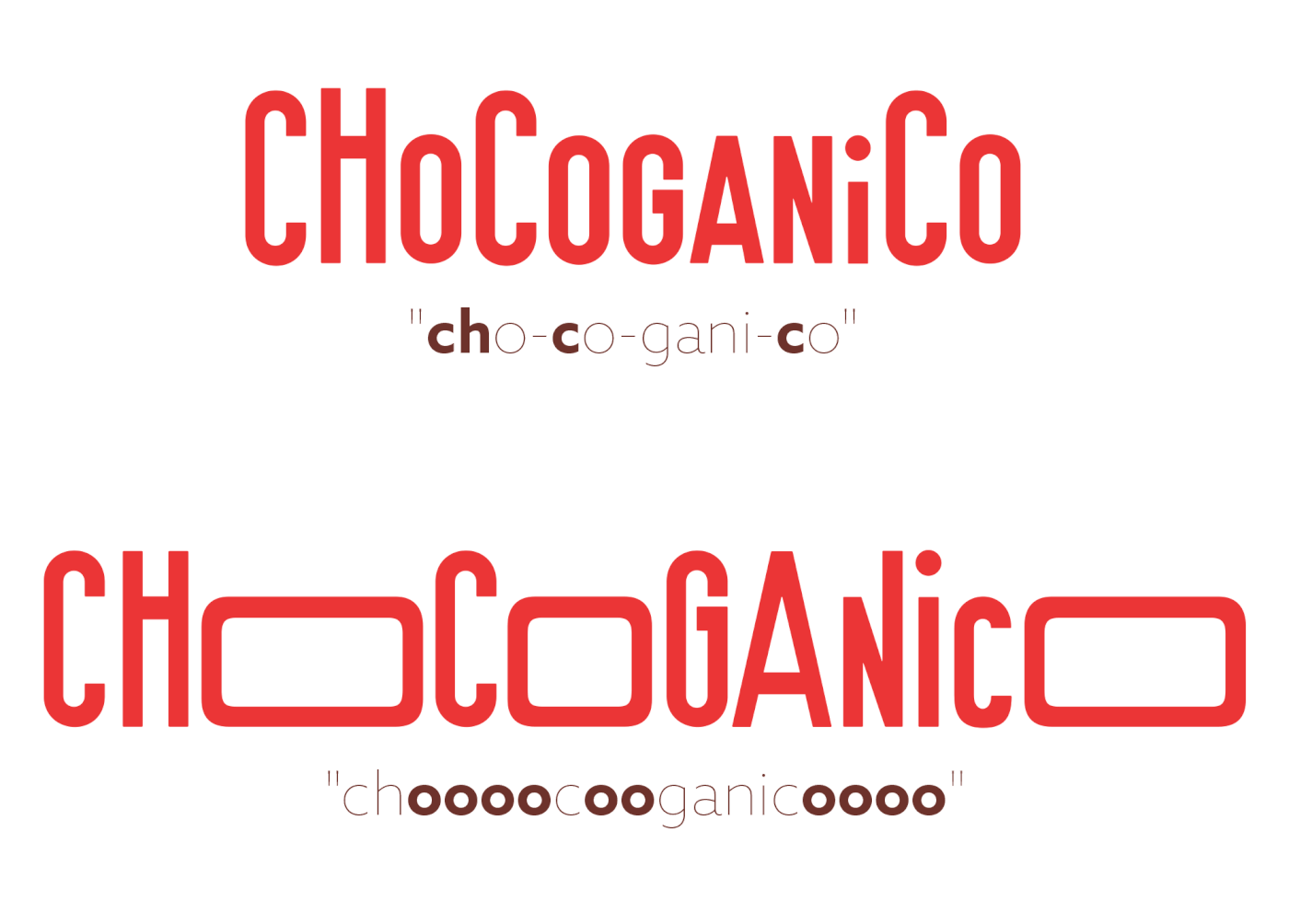
The flexible and playful letters represent the organic ingredients of the chocolate. Each letter can be transformed to a different size. This allows for a wide range of applications of the logo and brand recognition beyond just the logotype.

The intonation of the word can be said in different, fun ways. With the flexibility of the letters, the way the name is said can be translated to the logotype. This captures the human quality of how the name is spoken. The flexibility allows for the brand's personality to be heard through the logotype.
Visual Identity and Application
The rest of the brand continues the playful spirt of the logo. The accompanying typefaces were selected to compliment the logotype, each serving a purpose in the brand.


The flexibility of the logo can be applied to many applications, including the chocolate bar itself. Each bar is uniquely customized with a variation of Os. This allow for a personable and different experience when enjoying the chocolate.


