.
Hyde Park Picture House
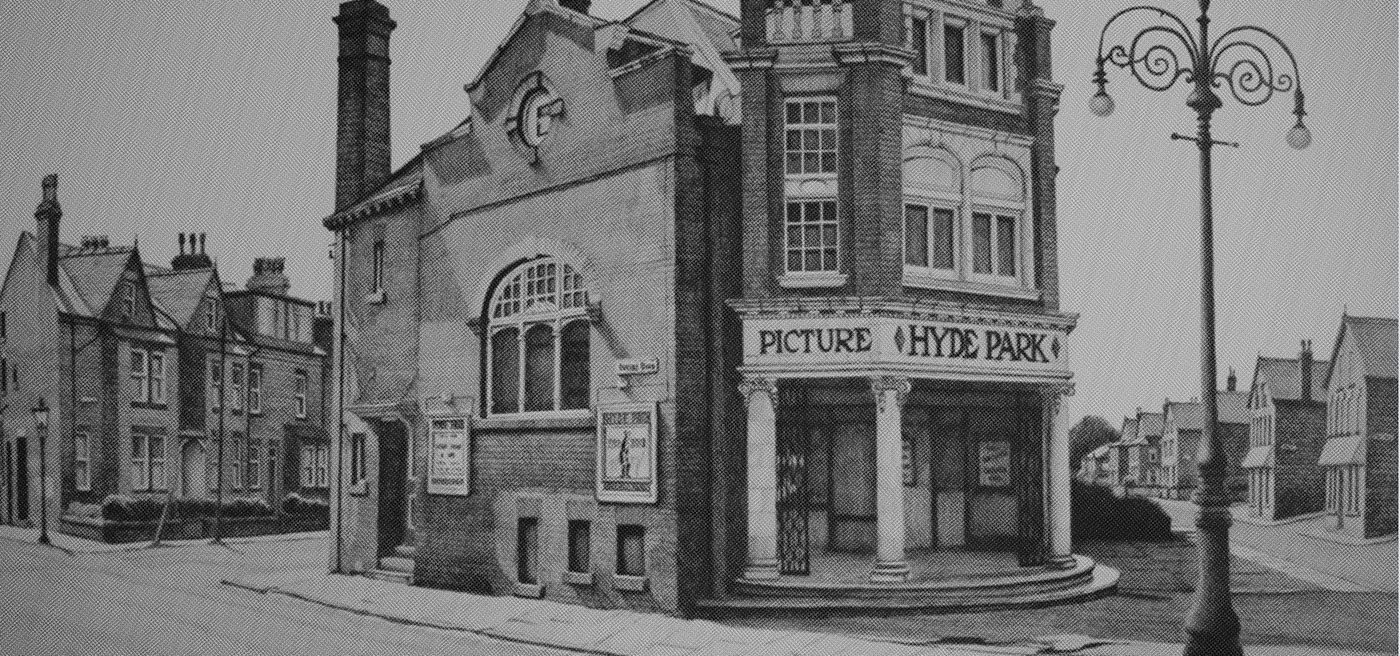
We were approached by the Hyde Park Picture House to tackle the task of attracting more students to their tiny 100-year-old independent cinema. Situated right in the middle of Hyde Park in Leeds, an area that is now heavily populated with students, the cinema is one of the oldest in the country and is a hidden gem that holds tons of heritage and original features.
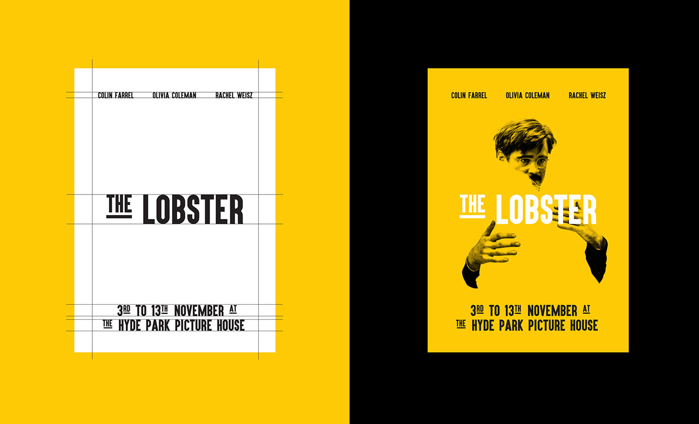
Focusing on their recognisable colour scheme of Black, Yellow and White, we created new and bespoke content for the cinema that was aimed specifically at the younger student audience. The content was focused on a bold Typographic approach that was combined with confident use of colour and imagery.
Typographic Treatment
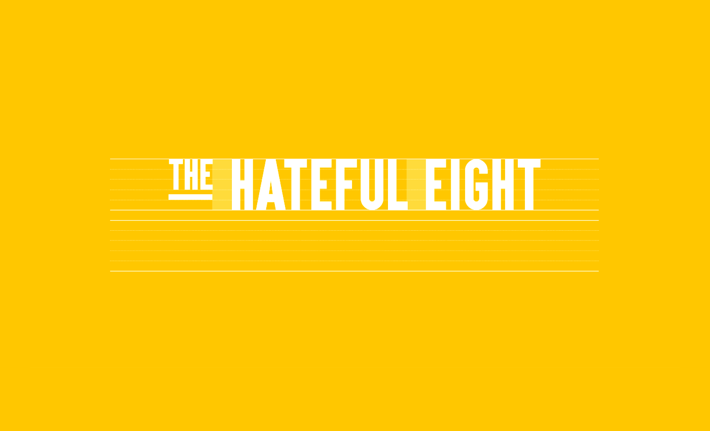
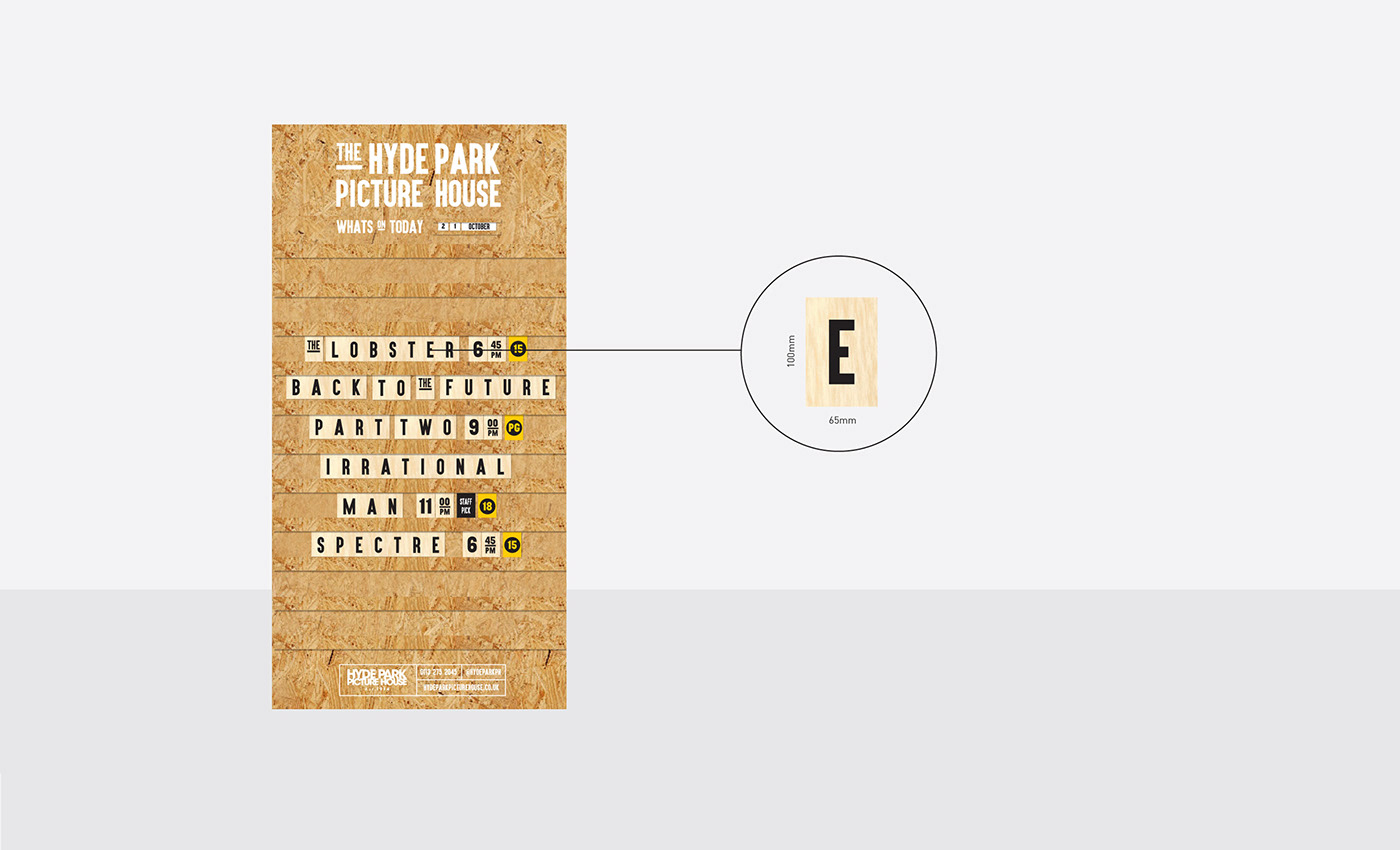
The Typographic Treatment we adopted was heavily inspired by traditional cinema screen boards, where the cinema staff would physically fix and move letters onto a board to spell out the constantly changing film titles and times. We referenced this by creating a unique look and feel that emphasised common linking words such as ‘The’, ‘A’ , ‘And’ or ‘To’.
Print Material
The Typographic Treatment formed the foundation of the look and feel and was combined with the bold yellow colour and black and white, high-contrast imagery. This created a graphic system that was instantly identifiable to the Hyde Park brand whilst maintaining a contemporary look and feel which was relevant to the target audience.


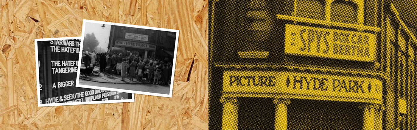
A-frame Board
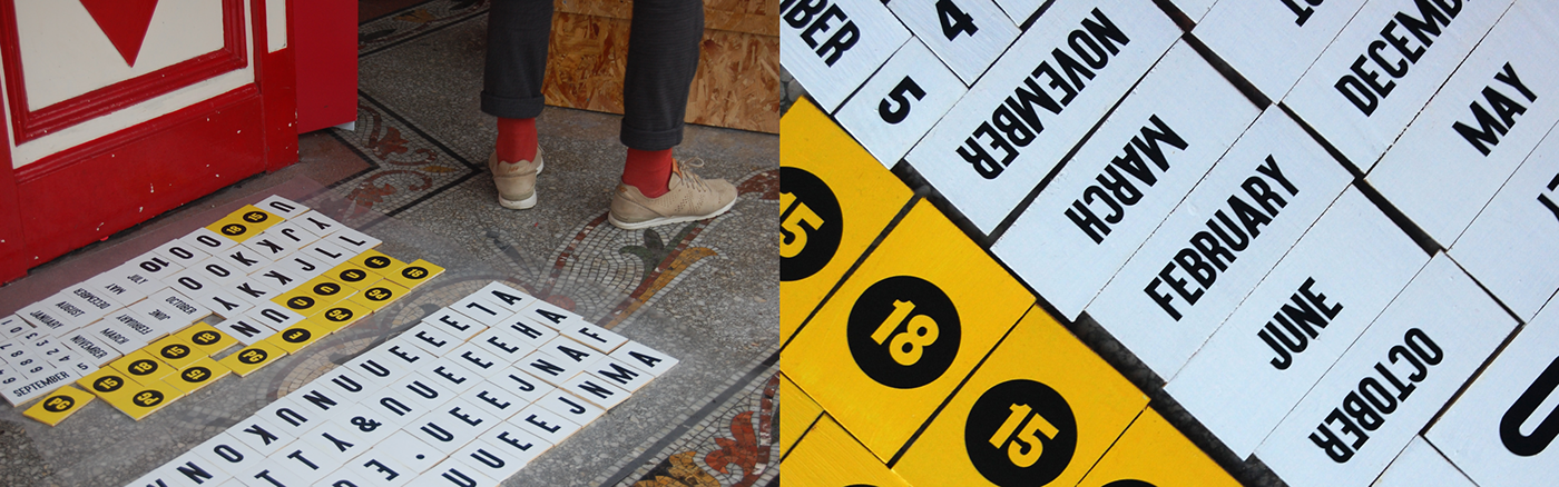
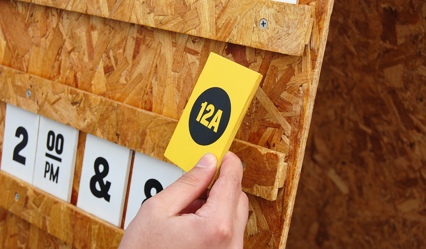
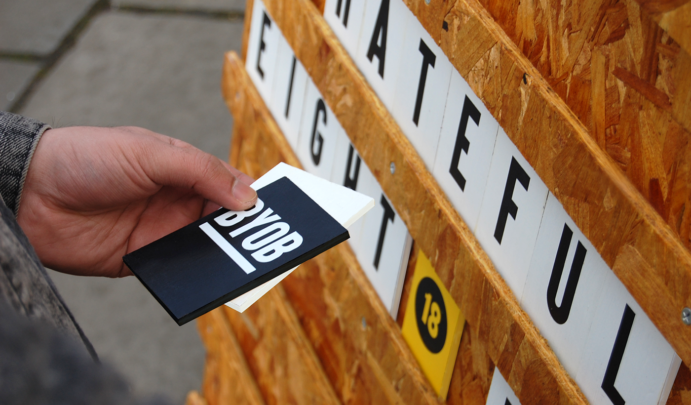
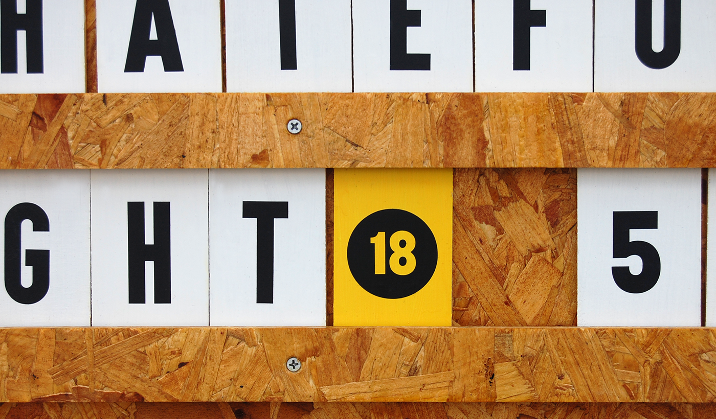
The new look and feel that was created culminated in a two-meter tall bespoke frame board that doubles up as a physical, custom cinema screen board. We used OSB for the base material of the board to help make that transition from traditional cinema to a contemporary audience. Tracks were created that sit on the front of the board and bespoke wooden letter blocks slide into the tracks to re-create the traditional method of cinema signs in a much more up-to-date visual style.
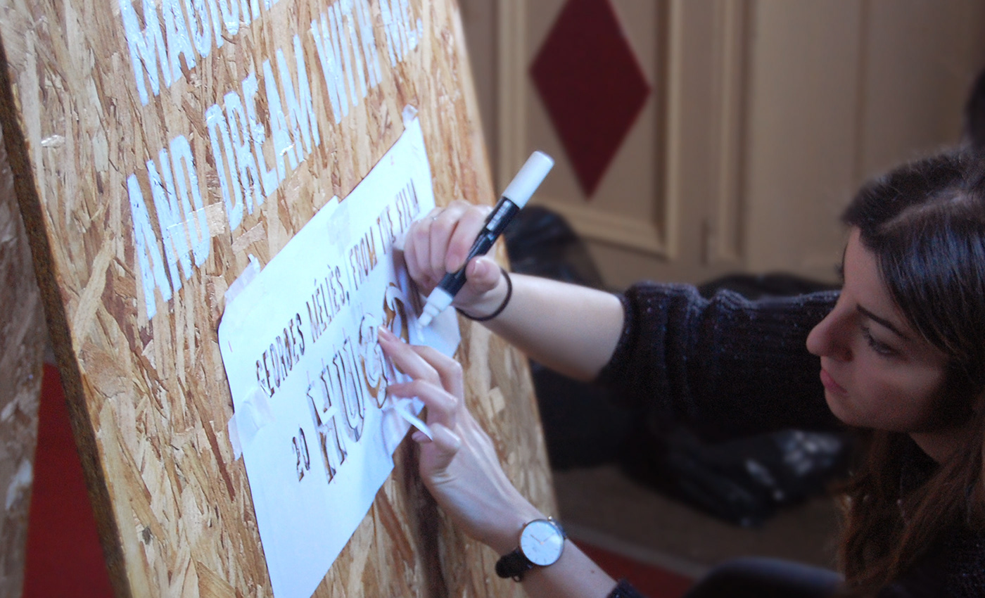
Process & Build
To keep with traditions, we wanted to keep the process of the build quite natural. The front and back of the board was hand painted in white which stood out well against the textured OSB surface. The tracks were simply screwed into place and the wooden letter blocks were hand-painted then applied with Vinyl and Varnish to create a professional looking finish that would also withstand our beautiful British weather.
The board is placed outside on the street throughout the cinema’s opening times to attract a younger audience in the busy student area of Hyde Park. The film showings are updated daily, every morning, by a member of the Hyde Park staff.
Thanks for scrolling


