La Salle Education
- Re-Brand & Logo Proposal -
The Details
As part of my placement at La Salle Education, our group of nine interns were challenged to re-design the company logo. Our brief was to give the brand a more modern feel, incorporating the colours and hexagon motifs used in the product logos. We were also asked to bring more of a story to the logo, embodying what La Salle stands for - teacher development.
As part of my placement at La Salle Education, our group of nine interns were challenged to re-design the company logo. Our brief was to give the brand a more modern feel, incorporating the colours and hexagon motifs used in the product logos. We were also asked to bring more of a story to the logo, embodying what La Salle stands for - teacher development.

Original Logo

The Concept
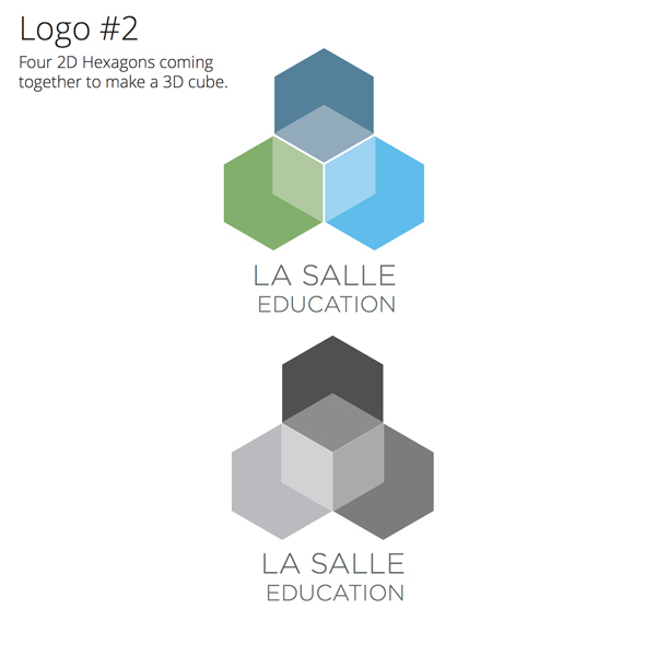
I started out sketching ideas, using hexagons as the central feature of my designs. From this I was able to create a variety of different frameworks and negative shapes and developed several logos, narrowing it down to three distinct routes to present.
I started out sketching ideas, using hexagons as the central feature of my designs. From this I was able to create a variety of different frameworks and negative shapes and developed several logos, narrowing it down to three distinct routes to present.


The Result
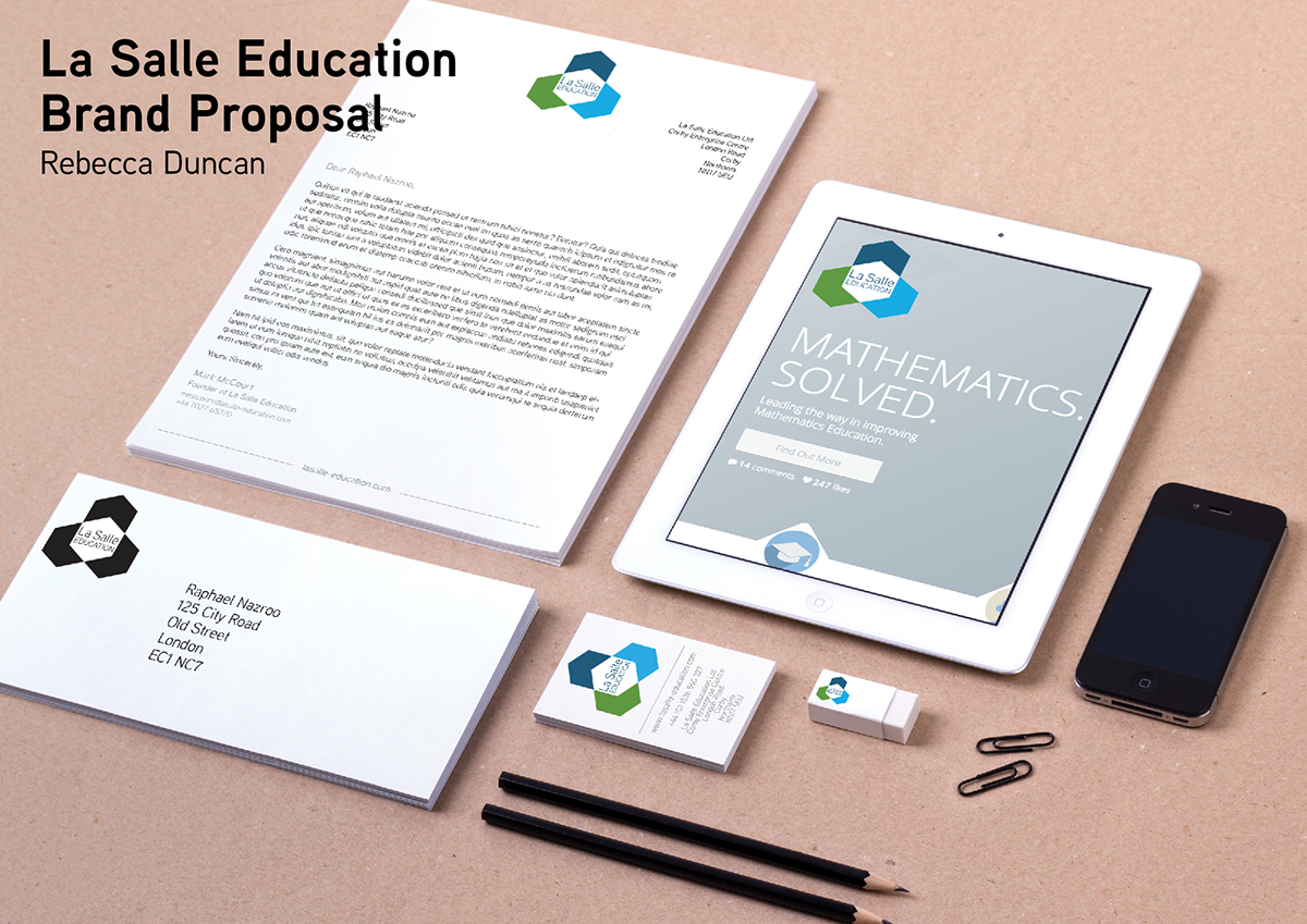
My design was chosen to represent the company, and is currently being used across social media and the corporate website. After winning I decided to adapt the logo, changing the typeface and developing some potential brand guidelines and ideas for logo application for use after the end of my internship.
My design was chosen to represent the company, and is currently being used across social media and the corporate website. After winning I decided to adapt the logo, changing the typeface and developing some potential brand guidelines and ideas for logo application for use after the end of my internship.

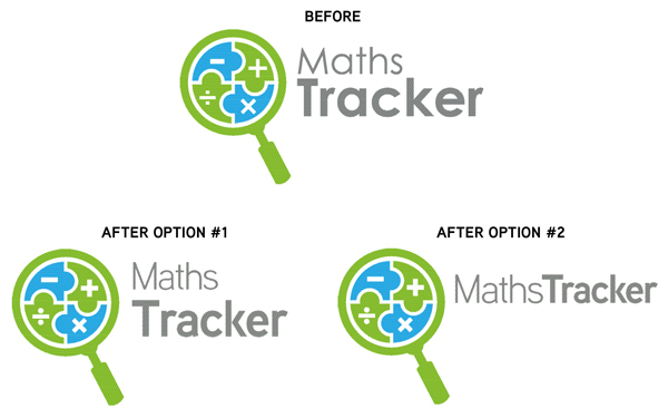
Adapted logo, using Aaux Next


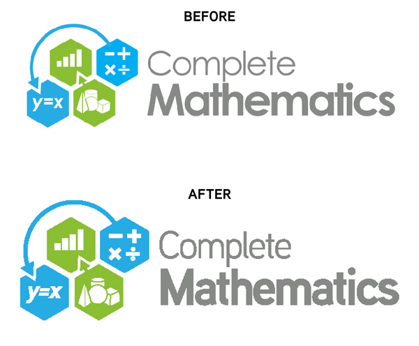
Applying the type treatment to La Salle Education's product logos

Web Presence

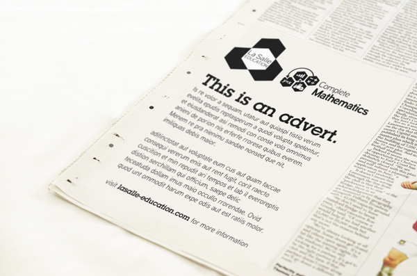
Newspaper Advert
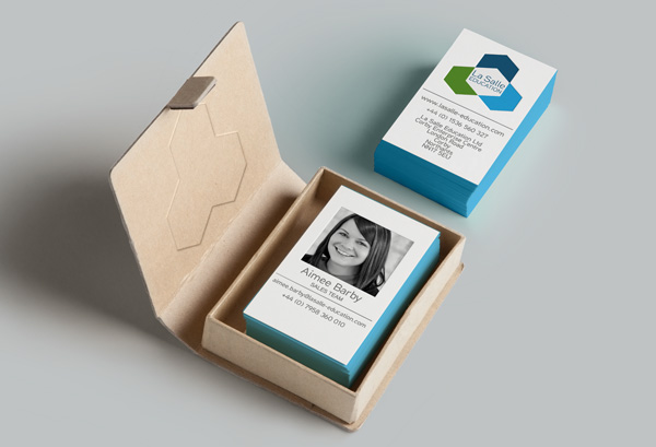
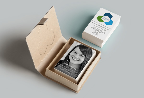
Business Card
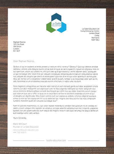
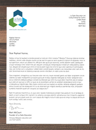
Letterhead Mockups