T h e C h a l l e n g e
Papercraft is a brand new art and craft store that is being proposed to set up at a location close to an art university. They needed their branding done from their logo, to the concept of their stationary branding (I put in sketchbook cover ideas as extra work for the client.) The following is the result of this experiment.
L o g o
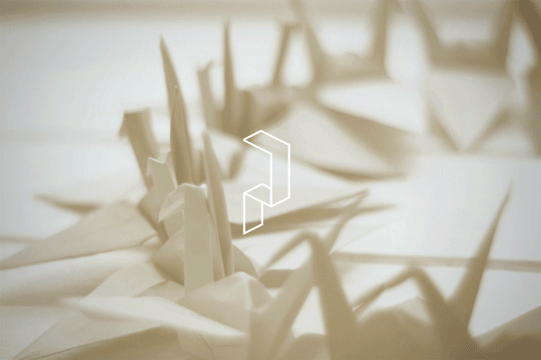
The logo designed was client specified. They wanted something unique but corporate, tantalising, but not too outgoing. Their keywords were 'strong', 'crafty', 'old school', 'bright' and 'distinct'. For this I used a pallate of vintage colours to give it a feel of corporate yet bright, attractive appeal, and at the same time, showed the client a concept of layered paper, with a simple font and a logo mark that stood out as a bit of folded paper.

D e s i g n P r o c e s s
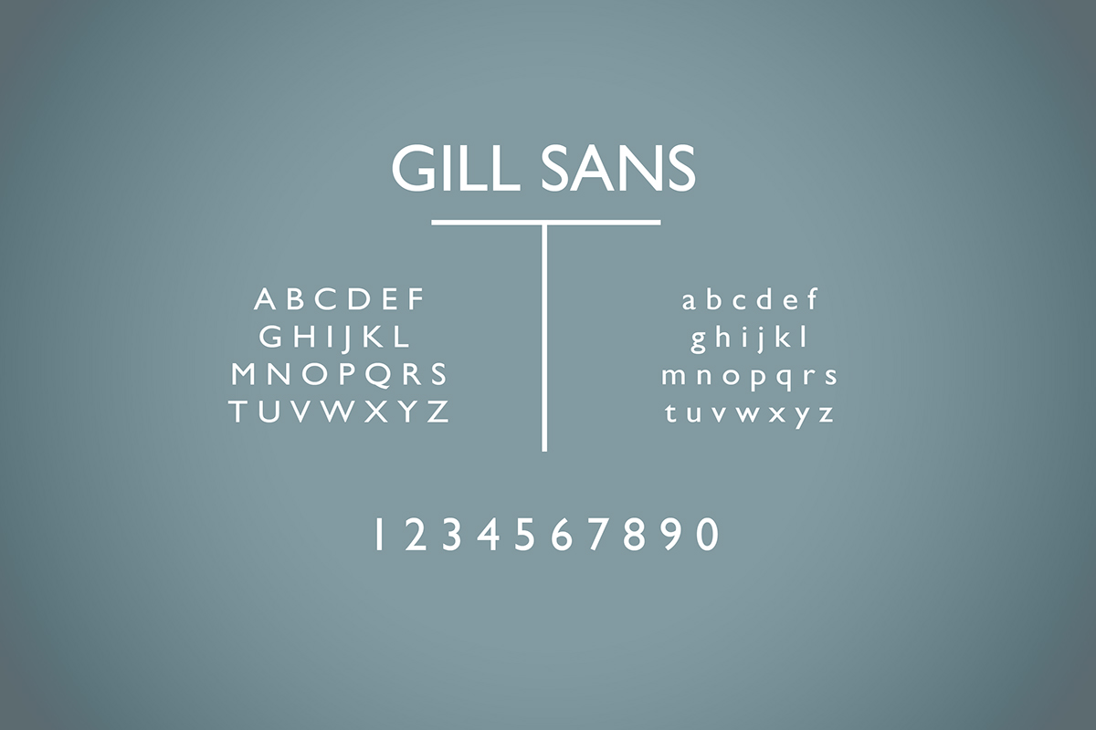
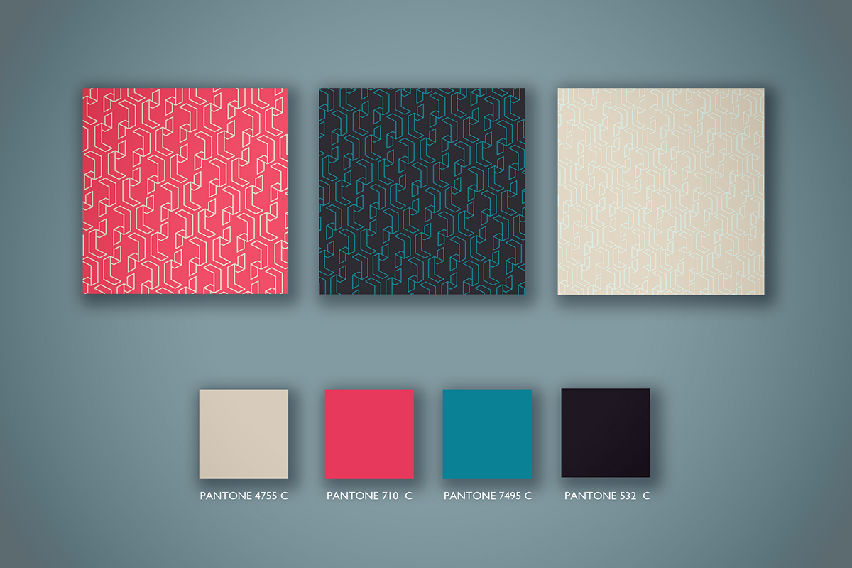
The following images show the design process undertaken to showcase this project. The dimensions of the logo, the pattern created from the logo mark and the colour palette as well as a strong, practical font that was favoured by the client.

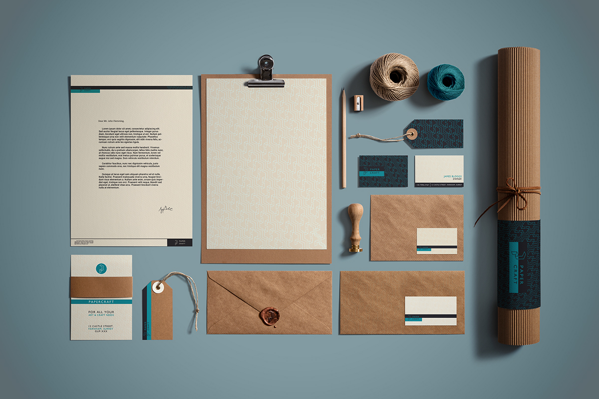
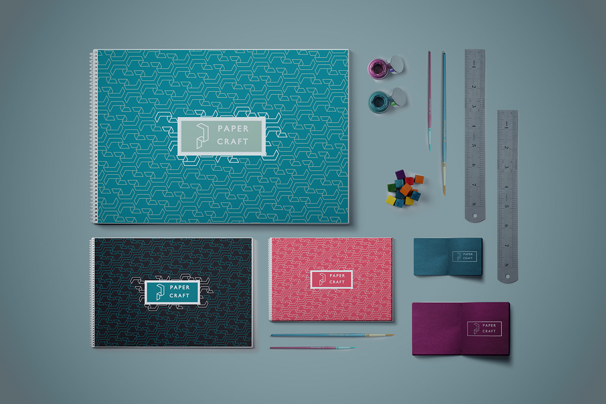
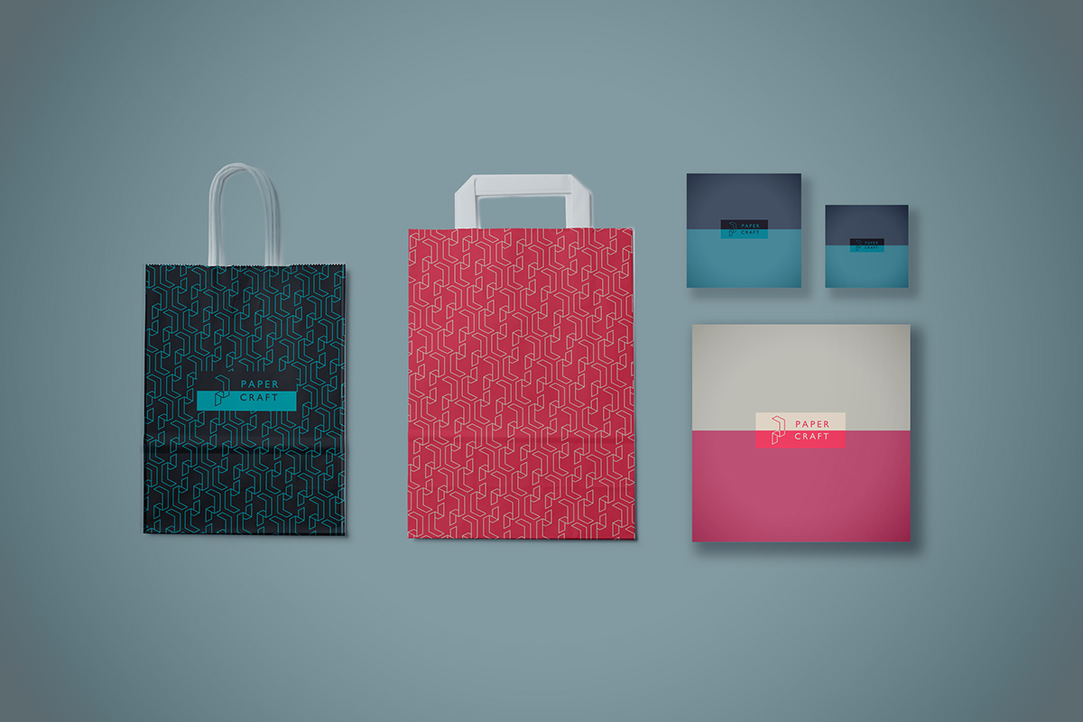
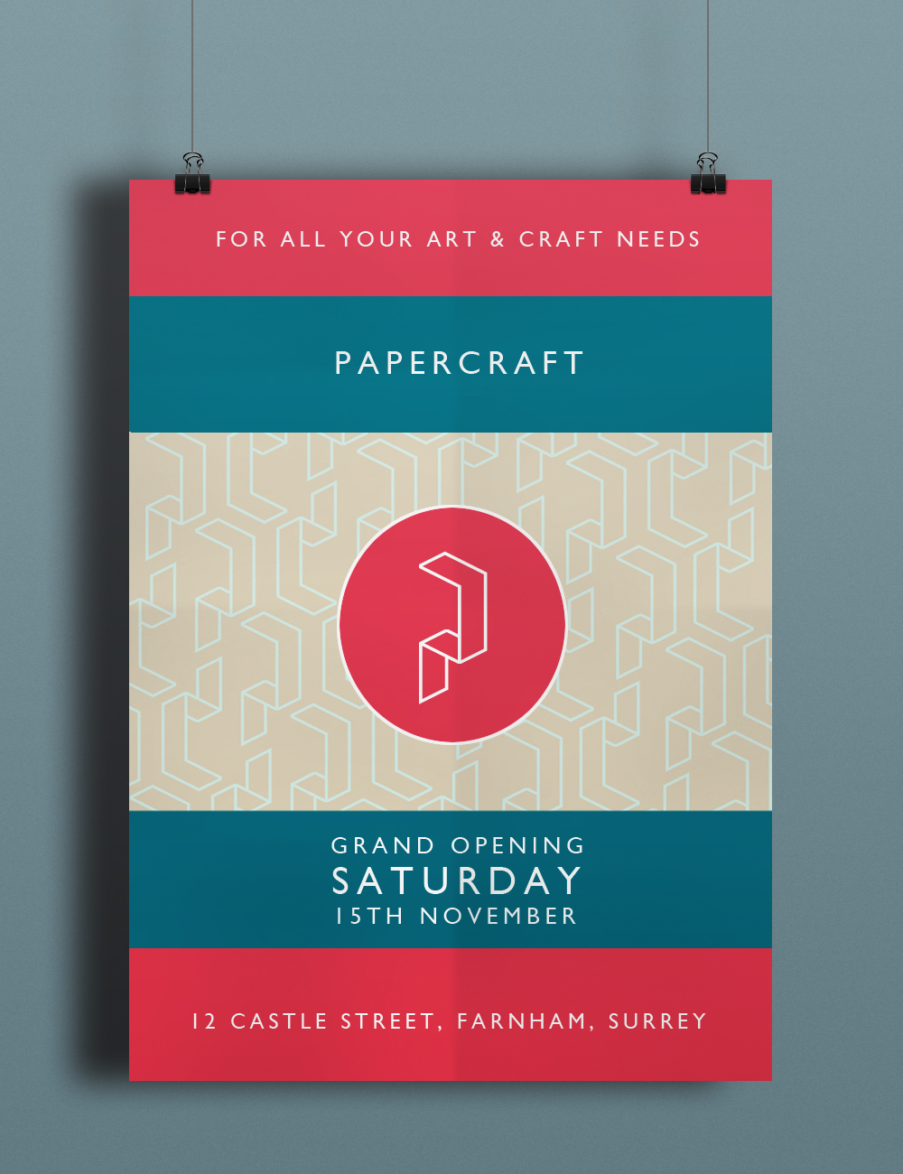
C o l l a t e r a l