Insipiration commissioned a Bolivian designer Jaime Claure to design a collection of three wines, for the label design I was inspired by the name of the family houses iconography itself and the unique red tint 'seco' of the soil where the grapes are grown against Winds of Winter, designing from bottle labels packaging based around the concept of wine as the blood of grapes.
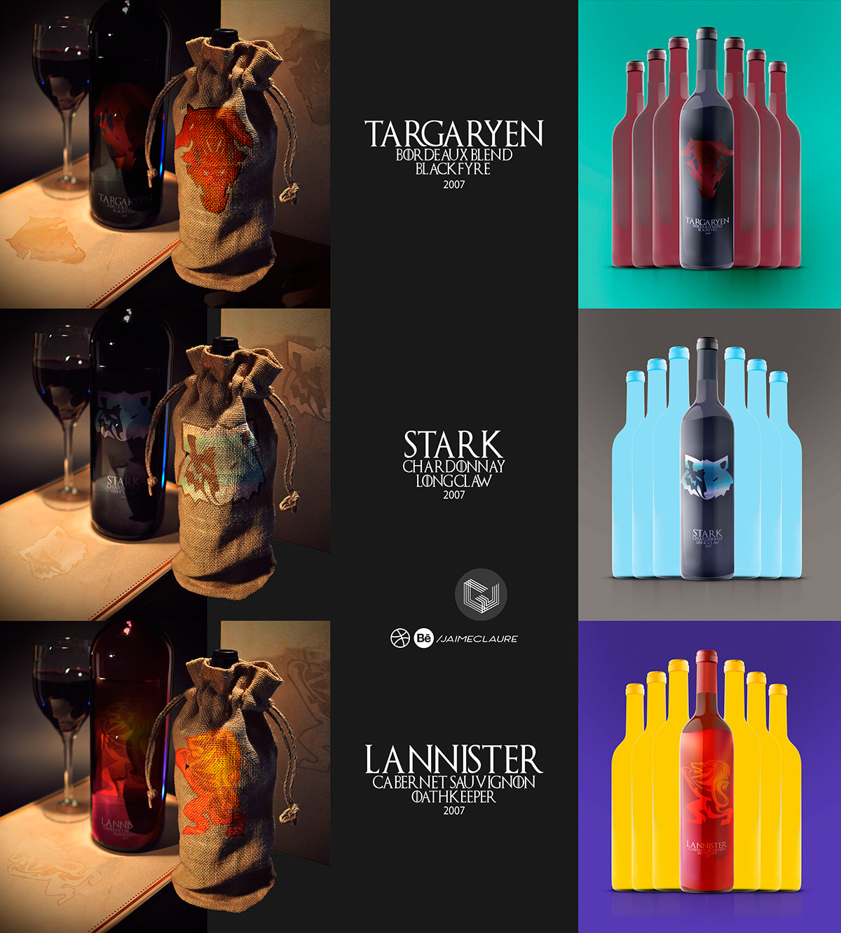
His product design adapts a thematic letterpress of Game of Thrones series, with labels attached to bottle container in a surprising way by essence of the houses more noble with each one of its emblems, first using the Stark House with the figure of a direwolf emerging from Winterfell North to the icy lands more than the wall in a heavenly finish dark gray as the night and cold, the roar of the lion Lannister of Casterly Rock accommodated in their shining armor in a golden finish like gold of their wealth and the Crimson red of his nobility, while on the other side of the sea it rises between the darkness of his ancestral house Targaryen mysticism of the Queen Mother of Dragons that defies the seven kingdoms in their emblem of fire that it burns everything in its front without mercy by their enemies and blood full of voracious passion for conquest.