


VISUAL IDENTITY
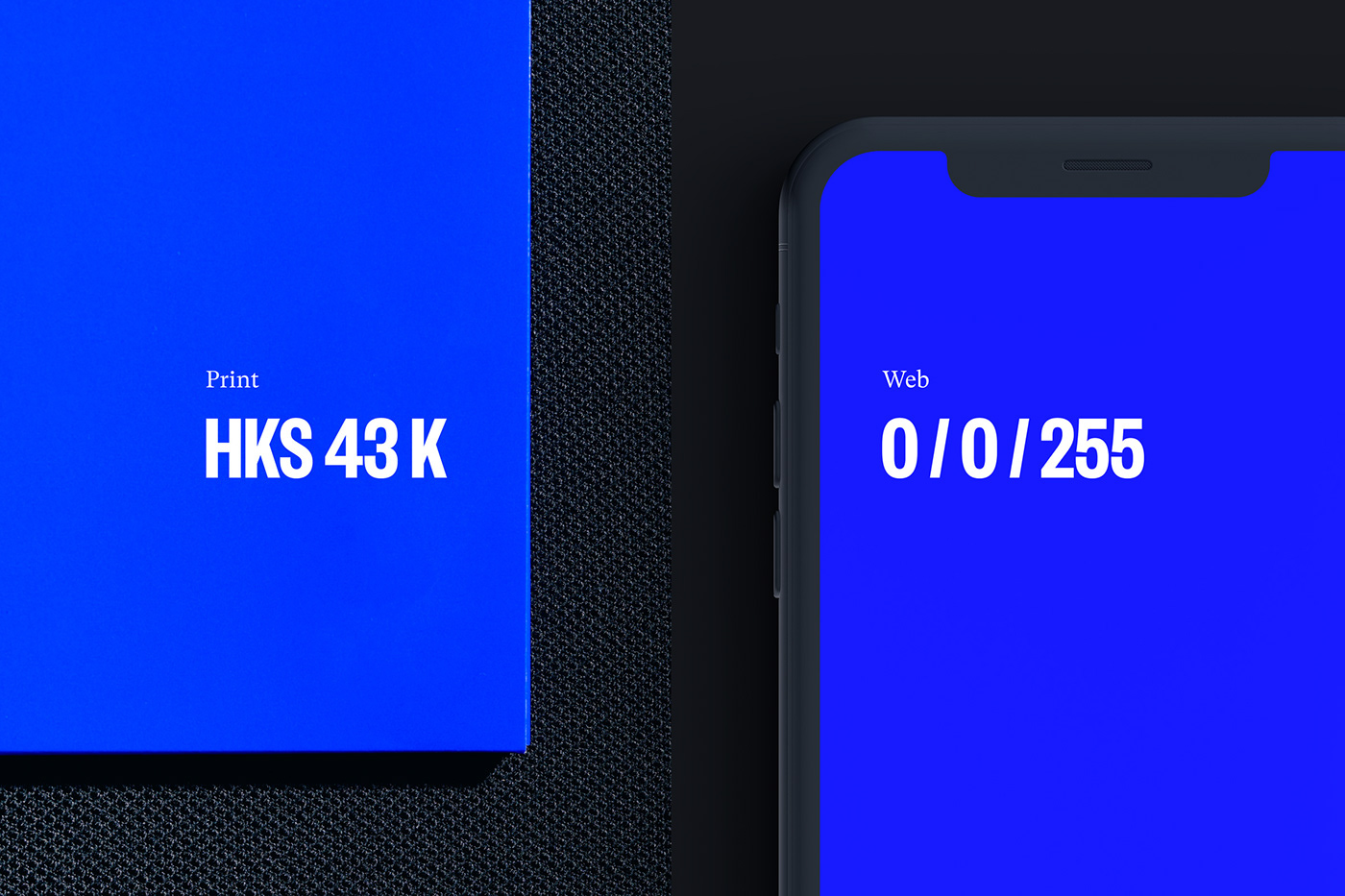
'Brands of the Century' (dt. Marken des Jahrhunderts) is a platform for traditional German companies and hidden champions. These representatives of their respective industries are inducted into a kind of ›Hall of Fame‹ and their success stories are told across numerous channels. This project was developed in close collaboration with our friends at hauser lacour. The new appearance focuses on recognition and differentiation in increasingly digital formats and media. The brand is confidently and unmistakably marked with RGB blue and the ›100-m‹ as the new symbol. The diverse field of application of design extends from social media to events to books.


PUBLICATIONS
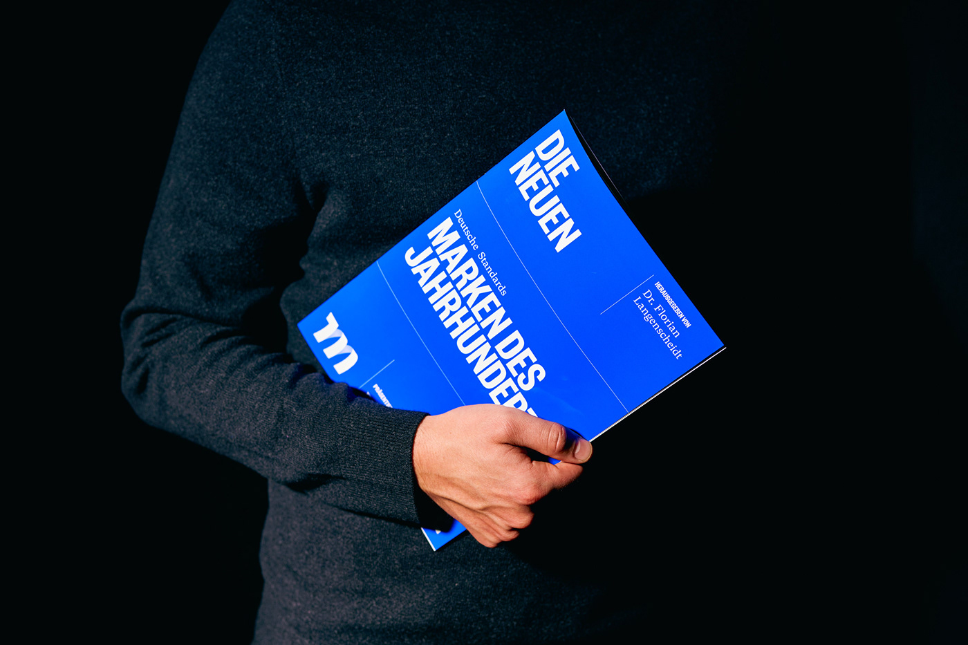
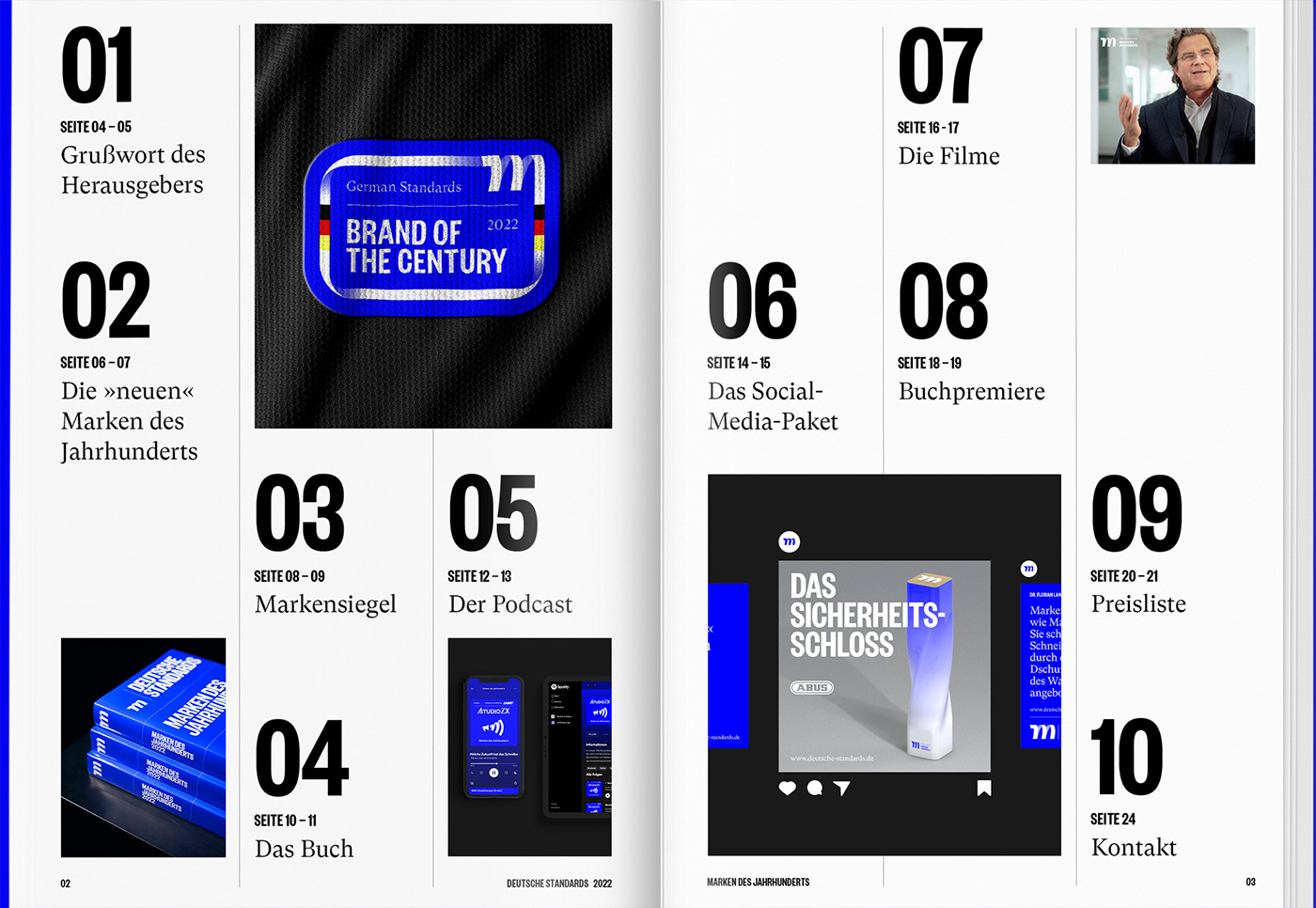
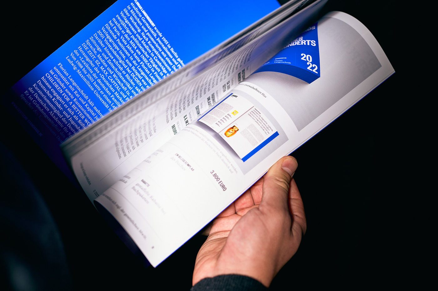
A high-quality synopsis was designed as the primary acquisition tool. An elaborate production process and the use of a special color created a unique visual and haptic experience. This brochure was followed by a book, that presents all winners in their respective categories.


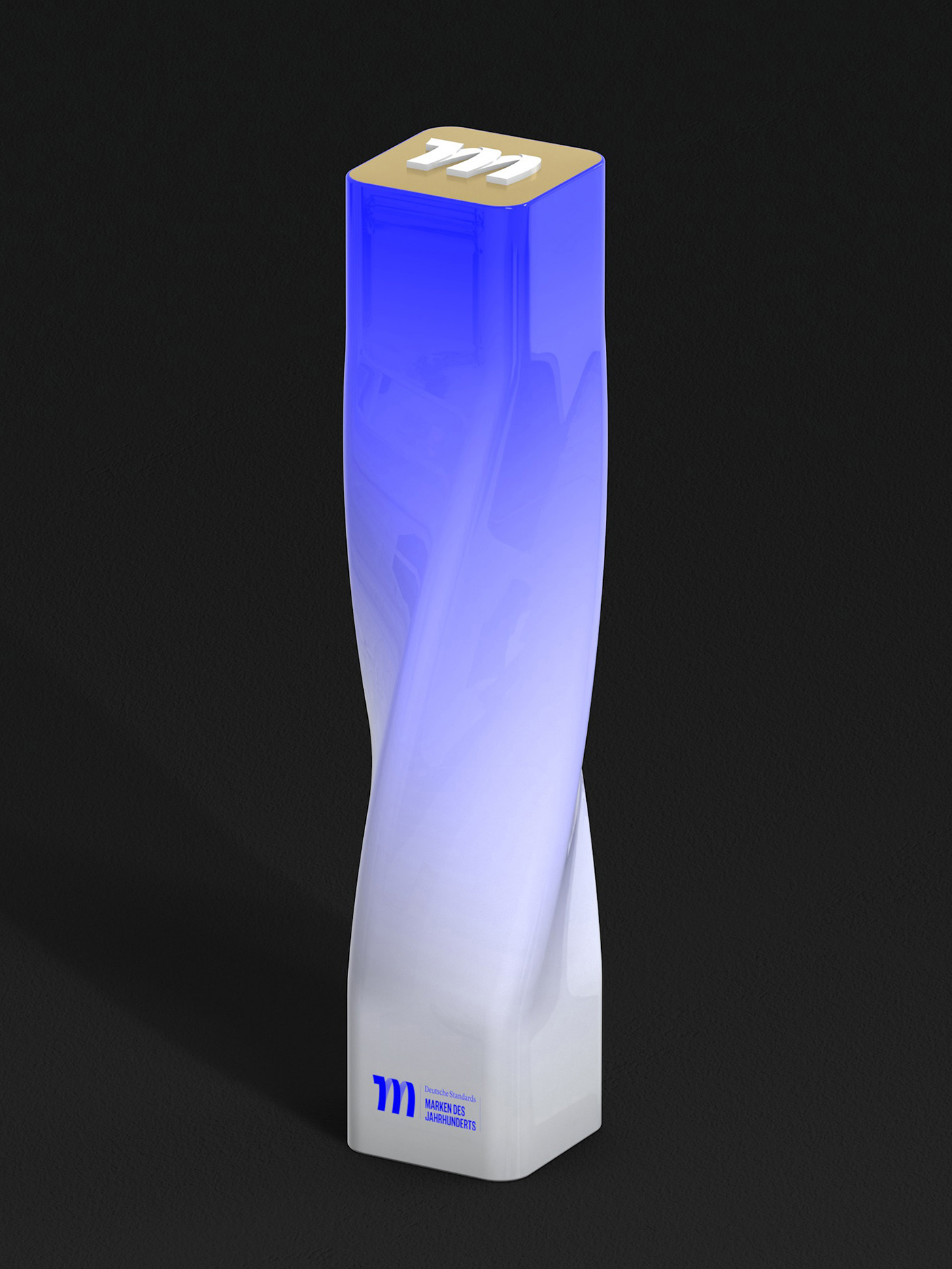
TROPHY
The central element of the award ceremony is the trophy made of porcelain. Its dynamic rotation takes up the shape and meaning of the logo - constant development. A gold relief on the upper side underlines the value of this object.


CERTIFICATE
The most important touchpoint for the general public will be the certificates that are placed on the products or in the marketing of the awarded brands. We have developed a responsive certificate system that always communicates concisely - whether digital or analog, large or small, simplified or dense in content.


