


Soft-Relaunch THE FIZZ Student Homes
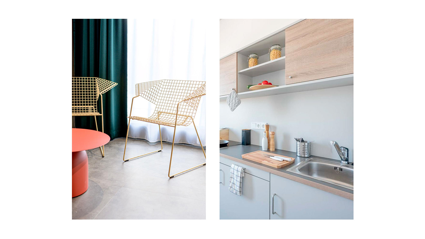
THE FIZZ is a vibrant brand offering the perfect homes for students. Fully furnished and completely hassle-free. The brand focuses on high quality accommodation, working environments, inspiring community experiences and valuable extra services. The first house opened in 2012 in Bremen and the brand has been ever-growing since. With seven locations in Germany, two in Austria and four in the Netherlands, THE FIZZ has developed into a strong brand in the student housing sector in Central Europe. Within the next few years, it is set to grow through further projects in Germany, the Czech Republic and Poland.
Our task was to rethink the Brand Standards (originally developed in 2011) and roll out a conceptually strong Relaunch that is still rooted in the origins of the brand, but transports the new vibrant modern spirit throughout all media. In close cooperation with the team of THE FIZZ we created a cohesive brand world that lives and breathes THE FIZZ brand values.
The key values of the brand can be split into two components. The first component is giving easy access to space with a high quality service, the other component is the community and the social life experiences within the houses. The goal throughout the Relaunch was to combine and convey these two components while developing a bespoke logotype rooted in the old logo that is modern, clear and simple – combined with elements that express the fizzy and the vibrant.
As this was a soft-relaunch the new logotype had to draw on the previous one and develop in an organic way. (see video below). Retaining the strongest elements, the colour and the extended forms, we redesigned the logotype to make it clearer, simpler, modern and more elevated than ever before, all the while not forgetting where THE FIZZ came from. This amounts to a natural evolution that will serve them well for many years to come.
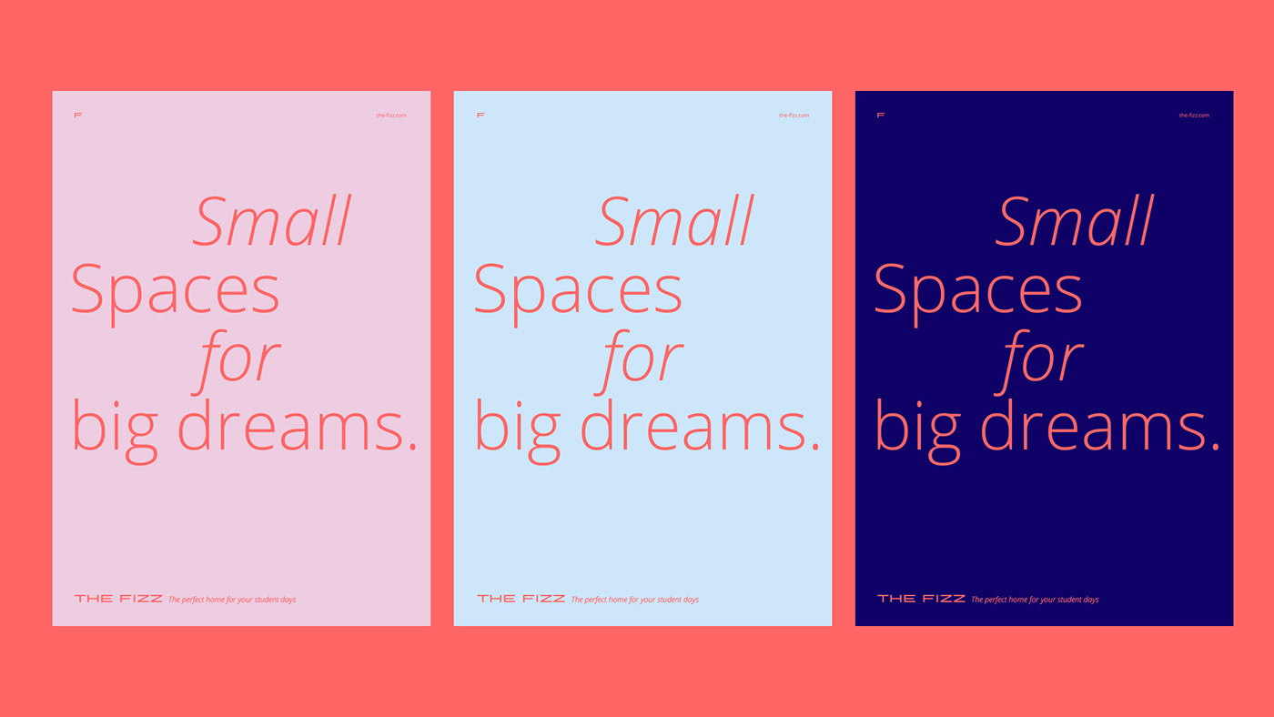
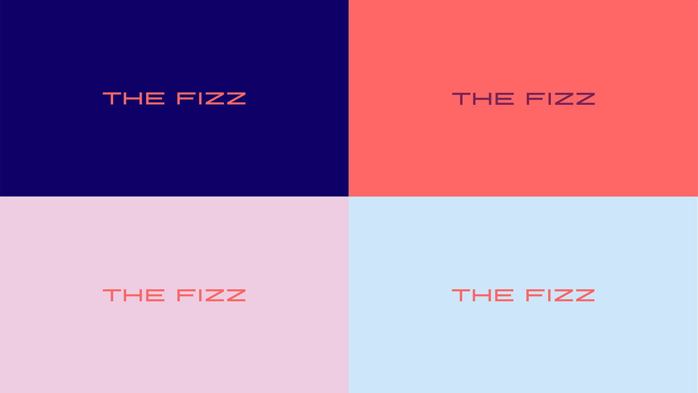
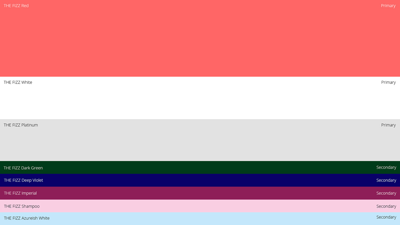
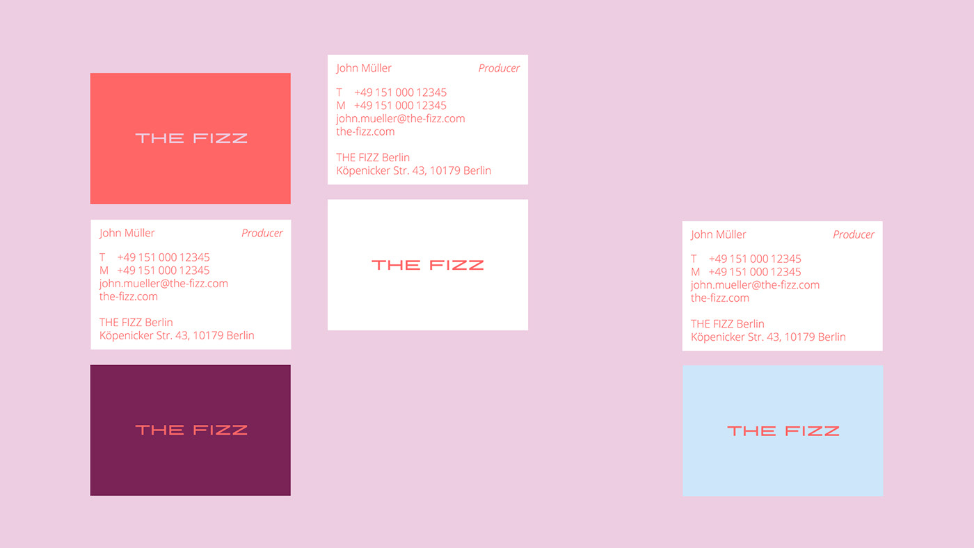
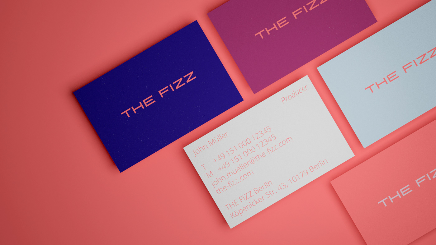
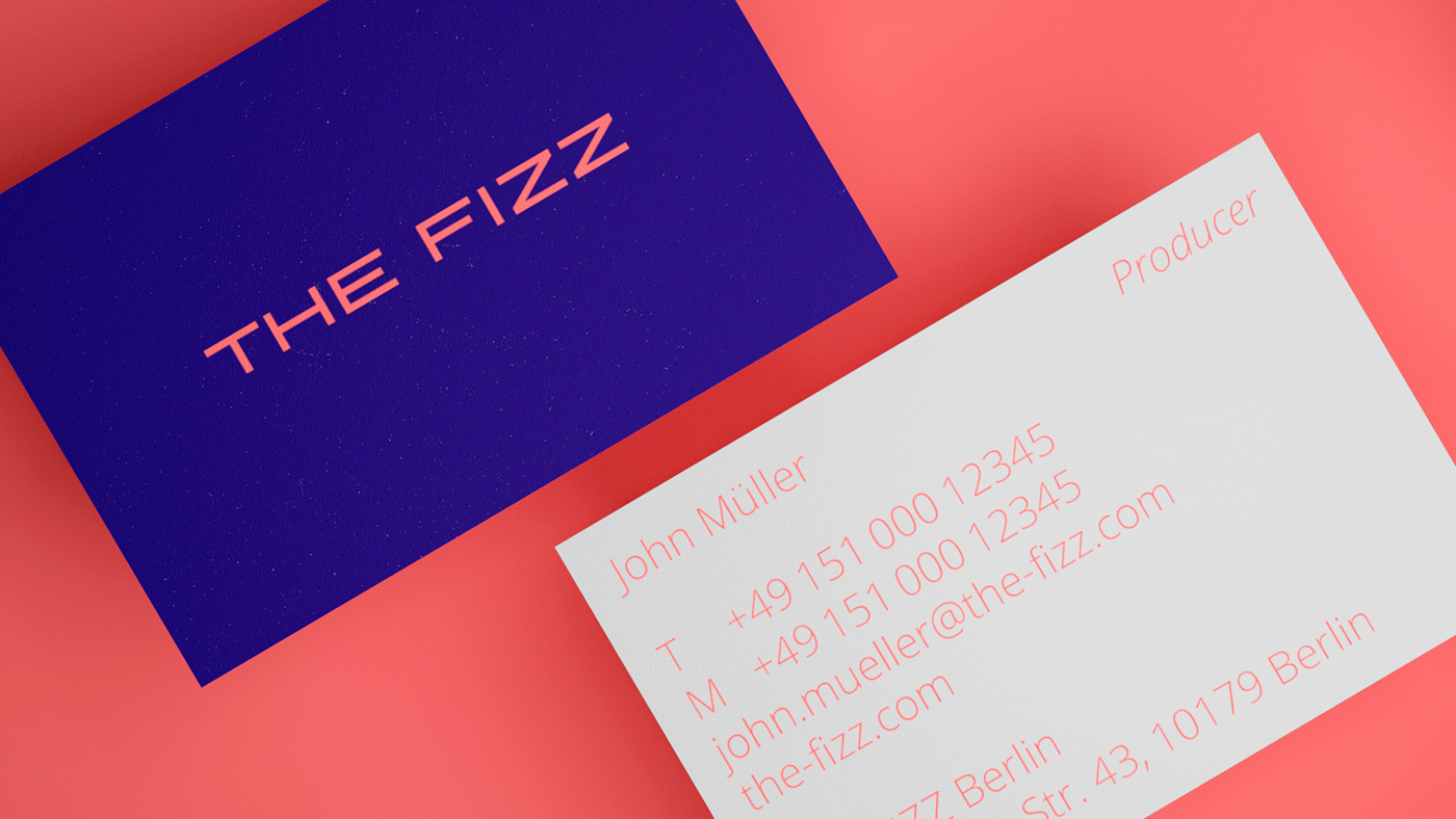
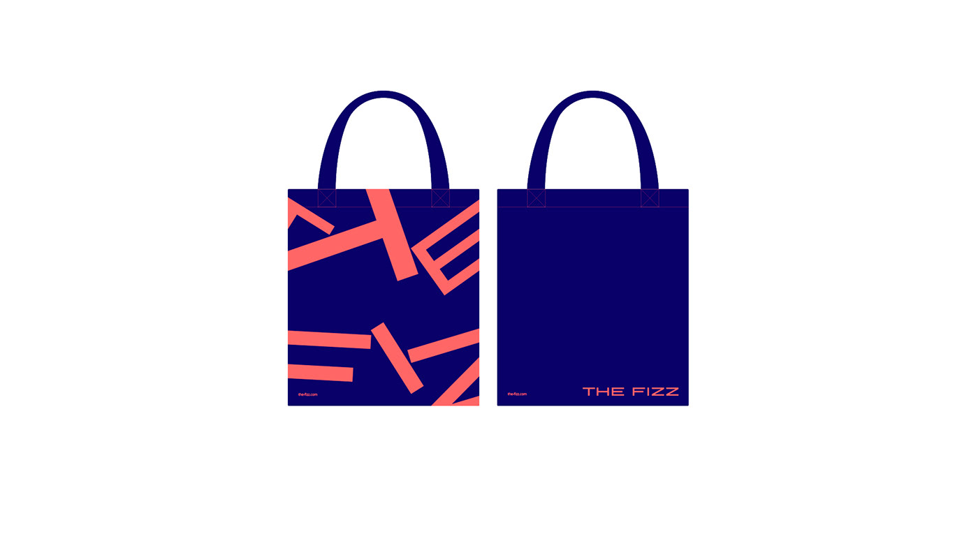
Introducing a brand new colour palette means we can tailor THE FIZZ look and feel allowing for varying tones of voice. For example, THE FIZZ Red can be paired with multiple different colours which allows us to find the right tone for the right situation.
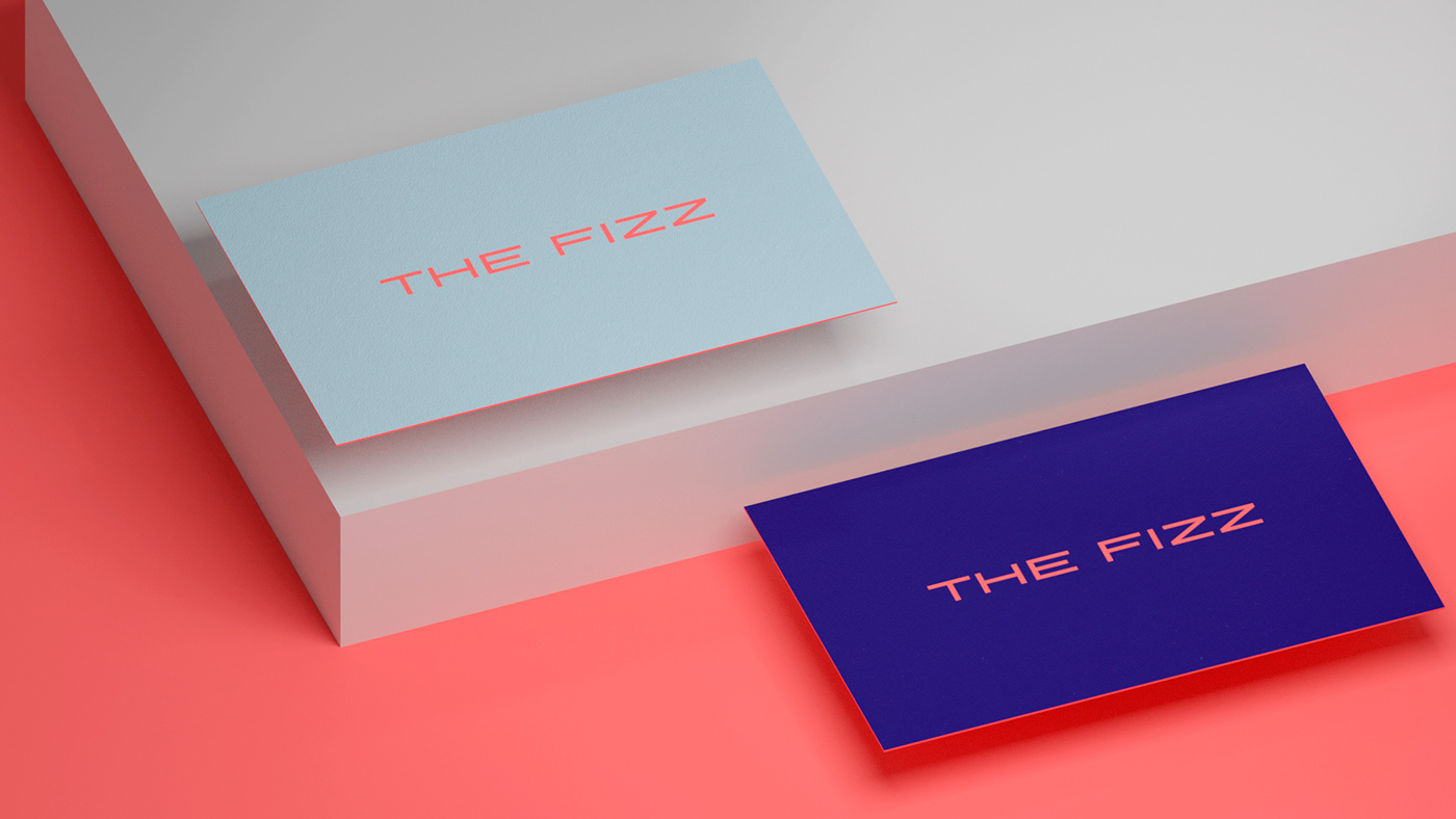
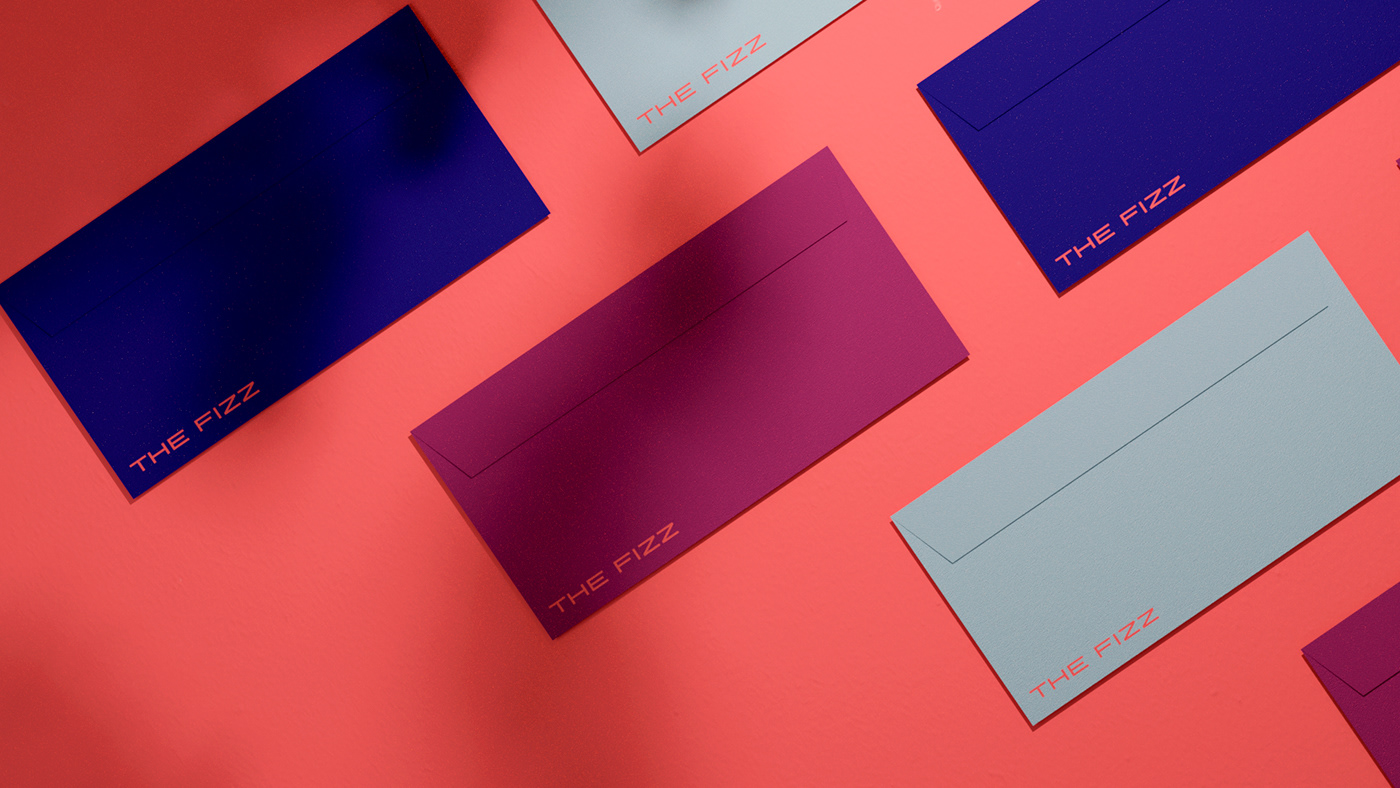
Below are some new THE FIZZ stationary pieces which showcase the flexibility of the colour palette, the business cards are fun and vibrant while the Letterheads are more corporate and conservative.
Below are some new THE FIZZ stationary pieces which showcase the flexibility of the colour palette, the business cards are fun and vibrant while the Letterheads are more corporate and conservative.
(business cards concept)


It was a great pleasure to work with a team that appreciates and embraces the spirit of a fresh design update, those who love to see their brand grow. THE FIZZ – 'Let’s start fresh. Let’s drive visual, technical and structural improvements. THE FIZZ stands for next-gen student living. And there’s more to come.'
Behind the Scenes
–
The wonderful team of THE FIZZ Student | with a special thanks to Enis Bayik and Ela Günes
The Team of Studio HEED | with a special thanks to Elena Pavaletz providing design evolution motion graphic
The Team of Studio HEED | with a special thanks to Elena Pavaletz providing design evolution motion graphic
–
Industry – Hospitality | Year – 2020 | Studio HEED | Project Title – Rebranding THE FIZZ | Description – Redesign, Rebrand and Spirit for a fresh visual look for THE FIZZ Student Homes | Pictures Pexels

Studio HEED
Aaron Matthew Canning (IRL) and Theresa Magdalena Feth (DE) currently located in Amsterdam (NL). We collaborate with small companies, organisations and big businesses located nationally and internationally. We love to walk with our clients throughout the whole process. This close collaboration takes us right to the core of the brand strategy and narrative leading into the creation process. The process of creating exclusive brand worlds that live and breathe the unique voice of your brand – to tell the story that sets you apart.
We stay true to our belief that there is one unique way of telling your story, one that empowers and moves, where beauty and purpose are equal.


