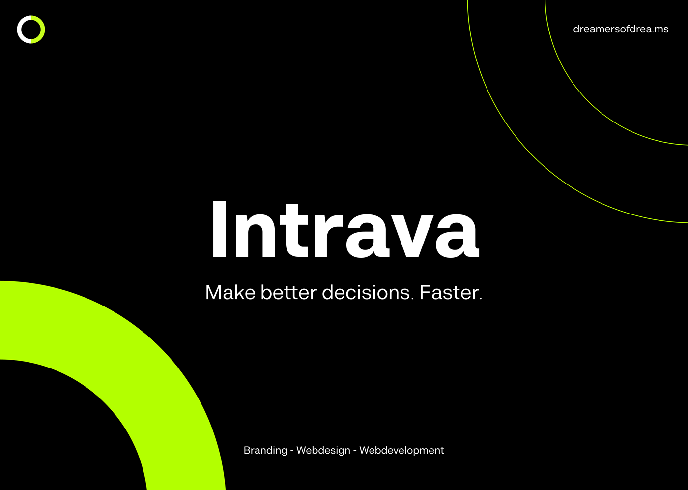

Intrava stands for intake, transformation, visualization and gives order to the world of messy data, giving to the users organized and clean answers. That's from where we started for the rebranding.
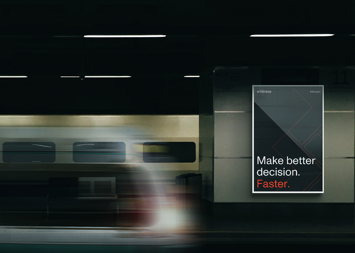
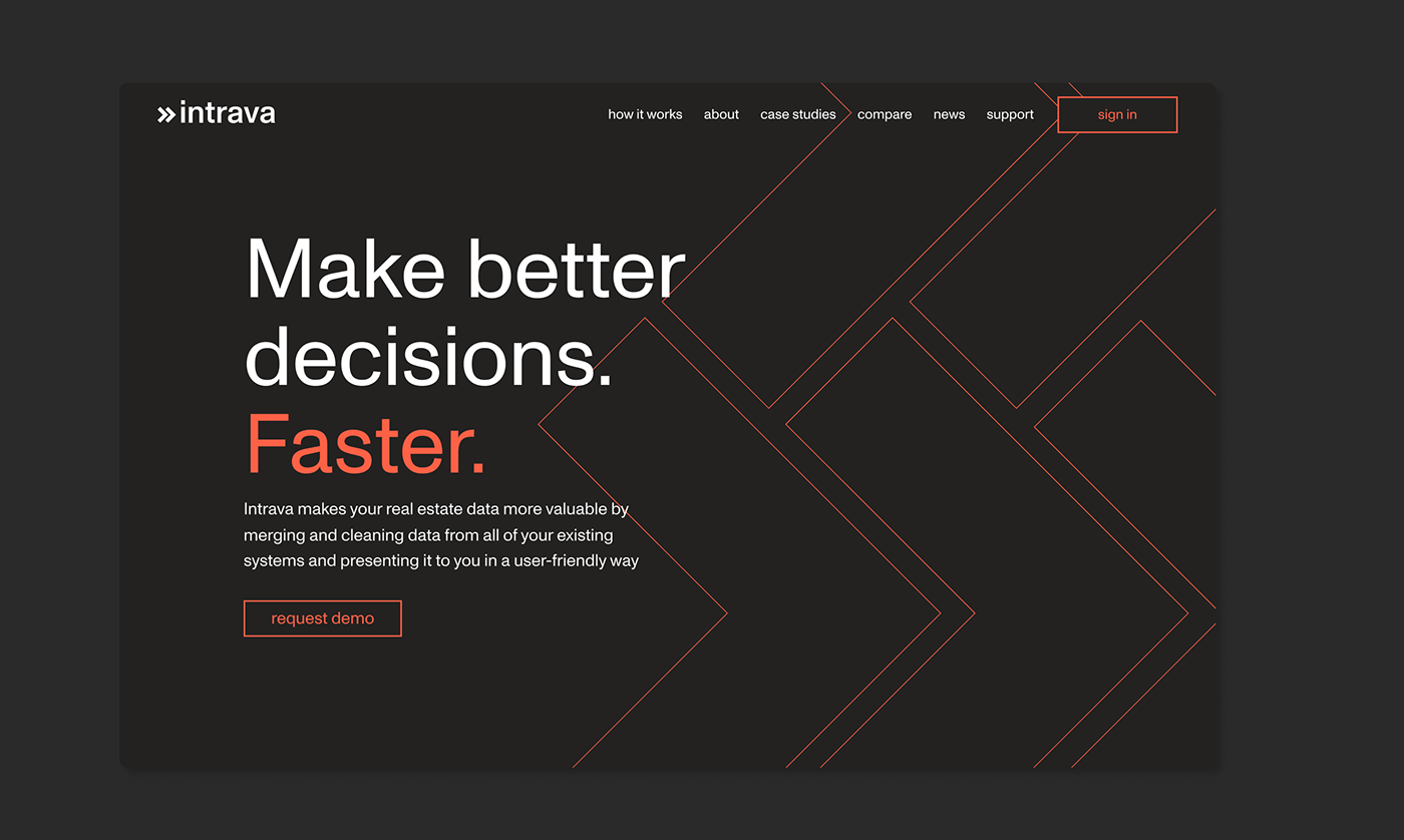
We wanted the new brand to reflect the nature of Intrava and to be: fast, detail oriented and innovative. For the logotype we played around with the meaning of the company and came up with the idea of using the two arrows as a reminder of the main goal of intrava: inserting and exporting clean data. The two arrows became a strong pillar of the new brand and we used them around the different materials, both web and print.
We wanted the new brand to reflect the nature of Intrava and to be: fast, detail oriented and innovative. For the logotype we played around with the meaning of the company and came up with the idea of using the two arrows as a reminder of the main goal of intrava: inserting and exporting clean data. The two arrows became a strong pillar of the new brand and we used them around the different materials, both web and print.
Check the website here

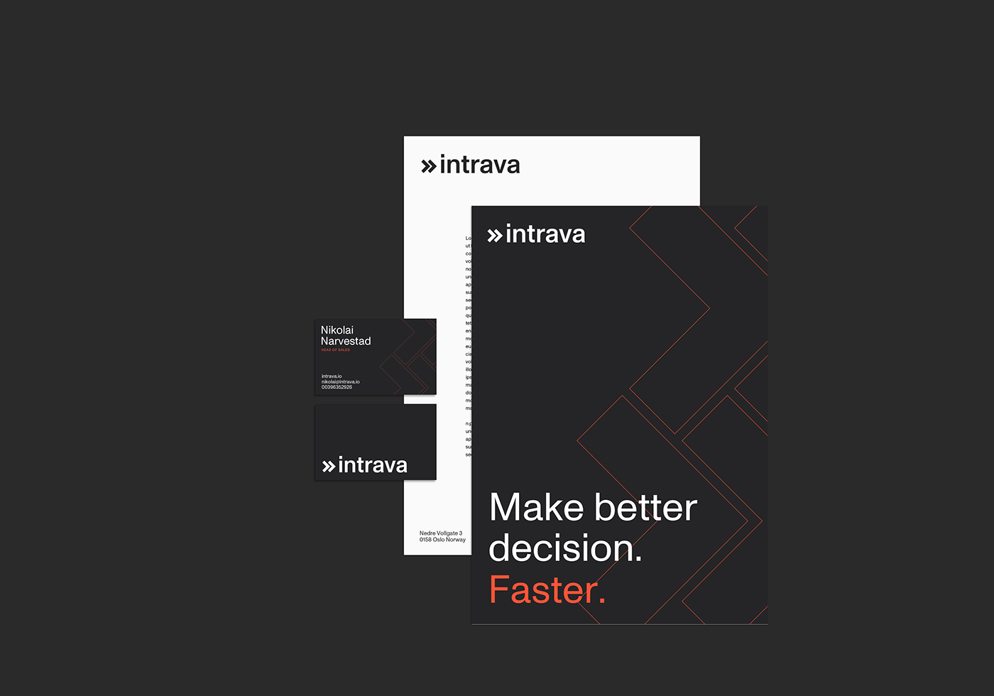
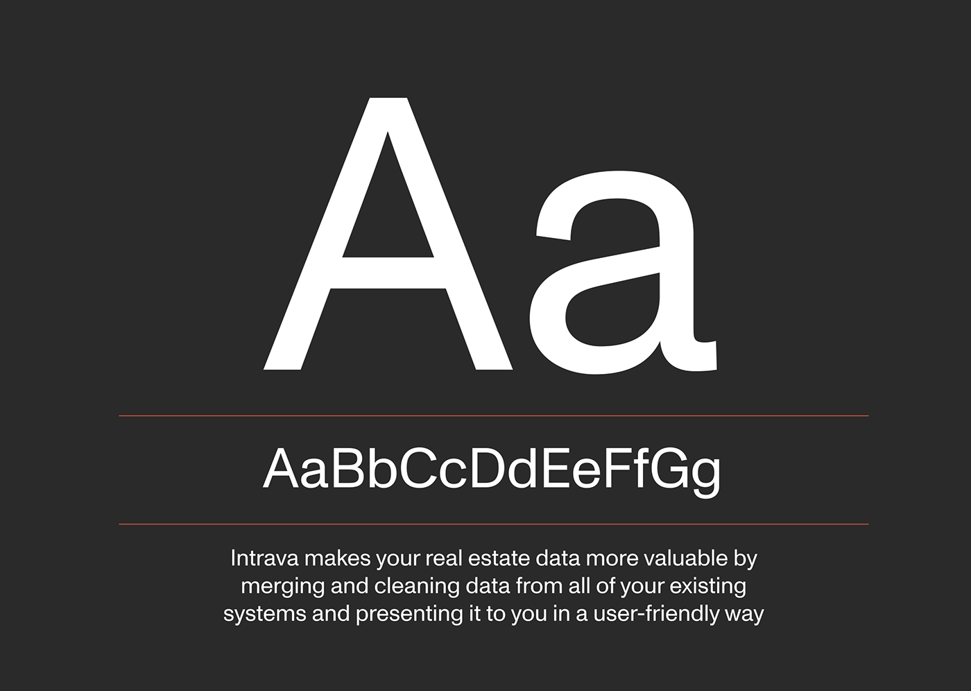
The character of the branding is strongly typographical and we choose a clean yet strong font: Monument Grotesk from Dinamo ABC in order to highlight the nature of Intrava.

Web Design
The design of the website follows the rule of the new branding: clean yet functional.
We played around with the typography and the shapes to underline important messages to the customers.

Responsive and interactive
We designed the website to be fully responsive and we came up with different interactions as for the how it works page where a drop down menu together with the animation of the graph shows exactly how Intrava can help.


