
About
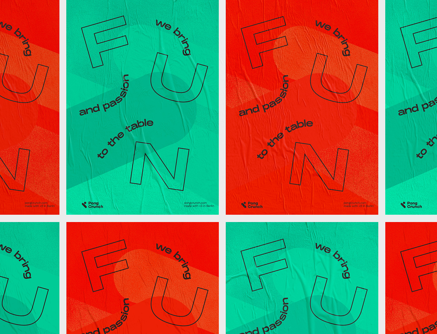
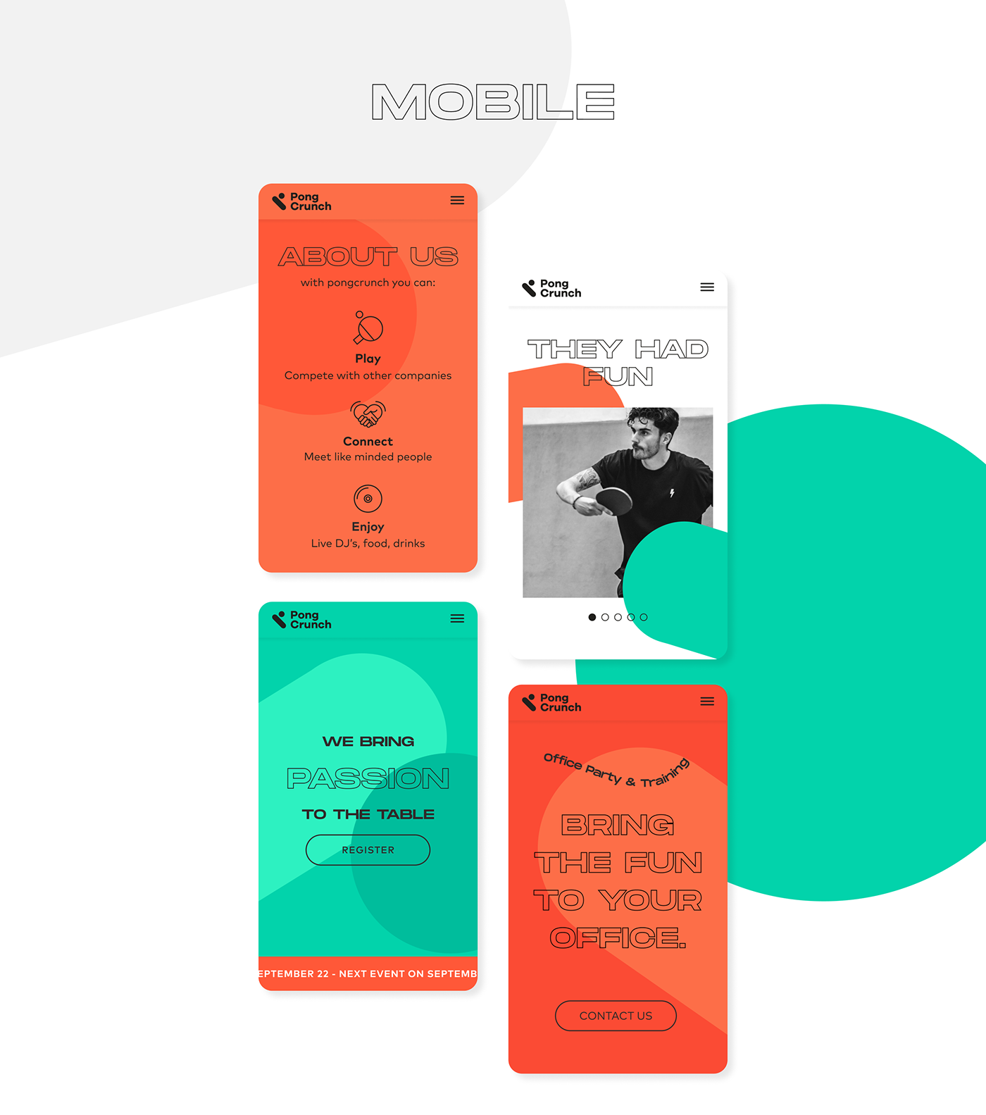
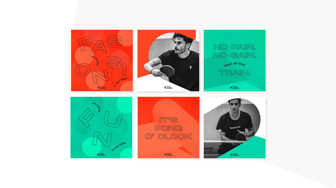
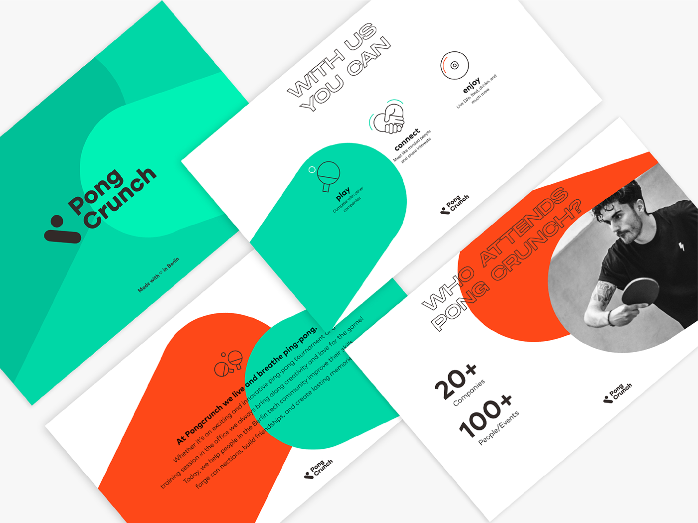
Pong Crunch organizes table tennis tournaments, bringing together and challenging different startup teams in Berlin. The new identity is representative of the nature of the brand: playful, dynamic and bold.
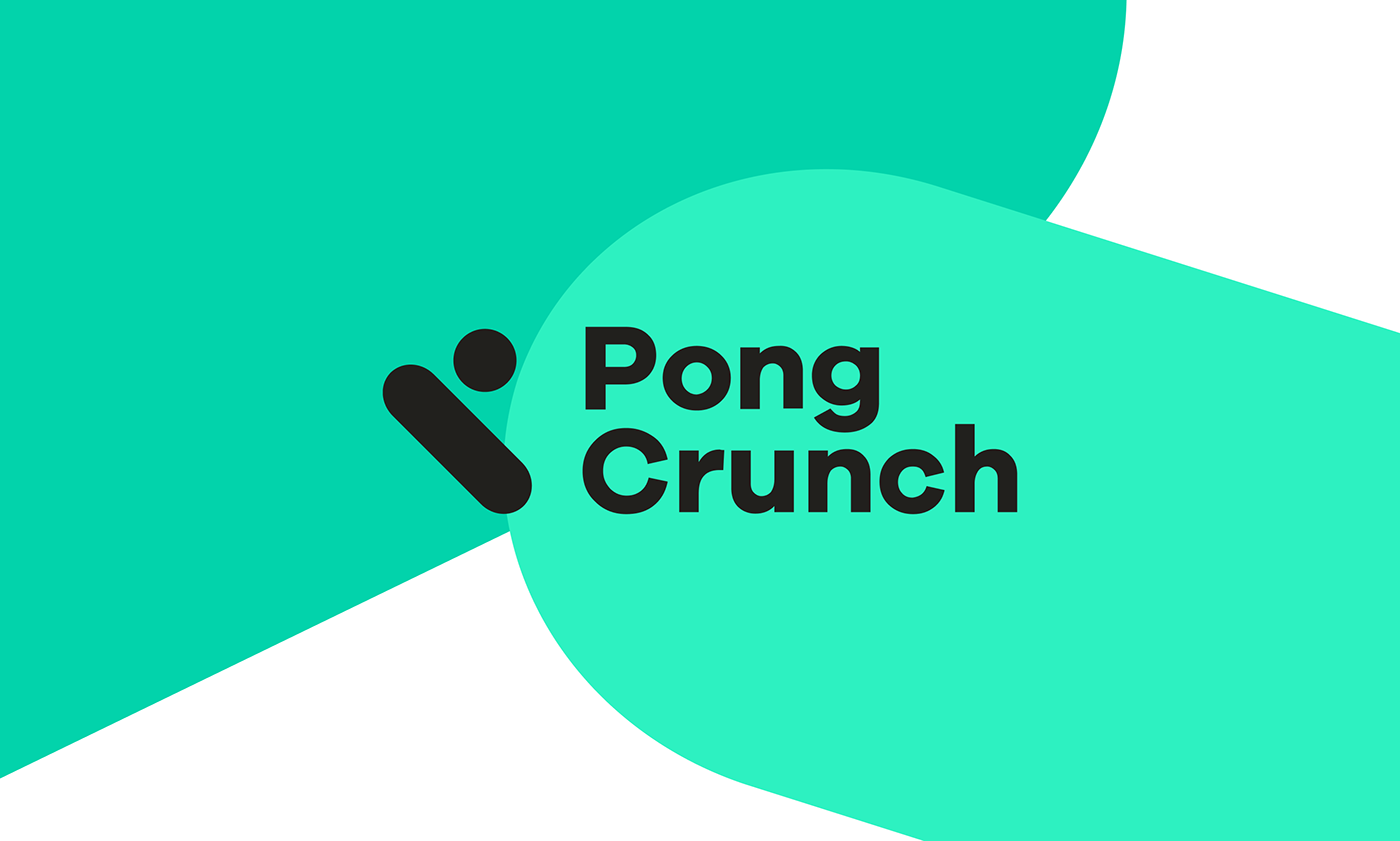
Logotype
The logo wants to be strongly connected to the table tennis world and is an abstraction of the shape of a racket hitting the ball. At the same time it also stands for the “P”, initial letter of the brand.

Identity
The overall identity plays around the use of the shapes representing rackets and tennis ball, creating a strong and consistent image, easily recognizable.
Playing with typography we highlight the main words while parts of the sentence are following a path which represents the ball trajectory on the table tennis, highlighting the dynamism of the brand.


Take a look at the all case study here:


