Token Naturals is an independent Canadian company, extracting cannabis for companies and consumers. More than a facility, they are your partner for custom, high-quality extracts.
Token came to us looking for strategic and creative ways to stand out in an increasingly competitive market. While they had a logo, that's where their branding ended. From visual language, to a brand system, to a modern website we knew we had to create brand experiences that reflected their unique offerings and viewpoints within the cannabis extraction industry.
View the live site →
View the live site →
Subtle Characteristics
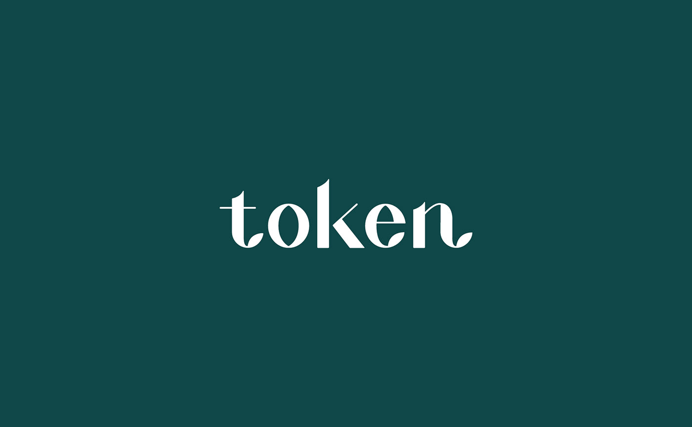
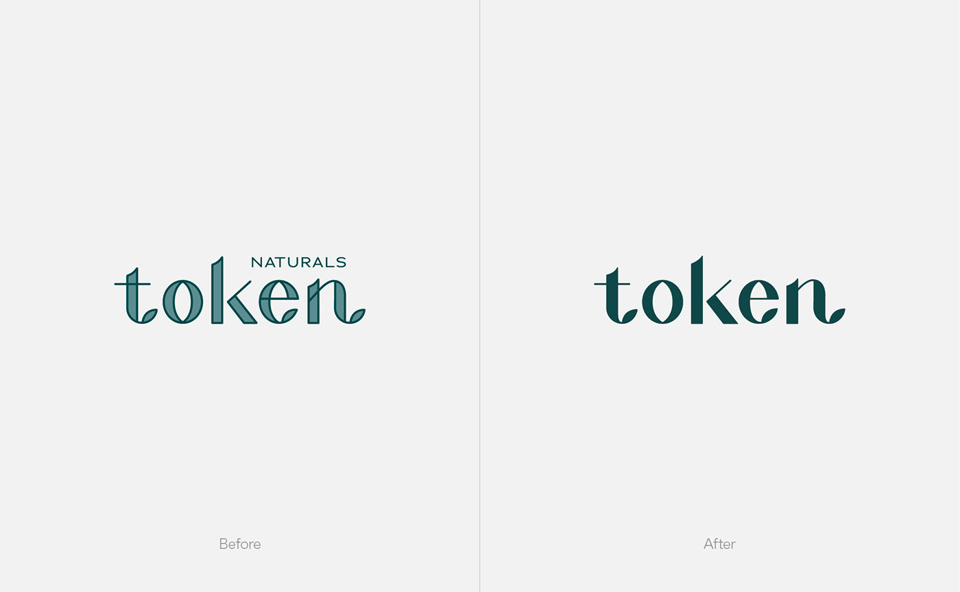
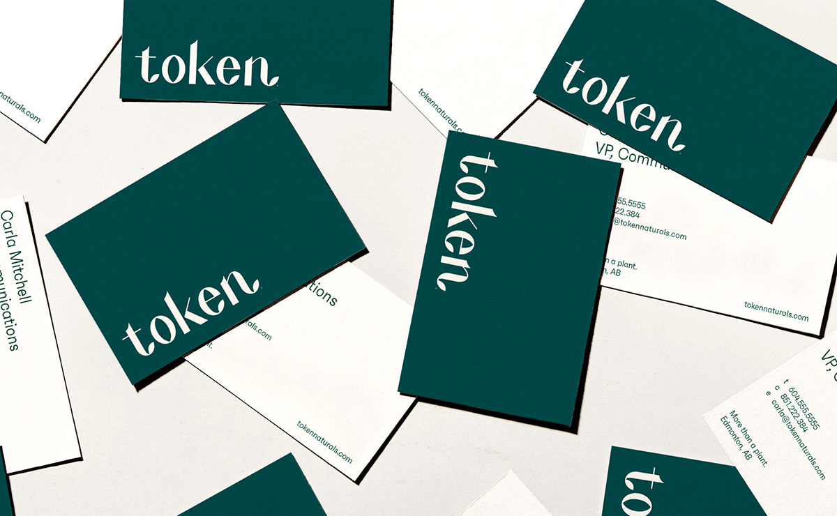
The logo that Token came to us with posed a variety of problems. It wasn't legible at all sizes, had a transparency that changed how the color appeared depending on where it was placed, and there were far too many versions in circulation. We wanted to simplify this and create something streamlined, elegant, and useable. We achieved this by redrawing the wordmark as a solid, reworking certain areas to scale more accurately and feel more representative of the top-tier company that they are. Paired with an updated color palette, Token was ready to move onward and upwards.
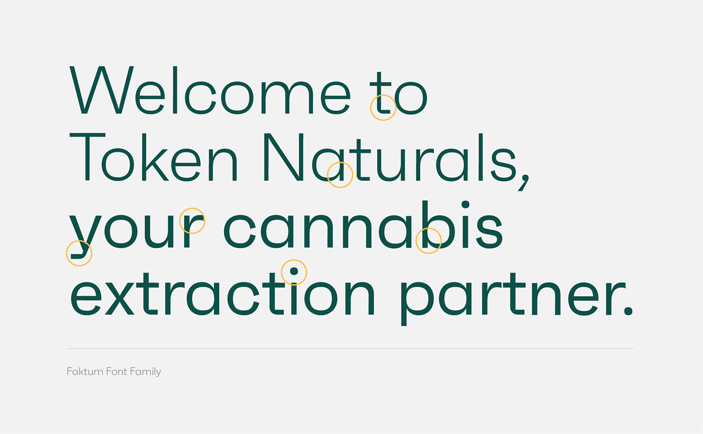
Furthermore, we adapted Faktum as the brand font of choice. Faktum is a fairly straight forward neo-geometric typeface on the surface. First and foremost, Faktum communicates information clearly and efficiently. When you look a little bit closer, there is personality that shines through within each letterform - very much representative of Token's brand as a whole.
The logo that Token came to us with posed a variety of problems. It wasn't legible at all sizes, had a transparency that changed how the color appeared depending on where it was placed, and there were far too many versions in circulation. We wanted to simplify this and create something streamlined, elegant, and useable. We achieved this by redrawing the wordmark as a solid, reworking certain areas to scale more accurately and feel more representative of the top-tier company that they are. Paired with an updated color palette, Token was ready to move onward and upwards.
Furthermore, we adapted Faktum as the brand font of choice. Faktum is a fairly straight forward neo-geometric typeface on the surface. First and foremost, Faktum communicates information clearly and efficiently. When you look a little bit closer, there is personality that shines through within each letterform - very much representative of Token's brand as a whole.
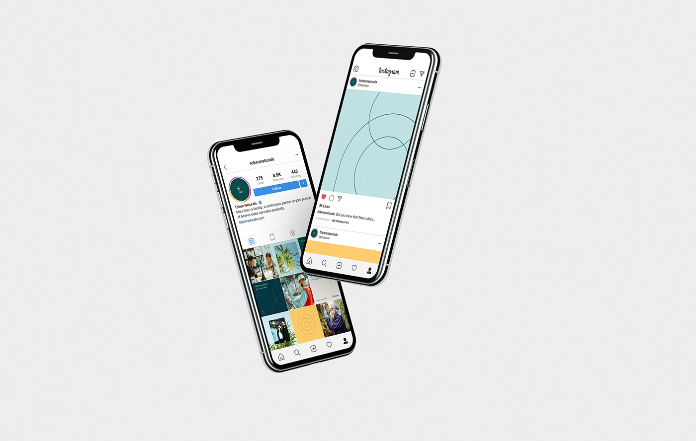
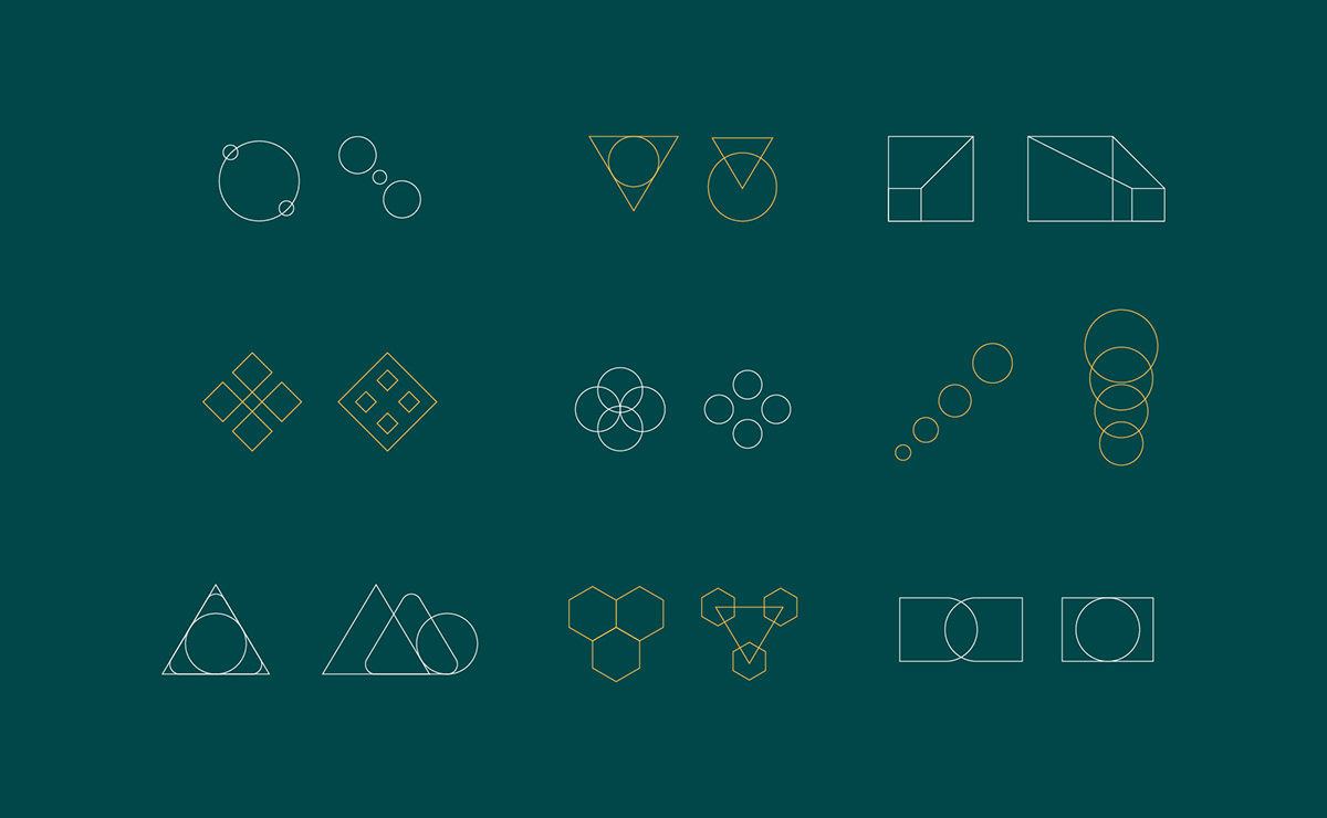
A Dynamic Graphic System
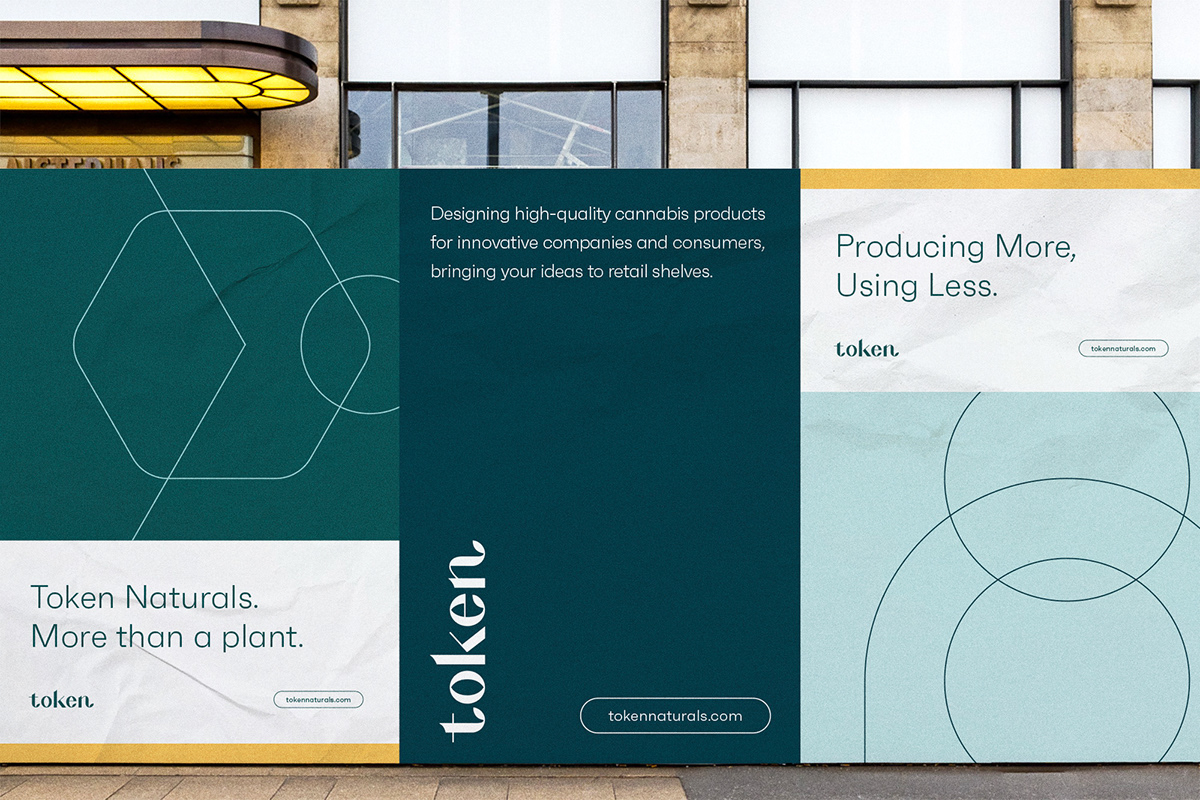
One of the big challenges Token had was communicating the complex ideas behind what they offer to their customers. By nature, Token transforms cannabis products from one state to another, giving them a unique vantage – one that is a point of transition, unique in its ability to see how something starts and how it ends all at once. With that in mind, we created a dynamic graphic system that used iconography and motion design to showcase this idea in a simplified and versatile form. This ecosystem of branded assets grew into something that felt unique, modern, and premium in marketplace chock-full of cannabis leaves and stock photos.


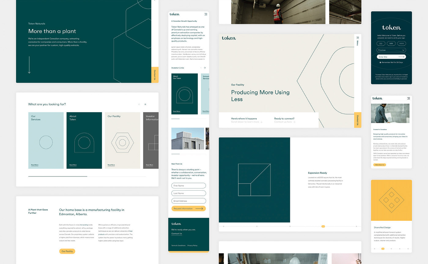
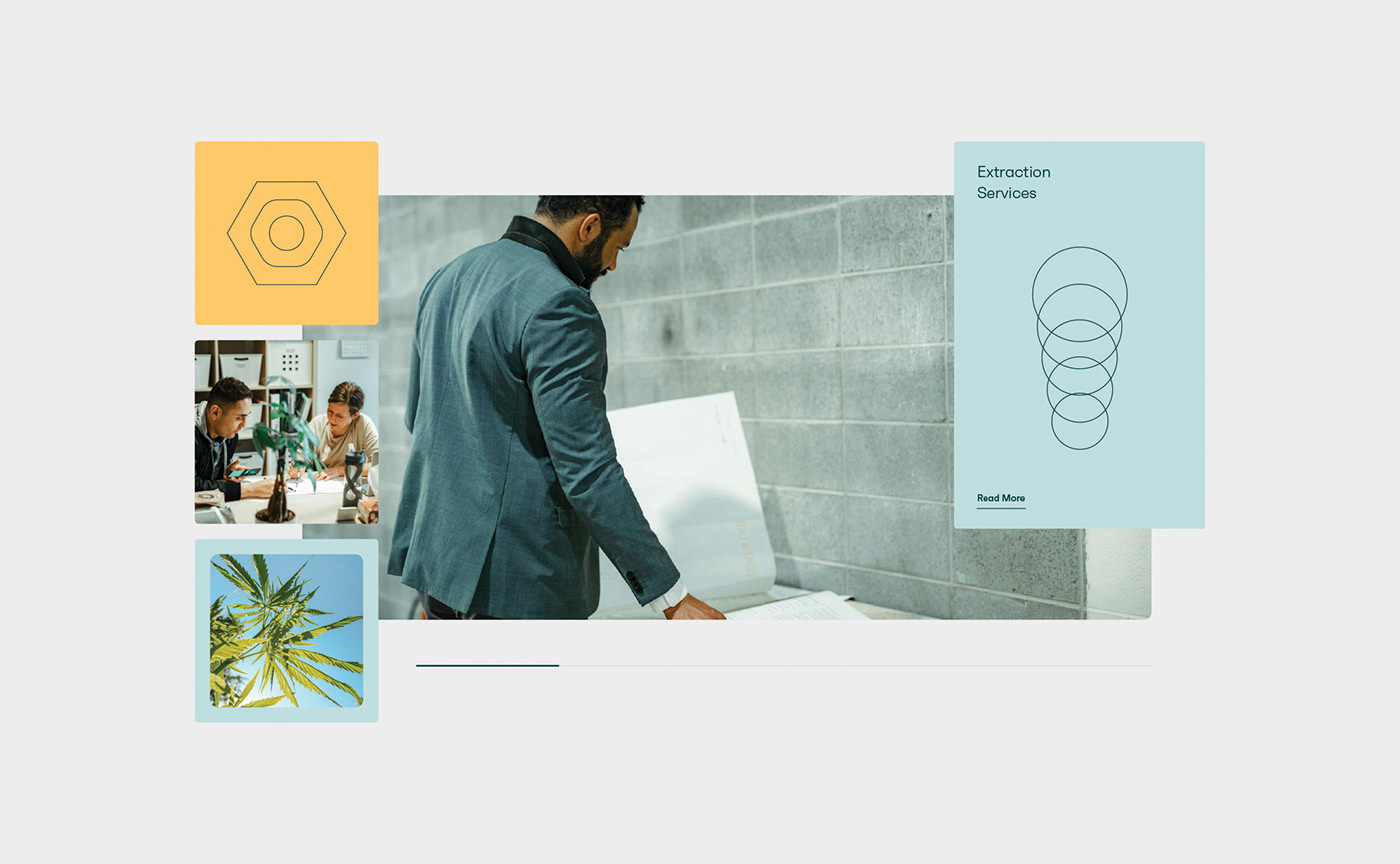
The Digital Experience
All of the work done came together in the largest deliverable in the form of a new website that embraced the graphic system and brand identity. We developed a digital experience that highlights who Token is, what they do, and what they believe in. We wanted to create a flexible digital platform that allows Token to serve the ever-evolving needs of the cannabis extraction industry.
The new website allowed Token to thoughtfully express their brand, services, and mission. A cut above the rest and more than a facility, Token is your partner in cannabis extraction.