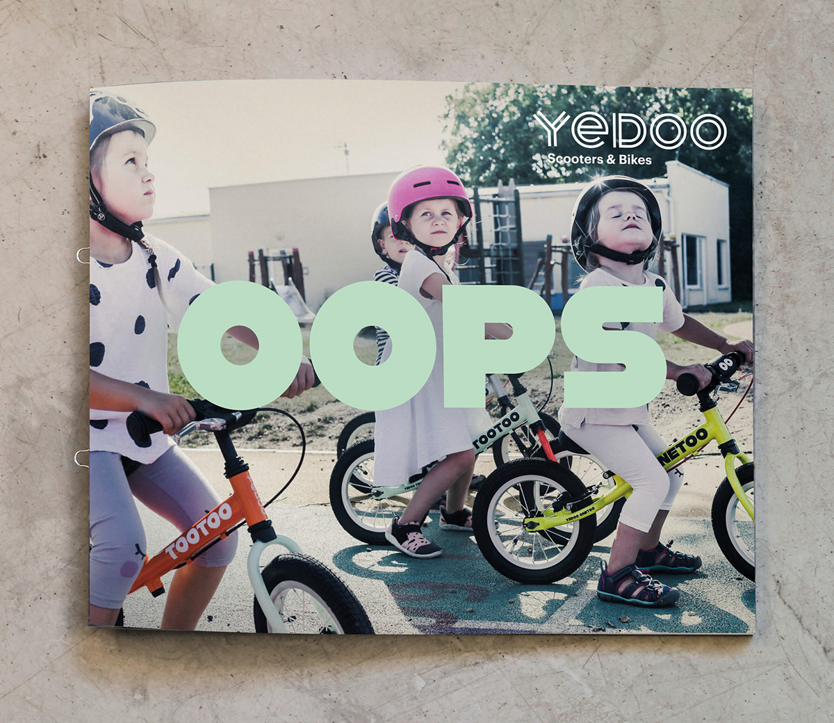


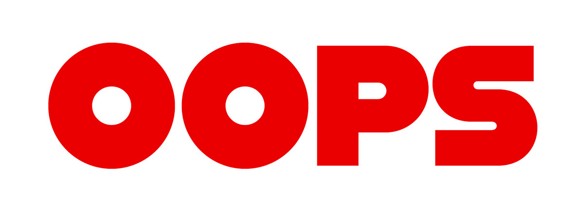

Yedoo OOPS
2020
Client: Yedoo
Art director: Zuzana Lednická
Designer: Ondřej Kahánek, Marek Pistora
Cooperation: Michal Nanoru (text), Dušan Tománek (photo)
Font: Custom
Type: Catalogue, Product, Name
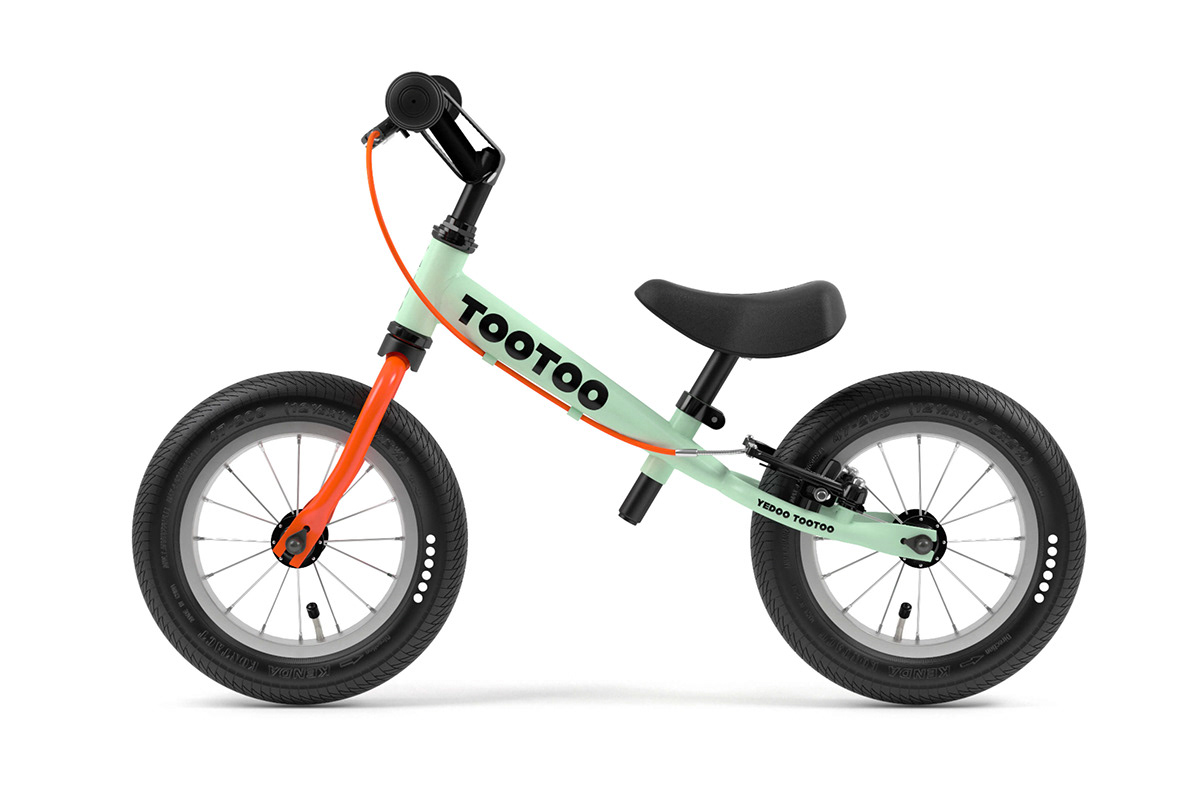
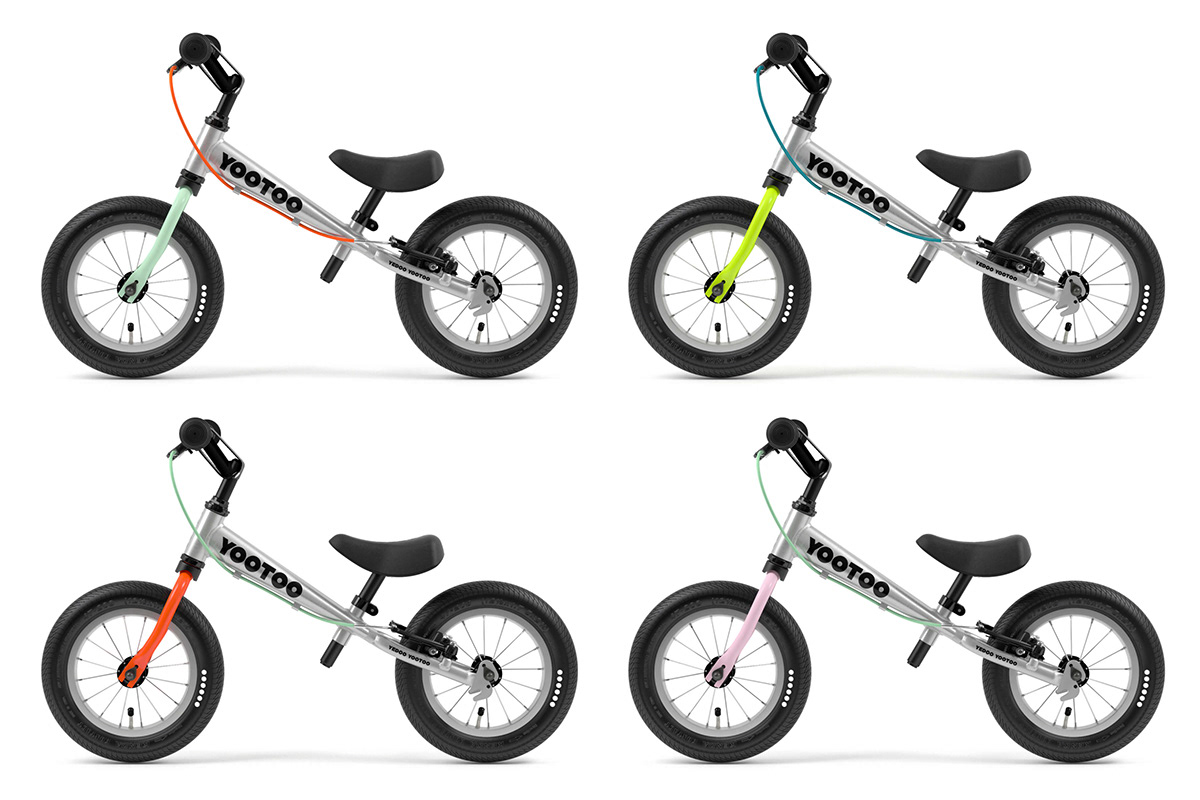
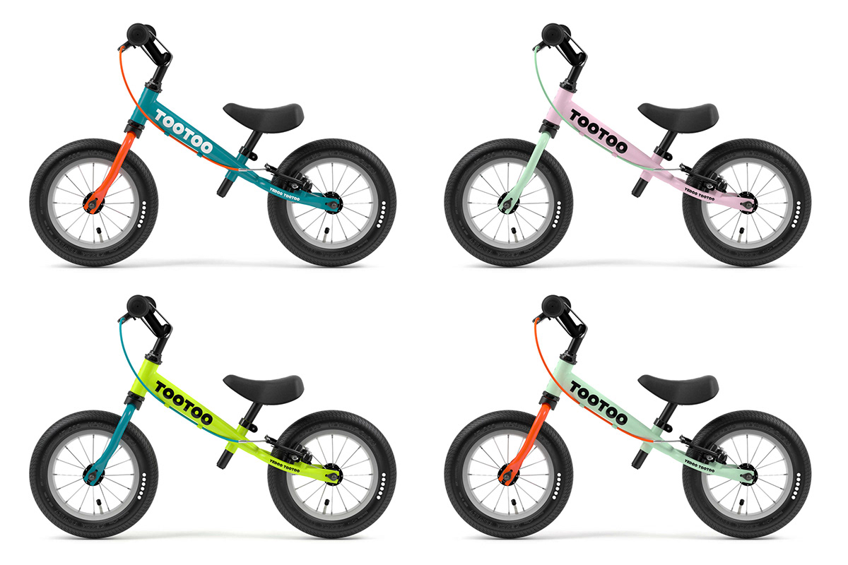
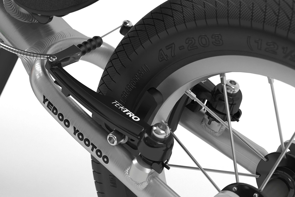
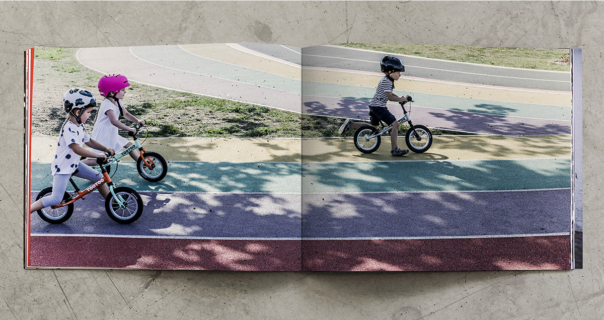
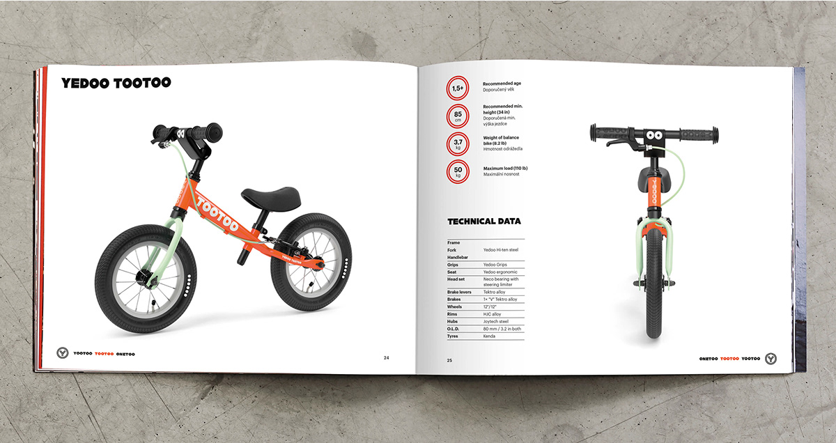
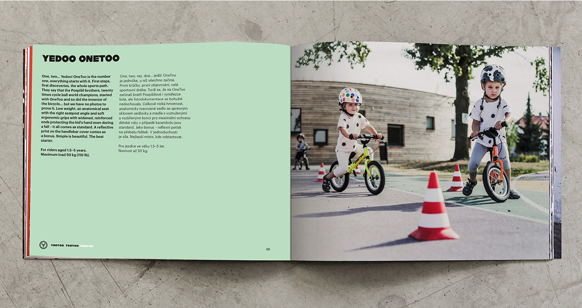
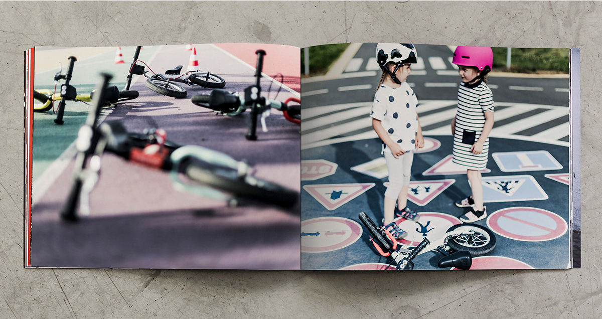
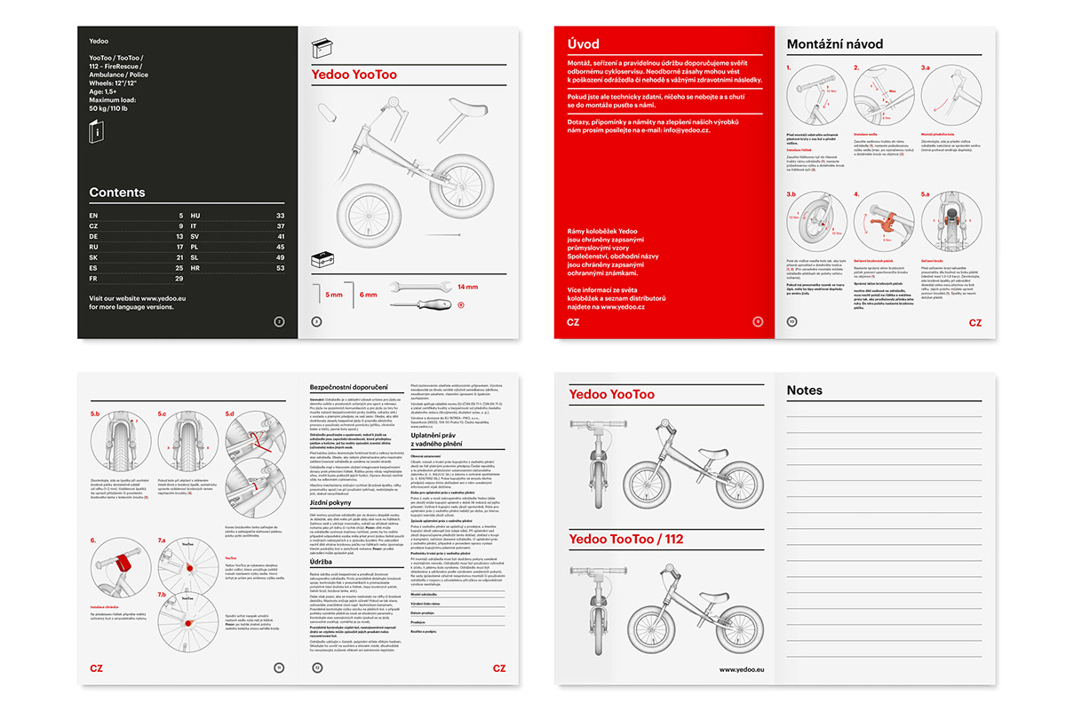
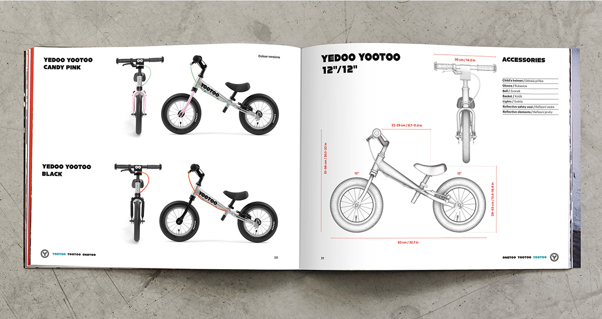
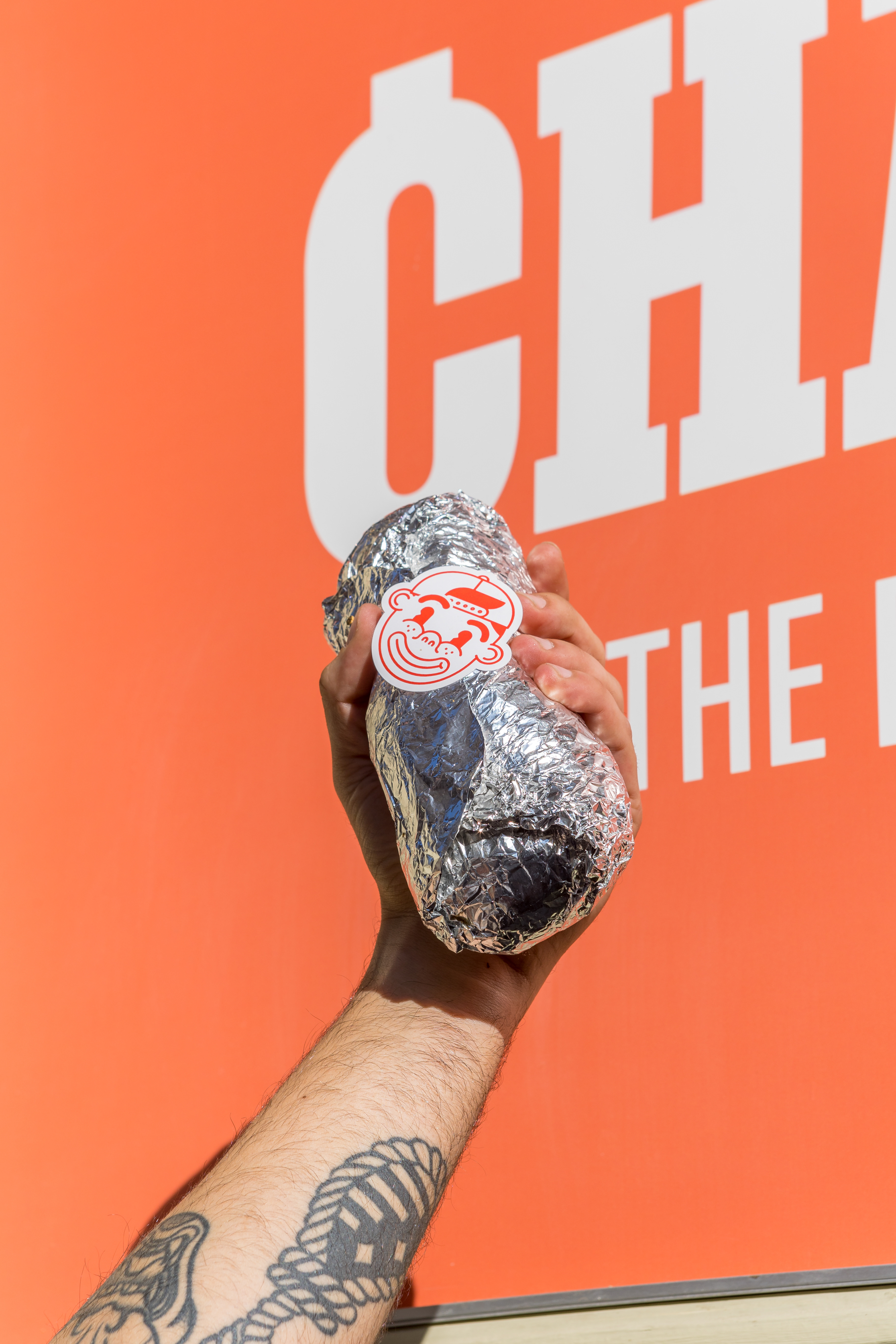
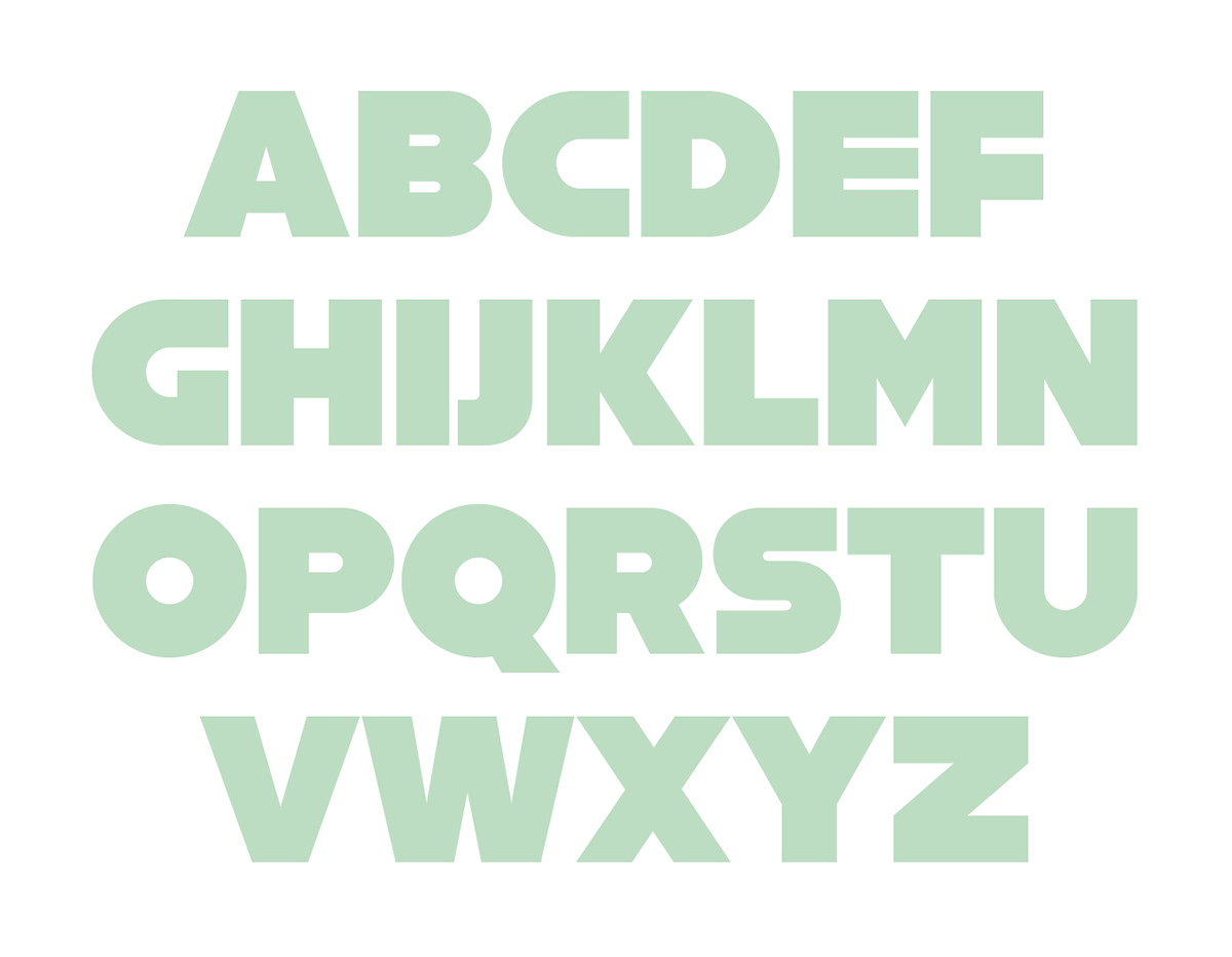
Oops, we did it again! The double “OO” in the line’s name – two dilated pupils, maybe, or two thick tires that every puddle turns into a street flusher – all these connotations fit the inscription on the young racer’s frame. Oops is a cute expression of astonishment and the uncertainty of little explorers who leave the stability of three wheels, experiencing the first buzz of riding on two. We used it to name a new line of Yedoo balance bikes and to the popular model TooToo added two new model names – OneToo and YooToo. The play with wheels continues in the graphics, which – apart from ice cream colors of lime, cotton candy, red orange or mint – is characterized by super-bold custom font created for Oops by Marek Pistora. The typeface seems inflated, with a cute, big head and only capital letters, making the balance bike look like a miniature race bike for adults or possibly classic car from Le Mans, Cannonball Run or Silverton. Said one user, “The balance bike is great. You don’t have to pedal – you just swing your legs!” As always with Yedoo, we created a catalog for Oops – copywriting, photos, graphic design, print production, everything.