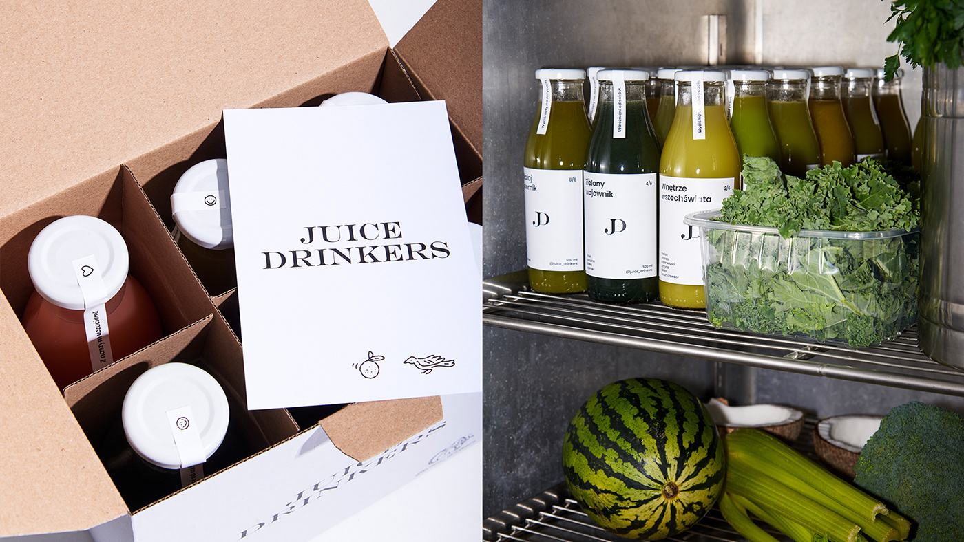
Juice Drinkers is a place created by youthful and open-minded people. For ten years, it has been serving freshly squeezed juices and is a well known Poznań spot that’s written on the map for good. We were asked to refresh their identity. Our focus was minimalism and simplicity with a playful twist. An important element to consider was also their new approach to materials. To protect the environment, Juice Drinkers have introduced returnable glass bottles and recyclable paper packaging.
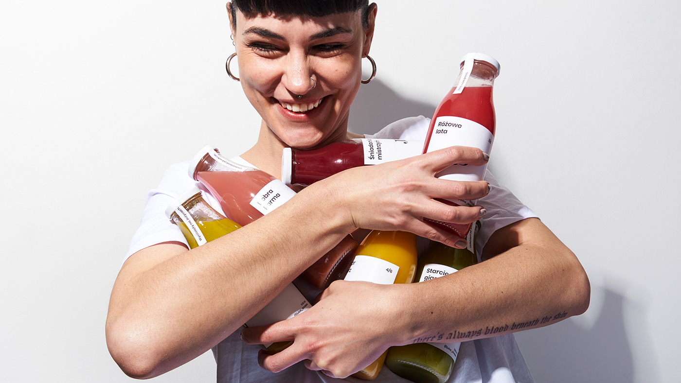
We designed a packaging system, created a series of photos and introduced elements of the identity into their new venue. The summary of the entire identification is shown in the series of energetic photos reflecting the free, urban character of the brand.
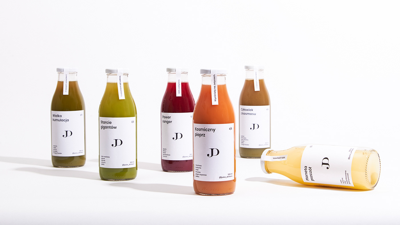
The classic Poppins font, which appears in all communication materials, works together with a series of small, original, hand drawn illustrations. The clean, structured, black and white packaging system is the perfect setting for the joyful colourful juices.
Client: Juice Drinkers
Art direction: Joanna Ziemowska
Illustrations: Maria Mileńko
Photo: Kuba Rodziewicz
Scenography: Jadwiga Paluch
Font: Poppins / Indian type foundry