Typography is beautiful if less is more
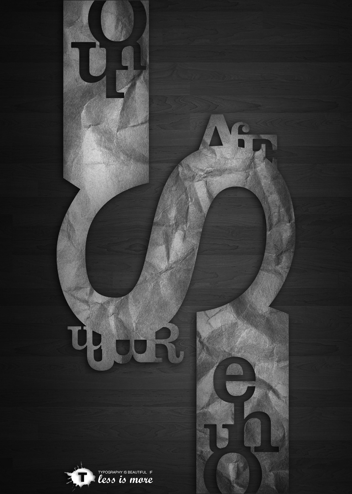
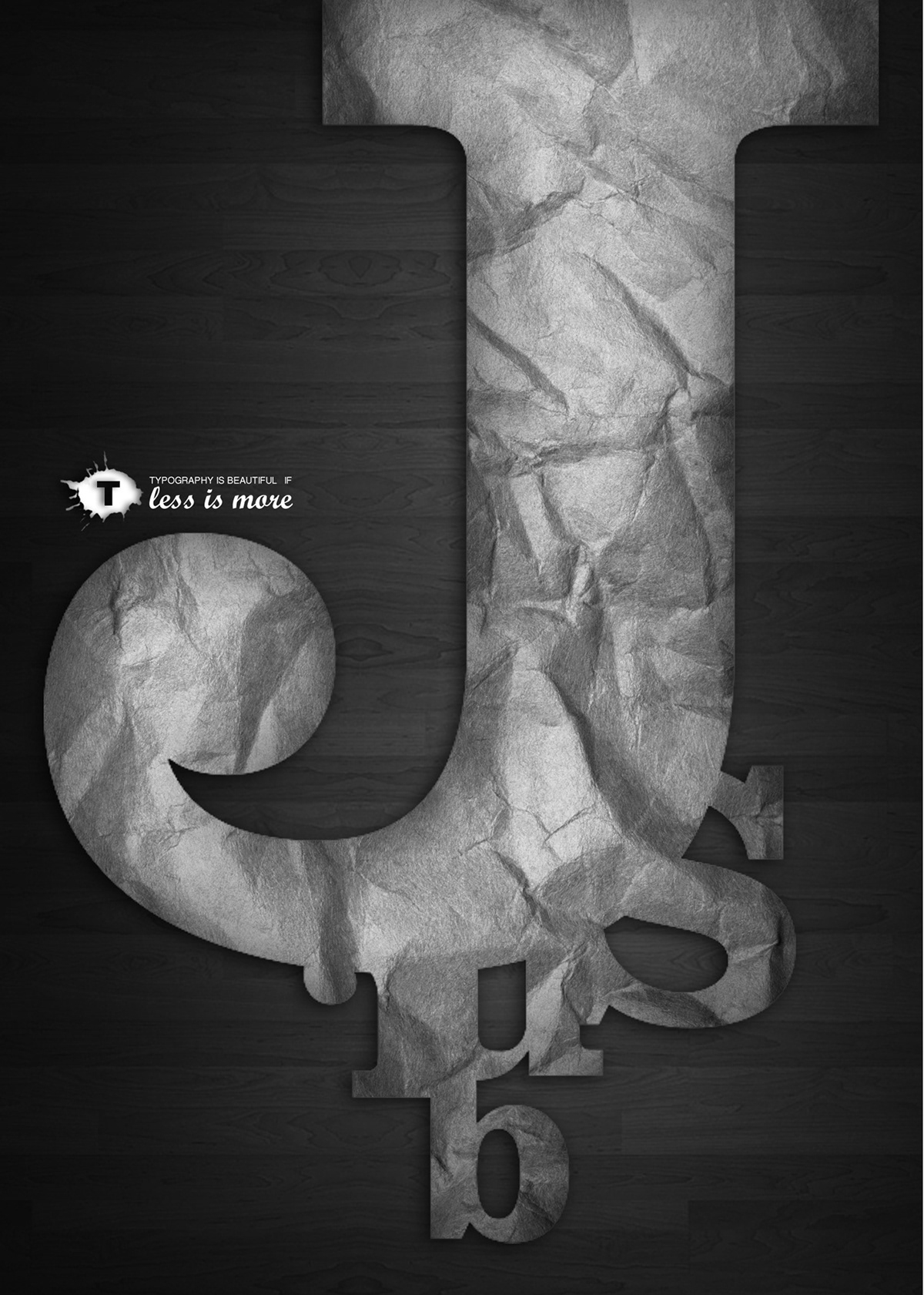
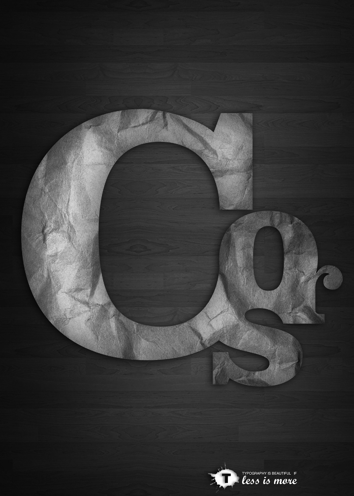
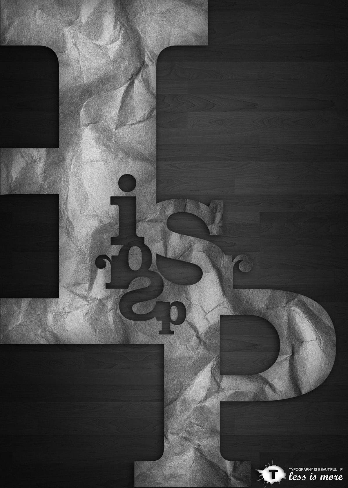
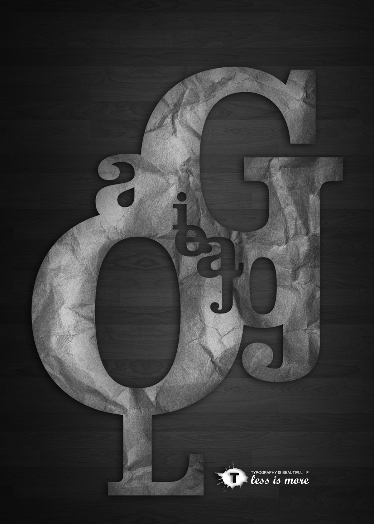
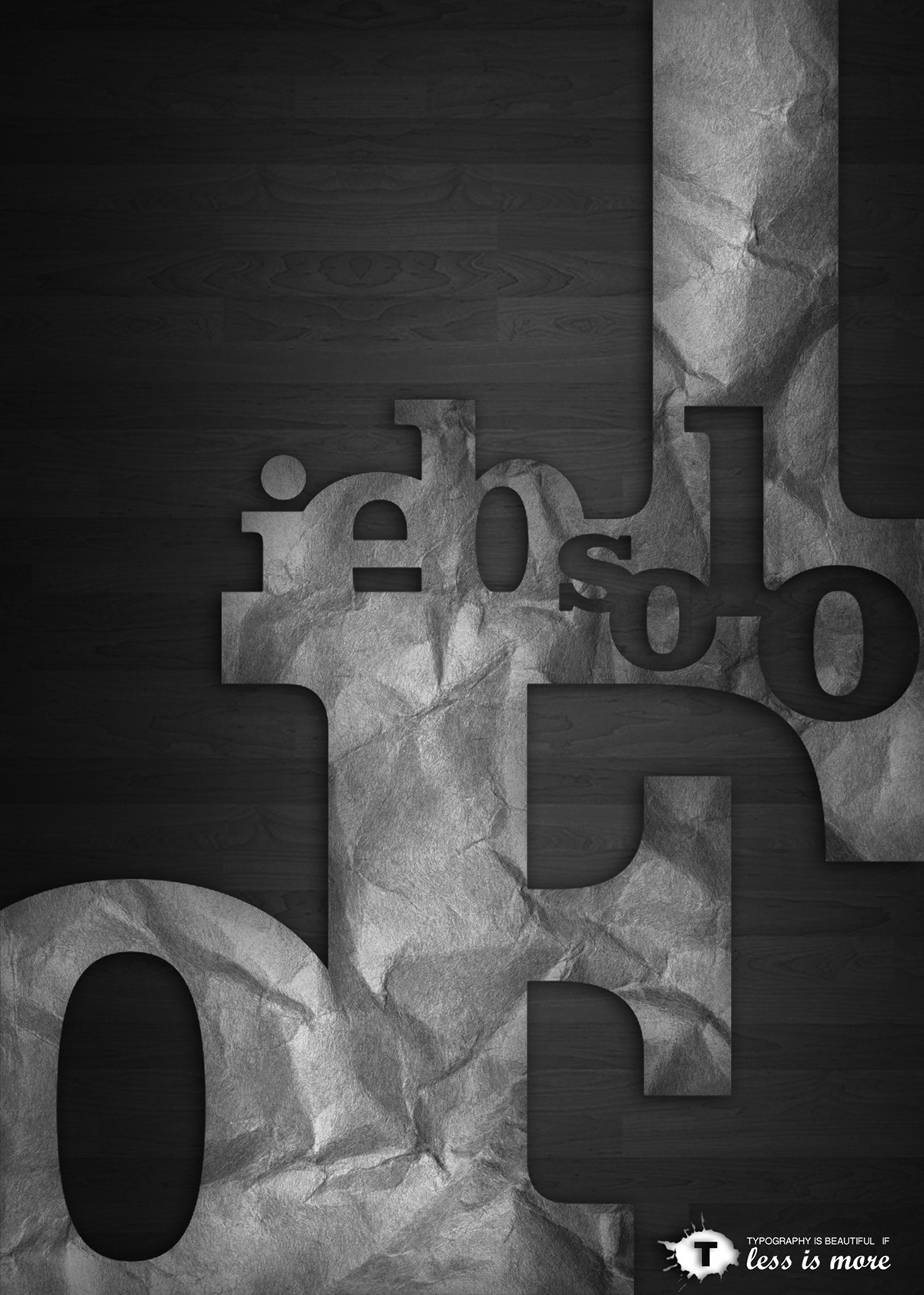
This composition is asymmetrical and the letters are forming a kind of object or a shape. I used wrinkled paper texture on letters, and black wood for the background. The logo of the project is "T" in a color drop, and it represents the word "typography". The slogan is "typography is beautiful if less is more".

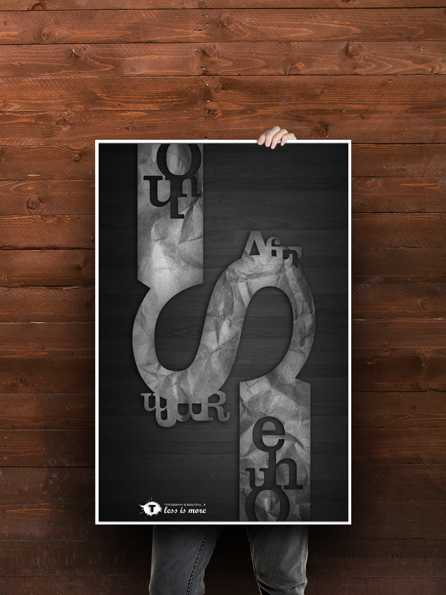

Publication in "Stop, Think, Go, Do" by Mirko Ilić and Steven Heller, Rockport publishers, New York