


THE CLIENT:
MKS Residential is a California-based real estate company specializing in the investment, development and construction of multifamily residential properties in the western United States. The company was founded in 2012 by a trio of friends who have more than a century of combined experience developing and building more than $1 billion worth of high-end multifamily projects. The name ‘MKS’ was formed from the surnames of the founding three principals of the company: Ronald Morgan, Louis Kuntz, and Ric Shwisberg.
MKS Residential is a California-based real estate company specializing in the investment, development and construction of multifamily residential properties in the western United States. The company was founded in 2012 by a trio of friends who have more than a century of combined experience developing and building more than $1 billion worth of high-end multifamily projects. The name ‘MKS’ was formed from the surnames of the founding three principals of the company: Ronald Morgan, Louis Kuntz, and Ric Shwisberg.
As a boutique developer, they are committed to building high-quality, well-built living spaces that are cutting edge in style and design. They pride themselves on their pristine industry reputation and unblemished track record in delivering projects on-time and under budget.
THE BRIEF:
I was asked to create a brand identity befitting the quality of work and attention to detail MKS is becoming renowned for, and to visually unify the company with its apartment brand, Solana. In addition, it needed to embody the company’s boutique nature in a unique and stylish way, yet remain classic and institutional in impression or feel as to appeal to investors.
I was asked to create a brand identity befitting the quality of work and attention to detail MKS is becoming renowned for, and to visually unify the company with its apartment brand, Solana. In addition, it needed to embody the company’s boutique nature in a unique and stylish way, yet remain classic and institutional in impression or feel as to appeal to investors.
THE SOLUTION:
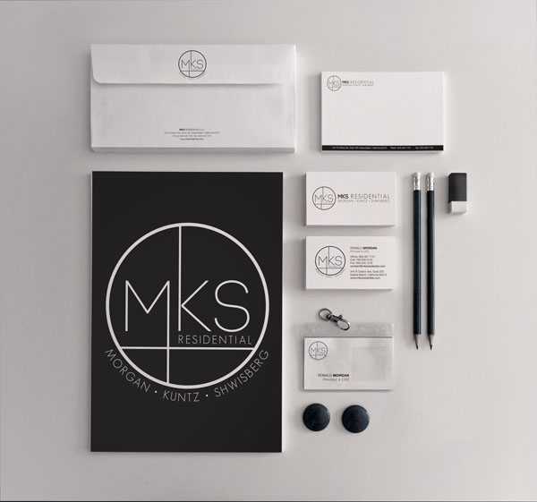
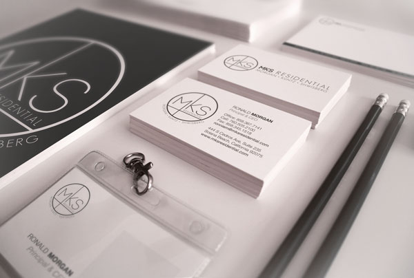
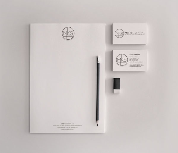
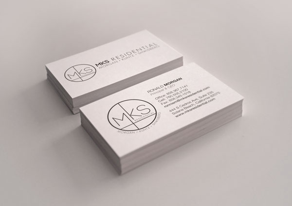
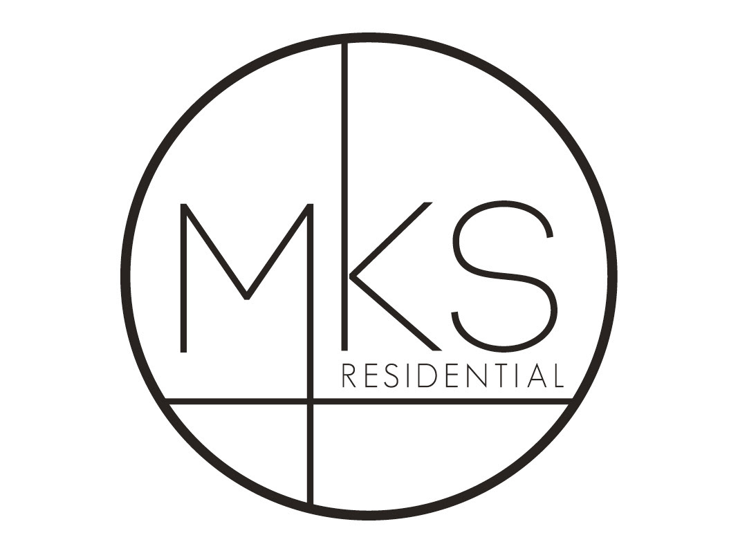
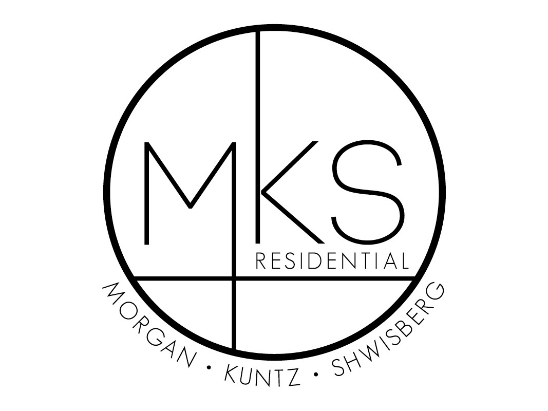
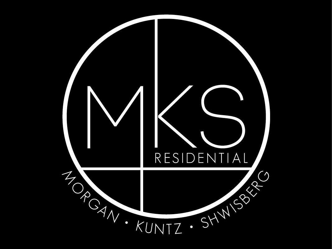
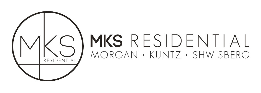
A strong, cohesive, memorable identity was achieved by creating a unique, circular logo. The logotype combines sturdy, bold lettering with elegant, ultra thin lettering in a visually appealing way that reflects the company’s commitment to well-built and refined developments. The typefaces are the same typefaces that were used in the Solana identity, therefore creating a stylistic consistency between the two brands.
A strong, cohesive, memorable identity was achieved by creating a unique, circular logo. The logotype combines sturdy, bold lettering with elegant, ultra thin lettering in a visually appealing way that reflects the company’s commitment to well-built and refined developments. The typefaces are the same typefaces that were used in the Solana identity, therefore creating a stylistic consistency between the two brands.
The logo’s circular form is eye-catching and reflects the boutique nature of the company, as it draws inspiration from classic rubber stamps that are traditionally used to add a personal touch to stationery.
I found that MKS shares many values with the Bauhaus movement, including simplicity, economical use of space, material, time and money, and modern design aesthetic. Although, the Bauhaus movement was almost 100 years ago, the Bauhaus style of design is timeless and objects produced during this time period look as modern as anything in production today. Thus, the MKS Residential logo is largely influenced by the Bauhaus style of design, and in particular Bauhaus typography. This can be seen in the clean, crisp lines inside the circle, the extension of the letters, the placement of Residential, the choice of sans serif typeface, and the overall geometric form of the logo.
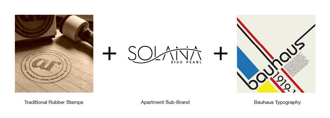
Inspiration for concept
Vertical version 1.

Vertical version 1 reversed.
Vertical version 2.
Vertical version 2 reversed.
Horizontal version.

Horizontal version reversed.