Na Zábradlí Theater
2020
Client: Na Zábradlí Theater
Art director: Aleš Najbrt
Designer: Andrea Vacovská
Cooperation: Zdeněk Trinkewitz (3D graphics), Jonatan Kuna (3D graphics), Marek Pistora (brand redesign), Pufcreatif (photography)
Font: Sabon
Type: Interior, Brand, Program, Poster
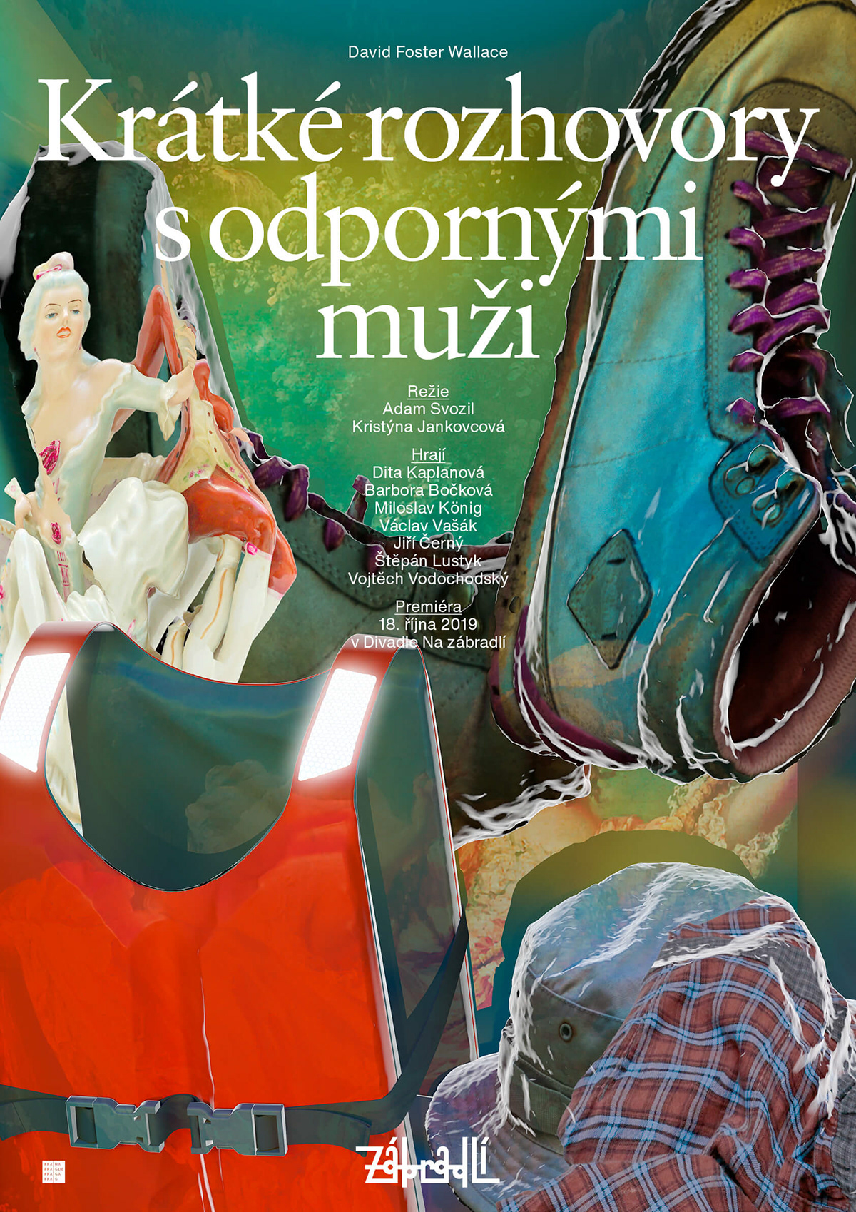
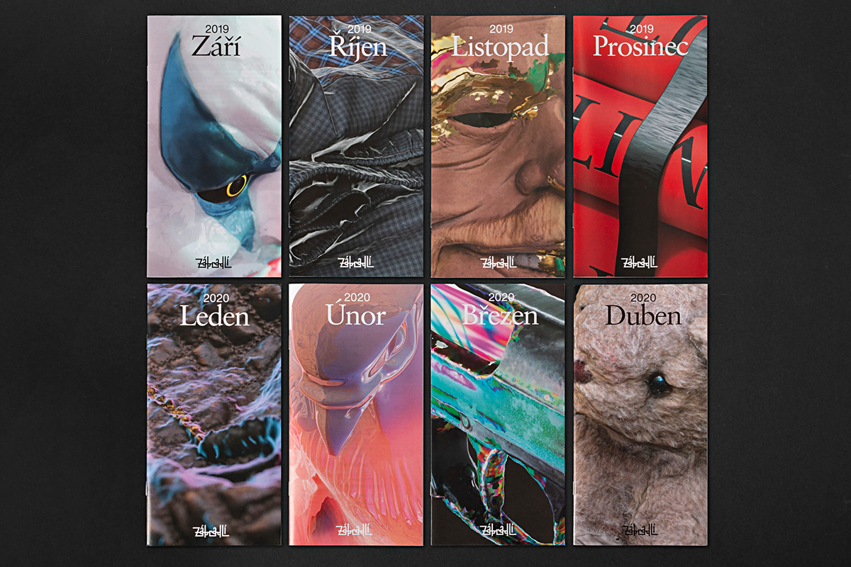
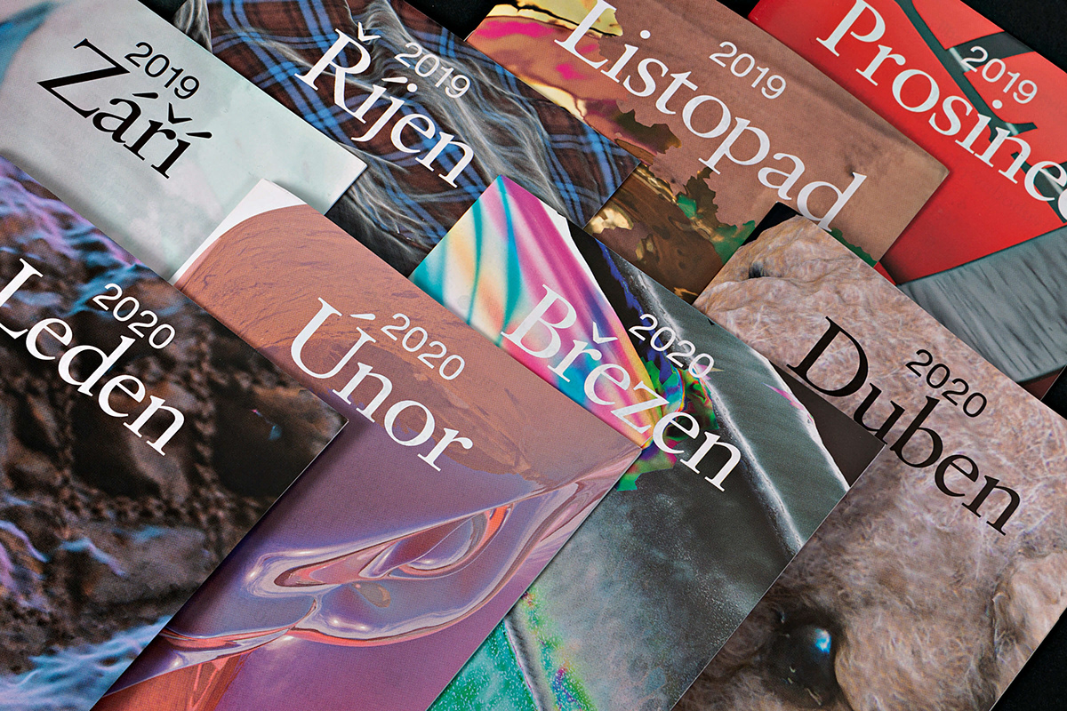
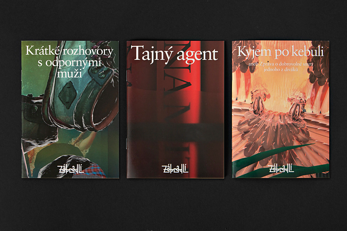
What began with a cleansing and return to Libor Fára's logo from the 1960s eventually evolved into a new visual style and system for all of the theater’s printed matter. Standard program leaflets were replaced by monthly brochures, and the new typeface refreshed signs on the facade, wayfinding and merchandising. The legendary Prague scene, where major performances always took place even long after the curtain fell (at the bar), has long been the most stylish, with its cast always one foot in a fashion spread. And in recent years it became to be visually characterized by its widely acclaimed, lush scenography and costumes. The posters thus take on the form of the Zábradlí’s trademark cube stage and the graphic presentation packs classic theatrical fame, make-up and poses into a current form of sleek and sensual editorial. In the visuals, curated props from current performances are unboxed and then scanned, abstracted in 3D and supernaturally intensified by the gel of liquid digital attraction. Who, next to the clown from It, recognized the rubber mask of Václav Havel, Na Zábradlí’s stagehand and later its artistic director, playwright (and also a president)? The idea of the amalgam of seductions in the heart of Prague’s Old Town continues in quotes from plays set in the elegant Sabon typeface, which Jan Tschichold cultivated from a revived old-style 16th century serif in the 1960s.