
Egoé
2020
Client: Egoé
Art director: Aleš Najbrt
Designer: Andrea Vacovská, Marek Pistora
Cooperation: Studio 9 (web development), Dušan Tománek (photo)
Font: Matter
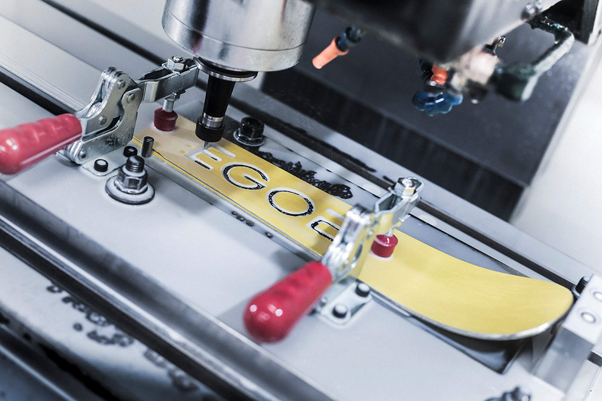
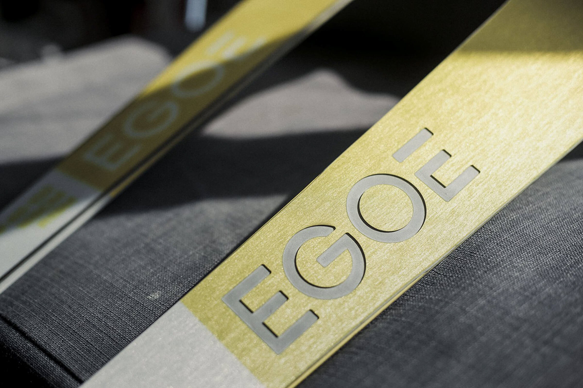
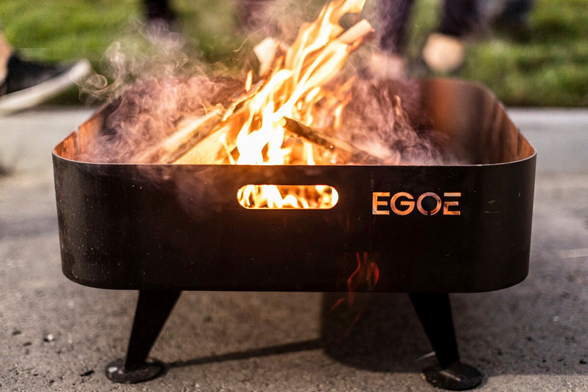
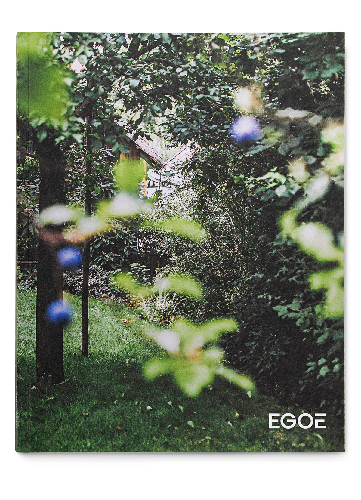
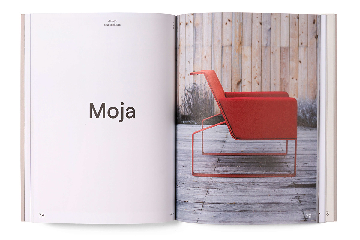
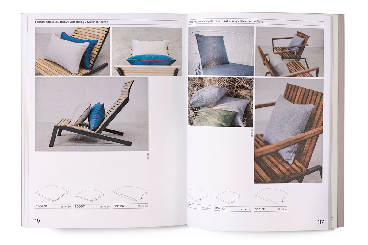
While Mmcité, the continuing success story from a little Moravian village of Bílovice, makes durable structures for public spaces, from urban furniture to noise barriers, its younger sibling focuses on objects for – as the name suggests – a private stay in the open. Its three lines, Life, Move and Nest, produce outdoor furniture, skis and sporting equipment and installations that convert your car into a camper. The characteristic stubbornness and angularity of the furniture and its weather resistance are reflected in the ferociousness of the logo and the formal play with the accent on the final “É”. Together, they resemble a typical Egoé stool. We devised a stencil version of the logo for cutting, embossing and other use in the range of materials, and selected and used the typeface straightway in the catalog, setting the rules of the visual style for long-term garden survival.