Kiwi
The challenge
Kiwi is a student project, where my task was to create unique and attractive brand identity and after that, labels for juices. During these days of pandemic, we are becoming increasingly careful of our health. Trying to get more vitamins and various minerals, we try to eat more different fruits, berries and vegetables, thereby remaining healthy. The problem is that children often do not want to eat those things. The goal of the project was to make an attractive brand and labeling for natural juices that children will be interested in and with the help of which they will receive these useful vitamins and minerals.
The result
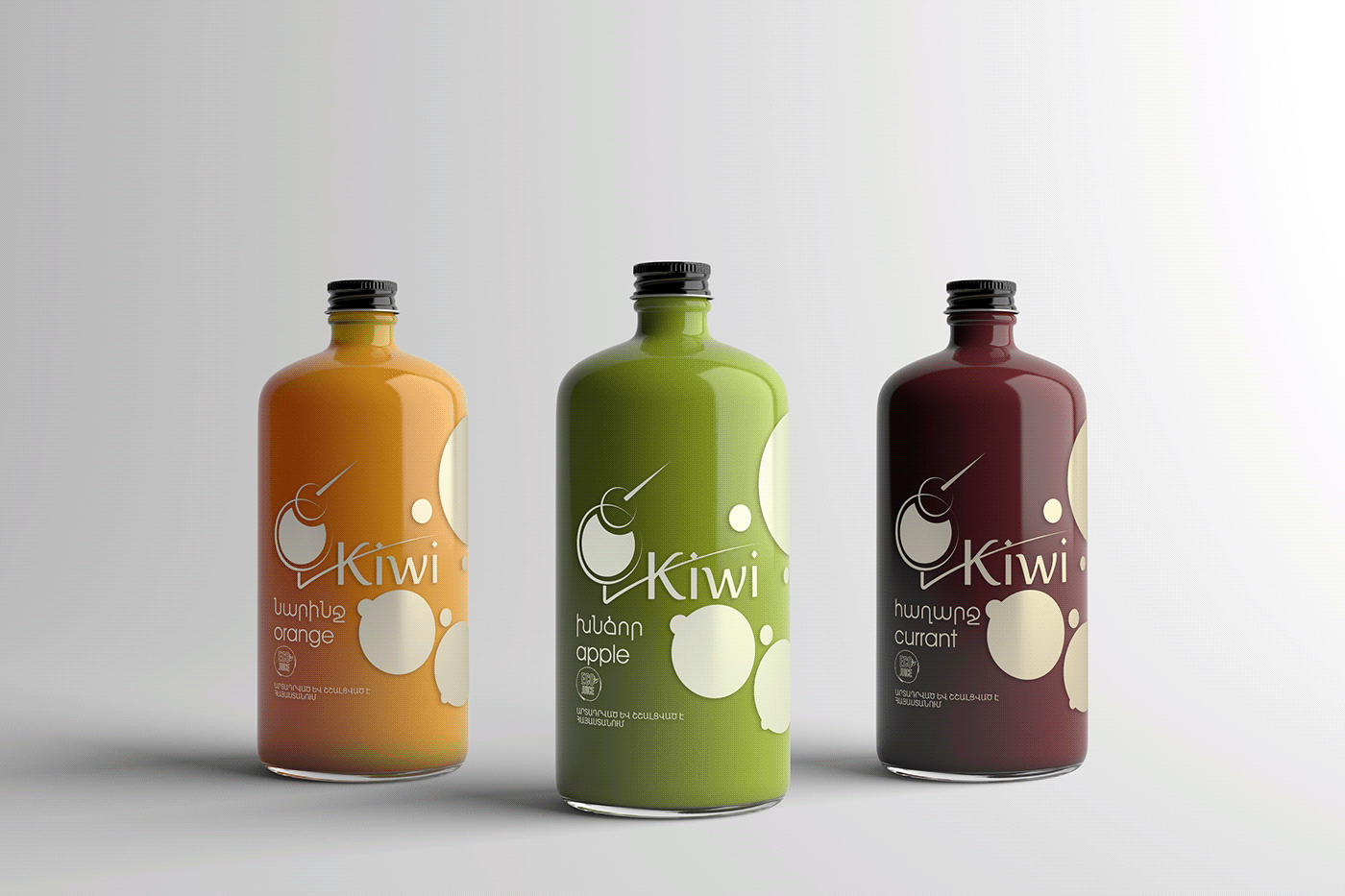
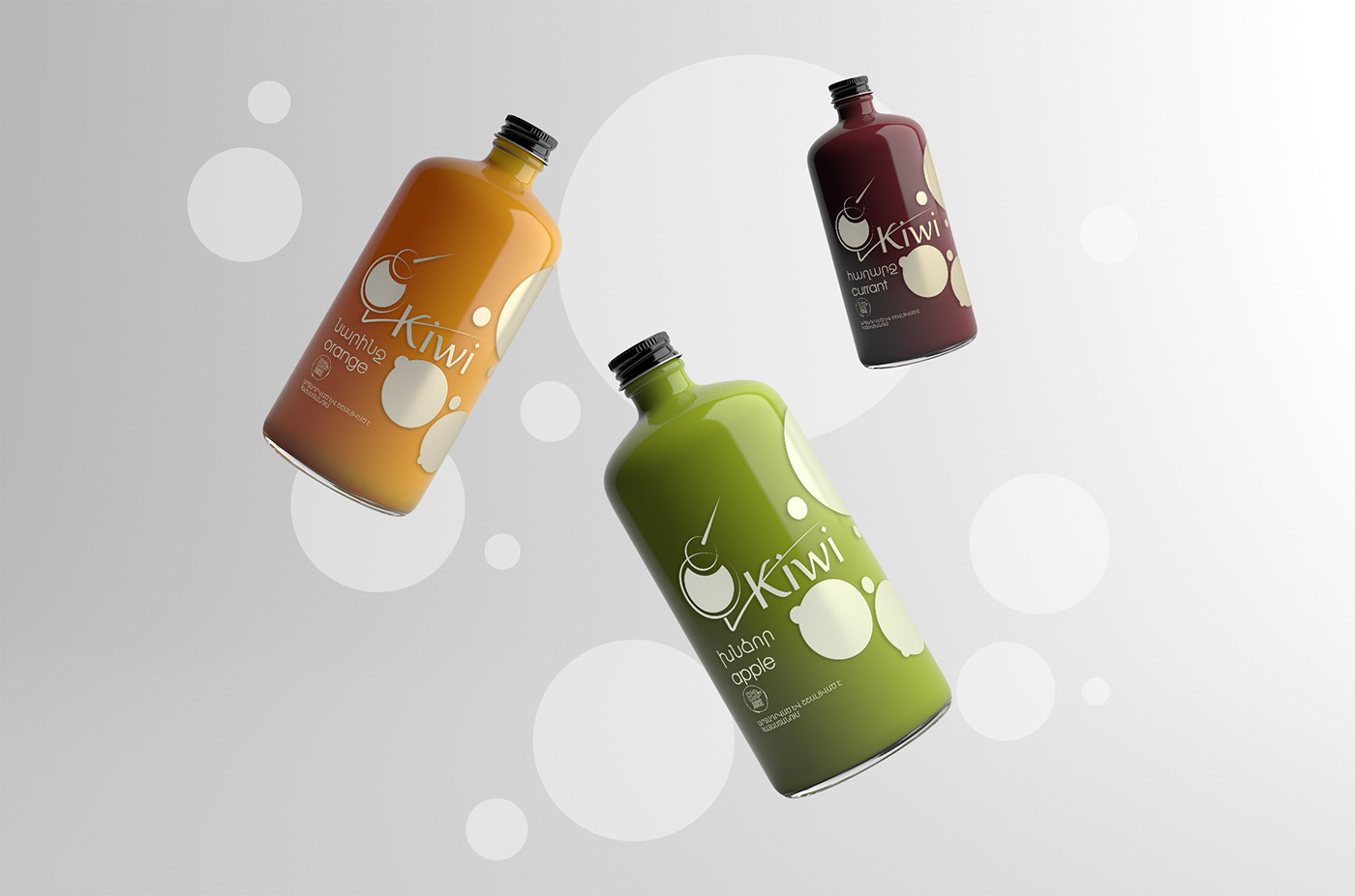
The concept of the labeling and brand identity is based on nature. Bionics is one of the main tools and complementary subjects for engineers, industrial and fashion designers, scientists and surely for graphic designers. The bionics allow us to generate new ideas from nature. Starting from choosing kiwi bird as the subject for logo, I created whole concept of this brand.
We know that bright colors and round, smooth shapes are attractive for children. These ideas are combined with kiwi bird, who has rounded shapes too. In the silhouette of kiwi, we can also see a glass full of juice. The white color off labels contrasts with bright colors of juices inside the bottles.