
Rosso Typeface
As a school project, at IED Firenze, I was encouraged to design my own font using whatever techniques or philosophy I deemed necessary. I feel that typography design is something that is often overlooked these days. With so many typefaces, it often feels overwhelming trying to find the perfect one. This is why I decided to create Rosso Typeface, a typeface that would not only be refreshing, but, beautiful, useful and look good as a flat or 3D style.
My main guiding principle for Rosso Typeface started with the grid. I started to play with this idea and found that I could use the grid edges as guidelines for the exterior of my letters.In order to create harmony between the exterior and interior of the type, I decided to make all the exterior corners at 45 degrees and use the graceful and rounded edges of the circles for the interior curves.
Rosso Typeface exemplifies my personality and design principles. I hope this design starts conversations about the lost art of typefaces and how important it is in our daily lives.
Enjoy!

First Sketches

Lowercase Anatomy

Uppercase Anatomy

Uppercase

Uppercase Close-up

Lowercase

Lowercase Close-up

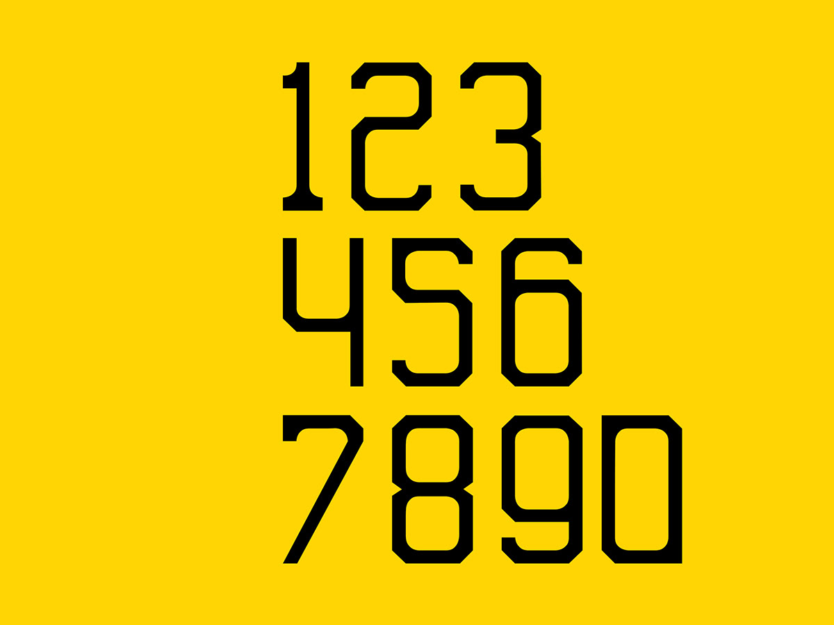
Numbers
Glyphs

Ligatures

3D Use

Typographical poster quote

Rosso Typeface designed is featured in "BranD Magazine", "The Typography Issue 11
Many Thanks for the selection

Coming Soon for download!
Thanks a lot for watching! I hope you enjoyed!


