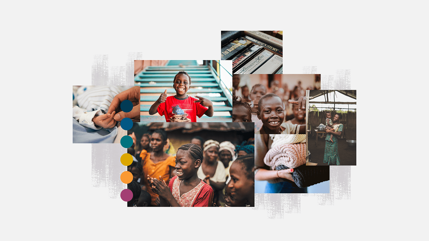
No Sad Faces
This concept gets to the heart and soul of The United Sisterhoods mission. We want to show people the good work that The United Sisterhood does, using strong photographic visuals. We want to emphasise the joy that they bring to people in need through outreach, donations and time spent volunteering - this joy will be brought through using happy colours and a friendly, modern font.
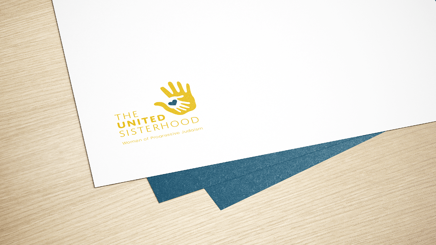
“Sisterhood Means Service” is the mantra of this organisation and the Sisterhood is affiliated to woman of progressive Judaism. Having originated in 1932, this social outreach organisation is in its eighth decade of service to the communities of South Africa.
The logo brings in an element that tells the consumer what The United Sisterhood is all about - caring. We have paired an illustration with a friendly font and introduced a striking, bold colour palette.