

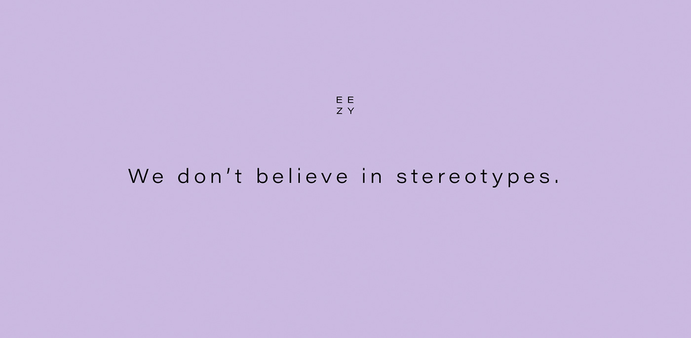
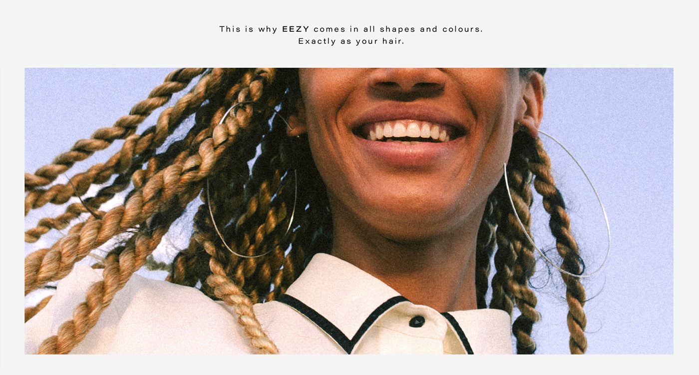


Design concept, art direction, naming and packaging for E E Z Y - a brand that makes luxury extensions for every type of hair. It is inclusive of all clients, no matter the colour, structure or length of their hair. Their message is very simple: Every hair is beautiful.
In order to be inclusive also in the communication, we decided to censure the women's faces and let their hair speak for itself instead.
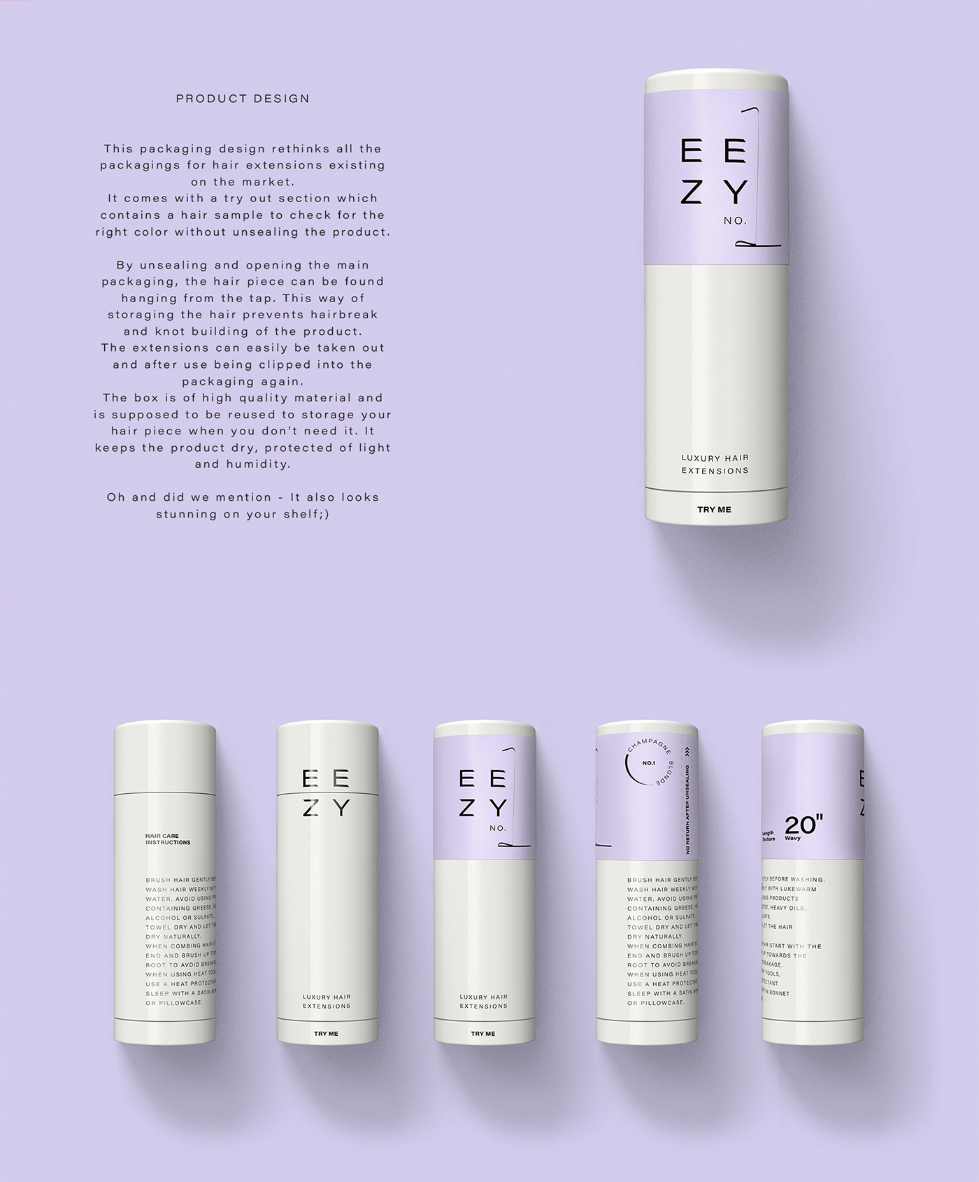
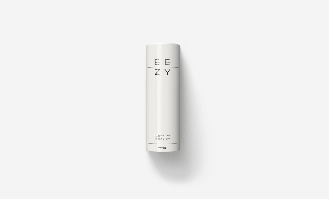
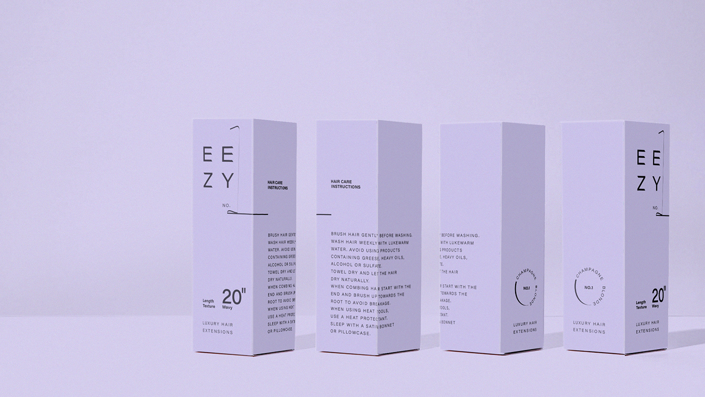
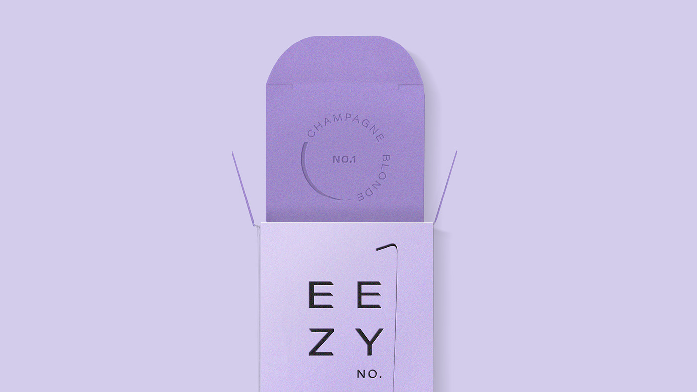
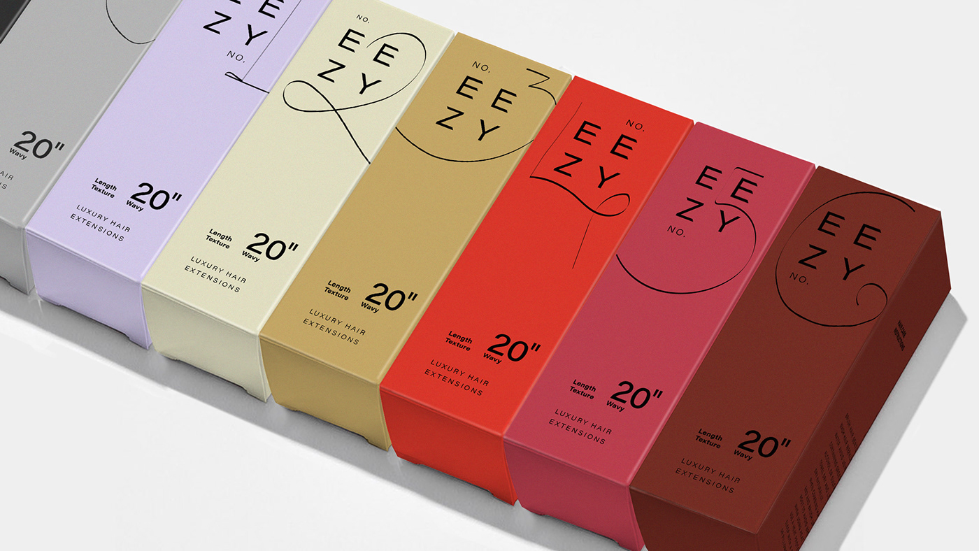
The goal of the graphical communication was to create an image of natural elegance. This is why the design is based on a simpel sans serif typography logo, which has been cut at the edges in order to create a highly recognizable word mark. The different hair pieces are distinguished by the colours of their packaging, as well as by handwritten numbers, that have been inspired by hair itself.
The name combines the concept of the breeze of wind with easiness, two protagonists which are giving your hair the magical touch of natural beauty in every adventure involving nature.
Art Direction & Design Concept by Design Studio B.O.B.
Packaging Design by Design Studio B.O.B.
Naming by Daniel Olea
Assistance by Amaia Kurschinski


