Mǽr Seaweed
BRANDING A SUPER FOOD
WITH ZERO FOOTPRINTS
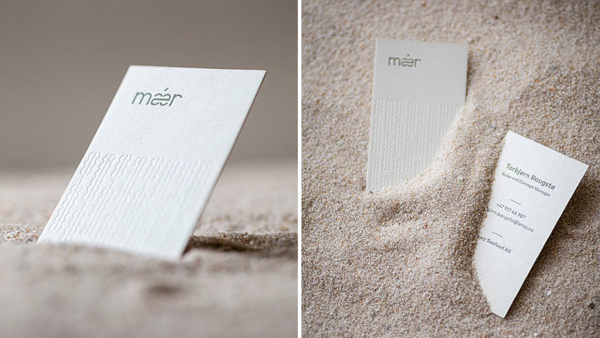
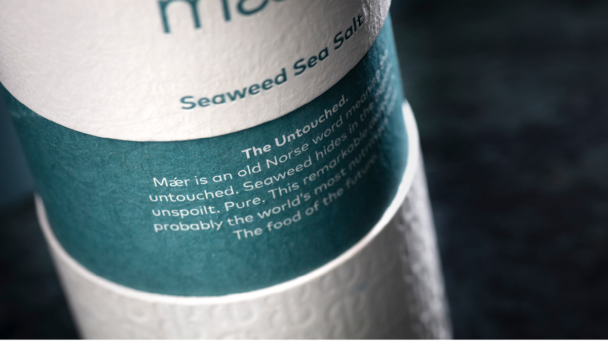
The word "Mǽr" means "pure, untouched". Just like the seaweed from Lerøy Seafood's brand “Mǽr”, which hides in the depths of the sea, pure and untouched.
The word "Mǽr" means "pure, untouched". Just like the seaweed from Lerøy Seafood's brand “Mǽr”, which hides in the depths of the sea, pure and untouched.
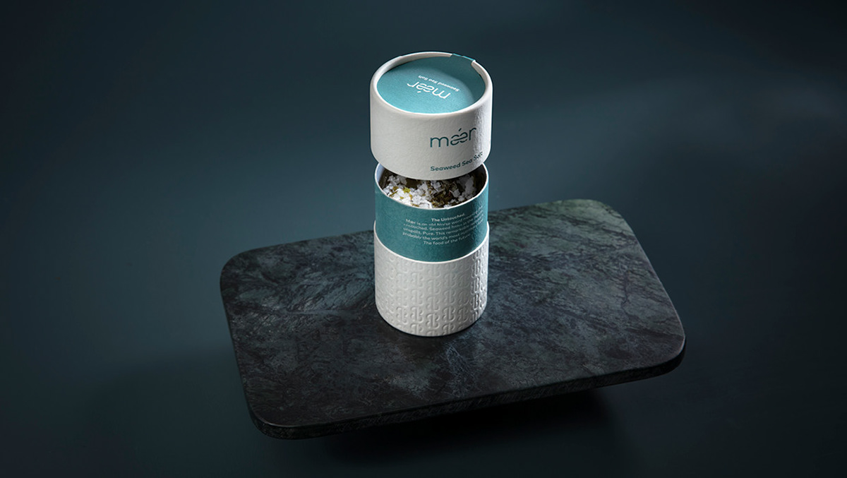
Pure and untouched
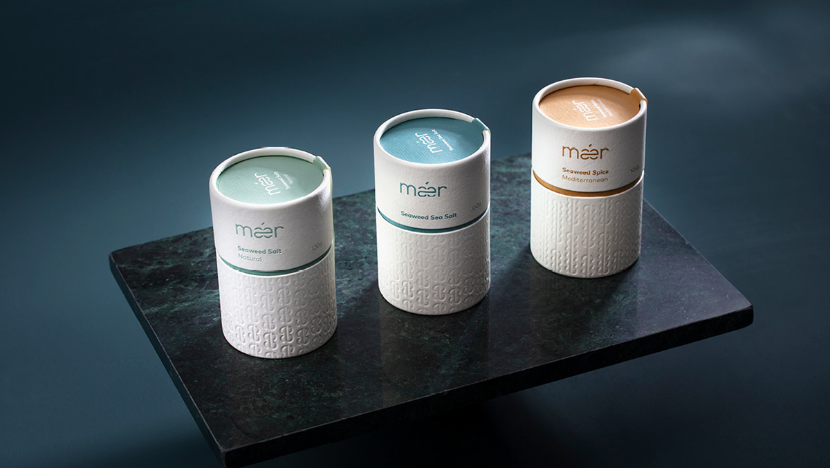
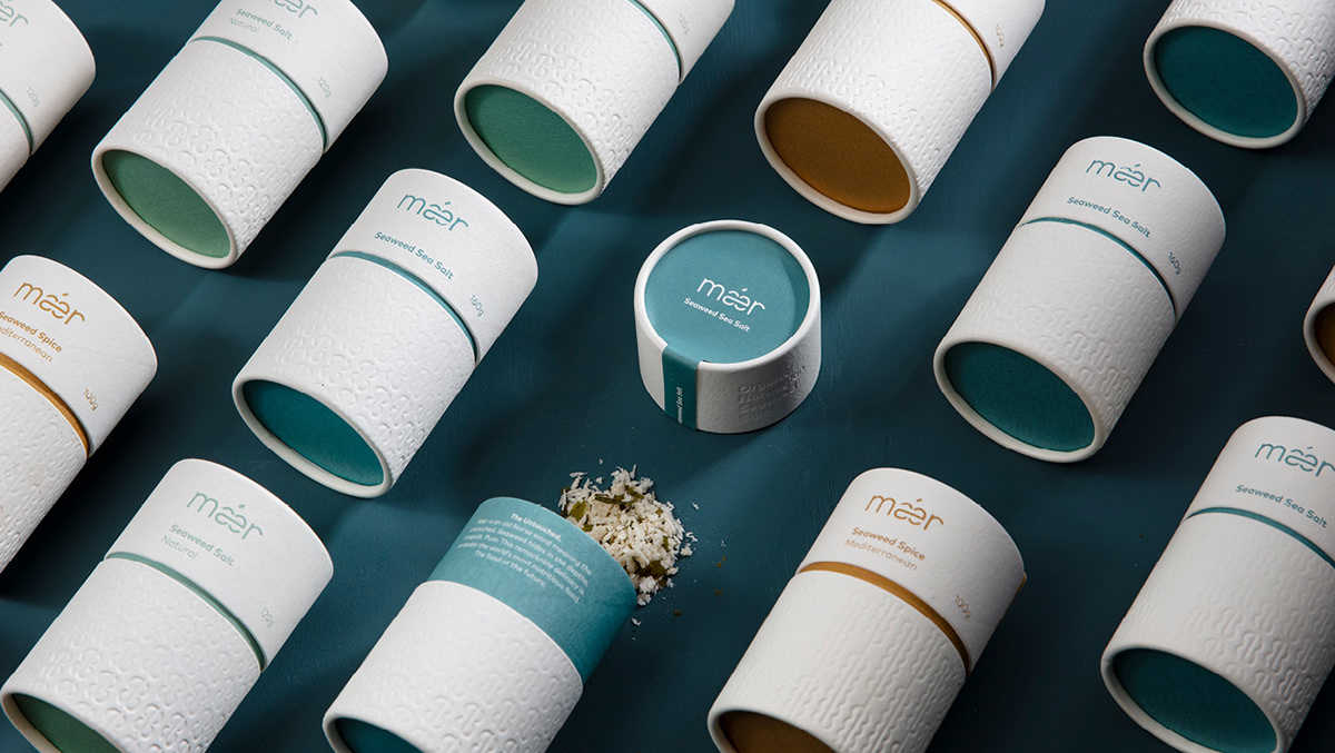
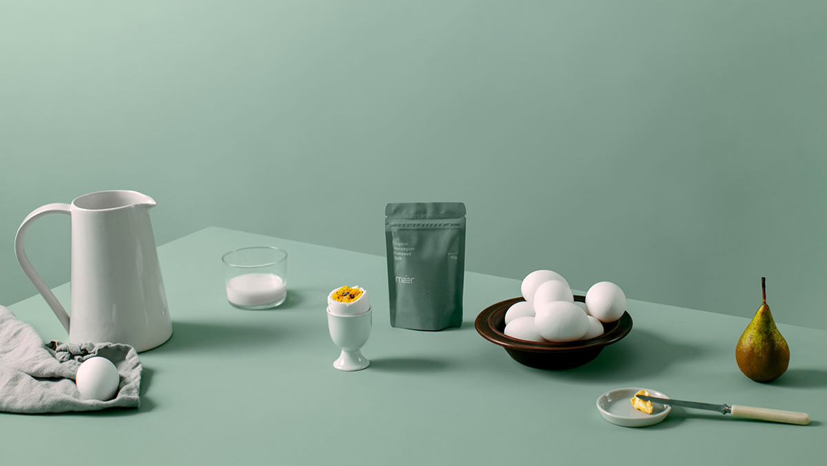
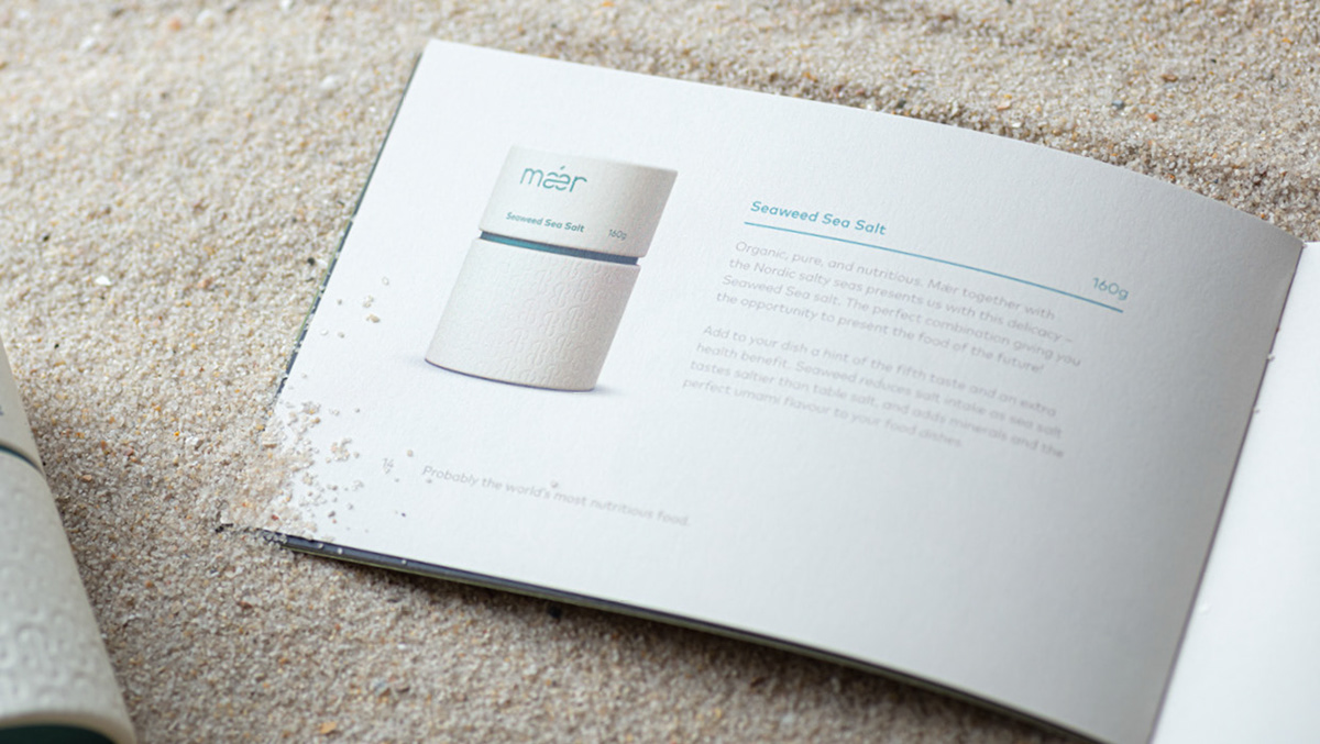
The word "Mǽr" means "pure, untouched". Just like the seaweed from Lerøy Seafood's brand “Mǽr”, which hides in the depths of the sea, pure and untouched. The products live up to their name and are both pure and organic. The Mǽr spices range consists of healthy gourmet ingredients available to everyone.
The word "Mǽr" means "pure, untouched". Just like the seaweed from Lerøy Seafood's brand “Mǽr”, which hides in the depths of the sea, pure and untouched. The products live up to their name and are both pure and organic. The Mǽr spices range consists of healthy gourmet ingredients available to everyone.
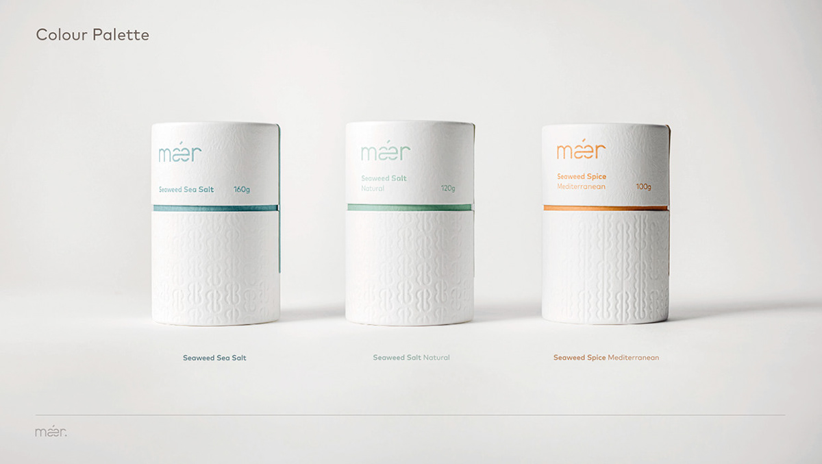
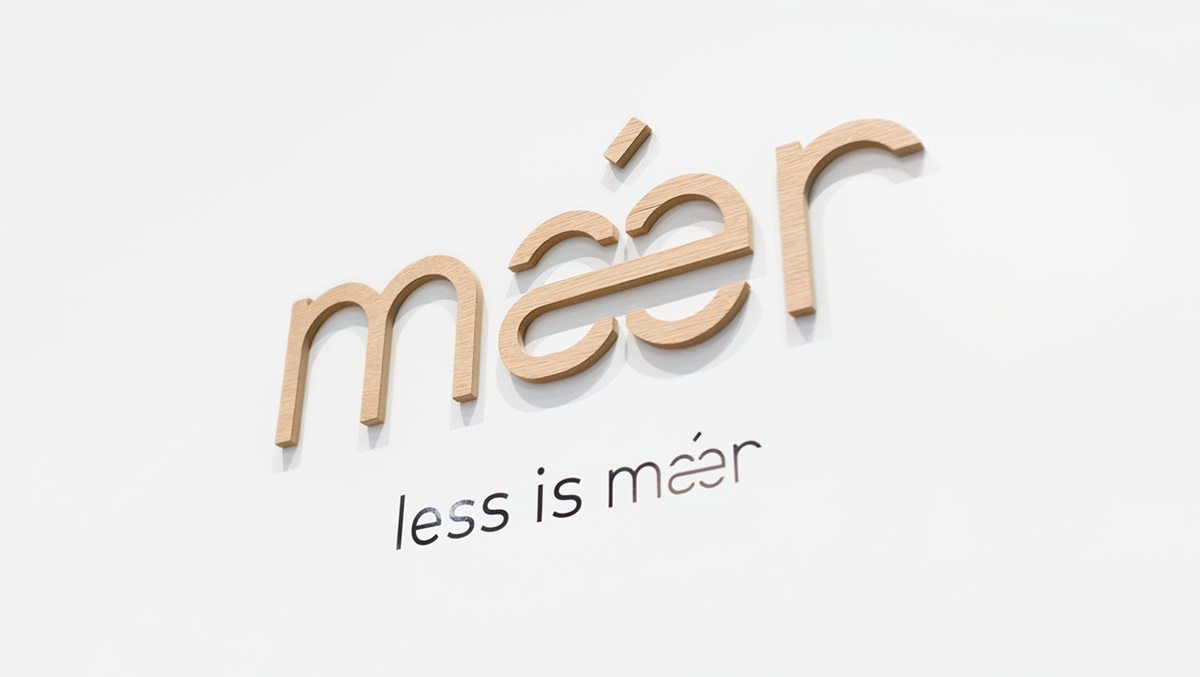
Less is Mǽr
Small amounts of seaweed from Mǽr can yield massive health benefits. This formed the basis for the slogan; "Less is Mǽr ".
The design philosophy "Less is more" is the very definition of Scandinavian minimalism.
Small amounts of seaweed from Mǽr can yield massive health benefits. This formed the basis for the slogan; "Less is Mǽr ".
The design philosophy "Less is more" is the very definition of Scandinavian minimalism.
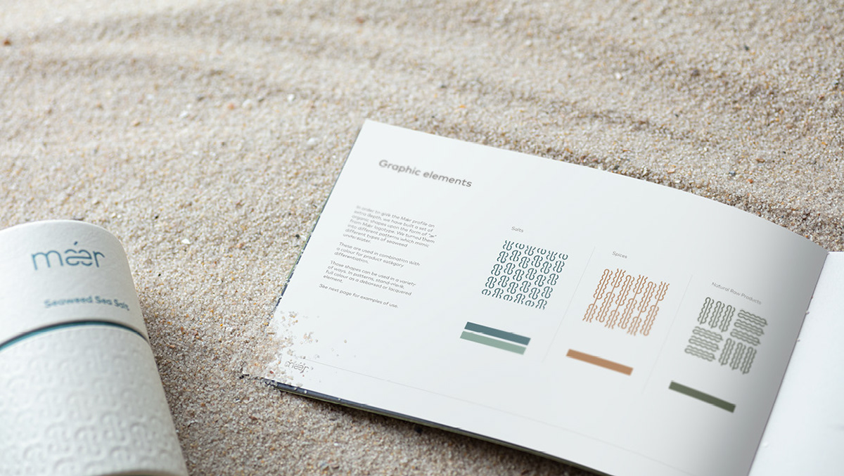
Mǽr, as a brand, is shaped through the aesthetics and active ingredients of the product.
In addition to the minimal footprints the product imposes on the environment, combined with the tremendous impact that the product embodies for a healthy and nutritious diet.
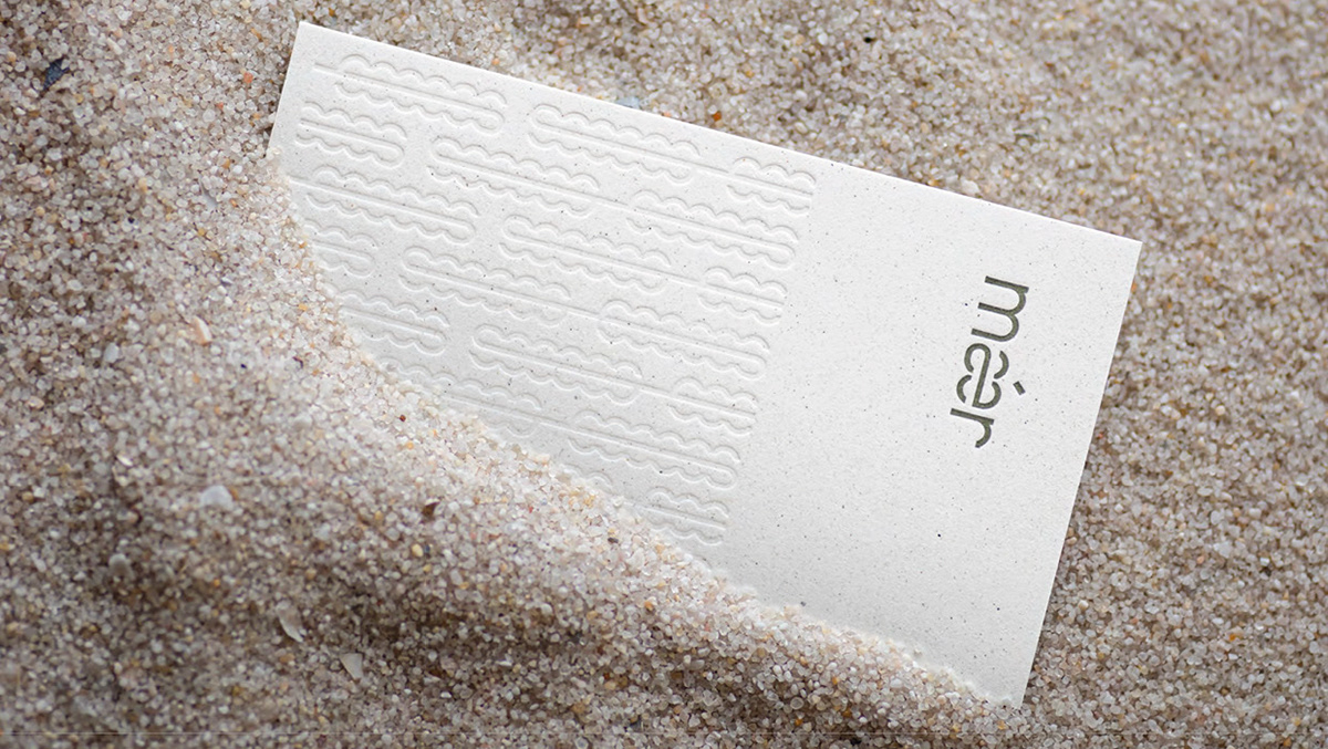
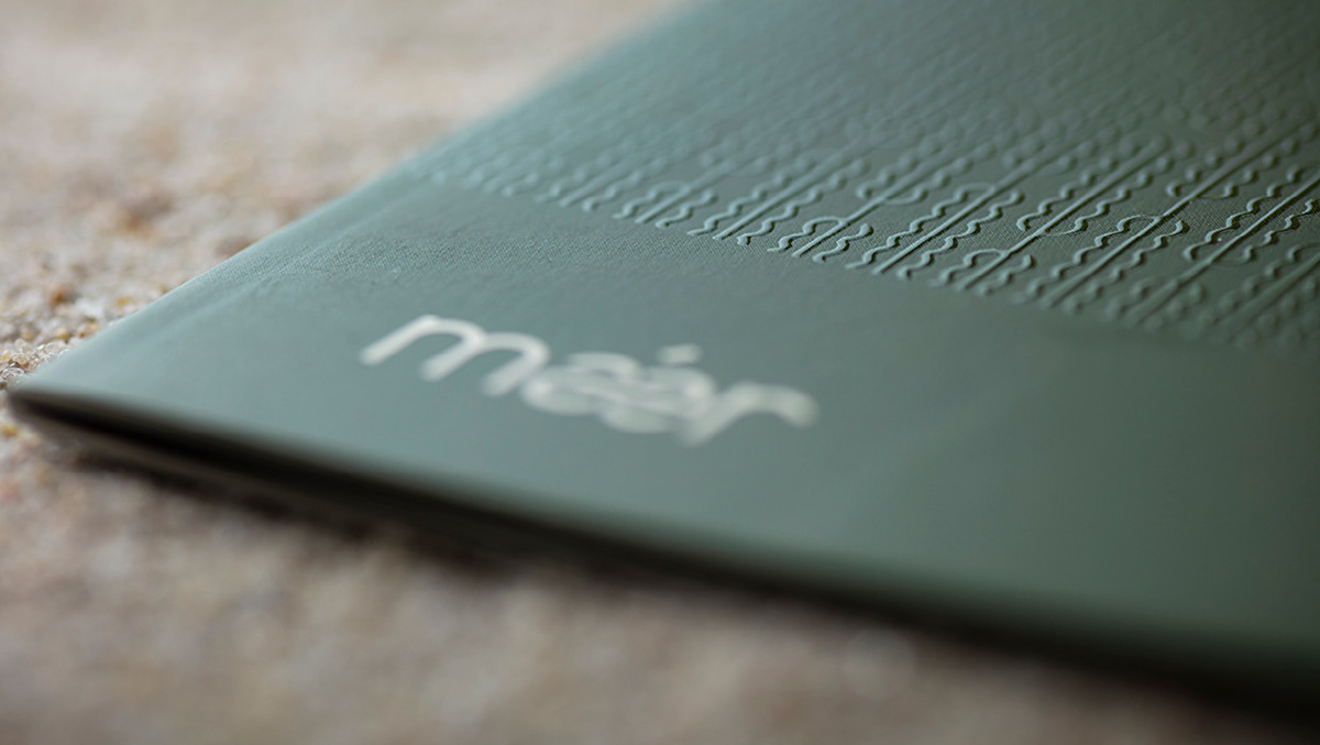
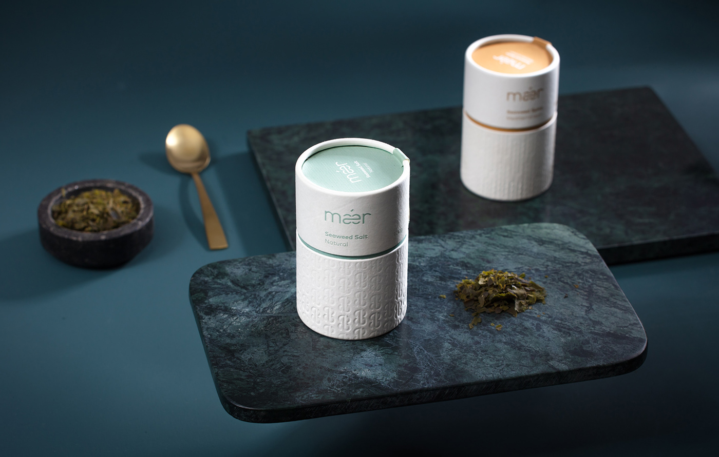
The identity is inspired by dancing seaweed and visualized in minimalistic packages of sustainable material. The paper used in the printed matter is produced from organic seagrass.
Sustainable production, sustainable packaging
For those intent on eating climate-friendly, green and sustainable, seaweed is, by far, the best choice.
In fact, no climatic footprint is left in the actual production of this seaweed.
For those intent on eating climate-friendly, green and sustainable, seaweed is, by far, the best choice.
In fact, no climatic footprint is left in the actual production of this seaweed.