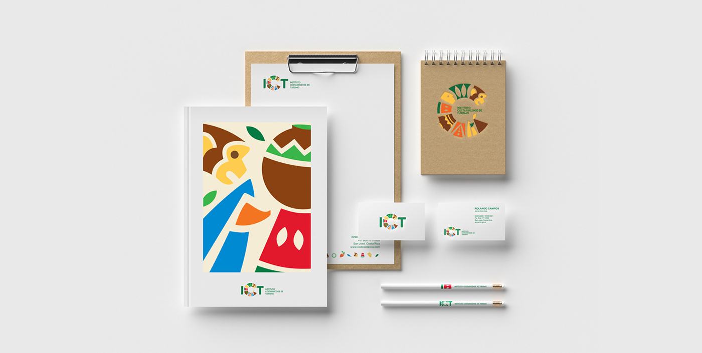


Instituto Costarricense de Turismo
“We are Tourism, we are Costa Rica, we are ICT”. Based on this premise, we proudly develop the new graphic identity of the Costa Rican Tourist Board, presenting an image of our country based on 3 standards: Dynamism – Multisensoriality – A Complete country.
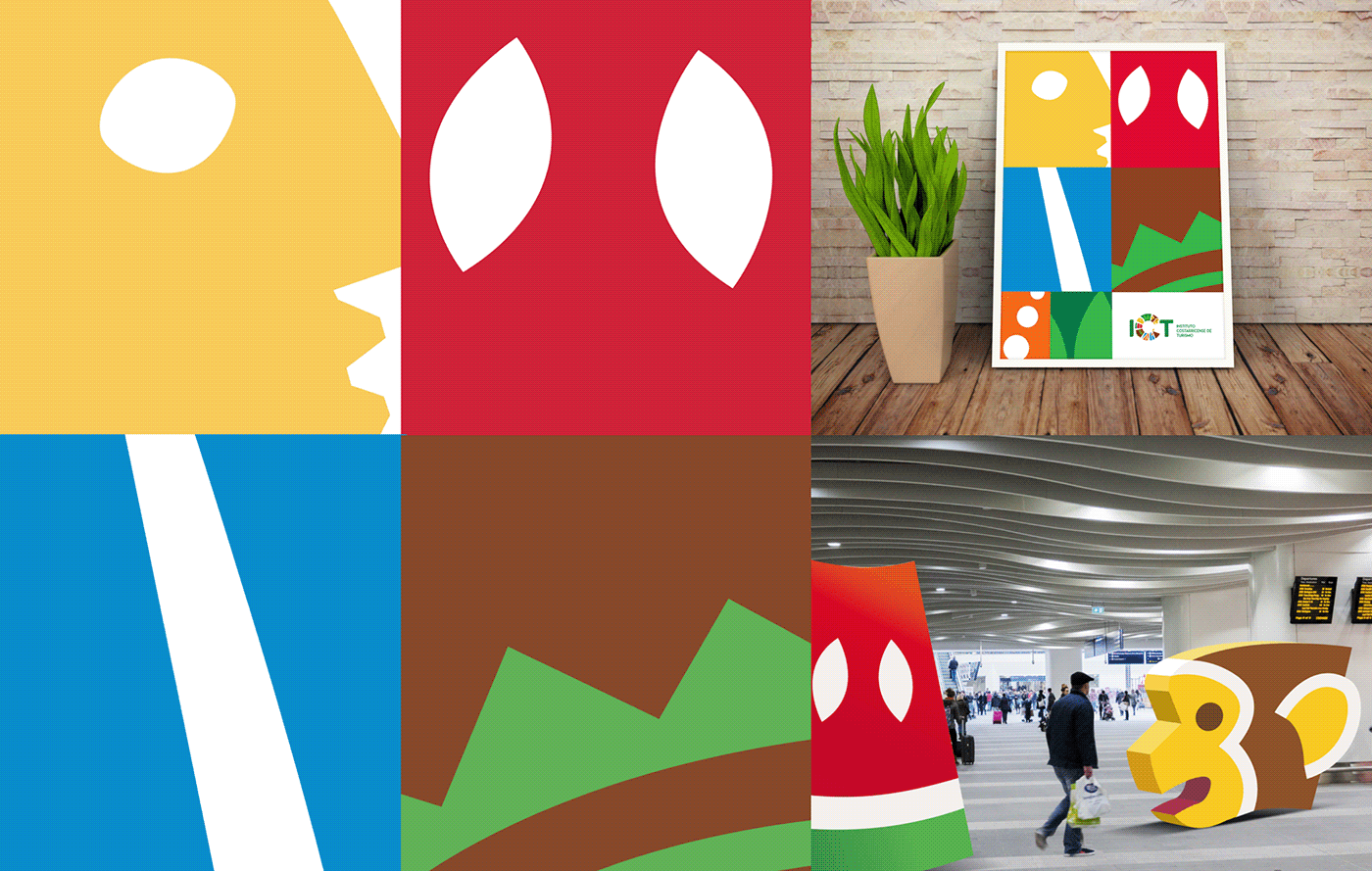
A graphic synthesis of different thematic axes of our country integrates and shapes the letter C, the main figure of the new logo and a letter that represents our flagship product: Costa Rica.
We developed a visual system composed of representative icons of the different thematic axes of the country, these can live separately but at the same time together.
This ability to shed in a system of icons gives the institution versatility, dynamism, its own language, and closeness, expressing in this way the visual and sensory wealth of the country through bright colors and a variety of formats and familiar figures for different audiences.