


BARAKEH PHARM
Baraka Farm is a group of pharmacies in Palestine.
Our vision is to become a leading healthcare entity in the MENA region,
Our vision is to become a leading healthcare entity in the MENA region,
and to maintain our position as the most important partner for our customers
towards better health, by providing the largest range of high-quality, diverse services,
and continuing to advance and advance the pharmacy profession.
Our mission is to aim to help our clients achieve better health through expansion of
Our mission is to aim to help our clients achieve better health through expansion of
our branch network, continuous innovation in business and the development of our partnerships.
DESIGN PHILOSOPHY
I have created a bold minimalistic logo with a modern and simplistic approach.
The corporate identity that creates intersting visual systems in all its applications.
This modern approach by a contemporary color palette and typography, to
communicate the agency`s message and core values.
The corporate identity that creates intersting visual systems in all its applications.
This modern approach by a contemporary color palette and typography, to
communicate the agency`s message and core values.
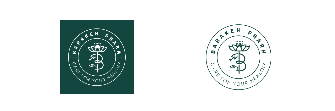
LOGO CONCEPT
This logo combines the first letter of the brand name, which is the letter B, and the rose,
which refers to cosmetic products, and where the rose is a symbol of softness and beauty
and the snake, as it indicates pharmacies and has an old story.

BRAND GUIDELINE
the purpose of these guideline is to explain the use of the new
brand style and to reinforce consistent application of the visual
ele-ments is all communications . the includes publications,
presenta-tions and all other marketing materials both online and
offline guidelines on the use of the logo are included.
brand style and to reinforce consistent application of the visual
ele-ments is all communications . the includes publications,
presenta-tions and all other marketing materials both online and
offline guidelines on the use of the logo are included.
logo variations
Modern branding requires a greater degree of versility;
descision as to how the logo should be displayed on various
backgrounds should be clearly estabished
descision as to how the logo should be displayed on various
backgrounds should be clearly estabished
The variations shown here looks the same at the first glance,
however they invert colors in order to produce a consistent
identity despite being placed on a different colors backgrounds.
however they invert colors in order to produce a consistent
identity despite being placed on a different colors backgrounds.

Color variations
Whenever possible , the logo should be reproduced in the
following specified colors :
following specified colors :

Spacing
Whenever possible , ensure at least
this much space is applied around
the logo as shoen « room of (a) to fit
the lengthways. »
this much space is applied around
the logo as shoen « room of (a) to fit
the lengthways. »

Logo Dimention
Never stretch or disort the logo.
If the space is restrictive , the scale of the logo
( not the dimensions ) must be ad-justed to fit.
The logo`s shape is consistent with the
ini-tial design, retaining balance and legibility
ini-tial design, retaining balance and legibility

Color Scheme
Oily is considered one of the most complicated colors in the meanings it carries, as it may represent new steps and openings, as it is considered a sign of prosperity, diversification and change.
Secondary colors have been added to the logo that match the Oily color
Secondary colors have been added to the logo that match the Oily color

Taypography
Brand Patterns


