

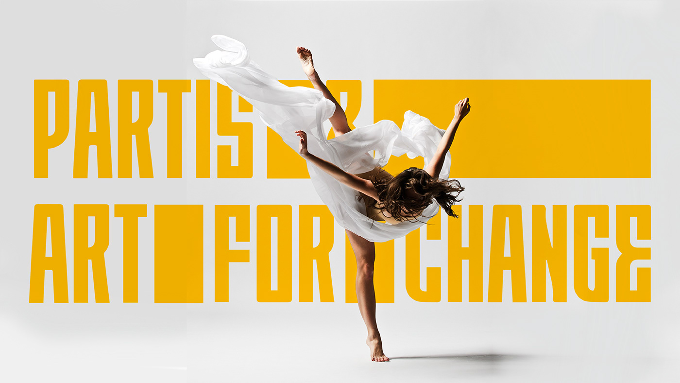
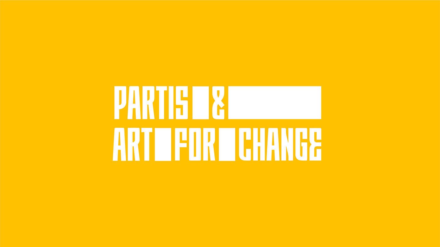
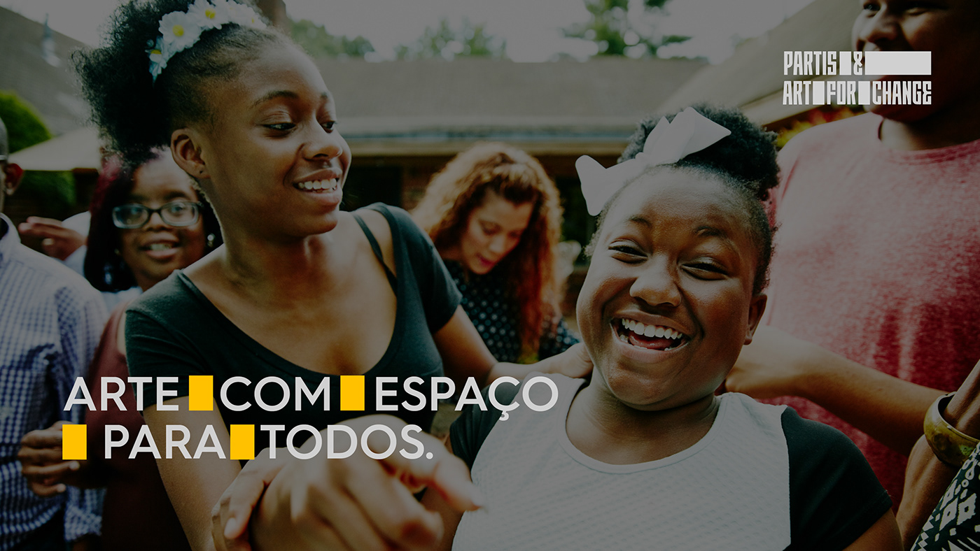
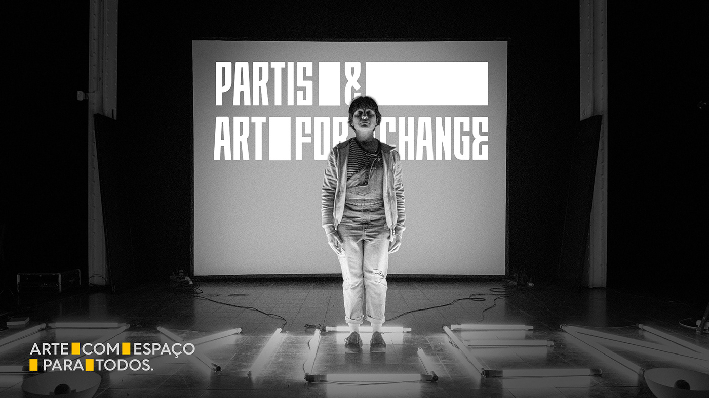
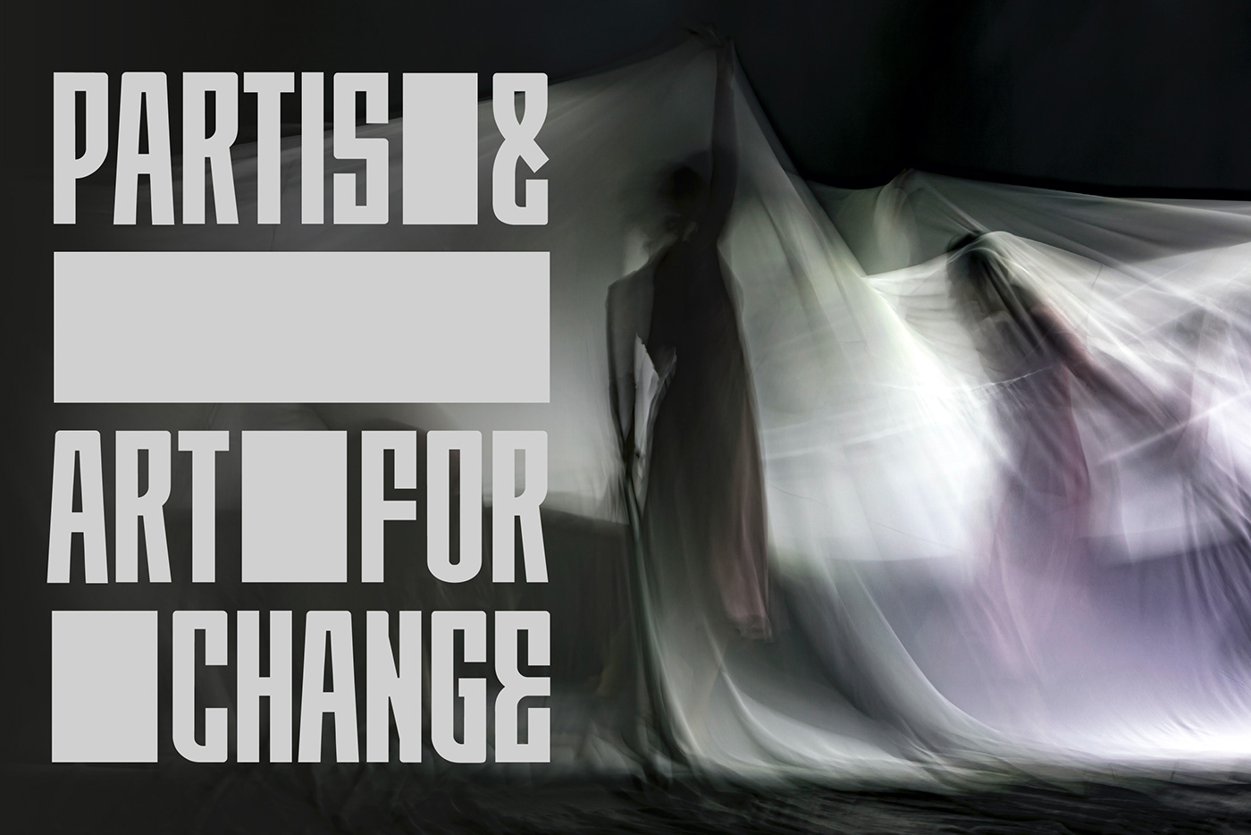
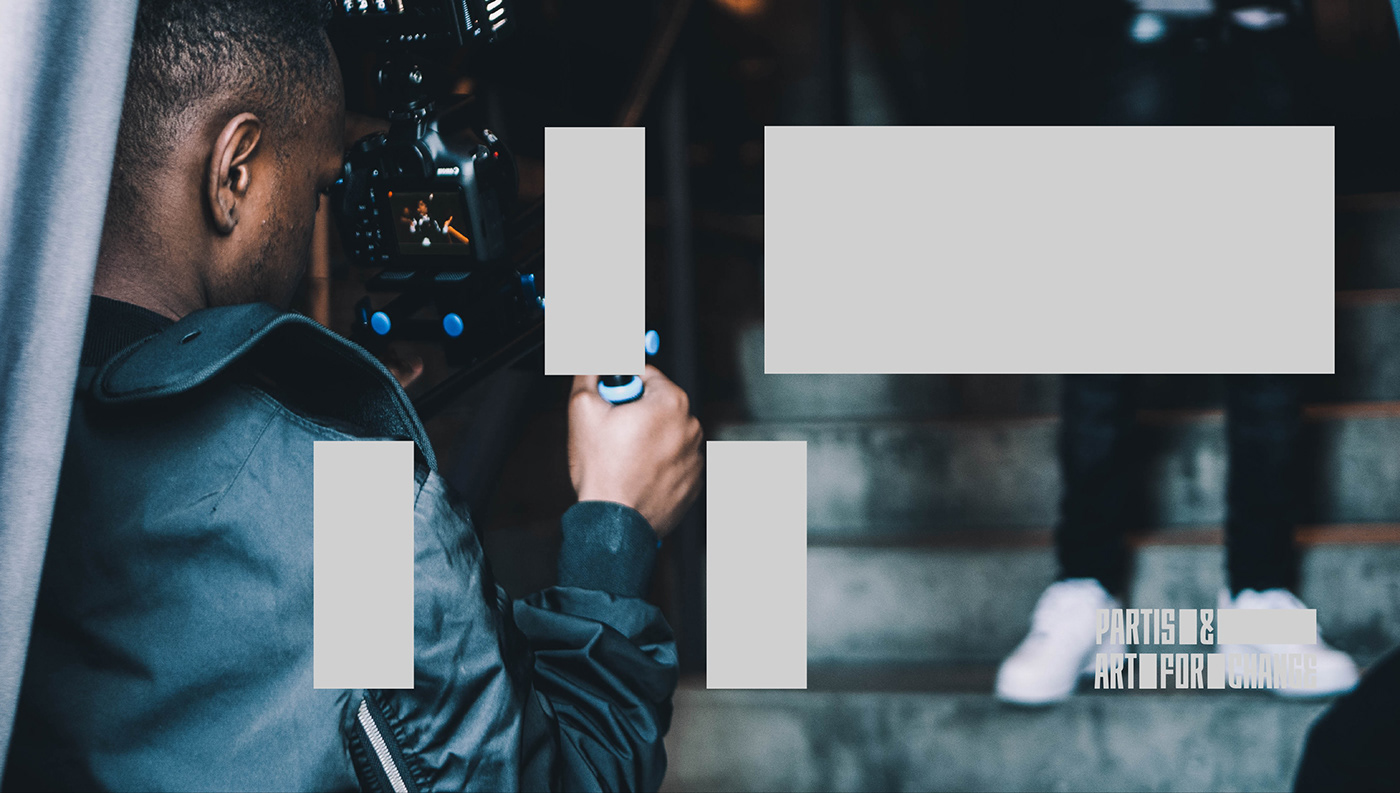
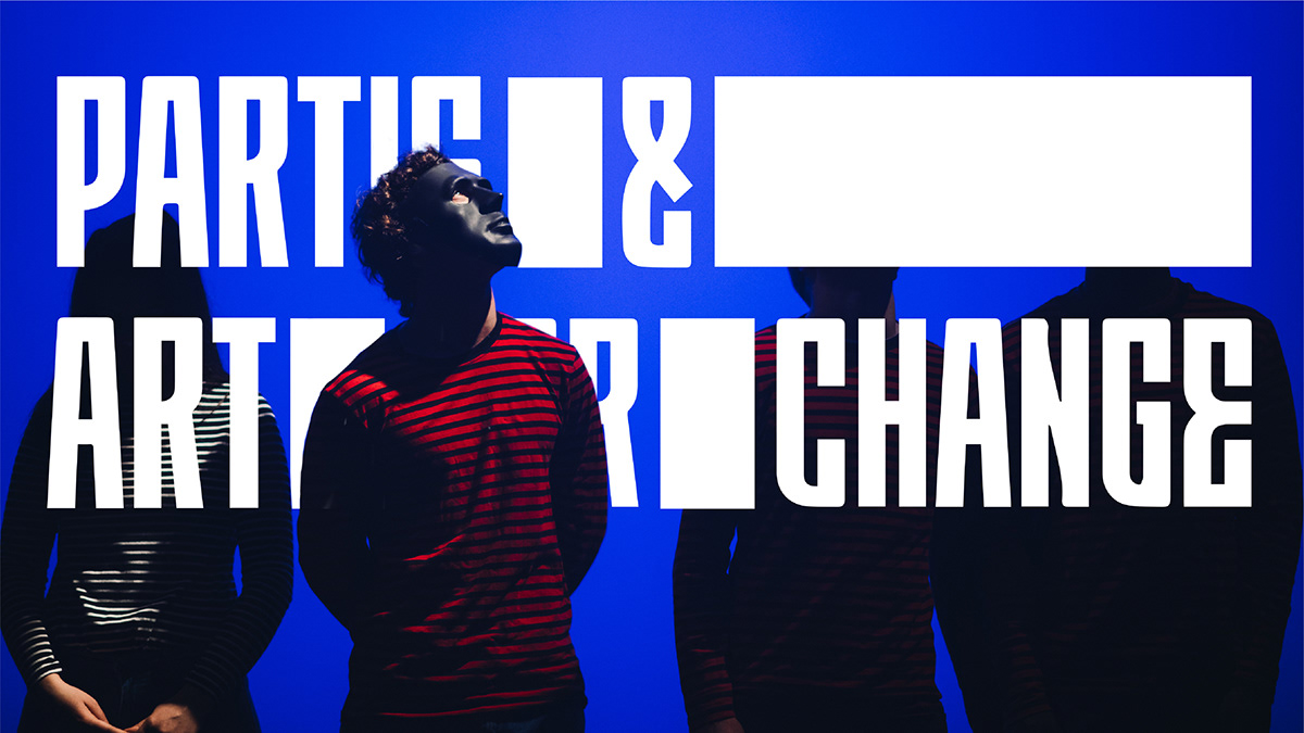
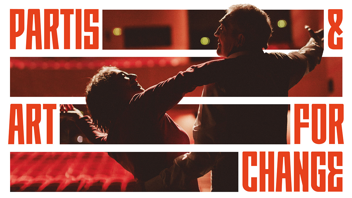
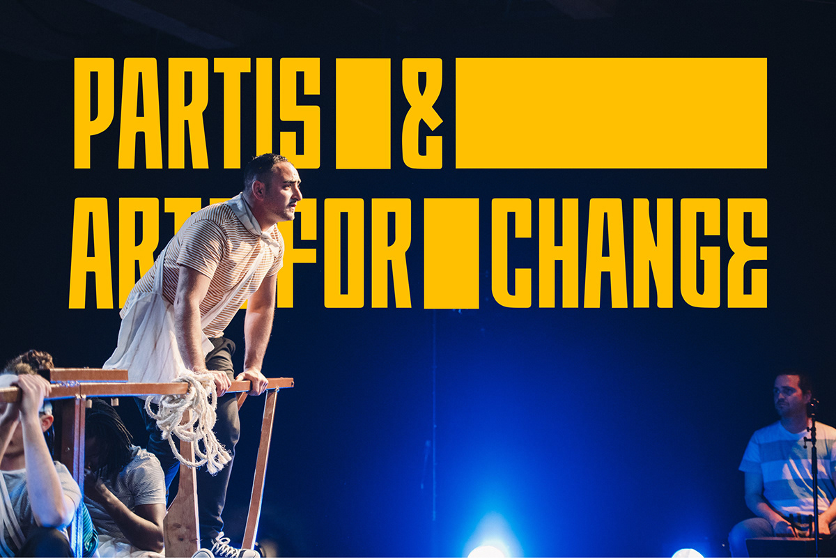
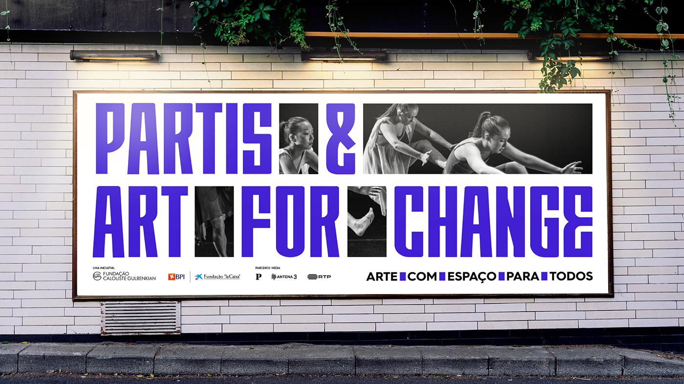
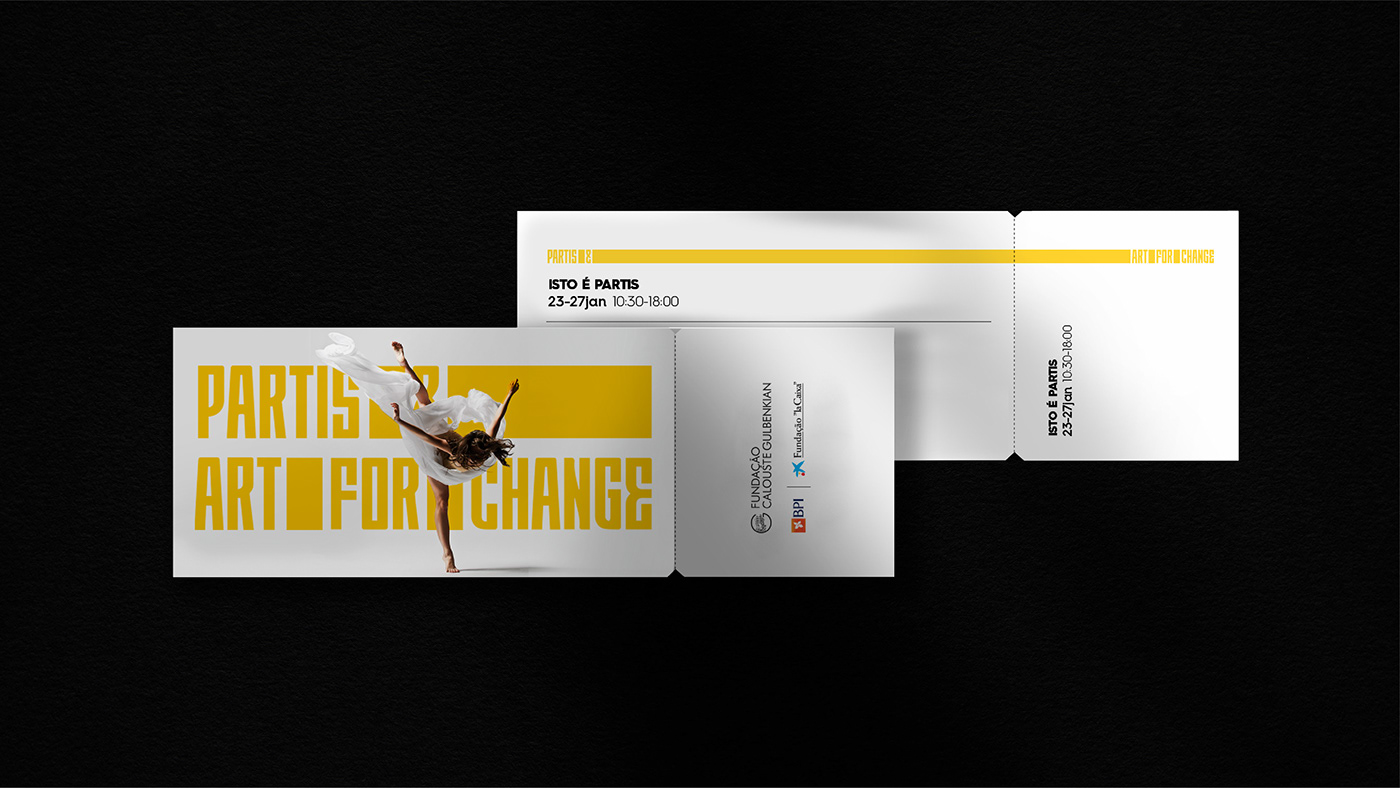
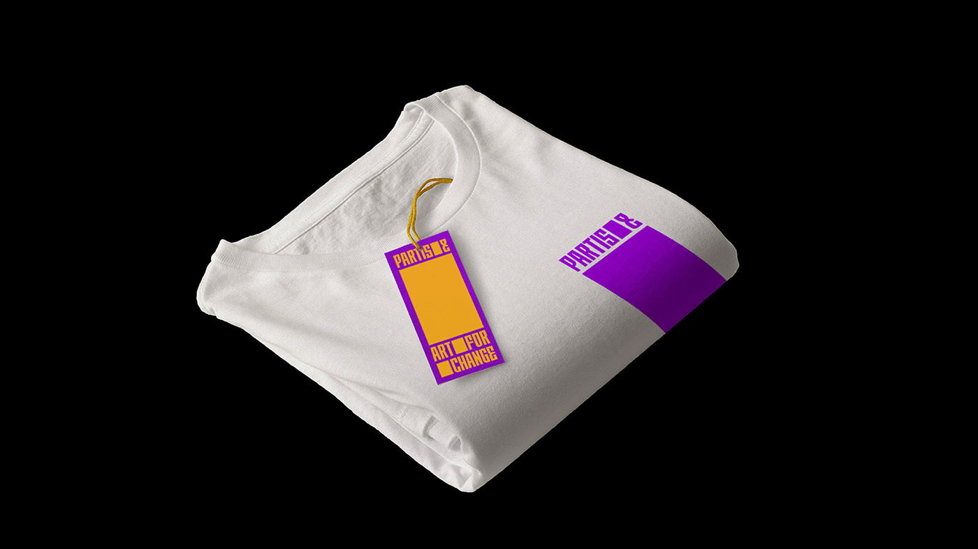
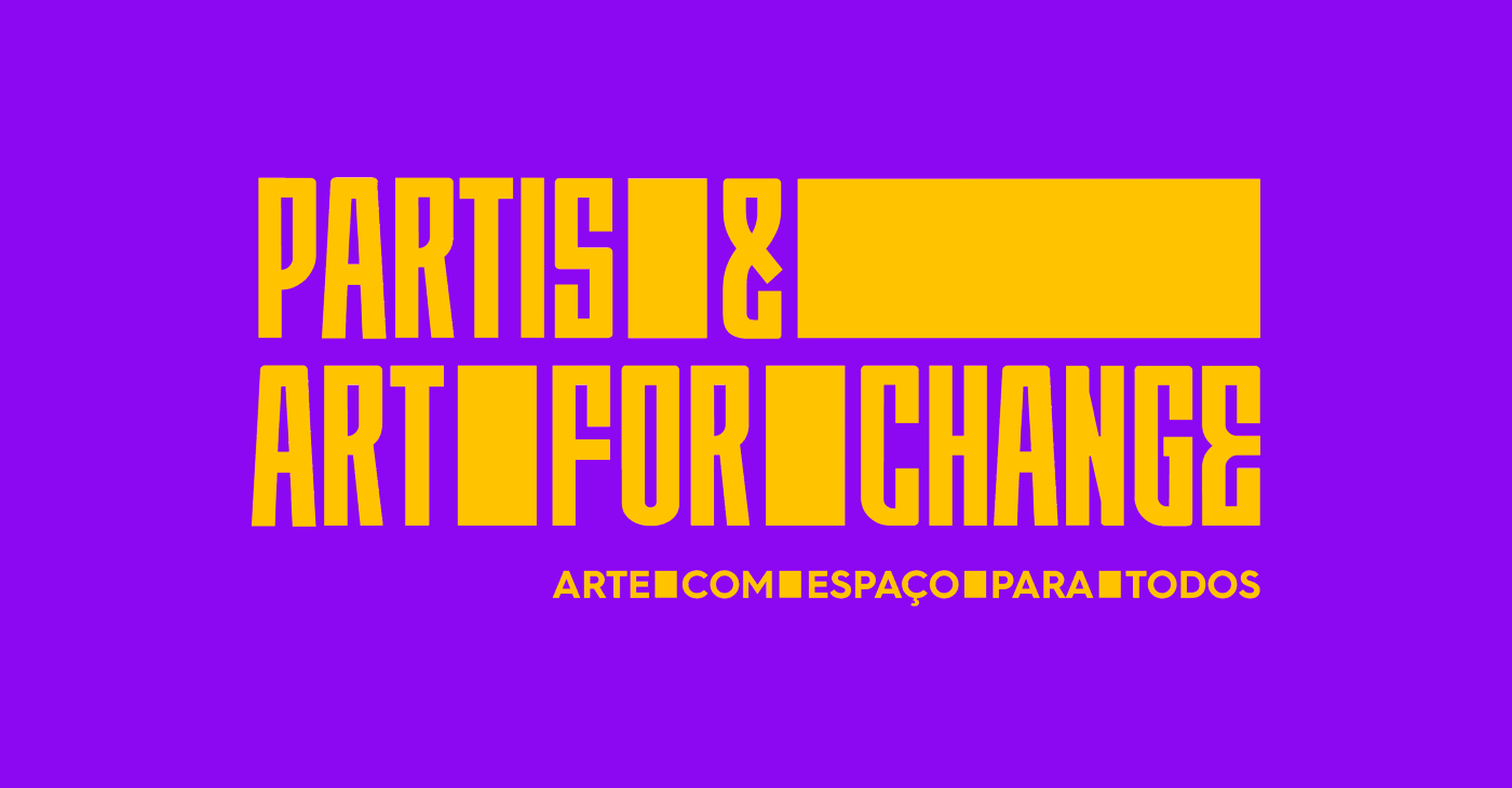
PARTIS & ART FOR CHANGE
The Calouste Gulbenkian Foundation and the “la Caixa” Foundation launched the joint PARTIS & Art for Change initiative, which allocates 1.5 million euros to support projects aimed at demonstrating the role that the arts can play in the the path to integrate and build fairer and more cohesive communities.


CONTEXT
We live in a time without time, in a fragmented society, in a culture centered on the self and in a world where, above all, there is a lack of space.
Space for everyone. More free, inclusive and participative. It is in this context, without space for anything, lack of common spaces that the PARTIS - ART FOR CHANGE brand-alliance emerged.
Hence the concept of "creating space" in society. Let it be a space to meet, to learn from one another; a space that allows to think, create and feel; a space of trust and mutual respect, diversity and freedom of expression.


IDENTITY BRAND IDEAS
The identity reflects 3 fundamental brand ideas:
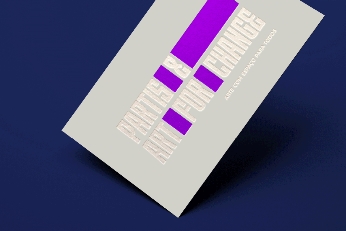
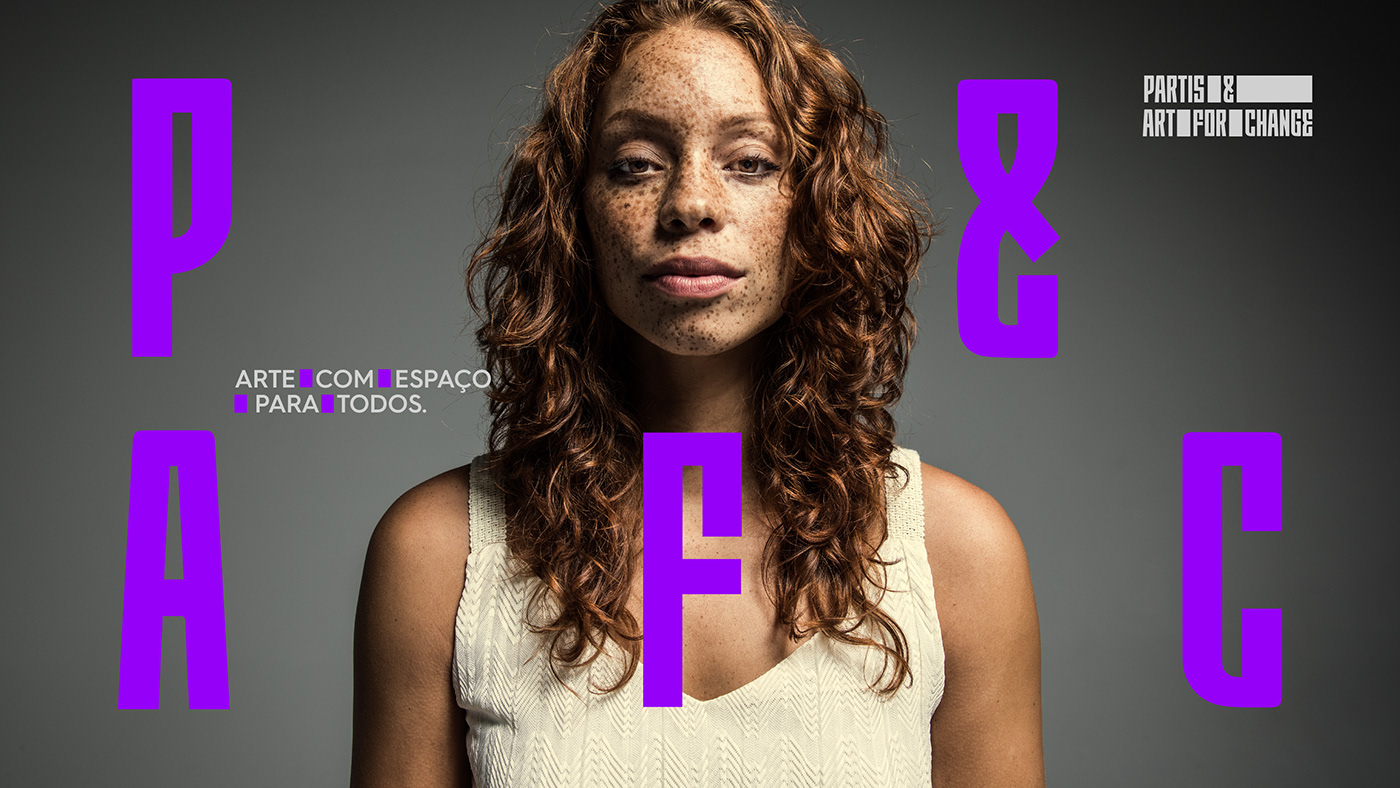
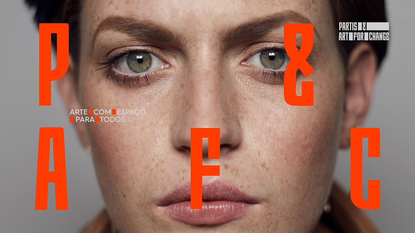
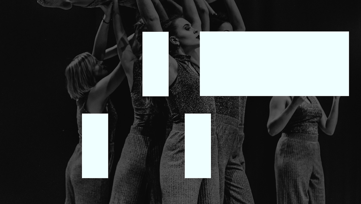
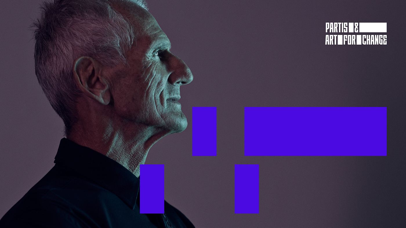
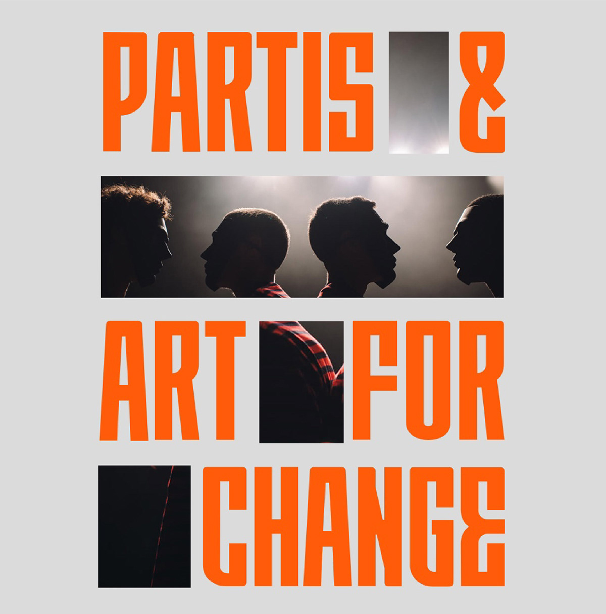
1. The idea of "space"
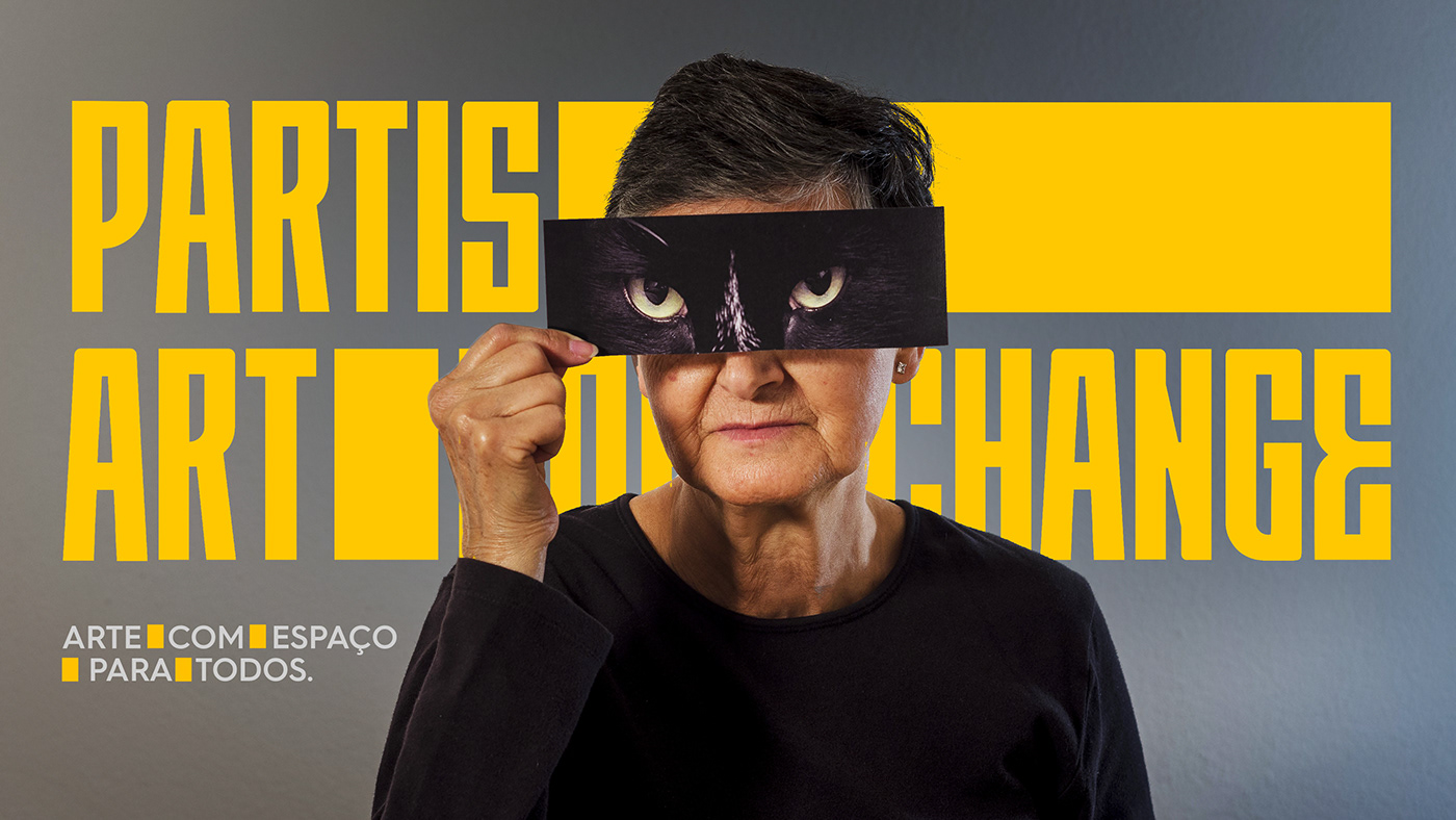
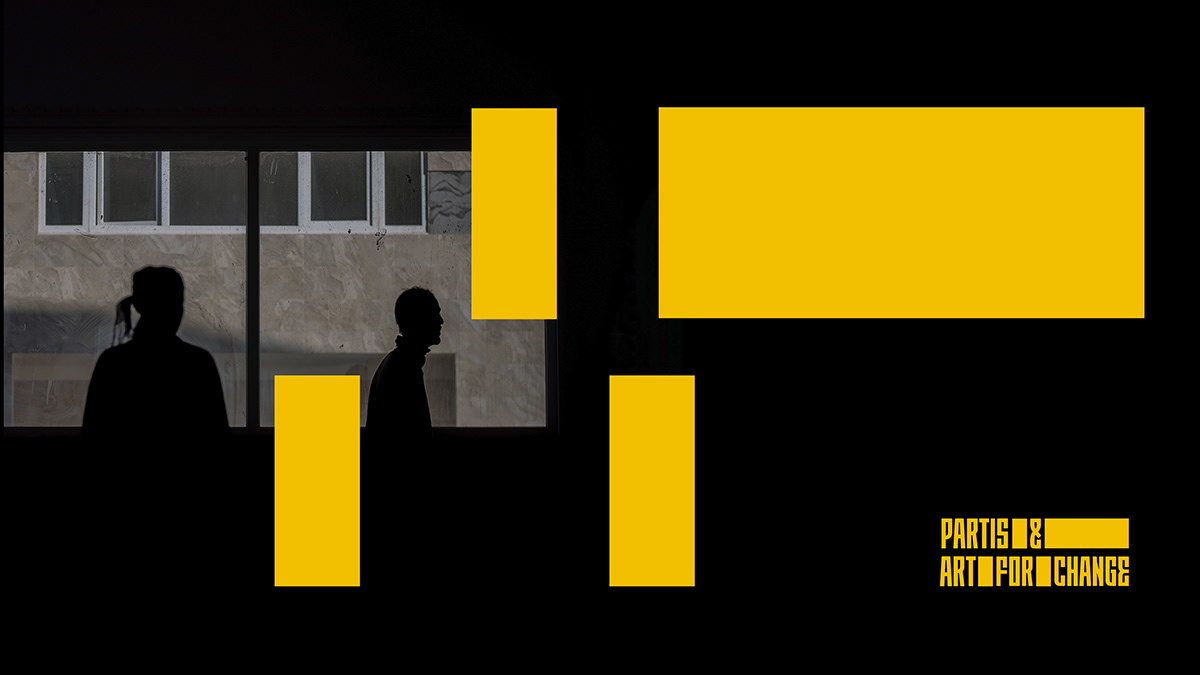
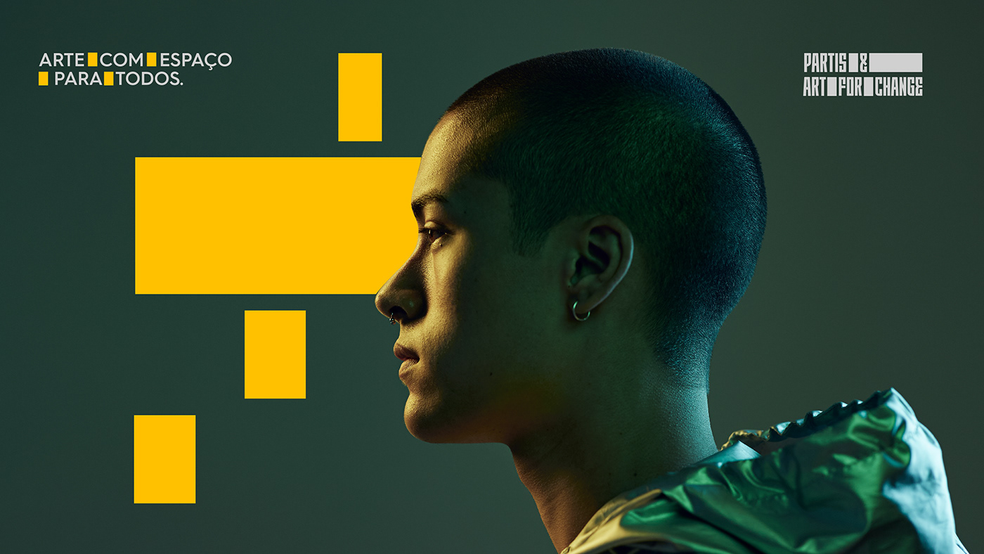
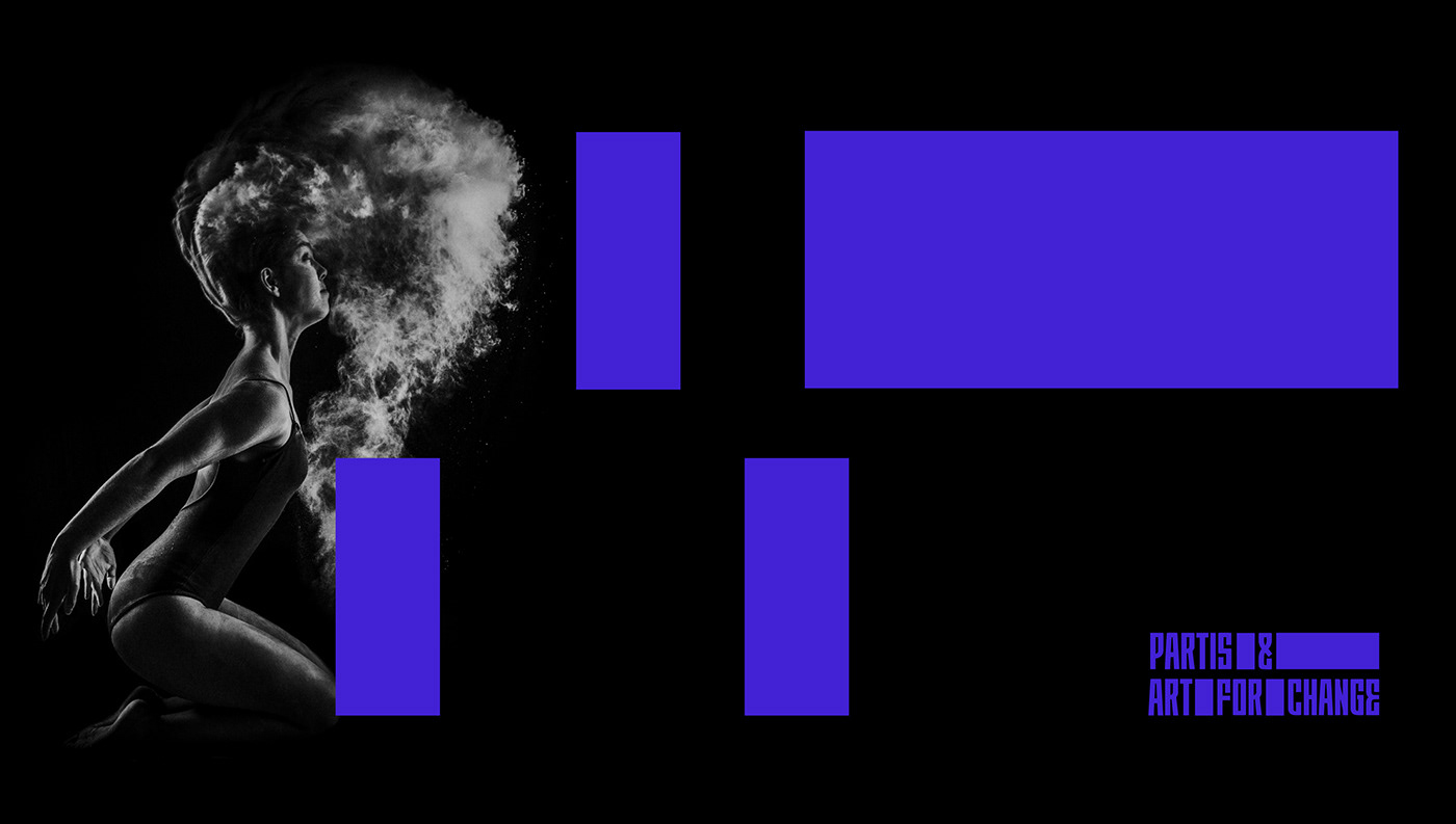
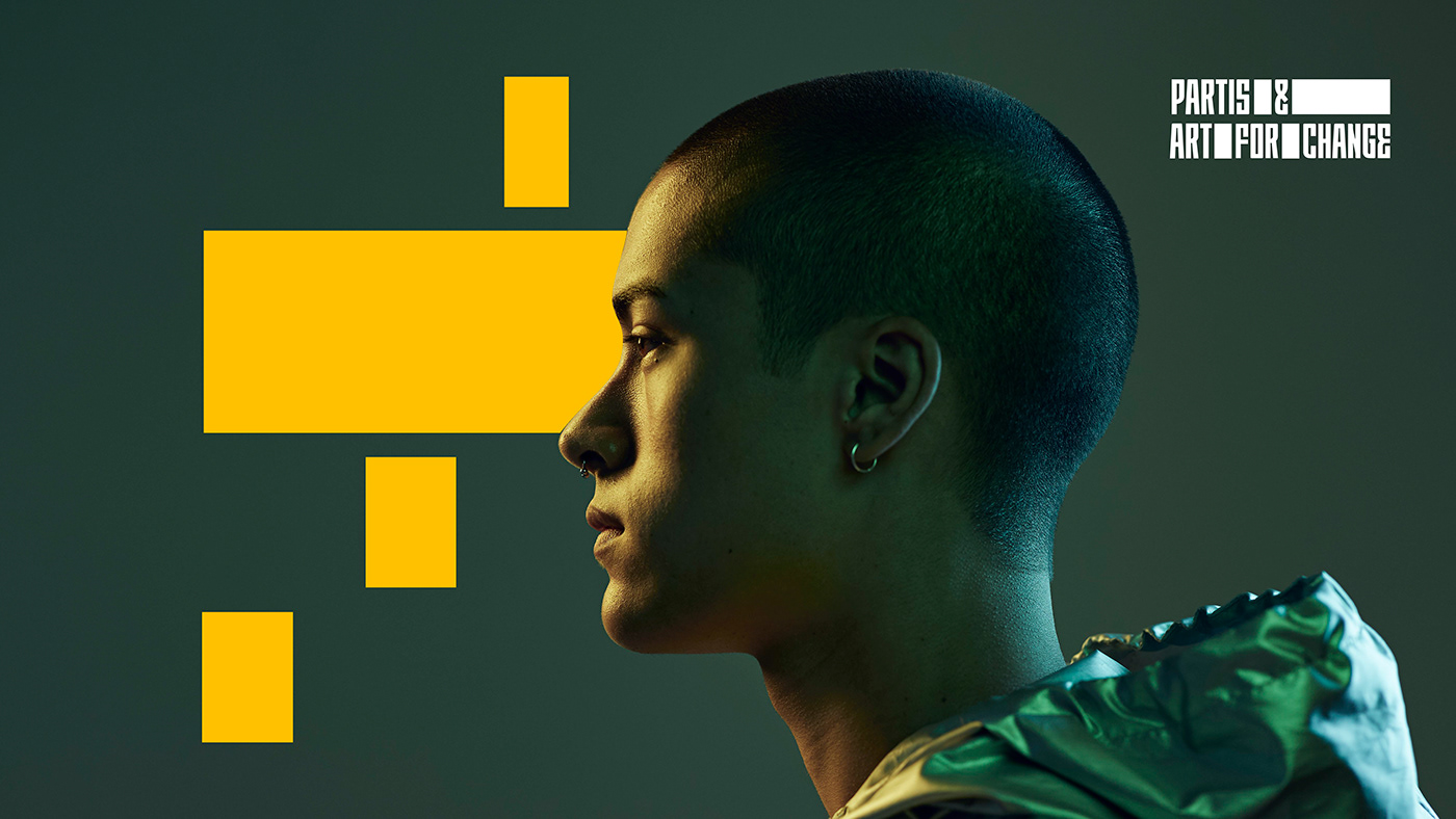
Symbolised by the spaces that are highlighted in the logo, which give space and stage to projects and communication.
2. The idea of "meeting"
Reflected in the cohesion and connection of the two entities (PARTIS and Art for Change) and in their relationship with the projects.
3. The idea of "evolution"
Represented by its dynamism, flexibility and capacity to adapt itself to every communication.
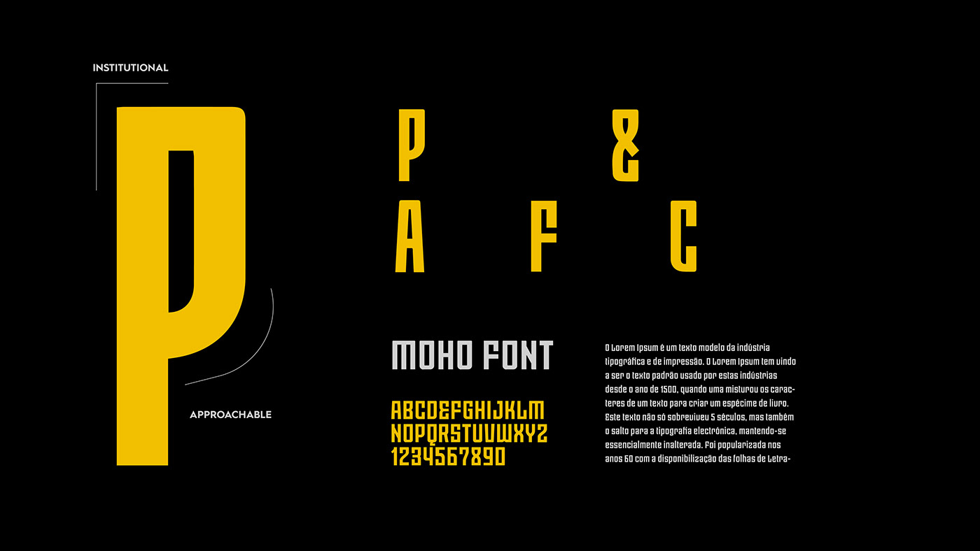
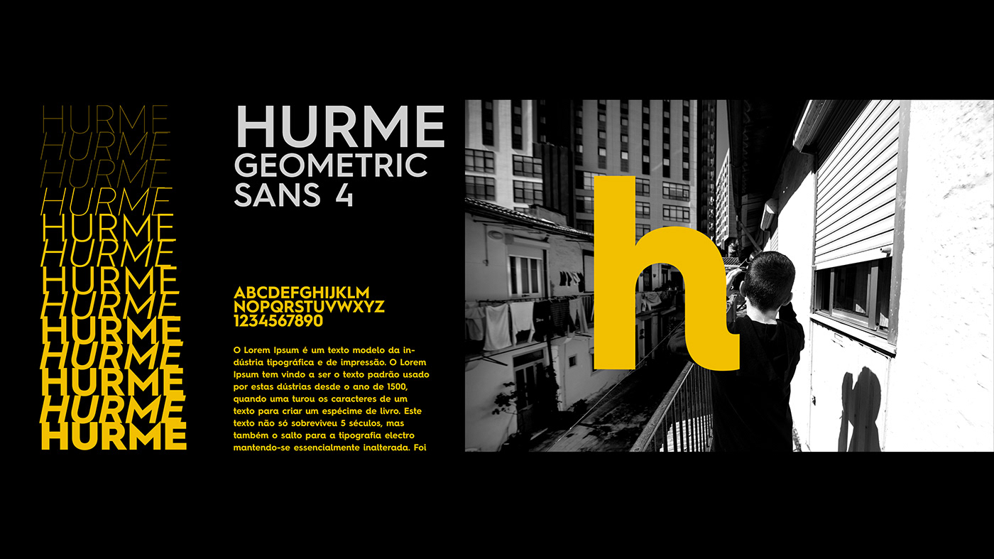
TYPOGRAPHY
The chosen typography convey institutional as well as human values. Its rounded features suggest a more social and innovative feel to it, while its straight edges give a sense of credibility and solidity to it.
It is deliberately bold to give an idea of being more interventional and impactful. It is also expandable and angular and fills all possible spaces in order to create a greater contrast with the empty spaces of the logo.

PRIMARY CHROMATIC
Optimism . Joy . Energy . Prosperity . Heat . Comfort . Relaxation
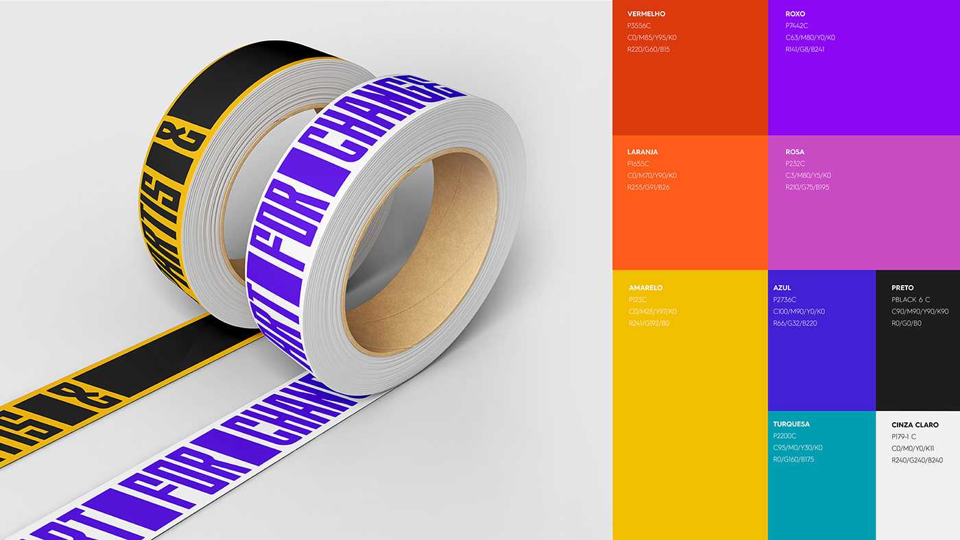
SECONDARY CHROMATIC
Secondary colors are equally important in the brand's structure and are often put at the centre of stage simply because this brand is about being inclusive and wants to convey the concept of diversity.
All colors are strong and cheerful, not only to contrast with the primary cololur, yellow, but also to draw attention, convey liveliness, intervention and get closer to participatory artistic languages.


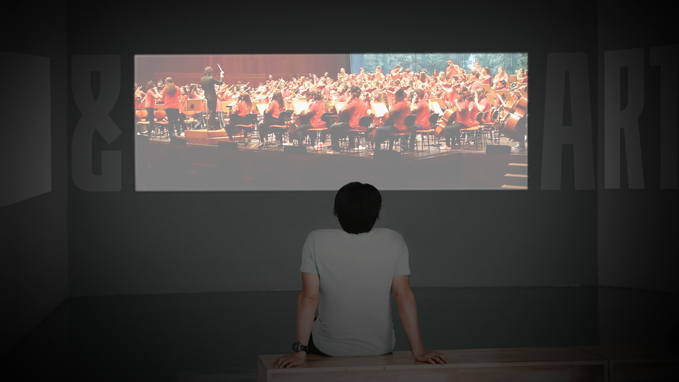

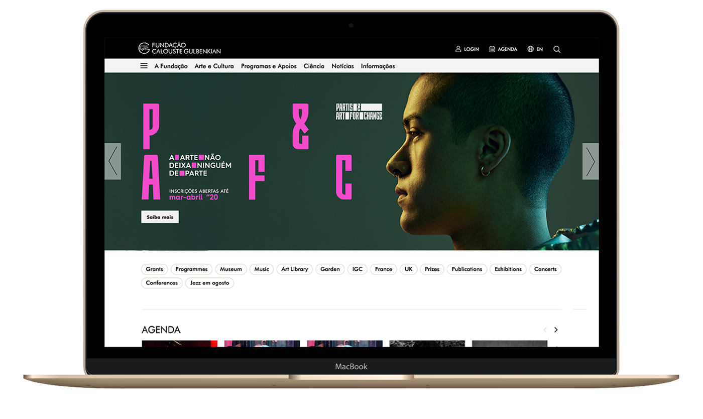
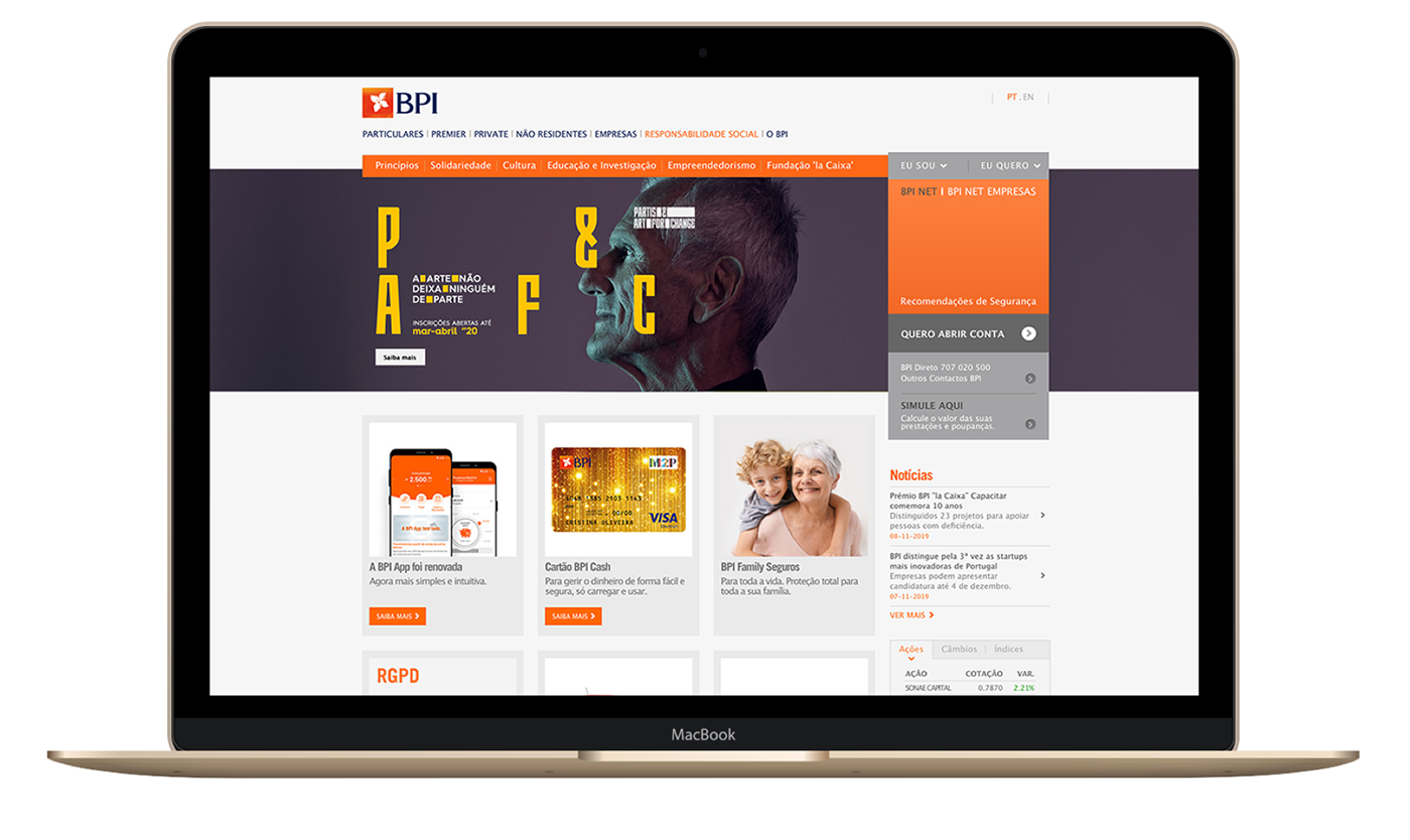
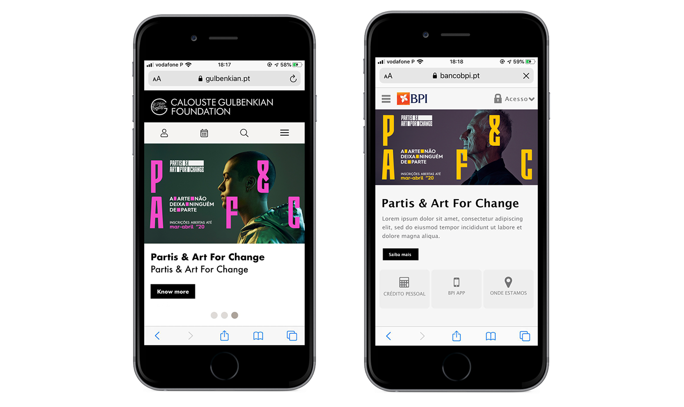
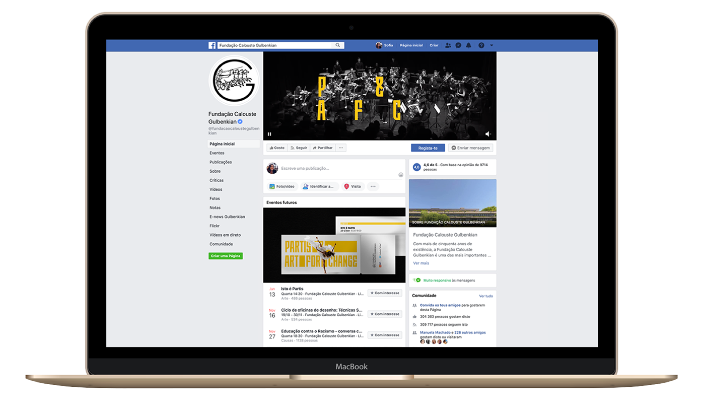
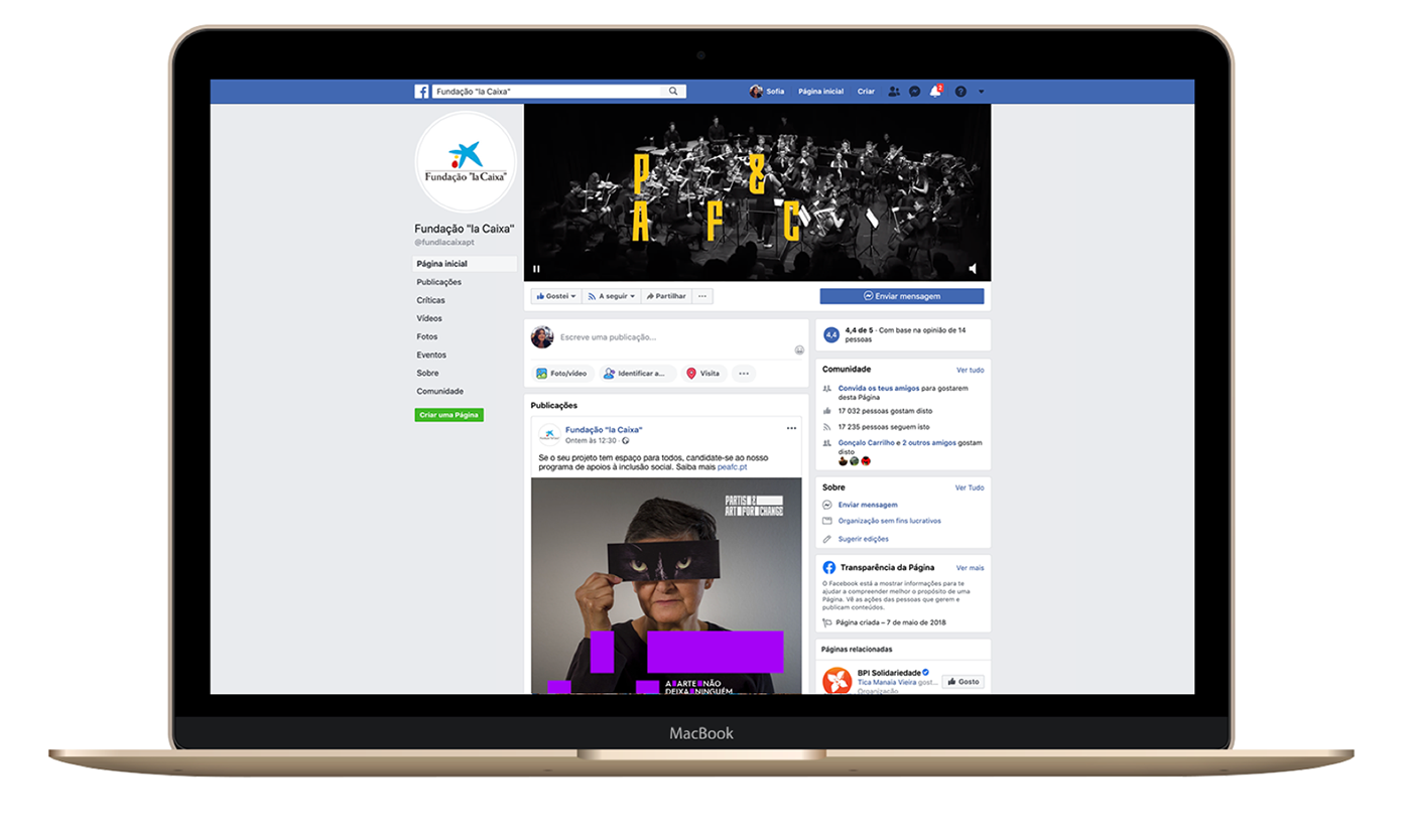
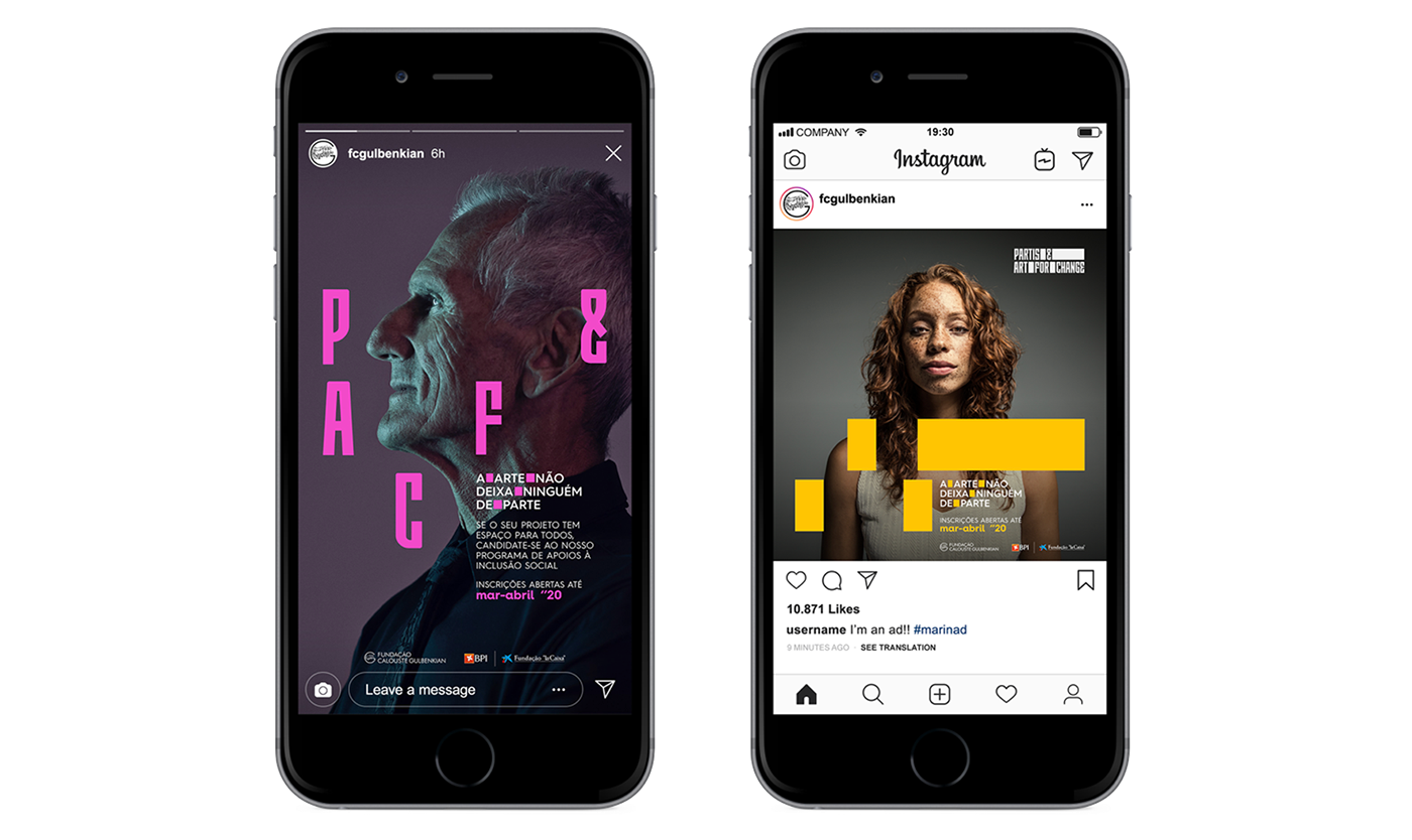
DIGITAL COMMUNICATION

Client: Gulbenkian Foundation
Creative Director: Anne-Laure Chauvin
Brand strategist: Joana Sepulveda
Brand Designers: Anne-Laure Chauvin, Leonor Gaspar
Copywriter: André Afonso
Digital Director: Dinis Deuschande
Digital Designer: Sofia Costa Pereira
Animation: João Sousa
Project manager: Vânia Araújo
Artworker: Estela Pereira
All rights reserved to NOSSA™


