

Far East Alchemy brings the power of whey protein combined with world-class taste. The health supplement industry is severely lacking in Asian inspired flavours. Seeing this gap in the market, Far East Alchemy created a range of protein powders aimed at those with a palate for these flavours. Their innovative range of products required strong branding and stand-out packaging.
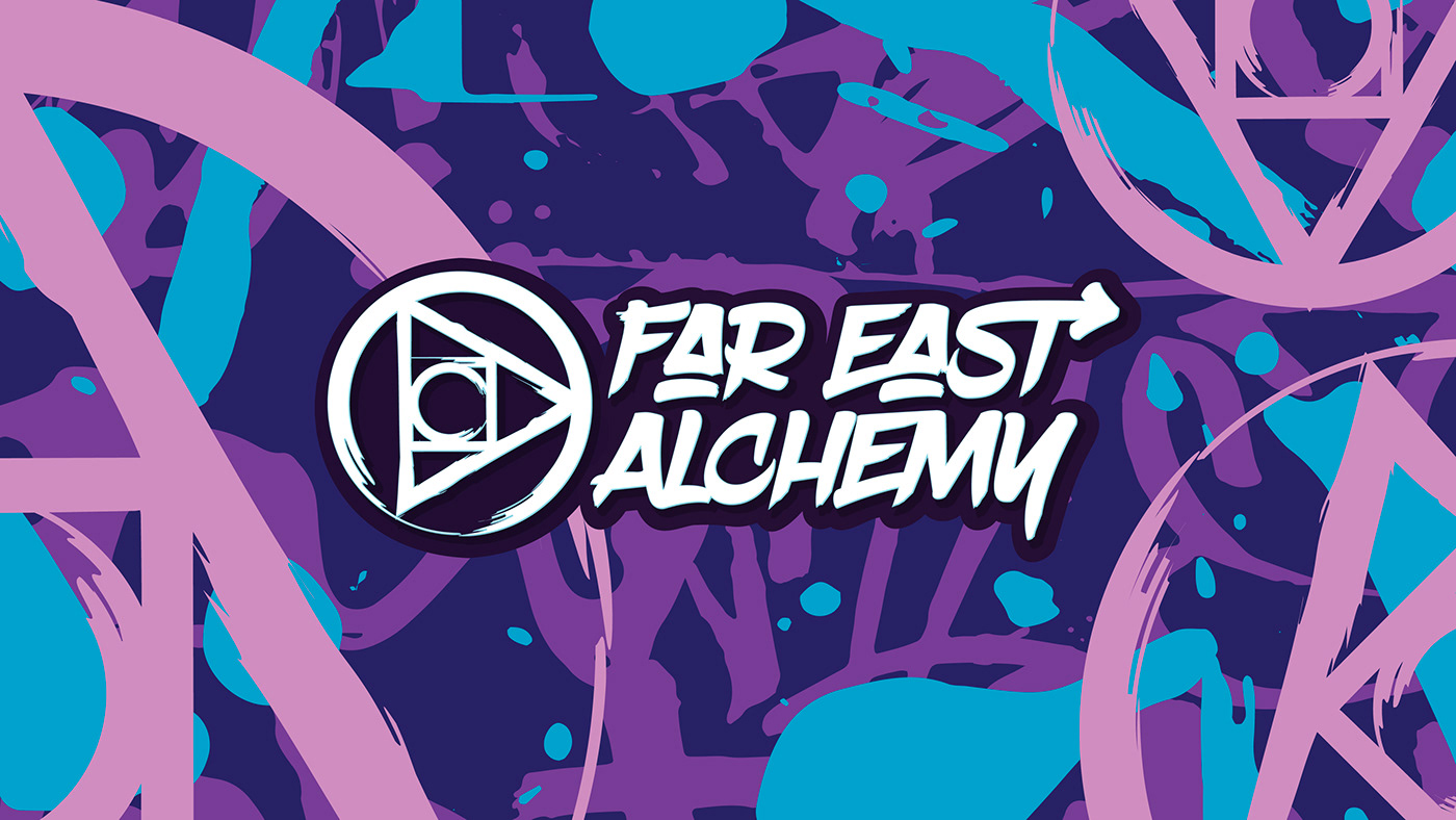
Far East Alchemy’s logo uses fonts with heavy stroke arrow design elements, representing movement and activity.

Protein powders provide essential fuel for athletes, bodybuilders and the physically active. Those who pursue these lifestyles are determined and want the best for their bodies.
Due to the unique nature of the product, we felt the packaging should be different from most on the market.
Deviating away from the serious clinical branding of most sports supplements, Far East Alchemy promises something different and better through bolder, more creative visuals.


Creative Director: Mo Hamdouna.
Designers: Andrés Herrera, Clemence Vandame


