


The Client
Located at the base of the Raton Pass, the highest point along the historic Santa Fe Trail, Raton is a small town tucked away in the Sangre de Cristo Mountains in northern New Mexico at 6,680 ft.
Raton sits at a perfect distance for access to regional fun while being far enough away from the hectic lifestyle of larger Metropolitan areas. Many travelers enjoy Raton's outdoor recreation amenities and the ease of being at a crossroads between New Mexico, Texas, and Colorado. Residents love the perks of the small town charm coupled with activities and rich history to enjoy a full, balanced lifestyle.
With four distinct seasons, crisp air, and crystal waters, Raton’s climate and beautiful vistas create an ideal living environment for residents. Wildlife and public lands call to outdoor enthusiasts. The town boasts a fusion of cultures – forged from a history of mining.
Local Recreation Destinations
Historic Downtown Raton
Sugarite Canyon State Park
Capulin National Monument
Philmont Scout Ranch
NRA Whittington Center
Vermejo Park Ranch
Carson National Forest
Maxwell Wildlife Refuge
Trinidad Lake State Park
The Project
We were tasked with developing a brand identity for the City of Raton that would be used primarily for the tourism department. This new logo and brand identity would need to not only entice regional travelers in New Mexico, Colorado, and Texas, but also invigorate the local community with a heightened sense of pride and ownership.

The Process
Existing Typography Inspiration
Once information from city stakeholders and the New Mexico MainStreet Revitalization Specialist in Promotion were gathered, we looked to several existing displays of the city's name throughout the city's landmarks. Though these displays may be arguably historic and/or effective, considerations were made to hold the new logo to the general “spirit” of these styles and iconic/recognizable representations.
Other Sources of Inspiration
The railroad system is not only an important part of Raton's history, but remains a mainstay today as Amtrak patrons can enjoy all Raton has to offer during lunch layovers for a long cross-country trip or day trips from neighboring Colorado or Arizona. Knowing that the railroad culture is important to Ratonians and their visitors, we looked closely at typography and graphic elements used on old train tickets and passes from the late 1800s and early 1900s – particularly those in the Southwest region. Working through the logo iteration and sketch phases, reoccuring themes and iconography began to surface based on the history, goals, and culture of Raton, New Mexico.


The Solution
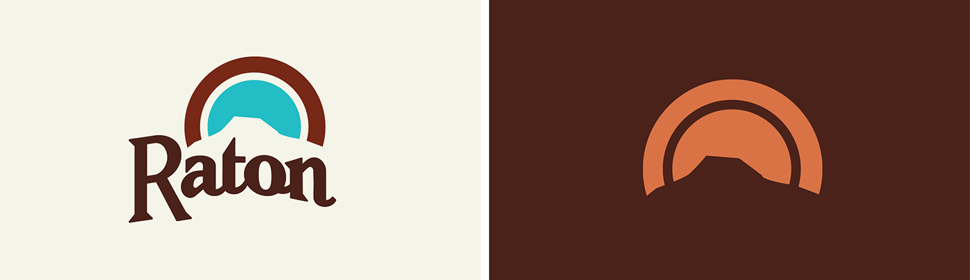
The Logo
The final logo nods to Raton's railroad history through its custom typography. It not only pays tribute to the iconic landmark of Goat Hill but, through the round motif, references travel, connectivity, and the enchanting New Mexican sunsets and friendly people.
The Seal
A city seal for the city was also developed as a companion mark to be used on legal documentation. The center of the seal showcases a detailed illustration of Raton Station, built in 1903 in the Mission Revivalist style. Unlike the city logo, the city seal is intentionally built with complexity so it isn't easily duplicated or altered.
The Tagline
Your Pass references the Raton Pass, a unique feature to the area and by which many visitors recognize the city. The use of "your" invites visitors to enjoy the community. The underline reflects a strike in the earth, harkening to the mining history and also highlighting the duality of "your" and "our" in the same word. The use of the tagline was designed to be extended in marketing campaigns as "your pass to...", allowing for flexibility in promoting area attractions and events.


Typography
For the brand typography system, we chose a system of typefaces that speak to various aspects of Raton's history and its current residents. The slab serif, Geogrotesque Slab, relates to the railroad and mining history, but has rounded slabs that tie in to both the initial wheel concept and the friendly nature of Raton’s residents. The sans serif typeface, Proxima Nova, pairs well with the slab through contrast and is both legible and professional. We also chose to include a typeface that would be used to keep professional and legal city documents consistent. Palatino, released in 1948, not only paired well with the rest of the type in the system, but it also nods to classic postcard artwork of the city made the same year.
Photography & Visual Messaging
Photography is a key part of communicating the Raton brand through visual messaging. We instructed that the images collected should be thought-provoking and inspiring and should demonstrate a knowledgeable perspective of Raton and the surrounding areas, not just a tourist’s eye view.
A primary goal of photography use within the brand is showing a unique, unexpected and surprising angle of Raton. The photography should be warm with an element of vibrancy, depicting natural actions and emotions of people within them. Images collected and used should create a sense of place and capture aspects of the city that align with the brand – from adventure to relaxation to history.
Other visual messaging motifs used throughout brand collateral include a circular graphic, again reinforcing the wheel concept, derived from the final logo itself as well as a textured swash, derived from the tagline, that's inspired by the city's prevalent outdoor recreation culture.


Wayfinding
We also were tasked with designing concepts for wayfinding within the Historic Downtown district. A set of wayfinding concepts were developed that would be helpful and useful for both vehicular and pedestrian wayfinding traffic, highlighting points of interest in the downtown area such as restaurants, museums, and shopping areas. Another smaller set of signage was developed to encourage pedestrian foot traffic to destinations such as the library or park utilizing the hashtag #walkraton. As an economic solution, our concepts for wayfinding utilized existing infrastructure (light poles, utility poles, etc.) in the downtown area.


