SODEULNYEOK.
Sodeulnyeok, a reputable galbi brand that has been passed down to the second generation, requested a design with a strong artistic tendency.
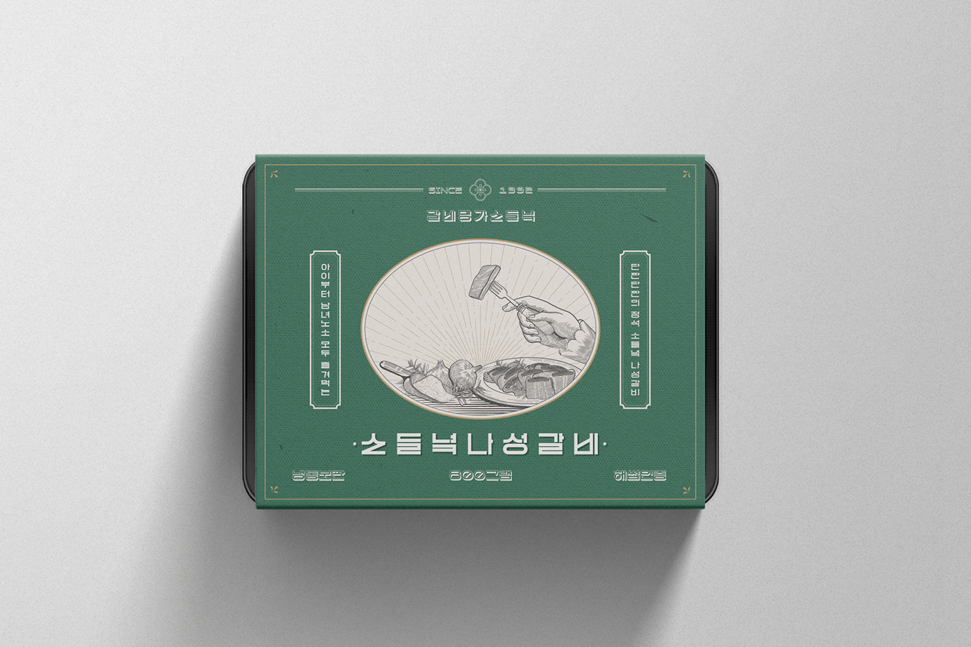
The brand wanted to break away from the old design that was created to reflect the existing meat processing market.
Sodeulnyeok’s request was “to place the logo on the back if possible,” “to avoid direct product images,” and “to break away from the typical meat processing package design.”
We thought about a design that would efficiently express the Sodeulnyeok brand image without it looking like an ordinary logo.
We developed a typographic design for each product name that could be used according to each package.
We also wanted to reveal the brand concept of Sodeulnyeok in a more intuitive way by using delicate hand drawn images created with a fountain pen.
The illustrations, completed with intense light and delicate lines, deliver the brand images in a way that visualize the philosophy of Sodeulnyeok,
that “the mother's heart is responsible for the family's meal.”