Hallopz came to us with quite an ambitious goal: To position themselves as a high quality and classic brand, made of natural & healthy ingredients that could compete with older and cheaper brands with a strong position in the market.
They already had a high-quality product, but they needed their sales and visual identity to reflect it. During one of our initial meetings our client told us:
" I always have a few of them after dinner or while i am working, they relax me. It takes
a while to eat them and a lot of the ingredients are actually really good for your digestion".
We realized they didn't had to sell a product.
They had to sell an experience.
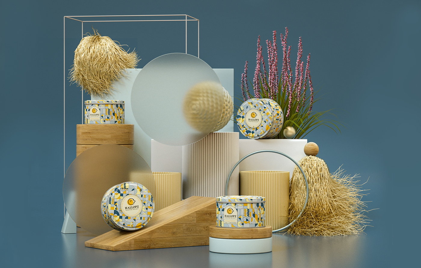
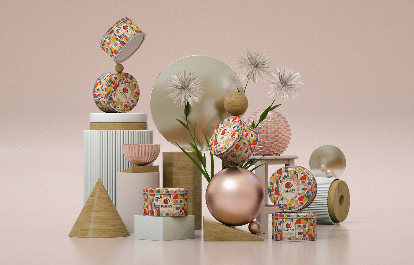
The first step was to create a new logo and packaging that would reflect the quality of the brand. we created a metallic container that people would love to keep as decoration in their house. The patterns were inspired by the Art-deco style but with a modern twist. the same style was used to update their logo: a vintage font combined with a bold illustration and a speck of humor thrown into the mix.


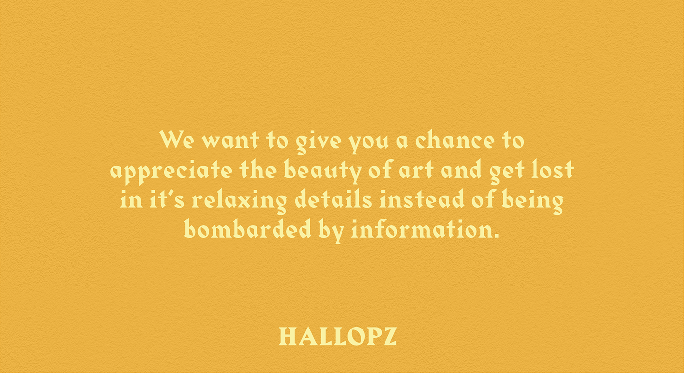
The second step was to create a series of billboards that would communicate the concept behind the brand's new tagline. They were strategically placed in subways, bus stops, and other high transited and stressful locations. We wanted users to get lost in the details of the compositions instead of being bombarded by information; for them to associate the brand with the emotions depicted in the artwork: balance, peace, simplicity.