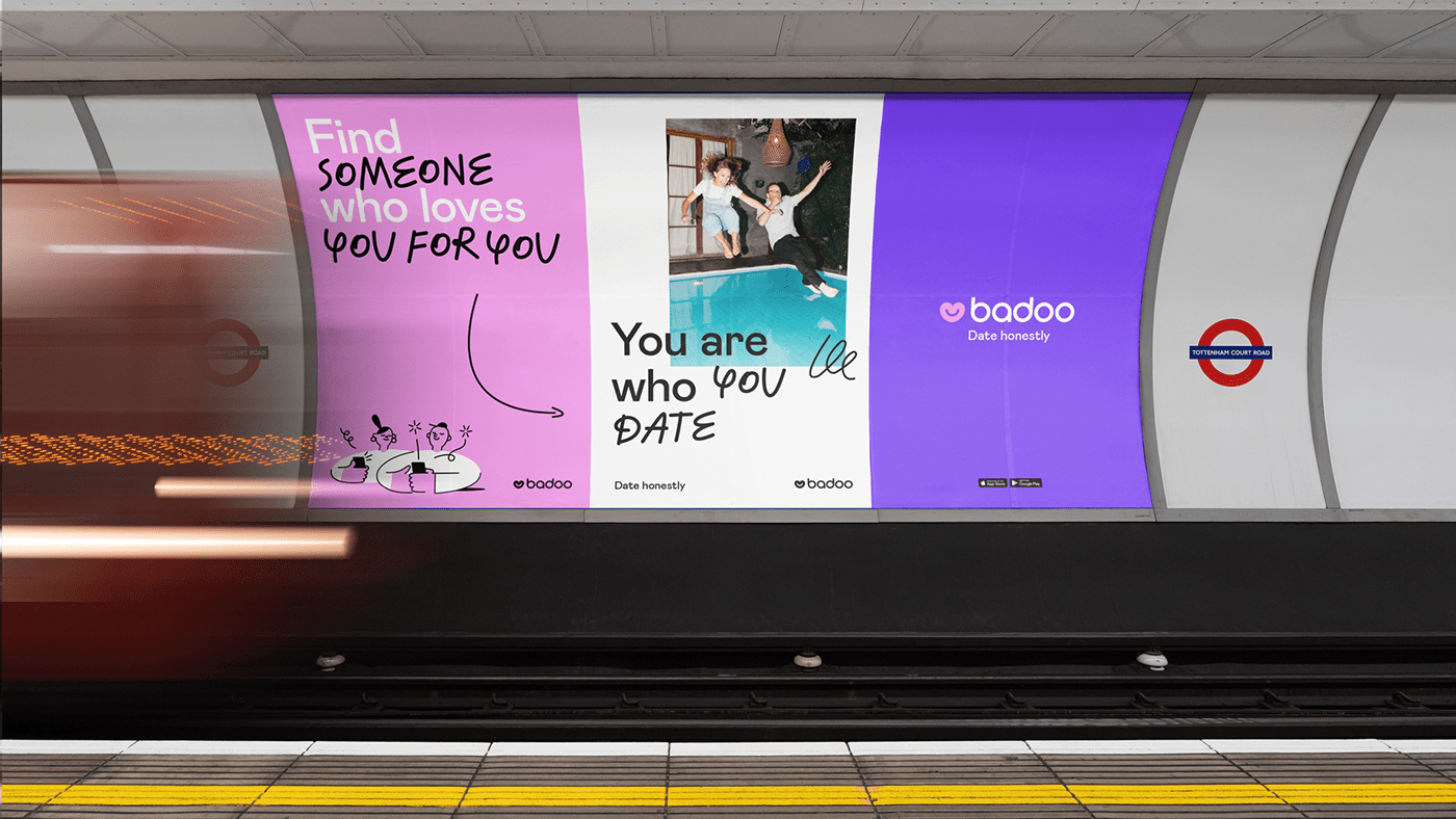
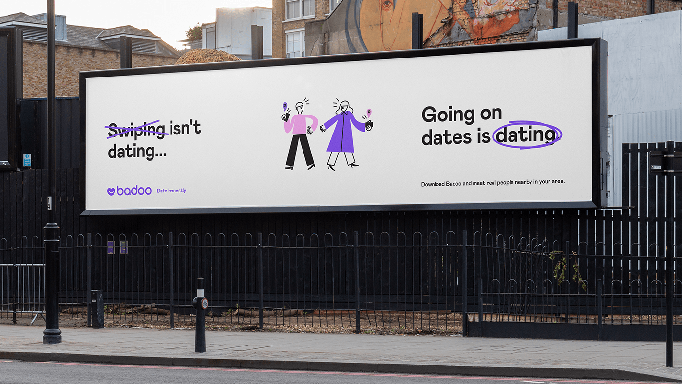
As an industry leader, Badoo has set itself an ambitious goal: to reimagine the world’s dating paradigm. The dating industry has undermined itself over recent years, so we decided to refresh our approach. Our goal? To bring back real dates and remind people of the value of relationships.
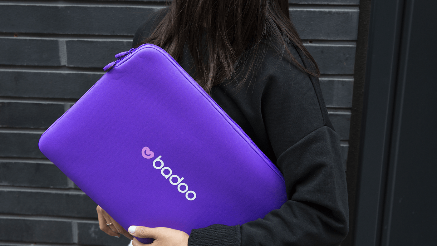
The Badoo logotype consists of two parts: the graphic symbol and the wordmark. The previous symbol wasn’t distinctive and was lacking emotional touch, so our goal was to create a new one that evoked the positive emotions, warm feelings and happy memories around real dates. Our new symbol is approachable, friendly, human and welcoming.


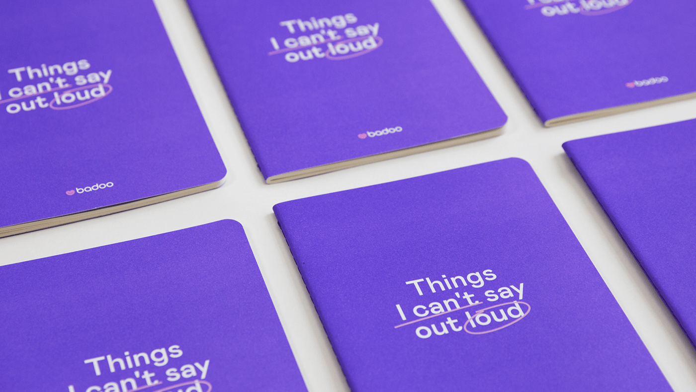
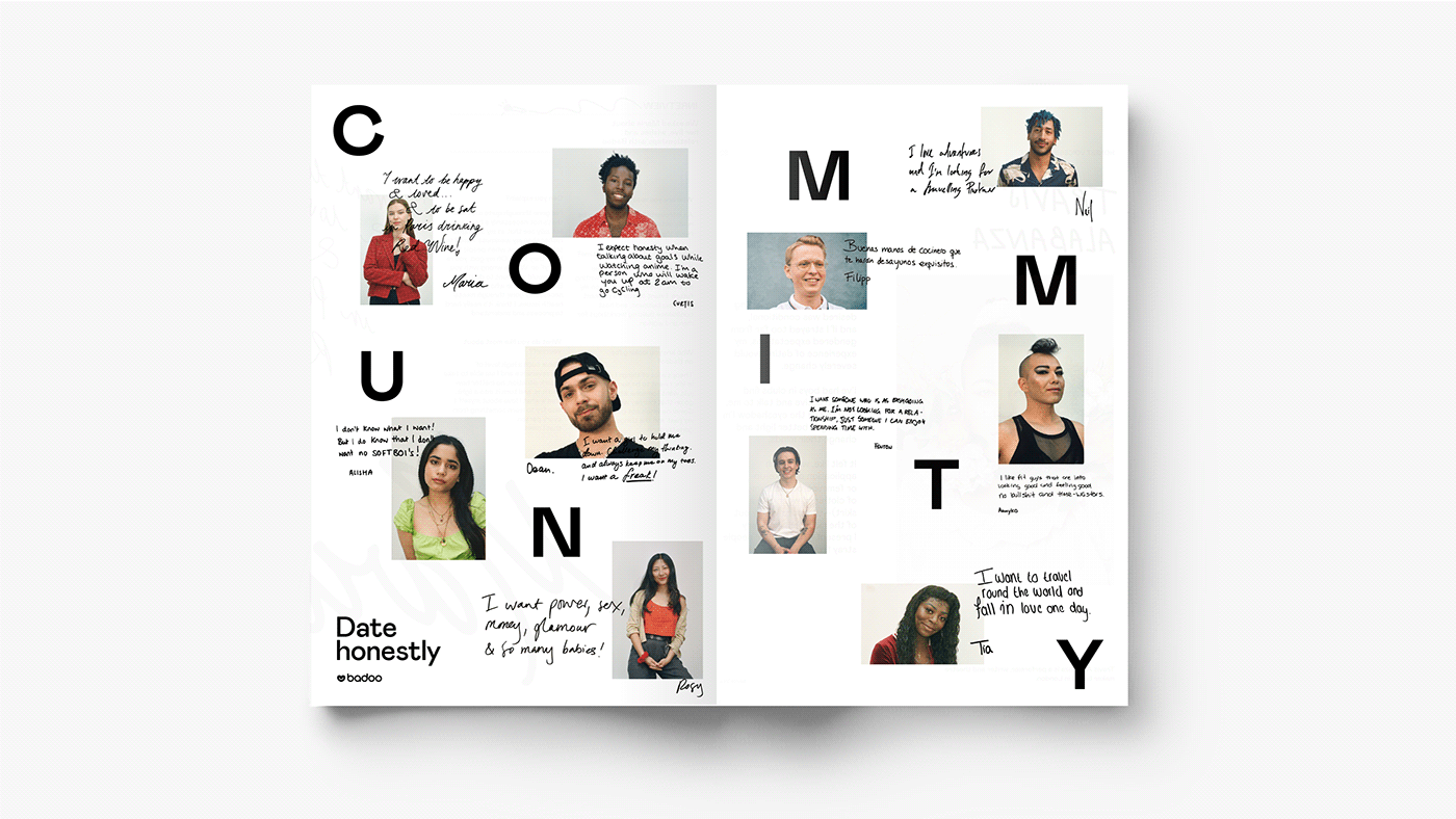
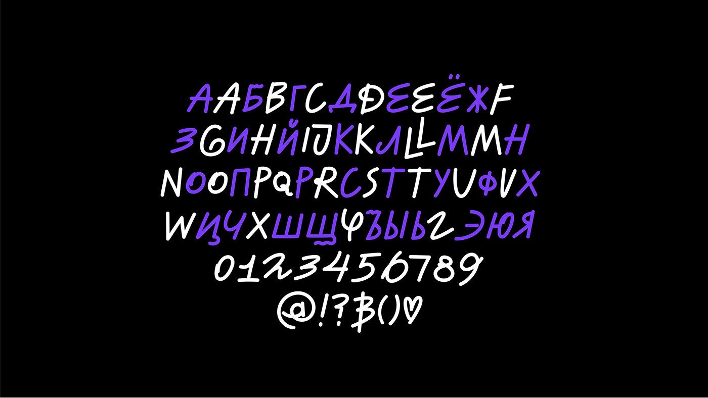
One of the key elements of our new identity is the addition of handwritten elements, which helps us to create a more human look and feel, to draw attention to the most important parts of the copy. We also created an additional typeface to complement this approach and evolve our ways of expression.

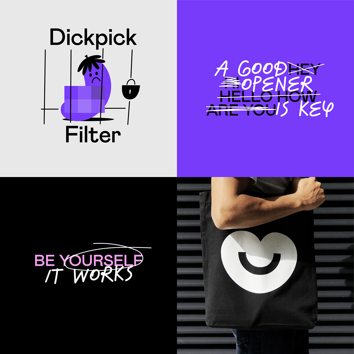


We bring all our community’s emotions, feelings and memories into one space, using clean, simple and flexible layouts with lots of space around each element. Imagine a memory board, moodboard, or love notes and you’ll be on the right lines. Our branding doesn’t require us to stick to a visual super-structure to create artworks. Instead, we usually deploy a basic grid with a scaleable number of images – and of course, all our media is designed to remind users of the joy of real connection.
We want our photos to capture the honest moments between everyday couples, friends and lovers, so we’re focused on capturing real emotions and real people. We want to steer away from staged photography and move towards something more realistic and unscripted.