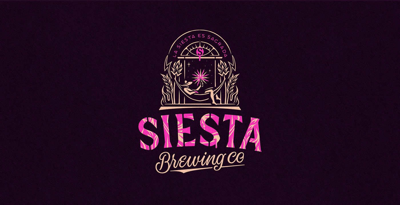
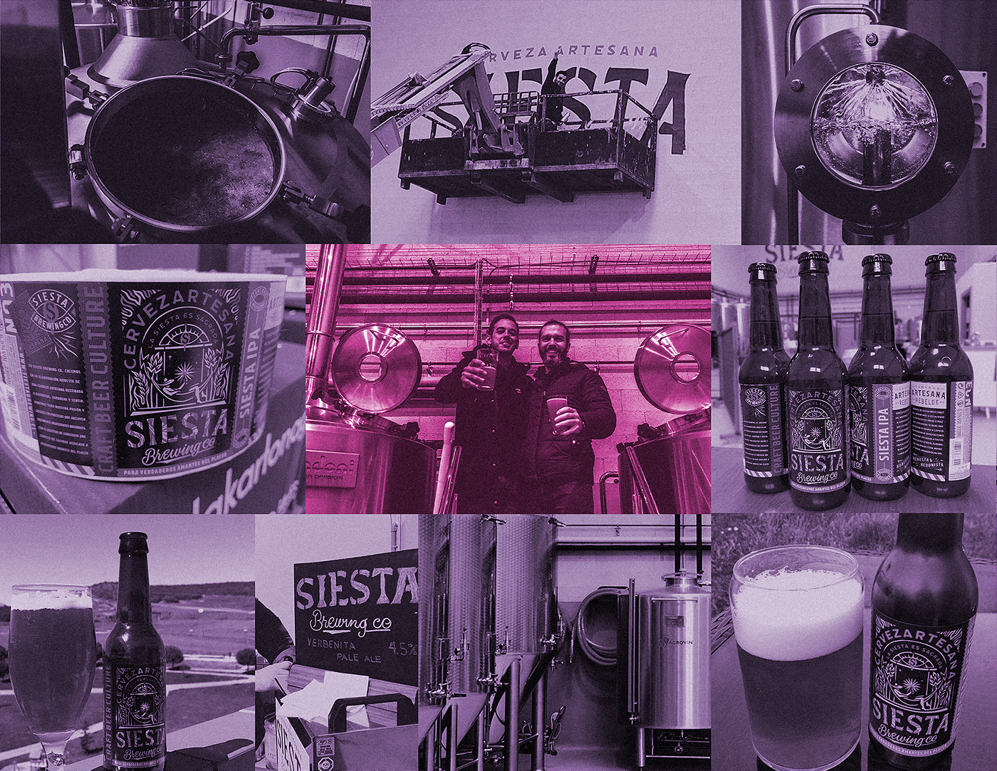
'Siesta' translates to english as 'nap' and is also the name of spanish micro brewery Siesta Brewing Co.
They are passionate brewers, unusual rebels and craft beer lovers who just know and love what they do.
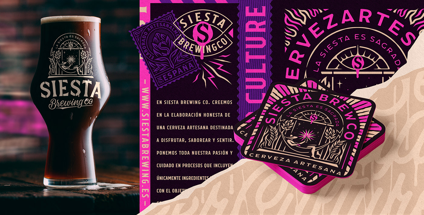
Honest craft beer for the hedonist folks - Aimed to enjoy, taste and feel as one of our life 'Sacred' pleasures.
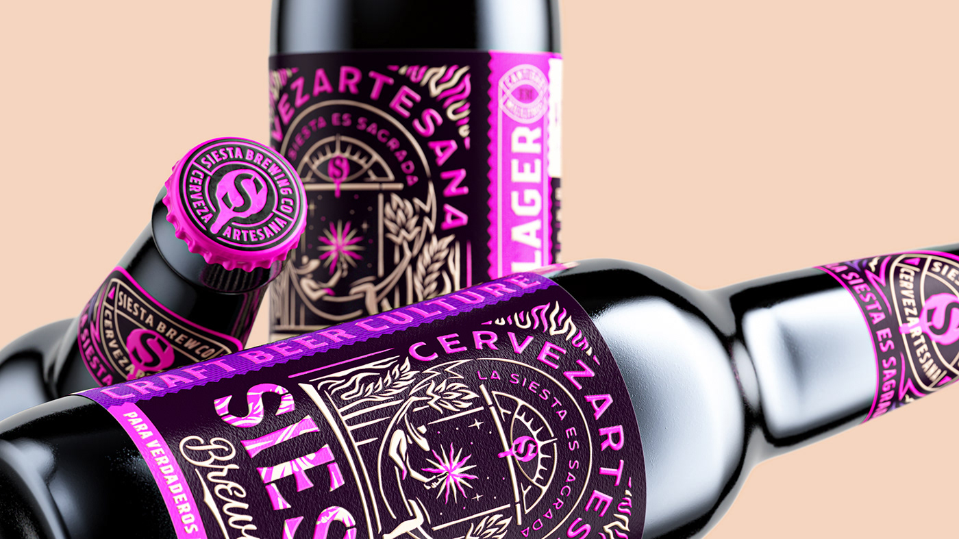
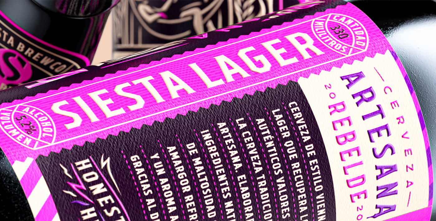
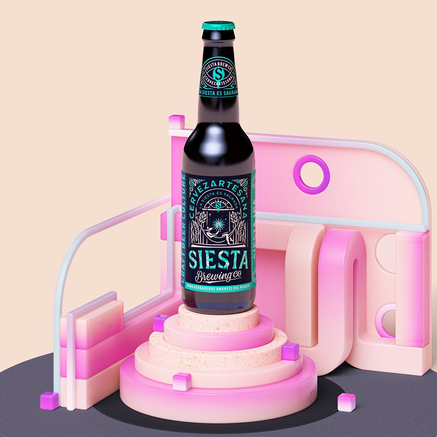
I was asked to design their brand identity and packaging for its three first core beers. Lager, IPA & Pale Ale.

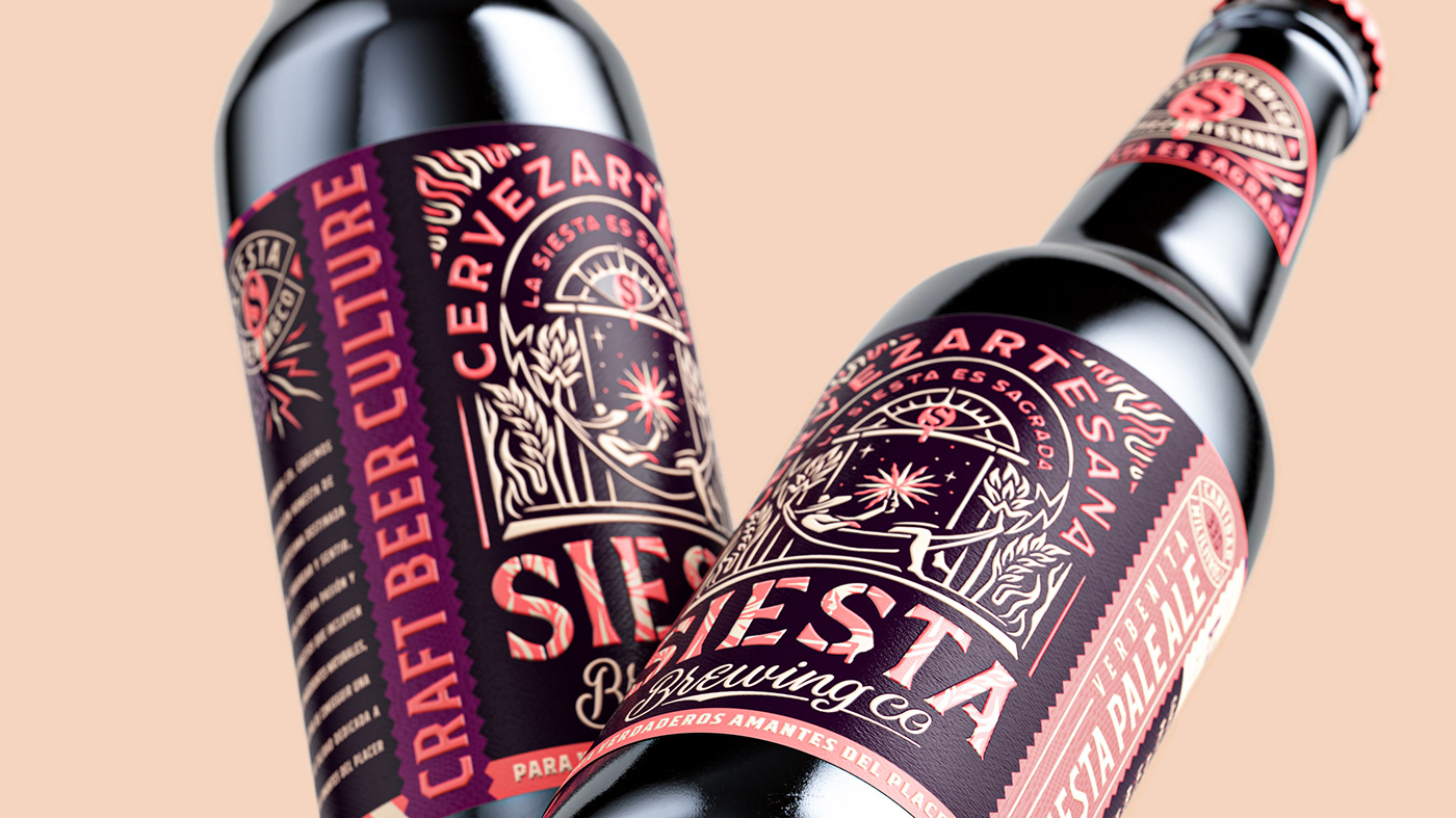
The design concept is inspired by the common spanish saying - 'La Siesta es Sagrada!' / The Nap is Sacred!
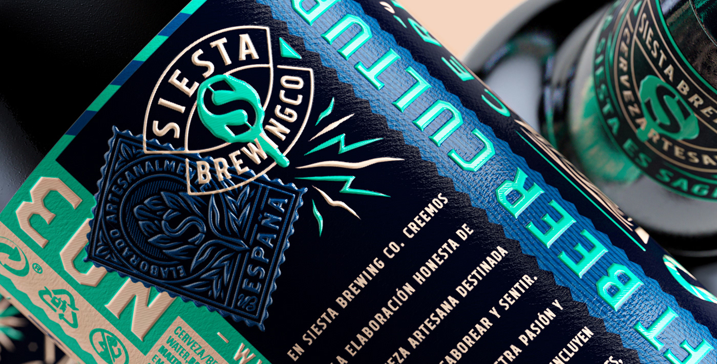
We imagined their product and the occasion of consuming it as one of the sacred pleasures of life, interpreted through Siesta's brewery spirit lens by the inclusion of rebel cues, pop colors and crafted execution set in symbolic scenes.
A unique signature is created by the celebration of a very ownable occasion for their brand, and the use of
a distinctive character, graphic language and bold fluor colors that will make it easily identifiable.
a distinctive character, graphic language and bold fluor colors that will make it easily identifiable.
Client: Siesta Brewing Company
Field: Branding / Packaging / Lettering
Concept: Luis Utrillas & Susana Sanmartin
Design & Art direction by Luis Utrillas
Design Assistant: Susana Sanmartin
CGI Illustration by Wes L Cockx
Year: 2019 / 2020