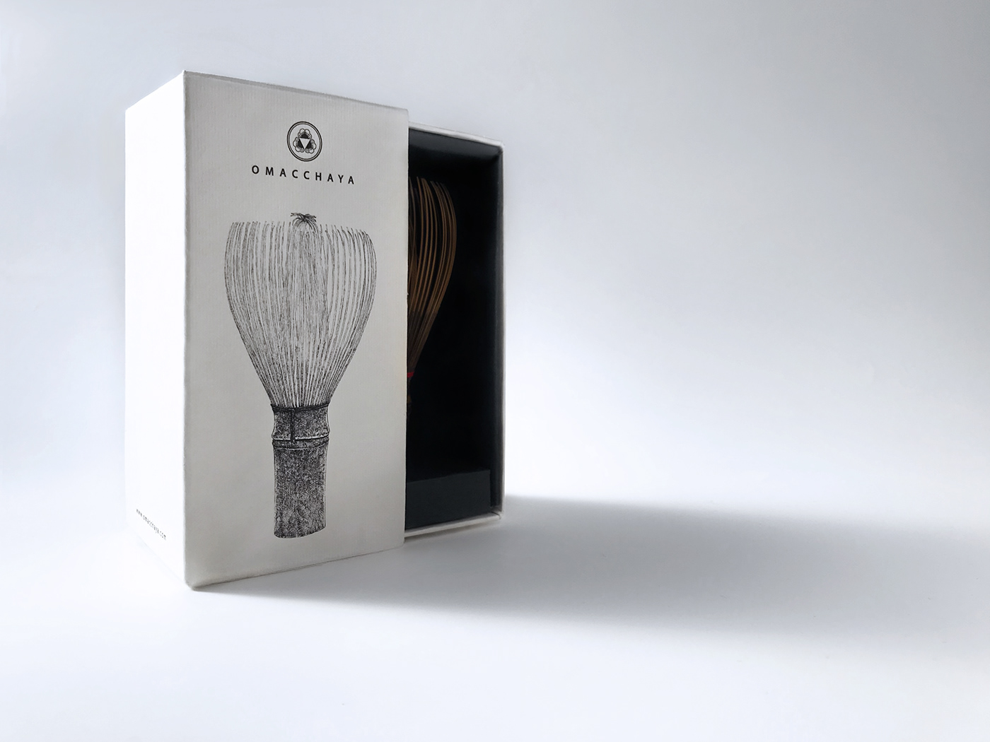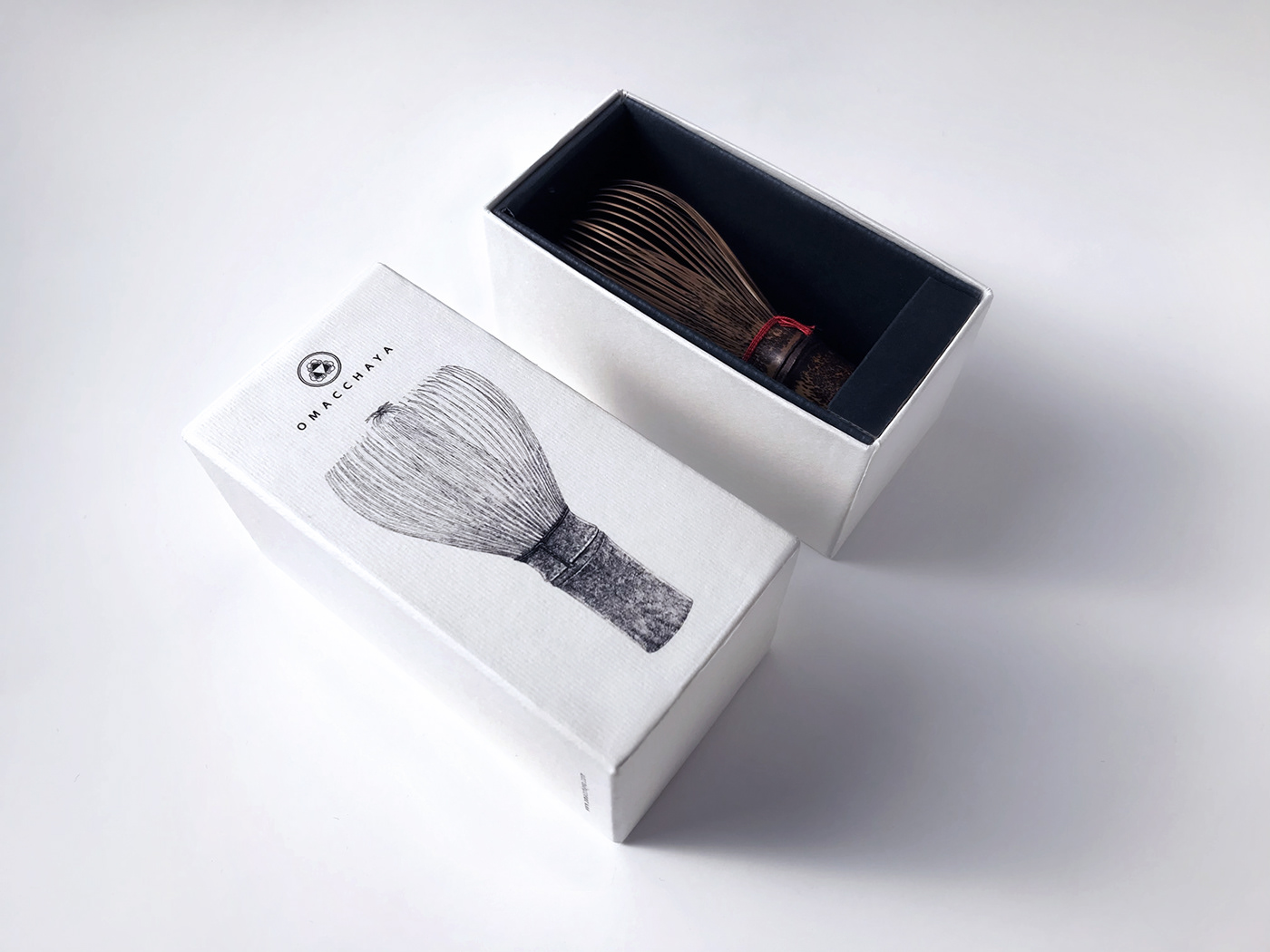
Omacchaya – CHASEN
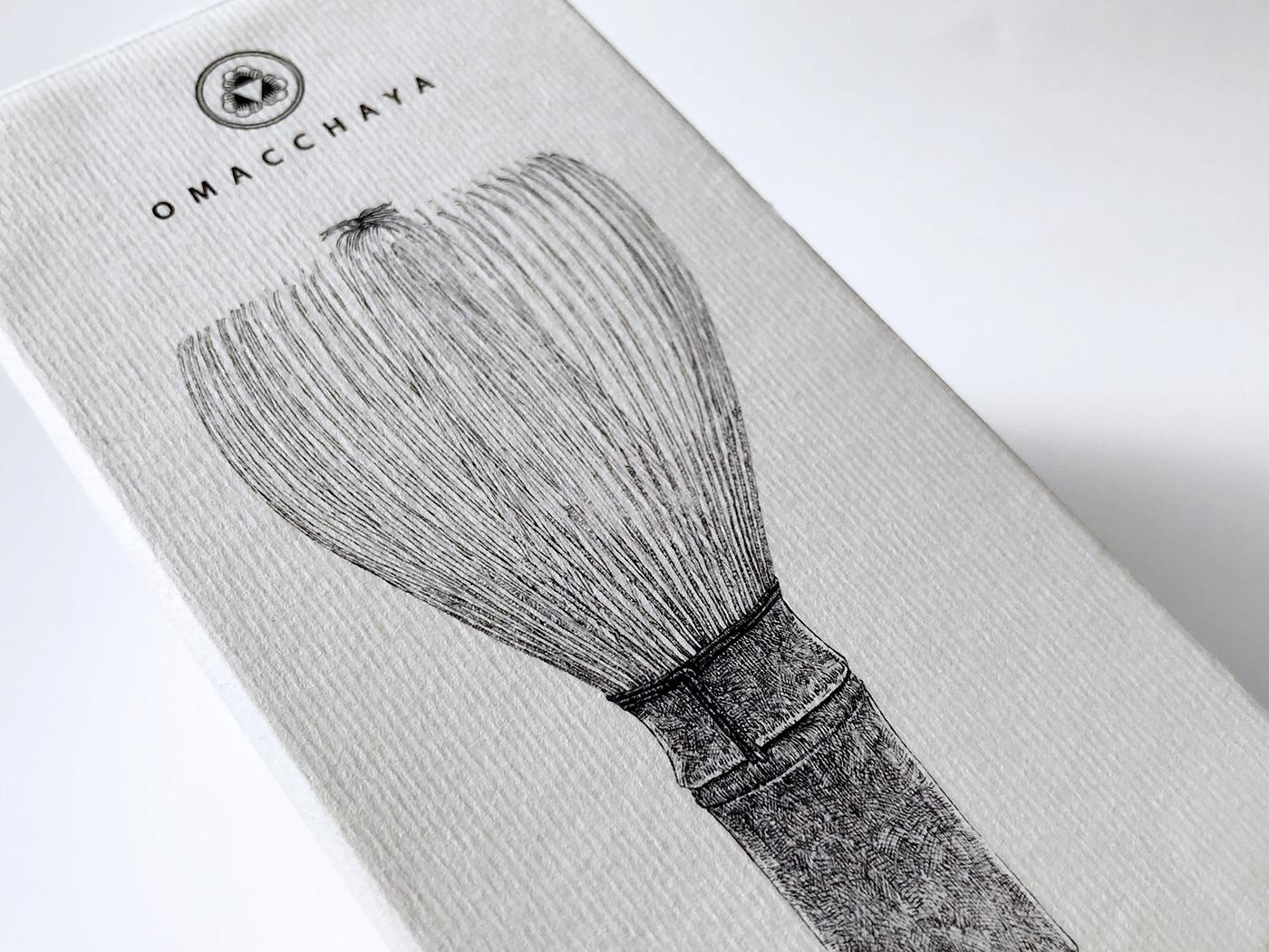
OMACCHAYA is translated as "THE HOUSE OF MATCHA". In Japanese, the prefix "O" marks the respect, the suffix "ya", meanwhile, defines the shop, the house. This Japanese form of respect expresses the philosophy of the brand in its practice of cultivating, processing and selling matcha. The logo is inspired by the traditional Japanese KAMON(family crest) and the minimalism aesthetics, combined with the shape of the combination of tea to make the logo as same as the company concept. "Connect East and the West"
社名「OMACCHAYA」は日本語で「抹茶の家」という意味です。"O" は「日本の抹茶への敬意」、"ya"は「店・家」を表しています。この社名は日本の抹茶への深い敬意を表し、そして彼らの栽培、加工、販売全ての工程における理念、哲学を表しています。
AD+D 李政逹/D 藤原秀法/CL MJ Lou Japon LLC.


