challenge
Icograda is publishing a printed design magazine. Design the first publication establishing the guidelines for
further publications.
further publications.
solution
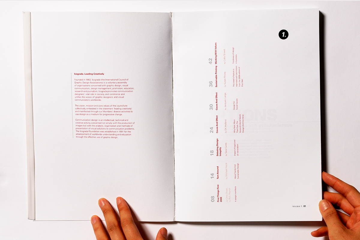
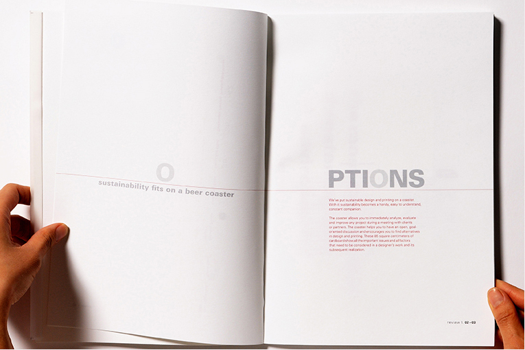
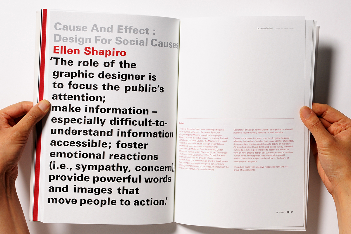
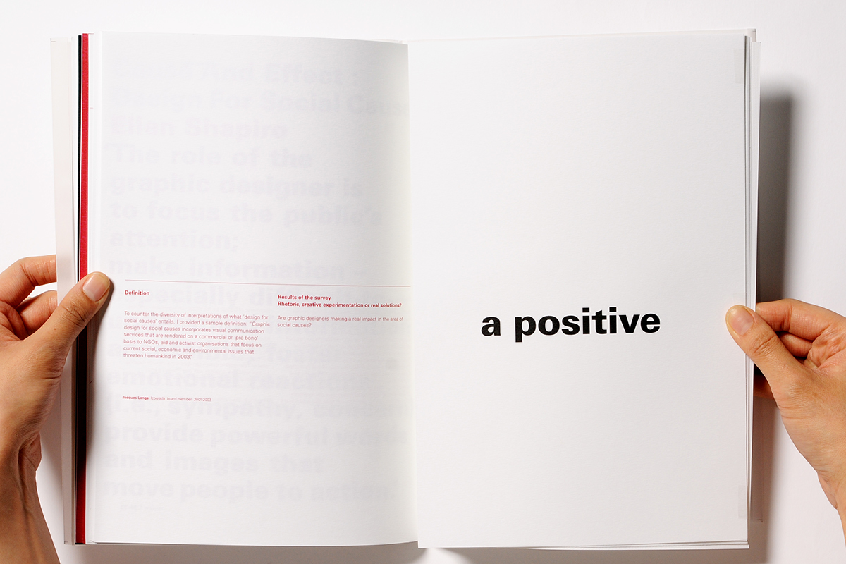
A typographic magazine designed specifically for graphic designers. All the articles are about ethics and also sustainability. I designed with typography without a single illustration. The tactile matte finish paper was used for pages with textured paper for cover instead of commonly used glossy paper. With an analysis of all the articles, I came up with the name of the magazine as ‘review’. As there are so many issues to redo, rethink – do it again.
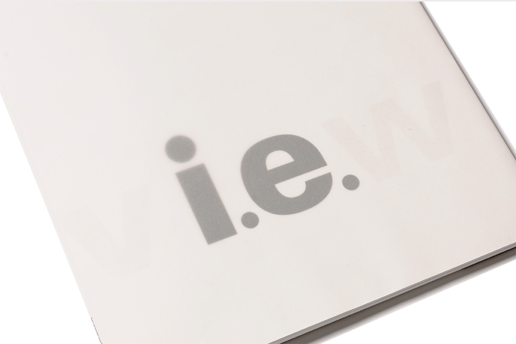
Front cover
A4 size magazine
perfect binding
translucent cover
perfect binding
translucent cover
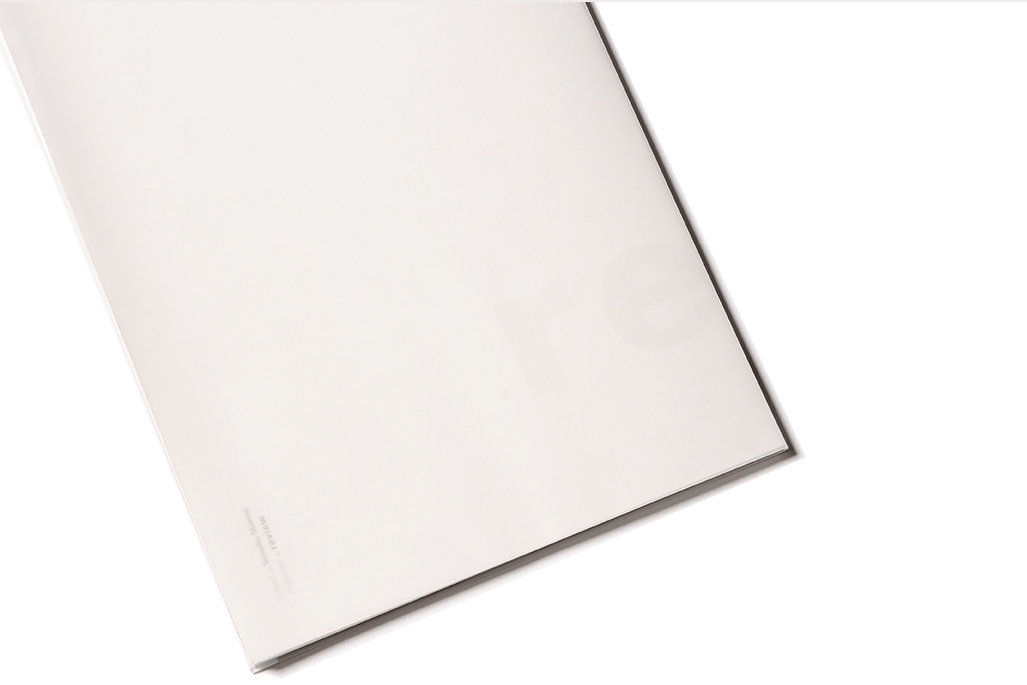
Back cover
The hidden word ‘i.e.’ supports the concept of the name as its meaning of explaining exactly the previous thing that you have mentioned such as the magazine features old manifesto.
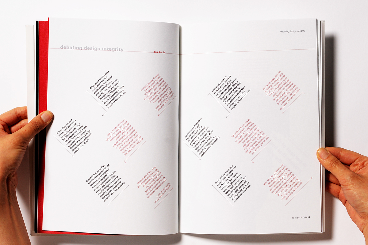
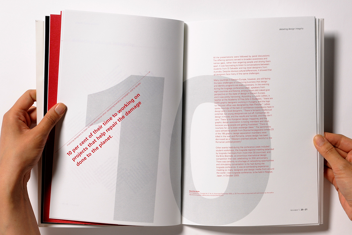
The spread is an article about the ‘debating design integrity’. Debating involves 2 people, 2 opinions that were symbolised by the colour coding as well as separation of the paragraph. It is challenging for the reader to follow the articles with the arrow and colour, as the debating involves a challenge.

Supplement
Cutting 10 percent of ink on the supplement contributes the idea of how a graphic designer can donate to repair the damage done to the planet.


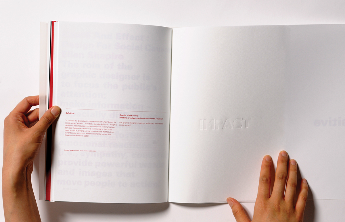
debossed ‘impact’ expressing the meaning of the word
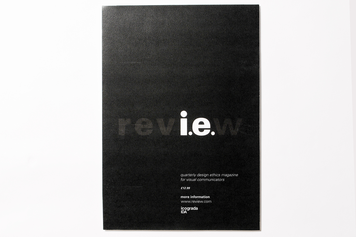
A2 size poster
The two different kinds of blackness were used for the poster. One is rich black and other is normal black. By making the hidden letters with the use of two blackness, it attracts viewers to look closely and examine the hidden words that connotes the concept of the magazine.


