Phoenix Branding Competition
This was my winning entry for a competition brief for 'Phoenix' - “Your task is to create a brand identity that will resonate with business owners as a cutting-edge technology consultancy for the 21st-century firm."
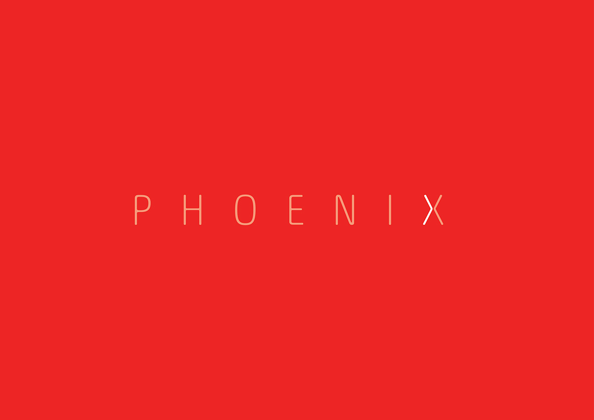
Phoenix are a consultancy firm, specialising in using technology to improve the way you run your business, through cloud computing, the creation of mobile apps and the improvement of web design.

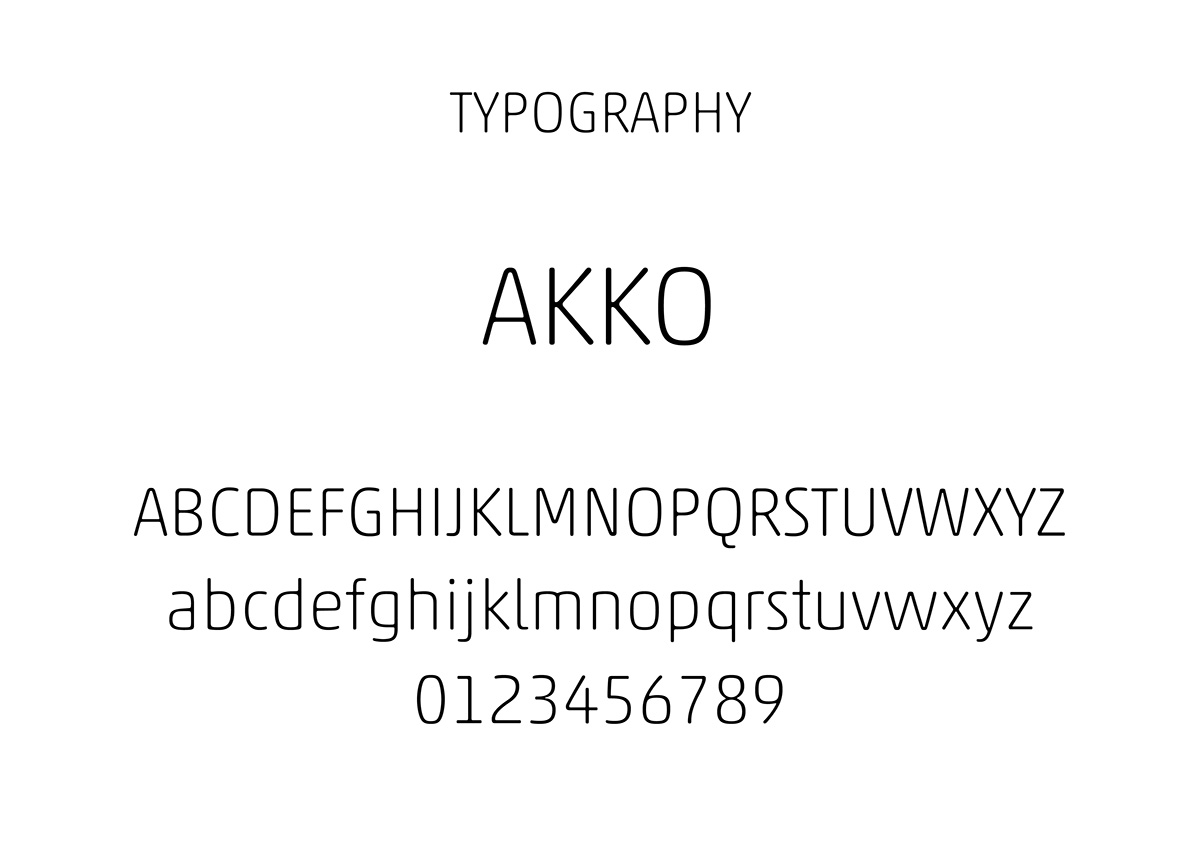
The highlighted/hidden arrow in the ‘X’ suggests progress, moving forward, and the future, representing the way Phoenix can help a business with technology as we move forward. The typeface used, Akko, is clean and modern, with a business focussed feel due to it’s structured look, but also approachable and friendly as it is sans-serif with rounded edges. The colour is bright, fire-like and bold, like a Phoenix. PHOENIX - ‘Dont let technology hold back your business’ - possible tagline.

Although primarily a consultancy firm, Phoenix have big plans for other, separate businesses all operating under the same Phoenix brand, so it was necessary to consider how sub-brands could look.


