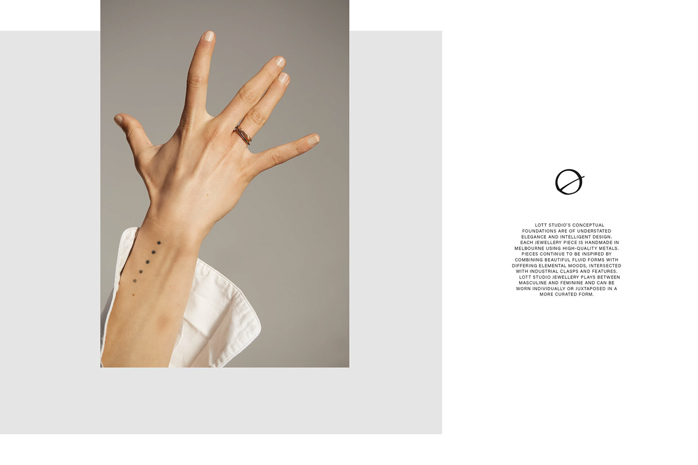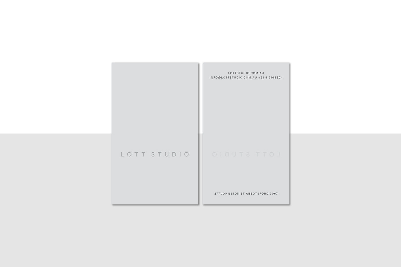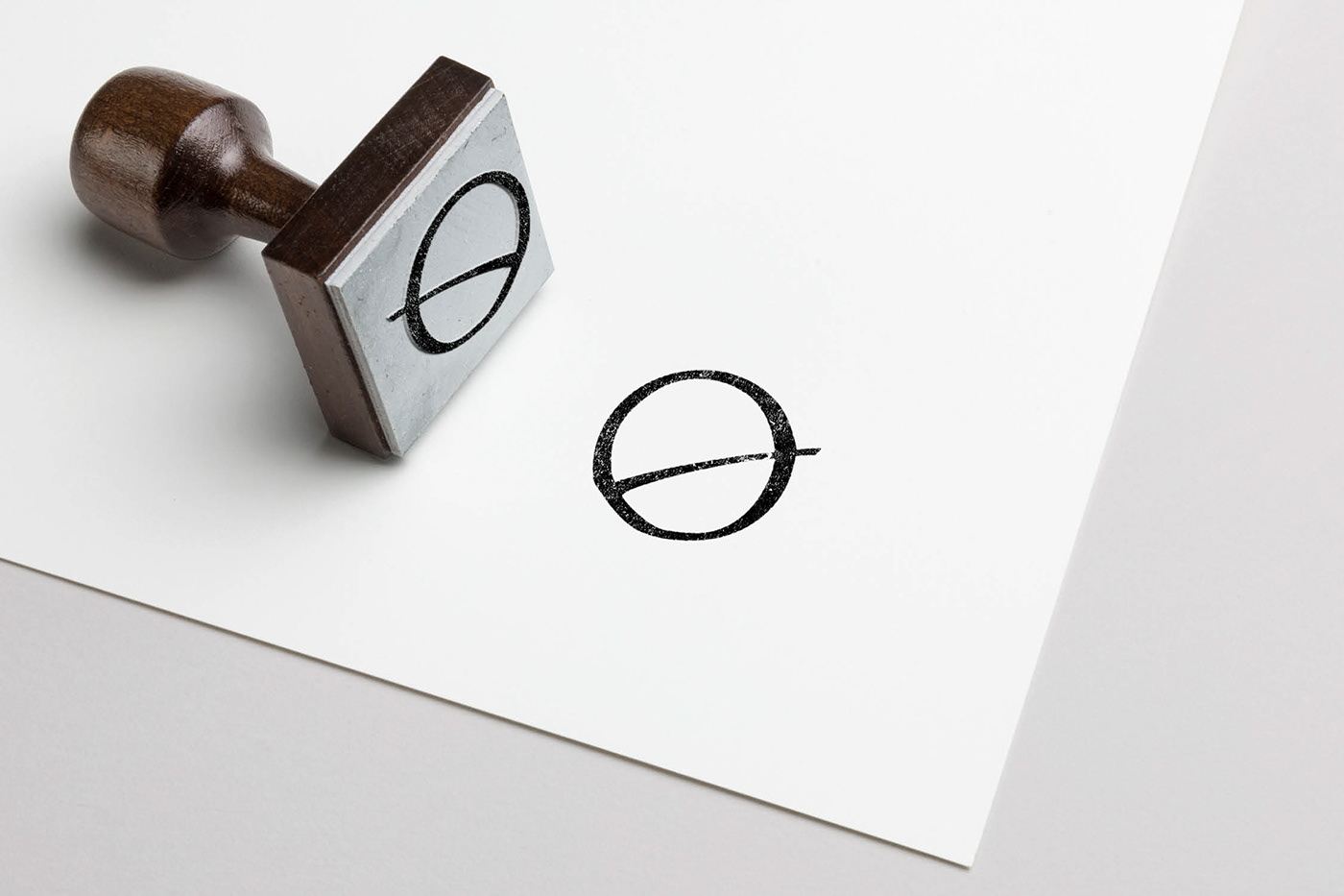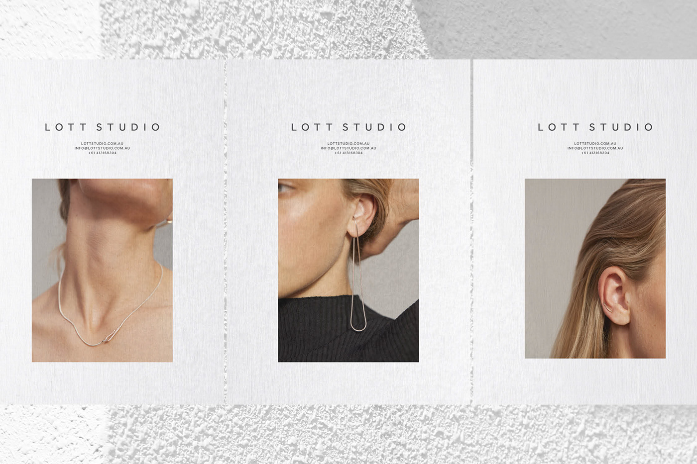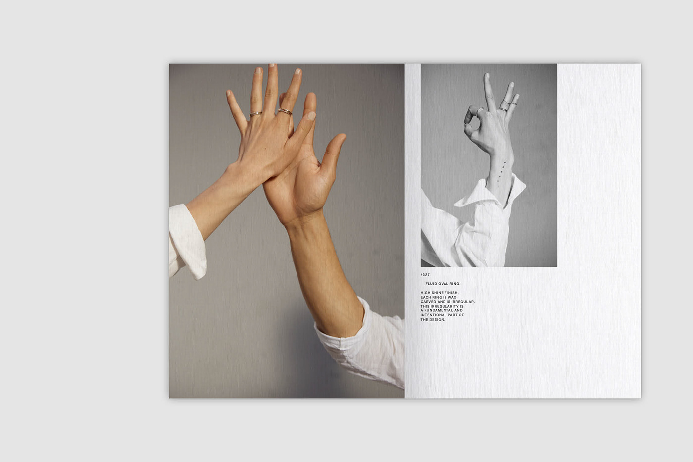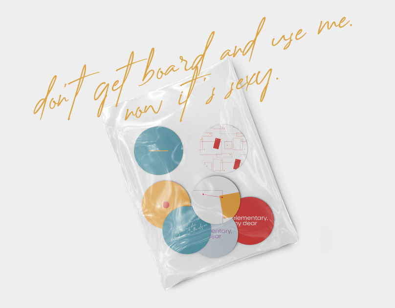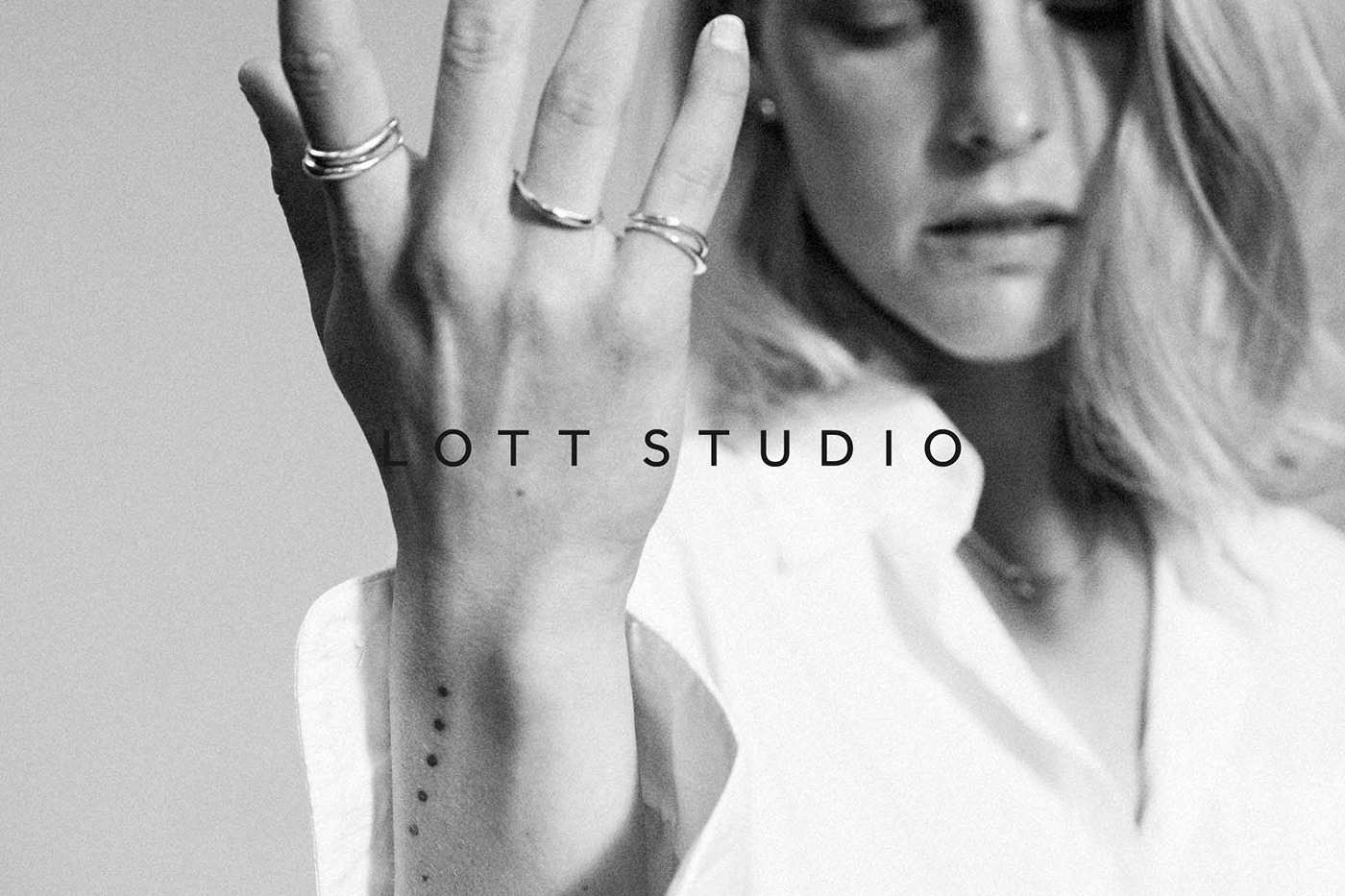
Lott Studio desired a refreshed visual identity that maintained their existing elements but modernised the overall aesthetic. The approach taken was an in depth development of the sans serif typography for a sleek, bold wordmark and the introduction of a hand drawn monogram to reflect their hand-made jewellery processes.
That brand duality was bought to life through; the interplay of the feminine and masculine through geometric, bold letterforms finding balance with softness of imagery and texture in application; and highlighting imperfections in the monogram’s form which was encouraged in execution such as through the use of hand tools like rubber stamping.
Photography. Tracey Lee Hayes
