


Context
The brief
This is a concept project I developed from challenging myself to create a packaging design and associated brand identity by only using materials I already owned. I searched the house for supplies and came back with plenty of card of all colours and thicknesses and a beer bottle I had kept from a camping trip years ago that I thought had been too nice to throw in the recycling bin. I knew it would come in handy one day. And thus, the project had commenced.
I gave myself the constraints of aiming the product at the target market of females aged between 18-35. The target customer is very active on social media, is a big foodie, and is an advocate of supporting local businesses and artists.
The process
I started by finding examples of my target customer on social media to see what brands and content they engaged with the try and get insight into recurring themes. A very common theme I came across was the colour pink so I felt like it was important to include pink in the creation. I created a mood board and identified key words and values that would help in the idea generation process.
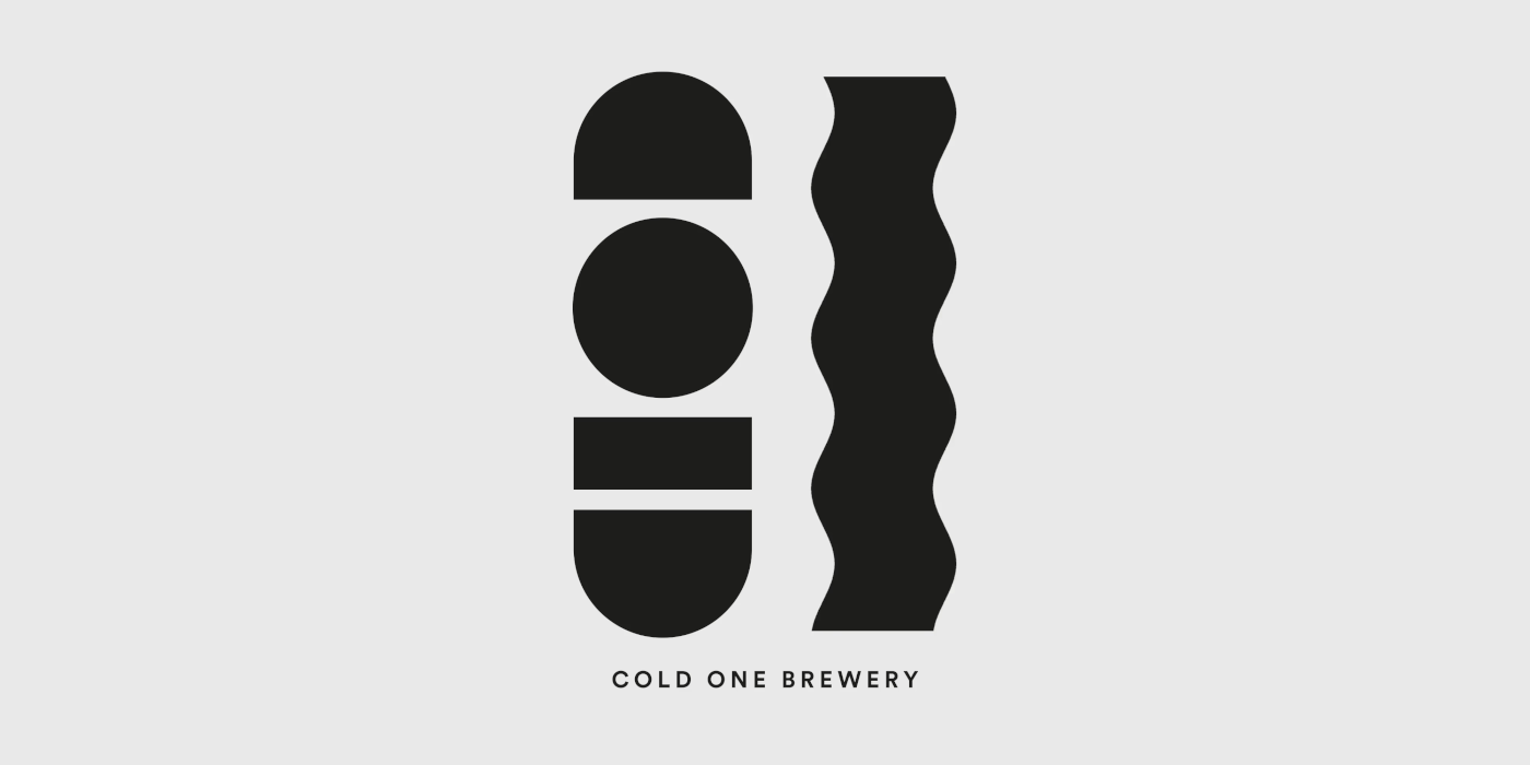
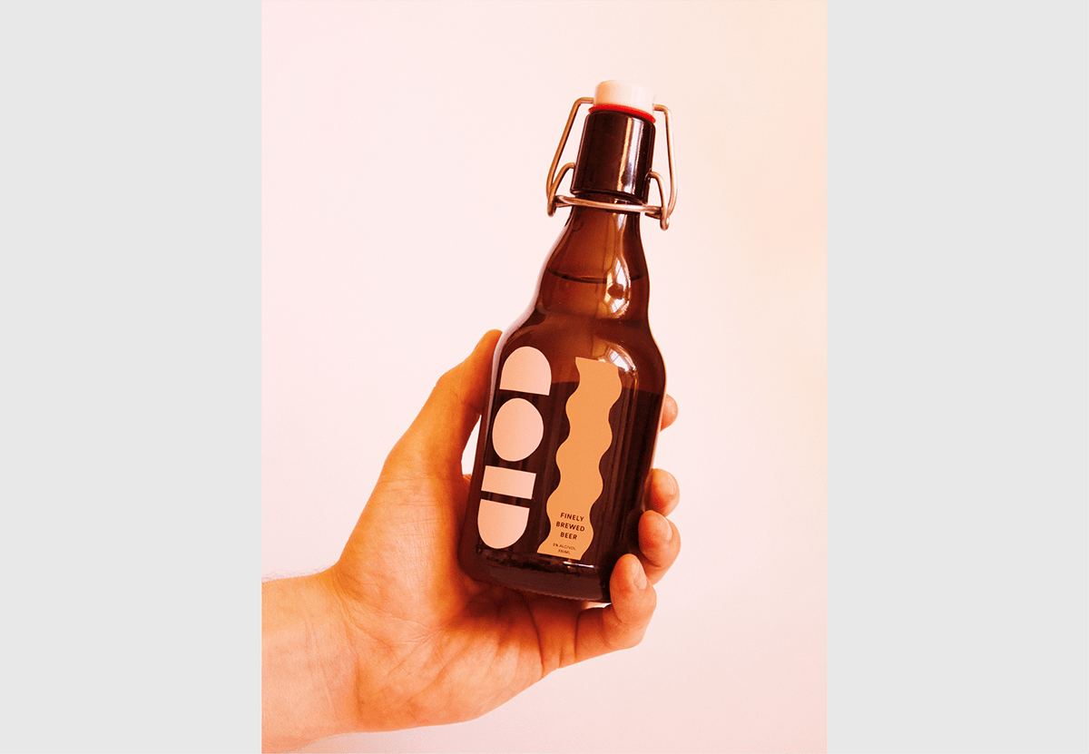
Most beer labels are can wraps or rectangular labels and, as I wanted to create a label to stand out, I designed a solution out of the status quo. These 'cut out' shapes stuck on the bottle not only abstractly read the name of the brand, but the bold graphic element helps them to stand out from other beers.
Challenges
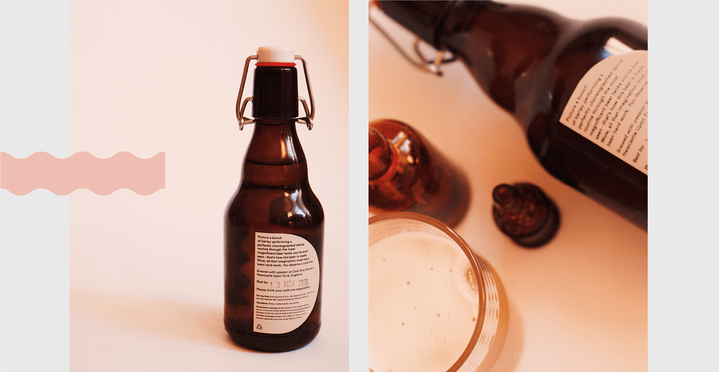
A challenge I faced was to create the shapes in a precise way in order to stick on the bottle as a prototype. I did not have a vinyl cutter or even a compass cutter so the only option was to print out the design on the desired stock and meticulously hand cut the shapes with a tiny pair of scissors. As this is a project I did for fun, it didn't matter too much how precise they turned out but luckily, it turned out well and I managed to clean up any faults in photoshop.
A challenge I faced was to create the shapes in a precise way in order to stick on the bottle as a prototype. I did not have a vinyl cutter or even a compass cutter so the only option was to print out the design on the desired stock and meticulously hand cut the shapes with a tiny pair of scissors. As this is a project I did for fun, it didn't matter too much how precise they turned out but luckily, it turned out well and I managed to clean up any faults in photoshop.
Solution
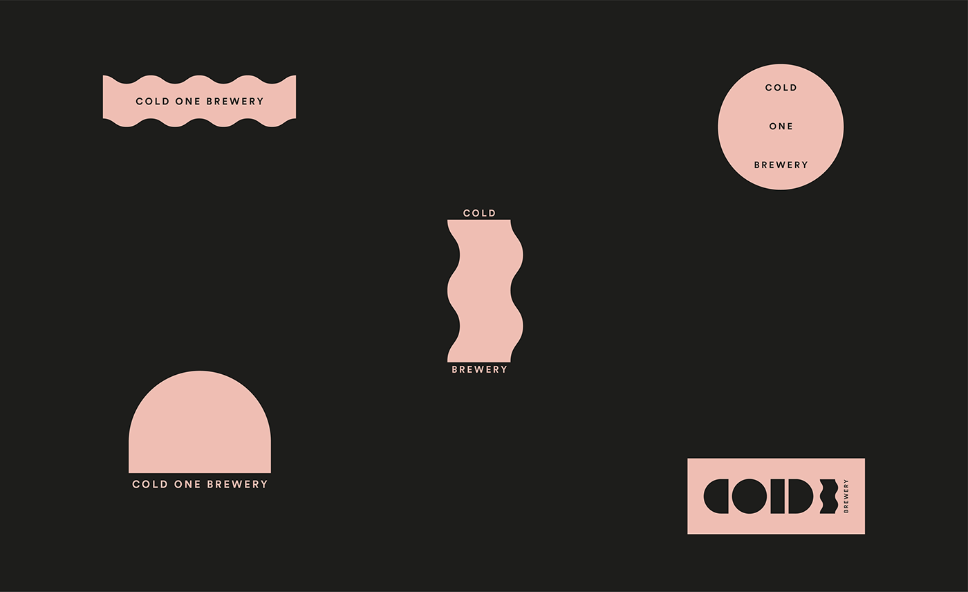
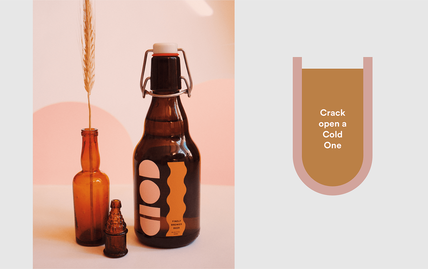
The solution I ended up with is appealing to the target market as lots of my female friends kindly let me know they would buy the beer if it ever went on sale. The bold graphic shapes allow for varied social media content to be easily made with simple changes to the scale and colours of the shapes. Whilst this design was created with females in mind, I did not want it to be exclusive so I created a more neutral colour palette.
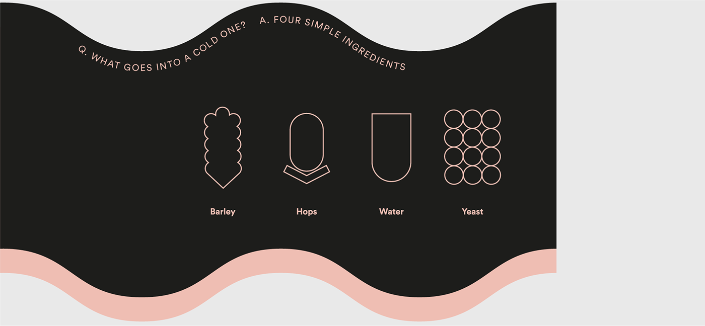
When photographing the project, I included dried barley to represent one of the key ingredients of the beer that is also included in the beer story on the label on the back of the bottle. I also created brand style guides to show how all the elements come together to form the brand of 'Cold One Brewery'.


