YU SHENG is a dish that contains various symbolism and is often overlooked. With advancement in media and technology, this transition replaces an old way of life with what we deem as trendy. Design with heavy Chinese elements are often regarded as old-fashion and traditional.
I wanted to inject creativity into branding a Yu Sheng restaurant and designing in a way with relevance in today’s society, so that younger generations take on a different perspective of the dish and Chinese design. It is important that they understand their cultural heritage and remember their roots.

THE LOGO
The logo design is created from the dot grid and is a combination of two words, 愉 and 生. 愉 translates to happiness and 生 means life. The red dot represents the fish, which is the main ingredient of Yu Sheng.


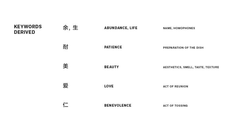
BASIC SYMBOLS
Each symbol represents a certain value (Abundance, Life, Patience, Beauty, Love and Benevolence). These symbols are created using the dot grid.

EXPANDED GRAPHICS
After more research, the basic symbols are further expanded. These graphics will be then be applied to the various deliverable.


CONCEPT BOOK; ABUNDANCE, LIFE
The book explains the entire concept of Yu Sheng where the symbolism, history, the how-tos, the values are presented like a story-telling journey.
It begins with an explanation of symbols as inserts, the symbolic meaning of food, Yu Sheng and how to Lo Hei. It then explains how we are affected by our senses, describes what the dish is about, it continues to clarify on the history of the dish, the misconceptions and ends with the reasons why we should keep the tradition alive.
It begins with an explanation of symbols as inserts, the symbolic meaning of food, Yu Sheng and how to Lo Hei. It then explains how we are affected by our senses, describes what the dish is about, it continues to clarify on the history of the dish, the misconceptions and ends with the reasons why we should keep the tradition alive.


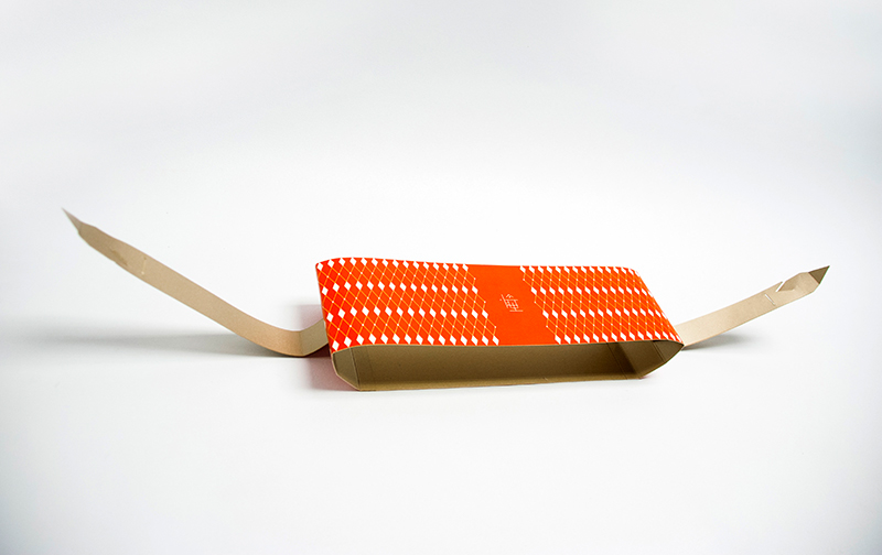
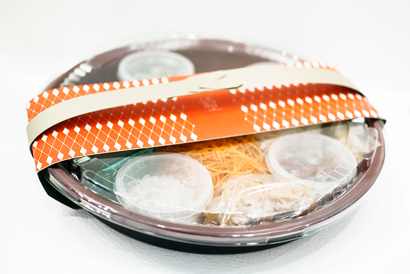
PACKAGING; BEAUTY
The packaging for Yu Sheng is a cost-effective carrier for take-away that depicts the structural beauty of the concept. The expanded symbol for beauty are also being applied onto the packaging. The existing mass produced take-away box that is often seen in the market is an effective solution for Yu Sheng and it would be redundant to come up with another as it would be considered as extra cost for the restaurant. Paper will also not be a good substitute to contain the dish as vegetables have water content and the moisture will destroy the material.
I decided on creating a carrier does not need additional folding, which will save time and money. The existing packaging for Yu Sheng can be easily slot into the carrier which will hold the Yu Sheng. It also comes with a handle to enable easy transportation of the take-away box.
I decided on creating a carrier does not need additional folding, which will save time and money. The existing packaging for Yu Sheng can be easily slot into the carrier which will hold the Yu Sheng. It also comes with a handle to enable easy transportation of the take-away box.


MENU; BENEVOLENCE
I wanted the menu to communicate the names and types of dish in a different way. When dishes were given beautiful names, it raised the appeal of the food. The names take on a colour-naming approach and use auspicious names that relates to wealth and elegance to add value and statues to them. Some of the names are also related to seasons.


DELIVERY PROMOTIONAL MAILER; LOVE
With delivery service right to the door step without extra charge, people can actually enjoy Yu Sheng in the comfort of their own home with everyone in the family.
The promotional mailer indicates the types of Yu Sheng the restaurant provides and creates awareness of this service.
The promotional mailer indicates the types of Yu Sheng the restaurant provides and creates awareness of this service.


DIY KIT; PATIENCE
The do-it-yourself kit in creating and arranging the dish trains and hones the patience of the user. Yu Sheng is a tedious dish to create due to the many ingredients required. Thus, people often purchase ready-made takeaways or consume the dish in restaurants.
The kit comes with the essential tools to create, ingredients, instructions and suggestions on how to arrange the dish. It allows the user to put effort in arranging the ingredients in different ways.
The kit comes with the essential tools to create, ingredients, instructions and suggestions on how to arrange the dish. It allows the user to put effort in arranging the ingredients in different ways.


