


Alto do Guadua
Brand Identity / Naming
_
[EN]
This is a fictional project that came between one nap and the next. I joined the need to study grids and naming with the desire to honor a magical piece of the state of Tocantins.
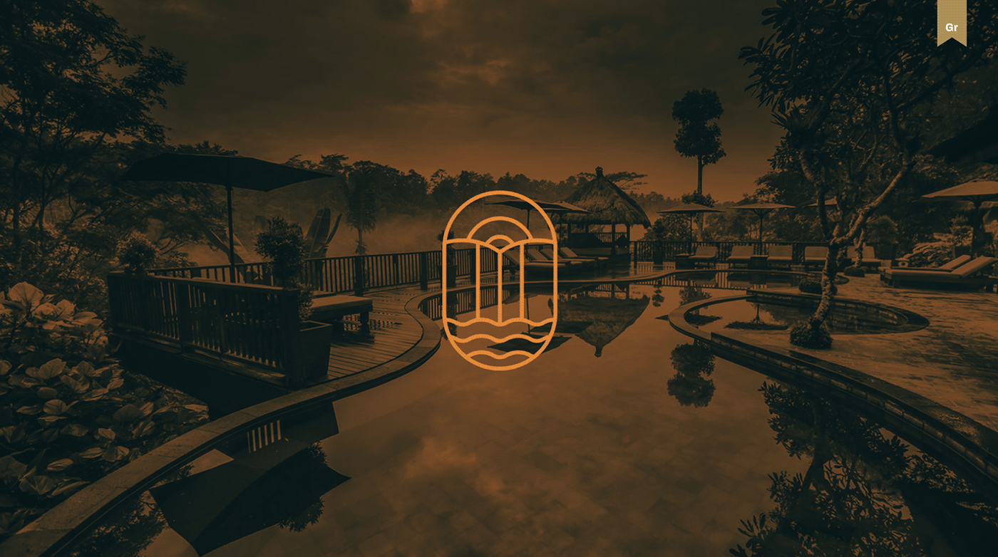
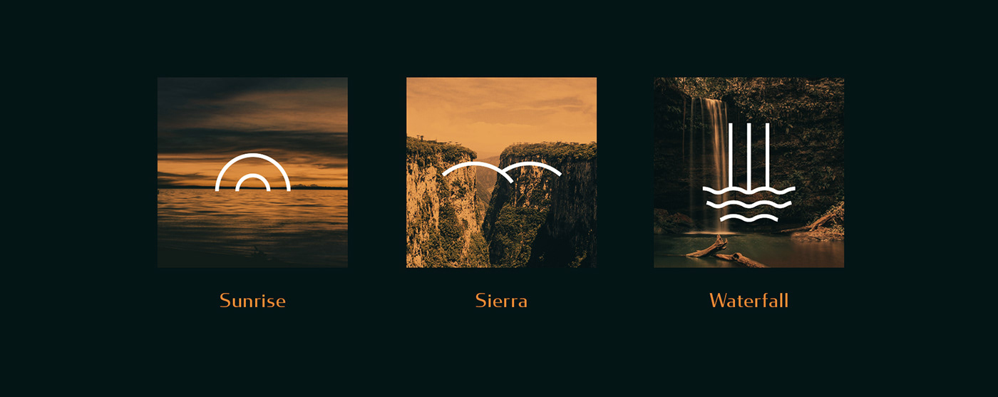
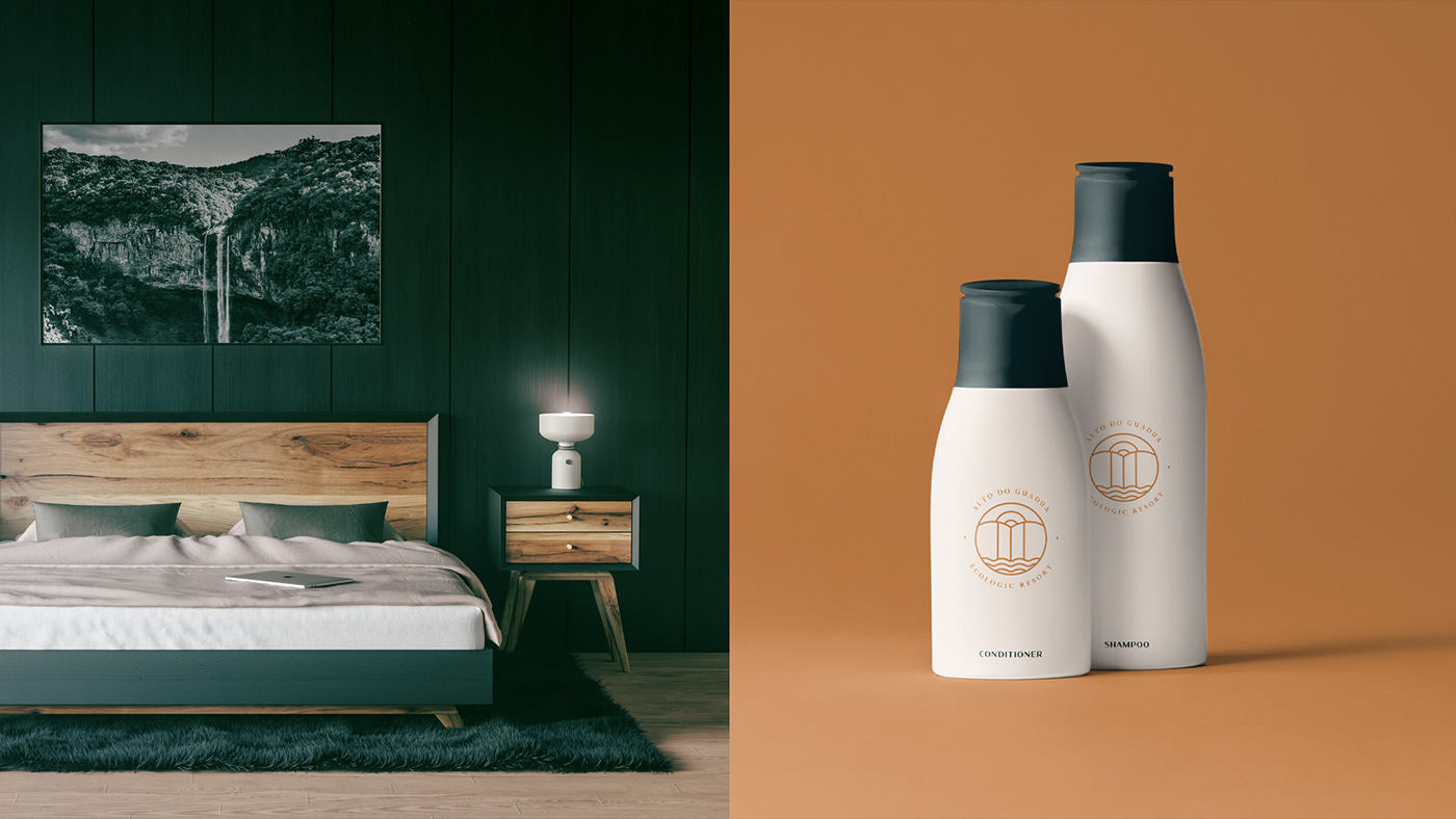
Surrounded by beautiful waterfalls, caves, viewpoints and rock inscriptions, Alto do Guadua is a resort located in Taquaruçu do Porto, district of the capital of Tocantins, Palmas. Built at the top of the Serra do Lajeado, in a preserved area, the place was designed to promote harmony between the environment and the guests, with rustic decor, but at the same time sophisticated. The main attributes of the brand are: modern, sophisticated and exclusive.
The name Guadua refers to the bamboo species found in Taquaruçu. Taquaruçu means "Taboca Grande" in the indigenous language, the large taboca is nothing less than bamboo. The name Alto do Guadua was chosen to honor one of the most common species in the district and to link the hotel to the fact that it is at the top of the Serra do Lajeado.
The name Guadua refers to the bamboo species found in Taquaruçu. Taquaruçu means "Taboca Grande" in the indigenous language, the large taboca is nothing less than bamboo. The name Alto do Guadua was chosen to honor one of the most common species in the district and to link the hotel to the fact that it is at the top of the Serra do Lajeado.
_
[PT]
Este é um projeto fictício que surgiu entre uma soneca e outra. Juntei a necessidade de estudar grids e naming com a vontade de homenagear um pedacinho mágico do estado do Tocantins.
Rodeado de belíssimas cachoeiras, grutas, mirantes e inscrições rupestres o Alto do Guadua é um resort localizado em Taquaruçu do Porto, distrito da capital do Tocantins, Palmas. Construído no alto da serra do Lajeado, em área preservada, o local foi projetado para promover harmonia entre o ambiente e os hóspedes, com decoração rústica, mas ao mesmo tempo sofisticada. Os principais atributos da marca são: moderna, sofisticada e exclusiva.
O nome Guadua é referente a espécie de bambu muito encontrada em Taquaruçu. Taquaruçu significa "Taboca Grande" na língua indígena, a taboca grande é nada mais nada menos que o bambu. O nome Alto do Guadua foi escolhido para homenagear uma das espécies mais comuns no distrito e ligar o hotel ao fato de estar no alto da Serra do Lajeado.
[EN]
The colors are a reference to the tones found in the landscapes of Taquaruçu: land, flowers and leaves. The golden was chosen for some applications to bring elegance and exclusivity to the brand and resemble "capim dourado", symbol of the state of Tocantins.
[PT]
As cores são referência aos tons encontrados nas paisagens de Taquaruçu: terra, flores e folhas. O dourado foi escolhido para algumas aplicações para trazer elegância e exclusividade à marca e lembram o capim dourado, símbolo do estado do Tocantins.

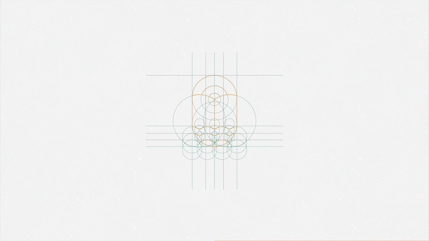
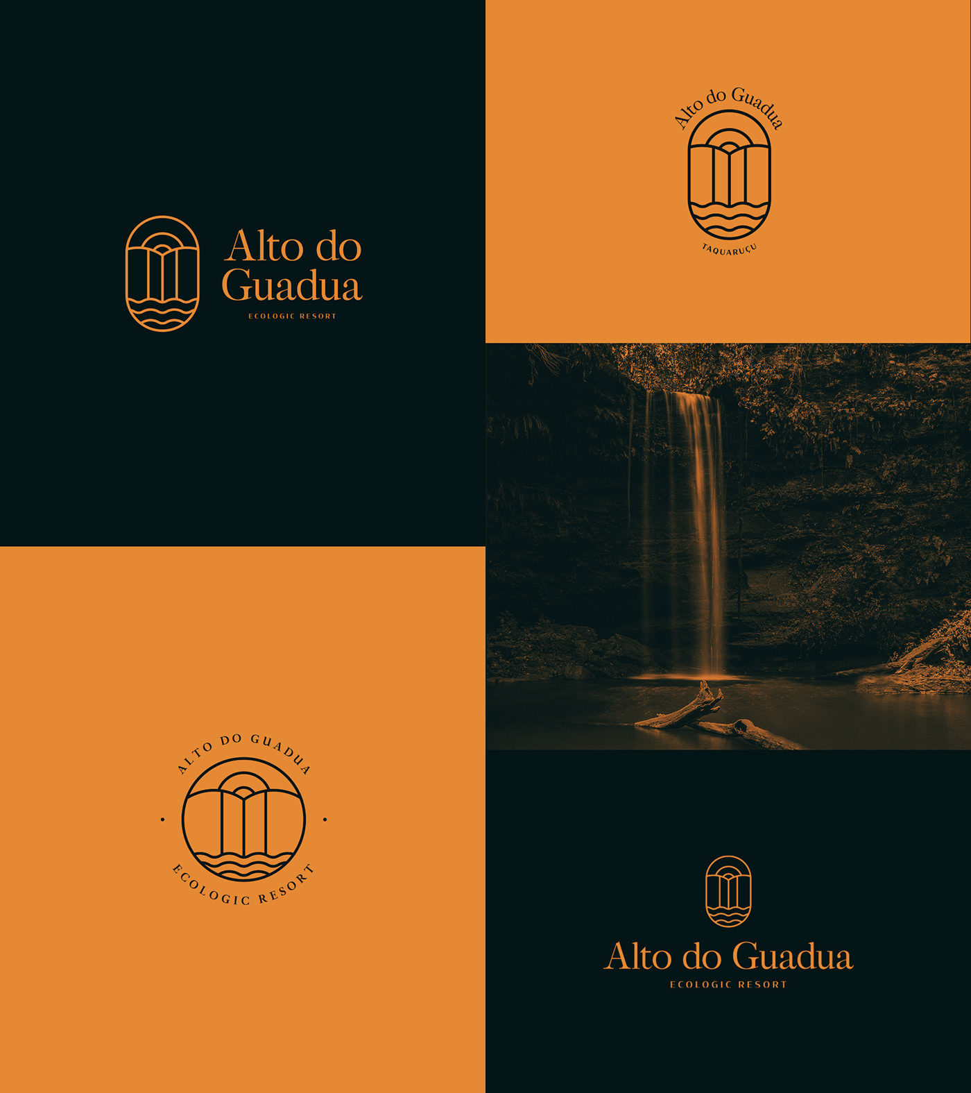
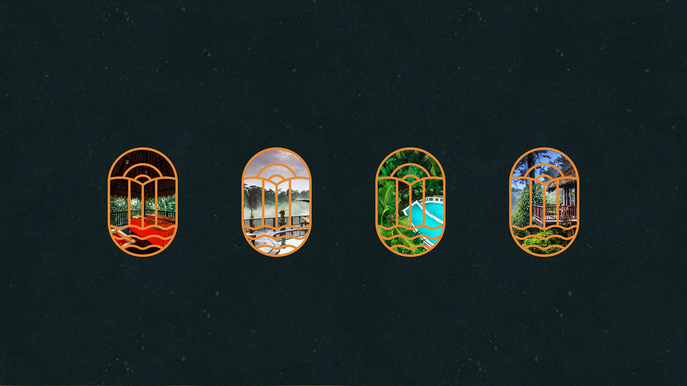
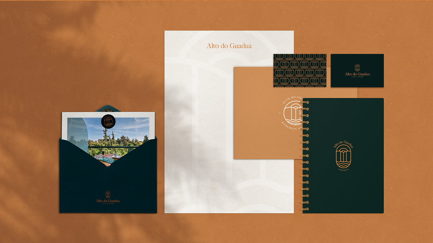
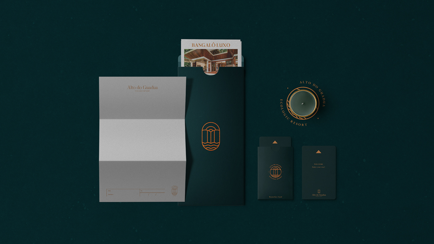
[EN] Four versions of the logo were created, aiming at greater versatility of the brand.
[PT] Foram criadas quatro versões do logo, com intuito de maior versatilidade da marca.
[EN]
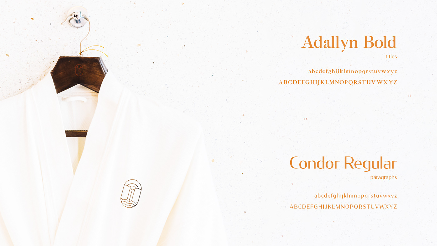
Adallyn is the main font, a modern serif, which was chosen with the aim of giving a feeling of sophistication, luxury and refinement. Condor is a high contrast sans serif that brings a contemporary vision and a balance with the main font.
[PT]
Adallyn é a fonte principal, uma serifa moderna, que foi escolhida com o objetivo de passar a sensação de sofisticação, luxo e requinte. Condor é uma sem serifa de alto contraste que traz uma visão contemporânea e um equilíbrio com a fonte principal.


This project is available for purchase.
Thanks for your time. If you liked, gives a thumb up.
Interested on the project? Send us an inbox. :)


