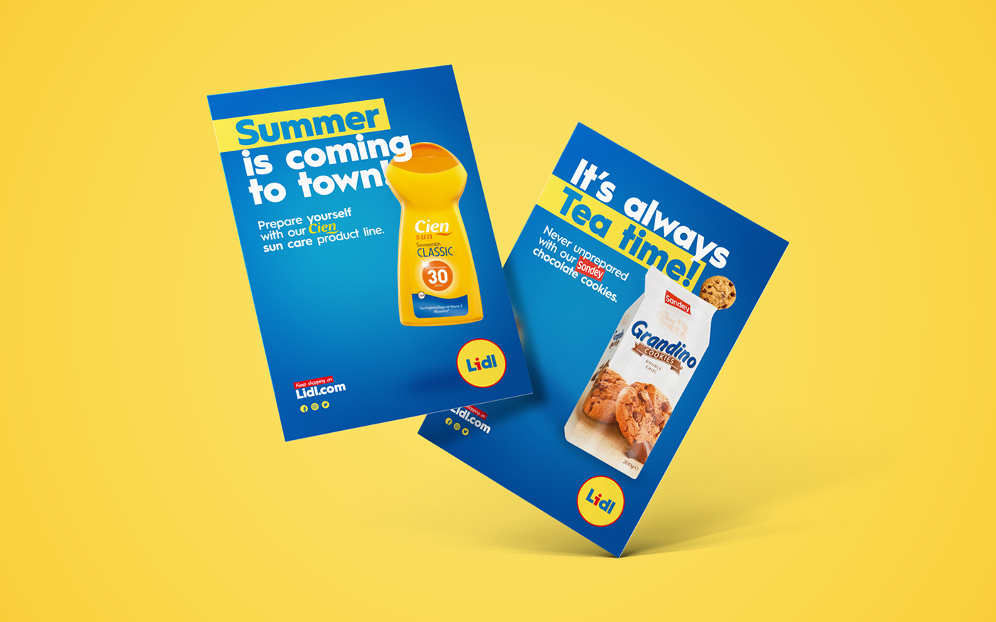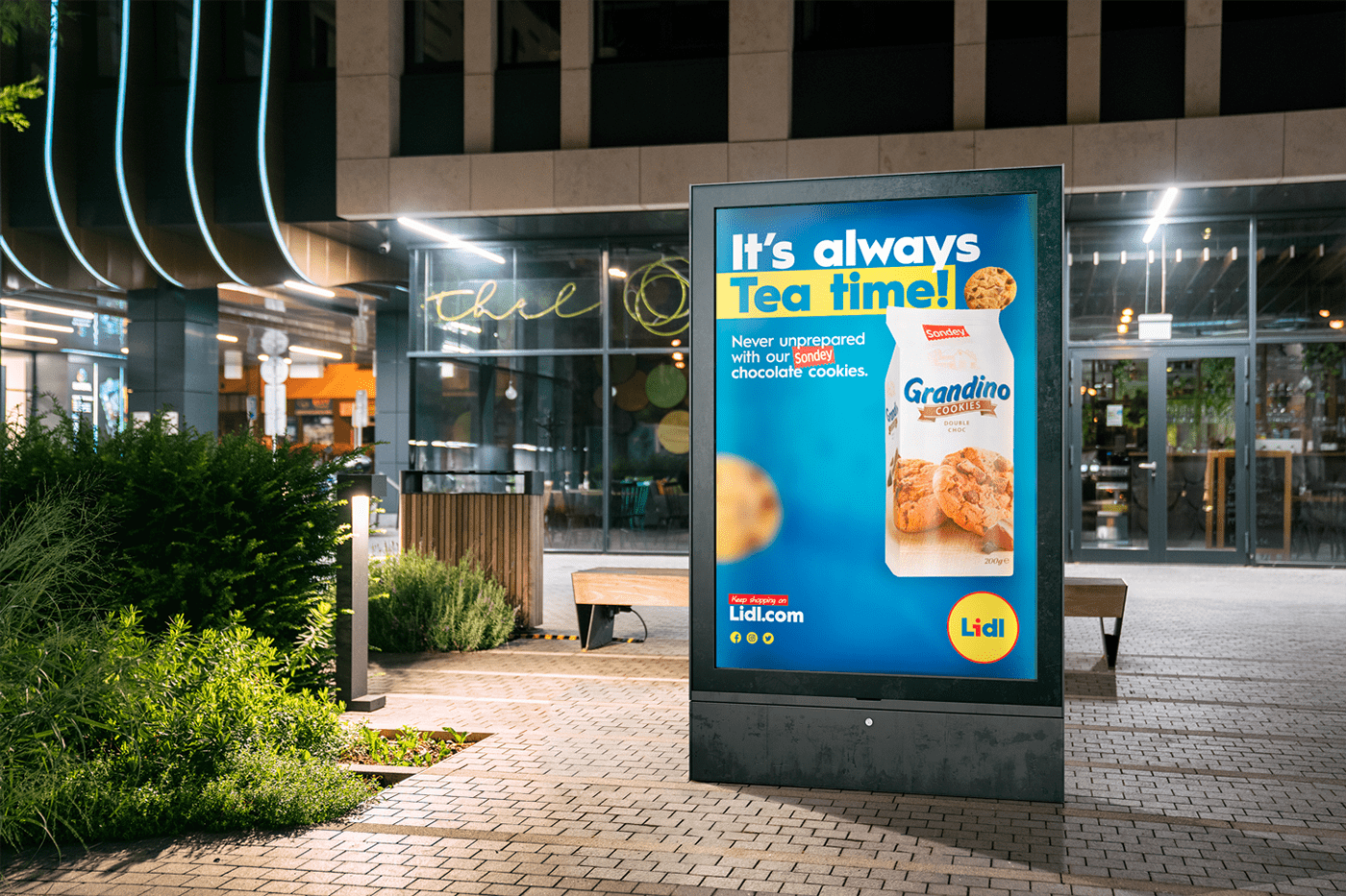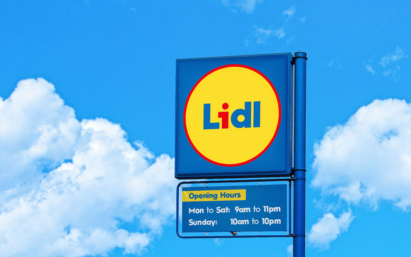
Lidl supermarket restyling concept
There ain't no doubt LIDL is my all time favourite supermarket.
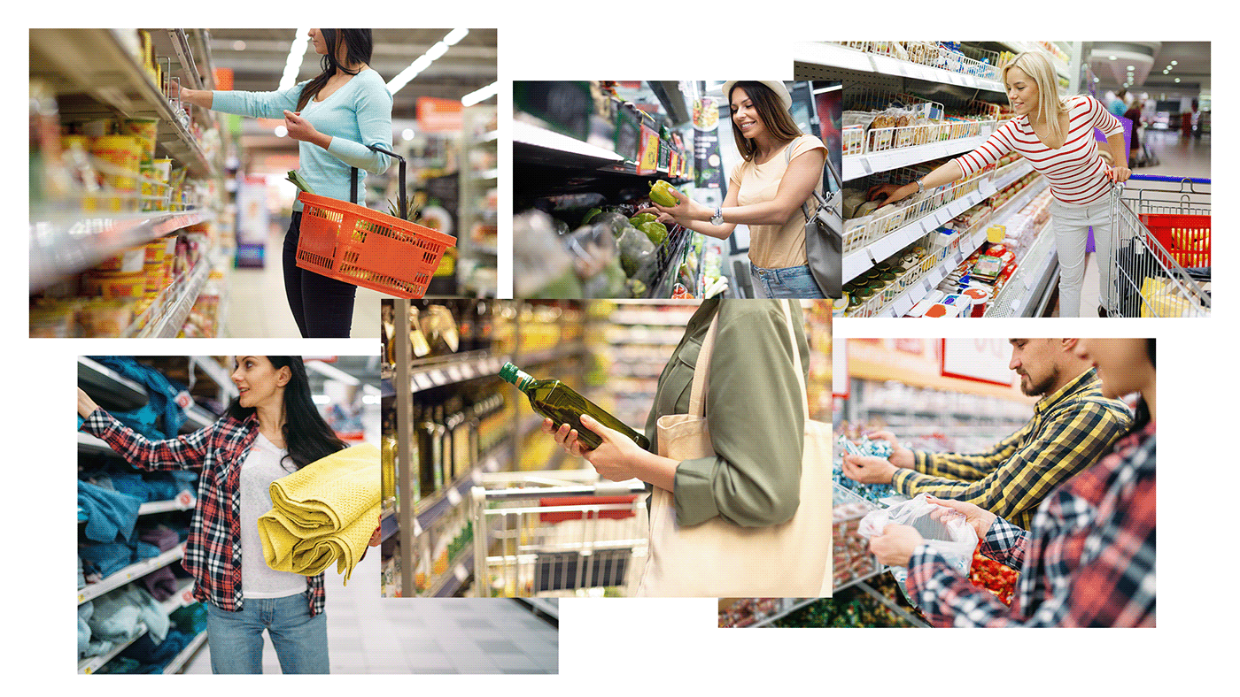
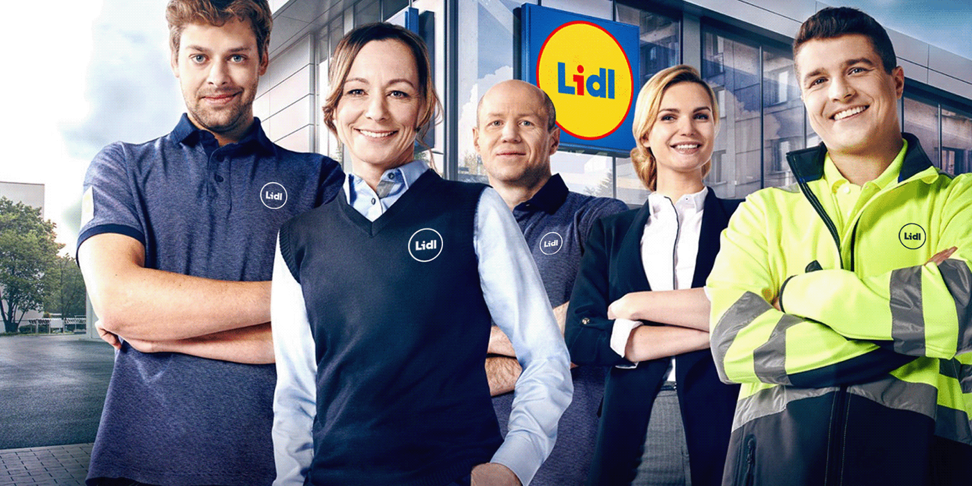
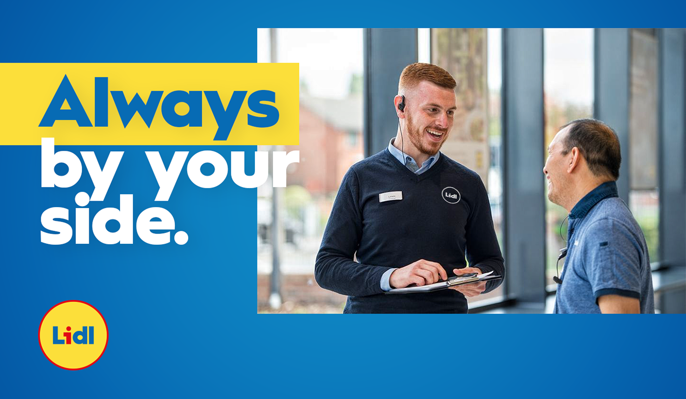
Prices are good, food is great, staff is lovely and you have always a beautiful and big car parking. Also, they have some amazing butter croissants.
Prices are good, food is great, staff is lovely and you have always a beautiful and big car parking. Also, they have some amazing butter croissants.
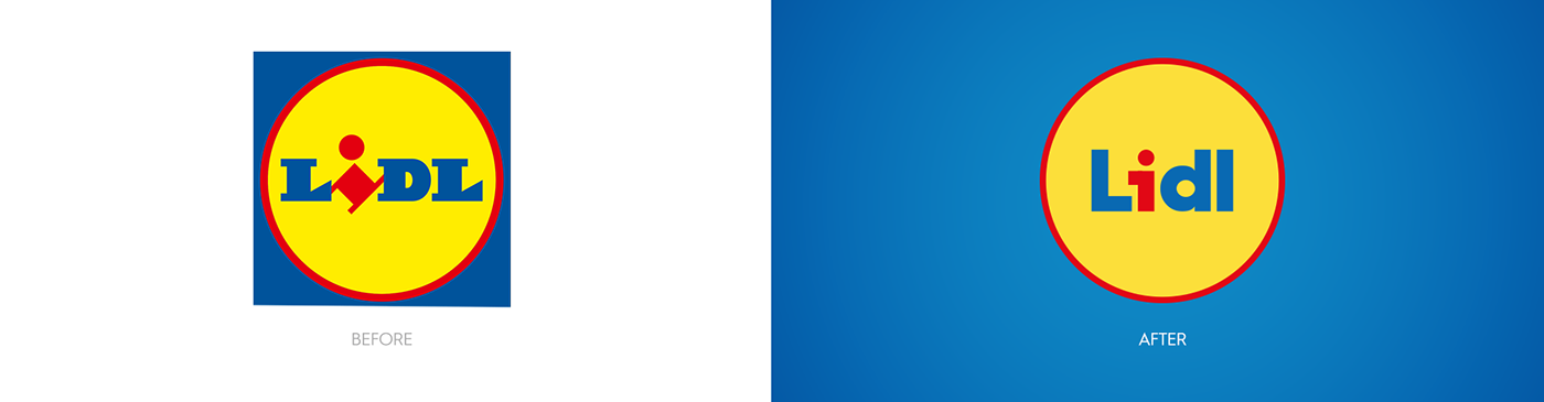
As I discovered, this supermarket chain was founded back in 1930 in Germany, and kept expanding until today with more than 10.000 stores across the world.
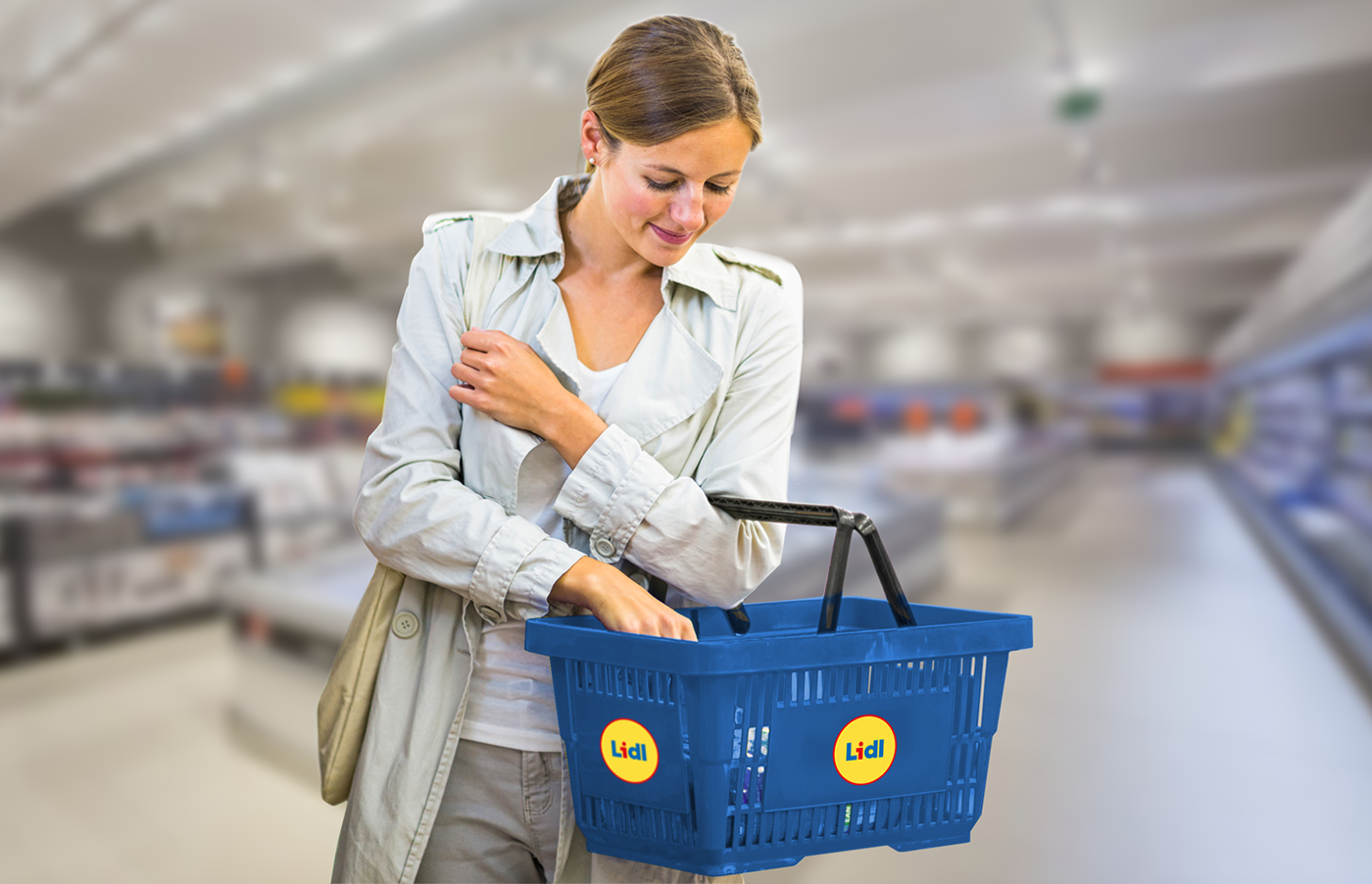
Nowadays, I think its logo needs a bit of a restyling: too much sharp edges, BIG & BOLD typography, old blue and dull yellow makes it unfit to the modern visual world, and the image the chain wants to show.
At least the image I believe the firm needs to show: fresh, modern, easy, familiar and affordable. And obviously, let's not forget about red, yellow and blue.
So I made this project.
I hope you'll enjoy it.