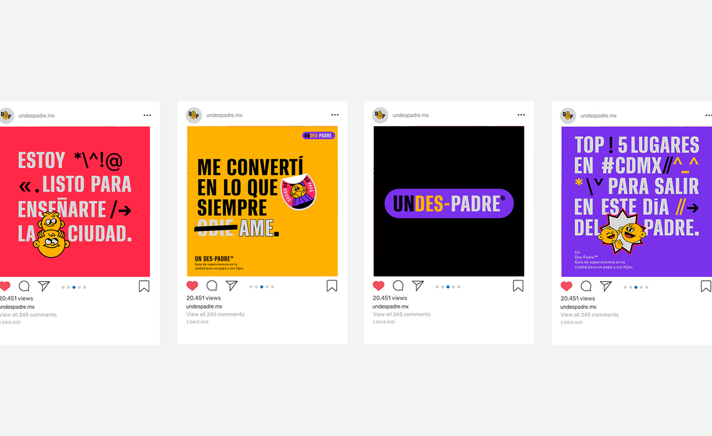


Year: 2019 Role: Master Design Client: Un-Des-Padre™


UNDES-PADRE™ City survival guide for a dad and his kids.
Mr. Lucifer blessed us to create a project dedicated to dads who like to be backpackers in their city.
UnDesPadre is an Instagram account that visualizes places of food, adventure and fun.

01 DESIGN APPROACH
Undes-padre is a brand characterized by humor, fun and a touch of adventure.
So it was important to discover the color palette. The elements of branding are similar to camping badges.


02 COLOR PALETTE
Undes-padre is a brand characterized by humor, fun and a touch of adventure. So it was important to discover the color palette. The elements of branding are similar to camping badges.

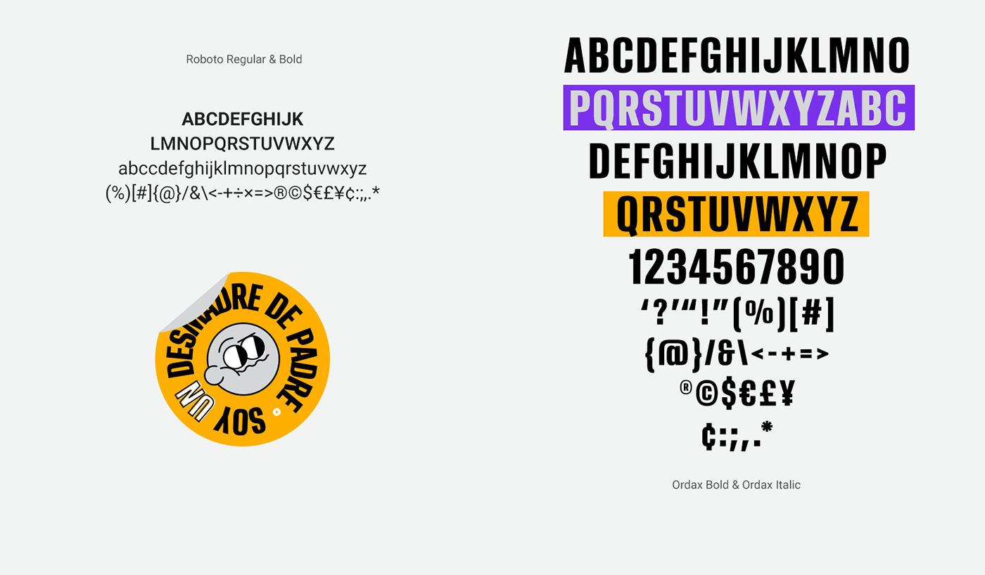
03 FONT &TYPES
For this project we use 2 fonts, modified ORDAX was used for headlines
and ROBOTO in bold and regular for support text.


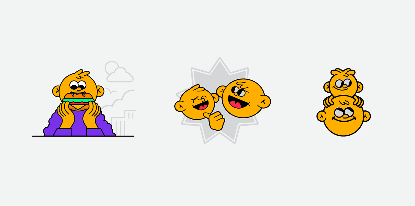
04 GRAPHIC ELEMENTS
Children's illustrations with an adult focus were created, inspired by the simpsons and cartoon network illustrations. We create different ways of living together with illustration and typography.