


翌耕名片
我們的客戶 - 台灣從事手工皂製作和銷售試圖將品牌形象重新設計,將設計定位在“純粹”。
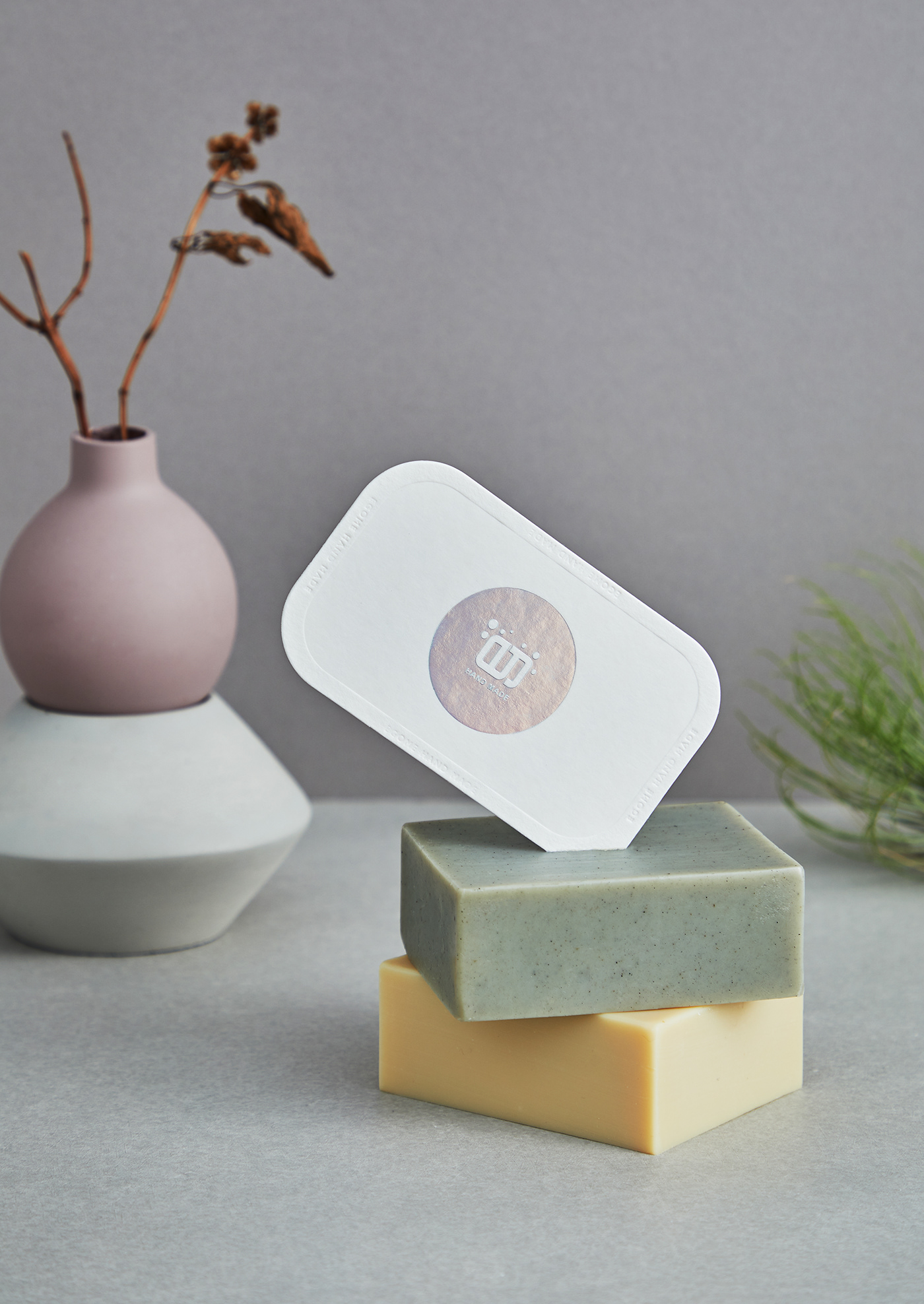
我們依循先前包裝概念繼續延伸出名片,透過皂盒的概念,將名片設計成可以一個呈現肥皂不同顏色的意象,構成整個視覺的特別性,並強化產品的純粹與乾淨的重要性。白色是主要顏色,因為設計是襯托產品本身的價值。散發出人們現在追求簡單的意象。
為實現這目標,我們使用德國棉卡。作為加工細節,我們決定全程使用燙印與打凹在名片的上增加層次。
為了傳達該產品別都有它的特殊性,因此名片上燙雷射去映照出產品的多樣化,讓消費者快速了解品牌意象。
為了傳達該產品別都有它的特殊性,因此名片上燙雷射去映照出產品的多樣化,讓消費者快速了解品牌意象。
EGOME NAME CARD
-
Our Client - EGOME is a Company that based in Taiwan which produce & sell hand-made hand soap. In order to help them to redesign their branding, the design direction will be “PURE”.
-
Our Client - EGOME is a Company that based in Taiwan which produce & sell hand-made hand soap. In order to help them to redesign their branding, the design direction will be “PURE”.
By following the previous packaging concept, based on it we’ve come out with a name card. Through the concept of the soap box, we create the name card into a different colour as to present a particularity visual and strengthen the purity/cleanliness of the product. White as the main colour is to bring out the value of the product own. It also fullfill the simplicity which most of the customer looking for.
To achieve our target, we will be using Gmund Fluffy Cotton Card. As the additional part, we’ve decided to use stamping with embossing on the name card to increase the layering.
In order to present the particularity of the product, we also applied hot laser on the name card so can reflect the diversification of the product so that our consumer can have quick identification on our branding.


Creative Director | Kevin Lin
Designer | Kevin Lin
Photographer | Férguson Chang
Print | 金彩包裝
Client | 翌耕工作坊


