Rebranding of the city of Marseille
Marseille is France's second largest city. It is located in the south of France by the middle of the sea. It is therefore an important port, economic center and administrative center of the southern part of France.
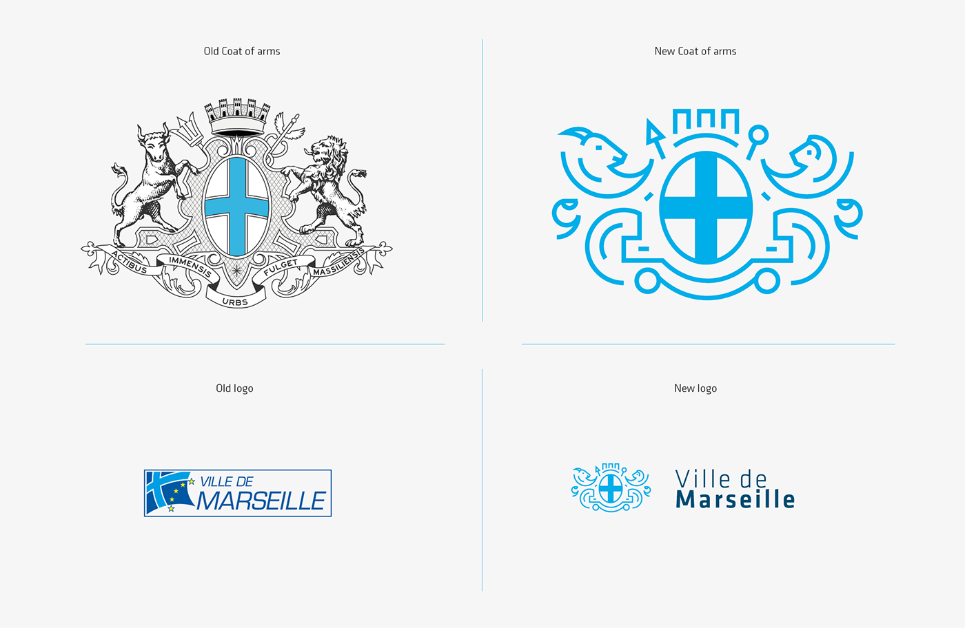
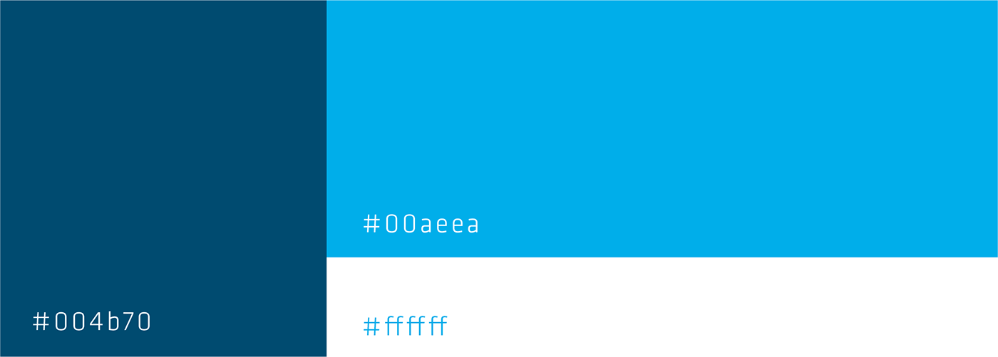
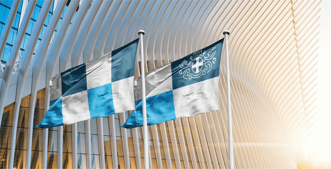
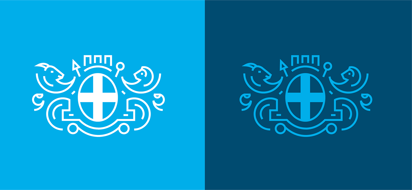
The coat of arms of Marseille has witnessed its existence since the 14th century. The current version was adopted in 1883.The blazon proper of Marseille consists of a silver field (white) with a cross of azure (blue). It has its origin in the colors of the city's flag. Behind the shield itself are placed a trident and a silver caduceus placed in saltire (on blade). The trident is associated with seas and fishing. The caduceus is usually presented as a symbol of commerce. The heraldic supports, the figures that flank the shield, are the figures of a bull and a lion, both of silver. The bull, located in the right hand of the shield (left of the spectator), is a rampant and guard (erect and watching the spectator). The lion is a rampant.
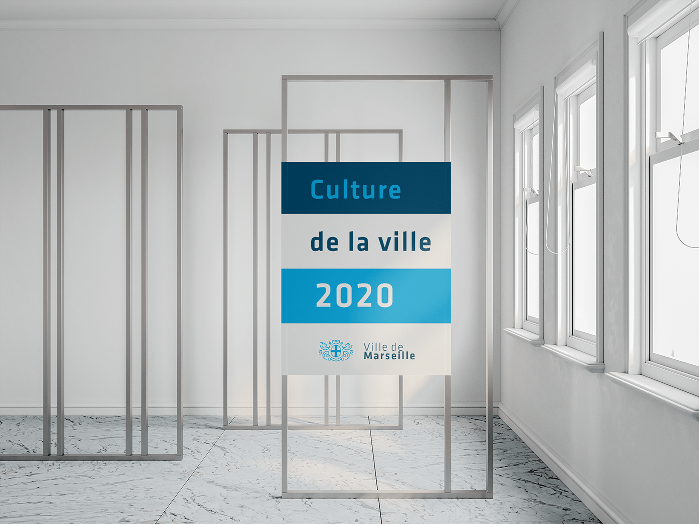
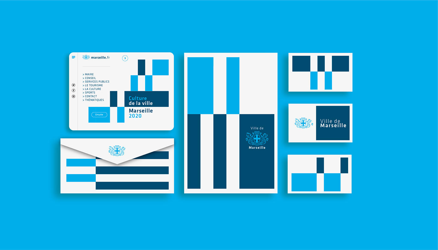
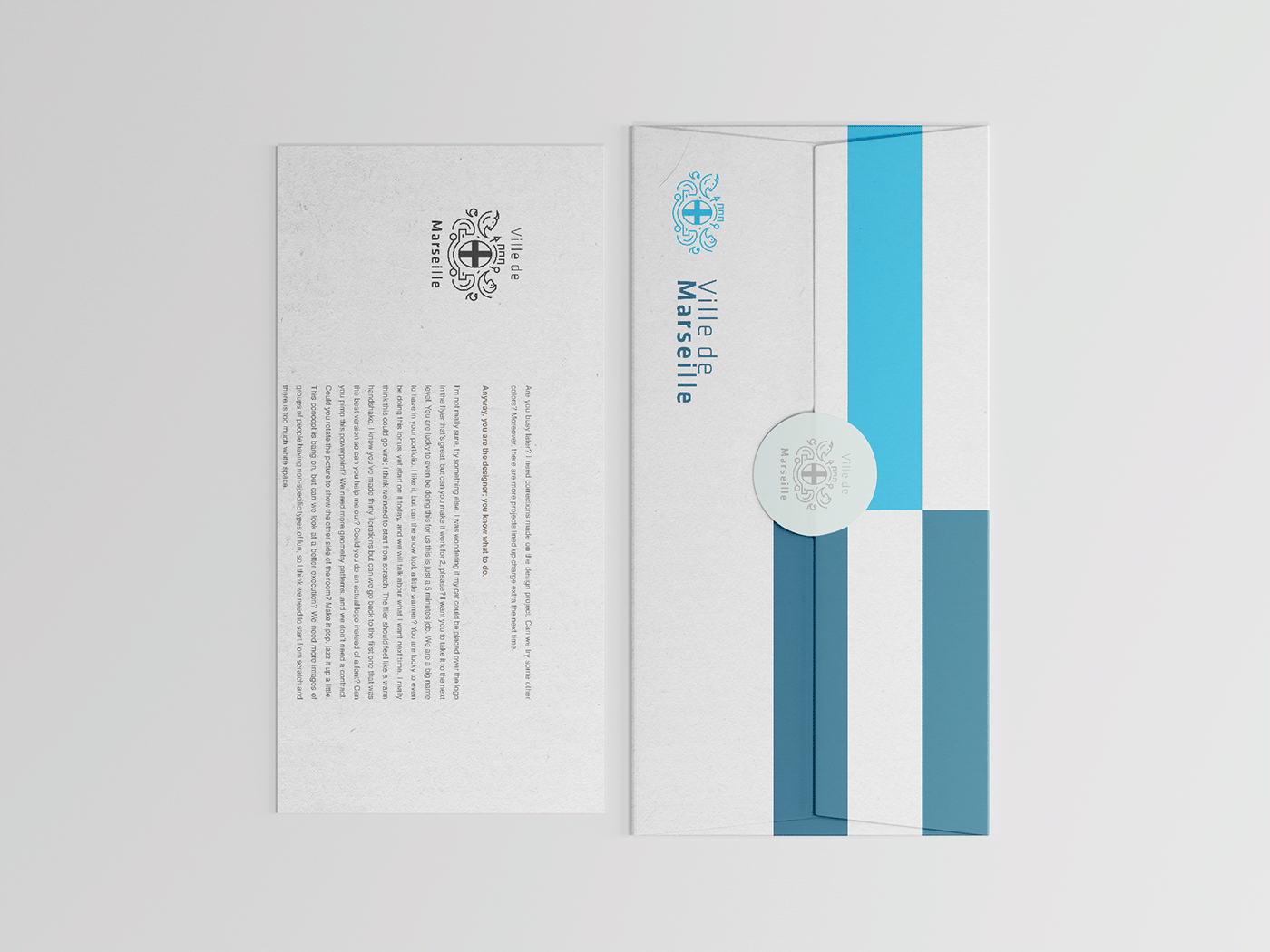
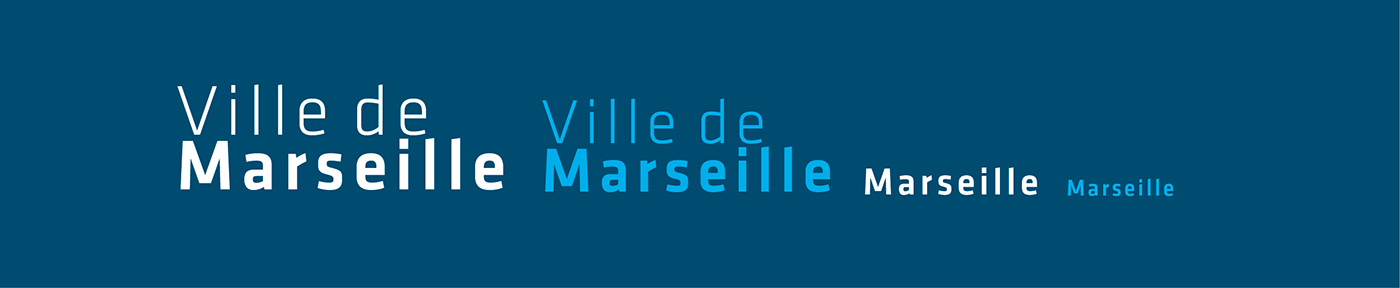
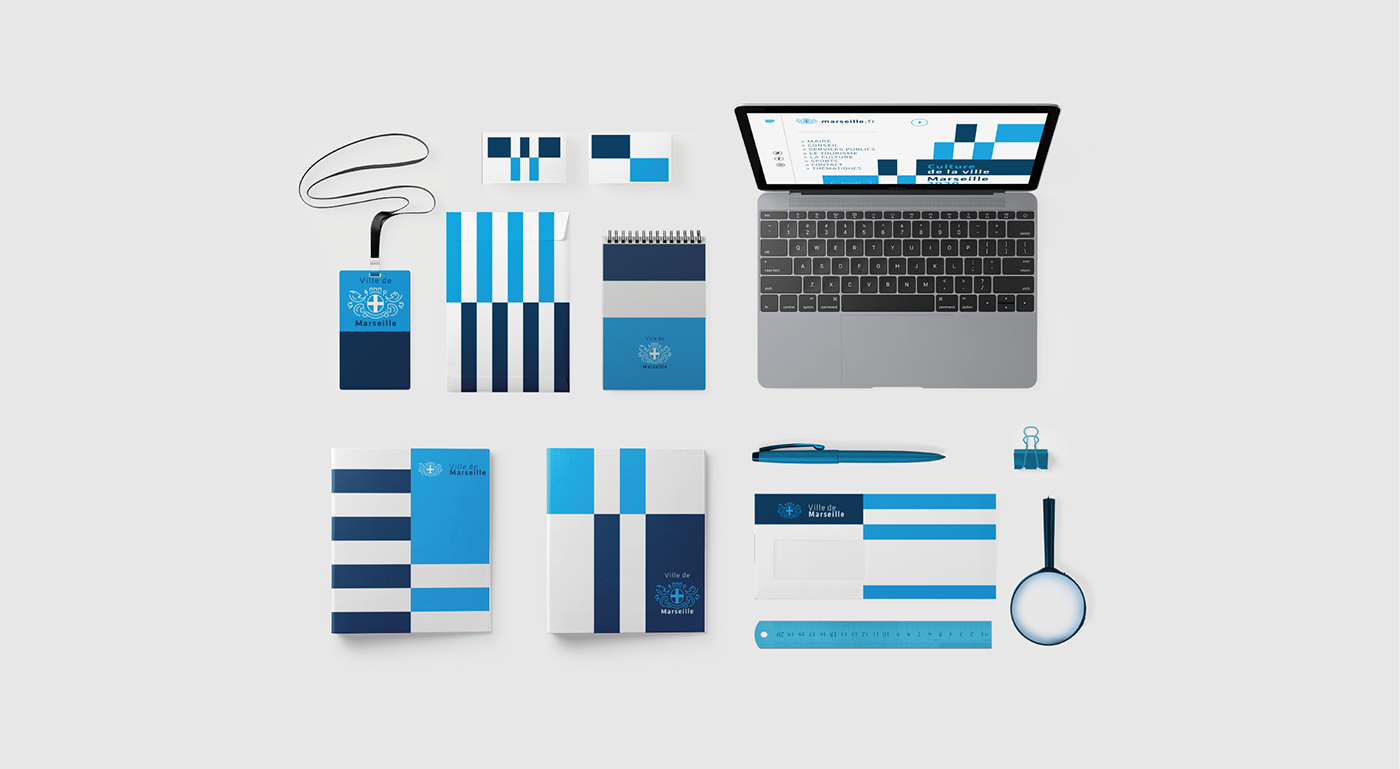
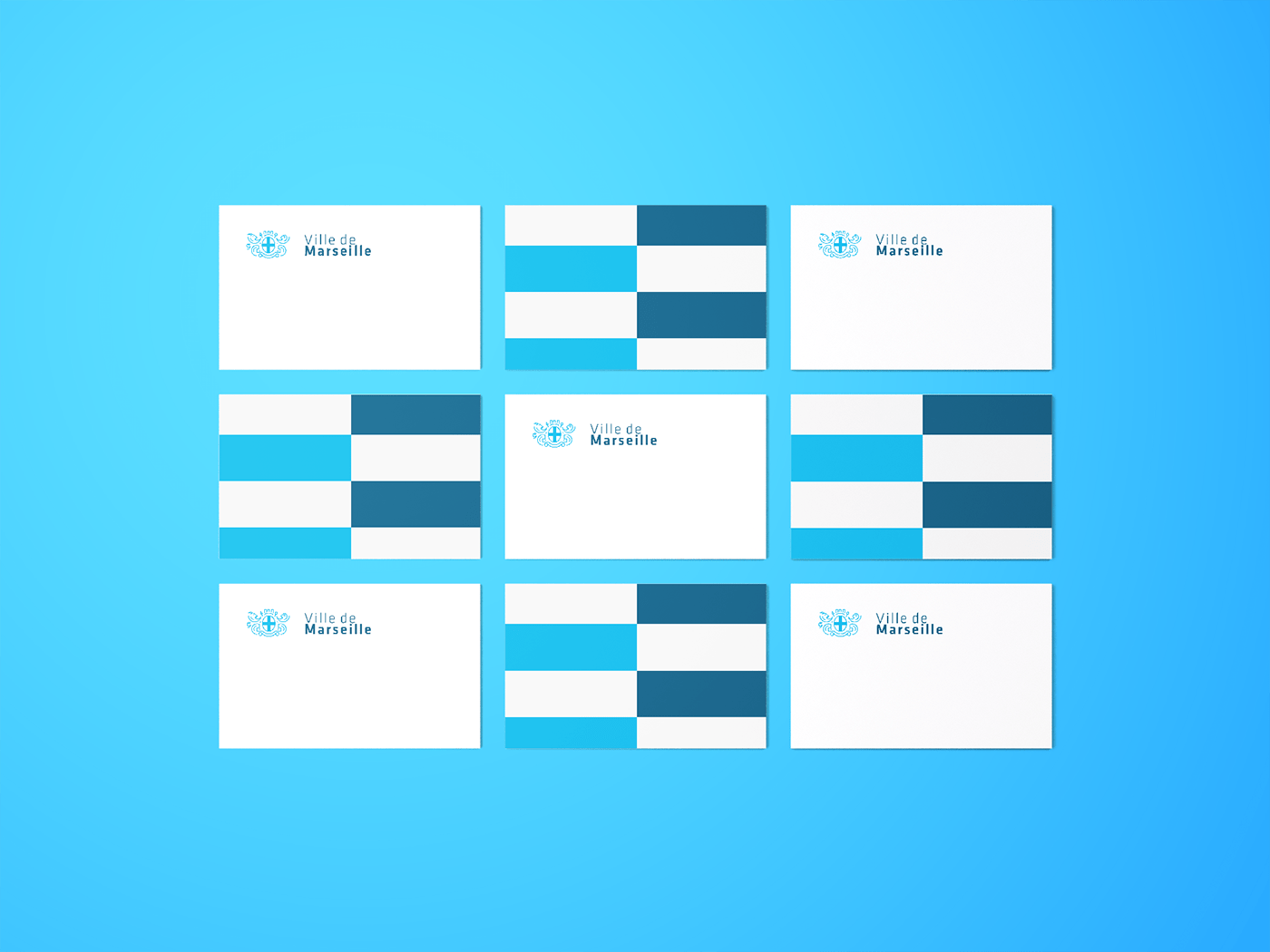
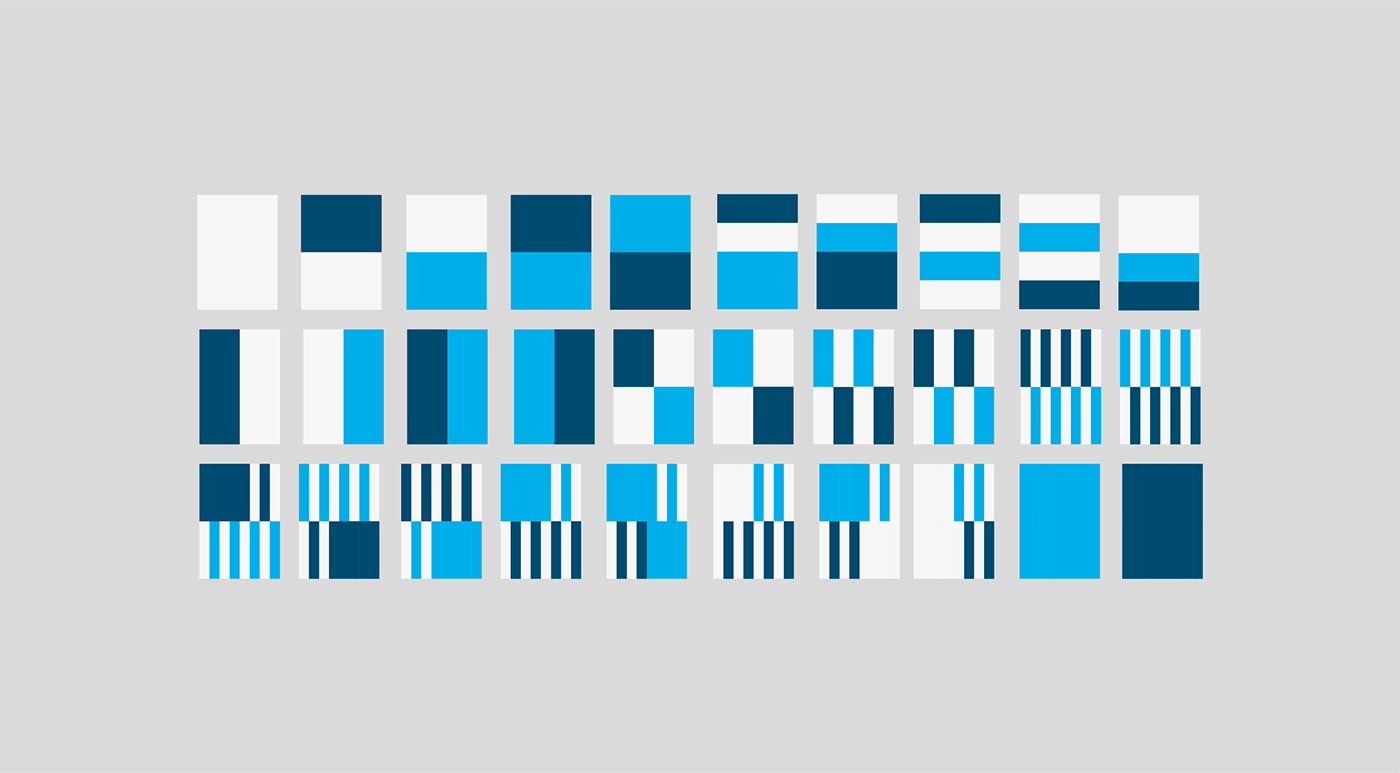
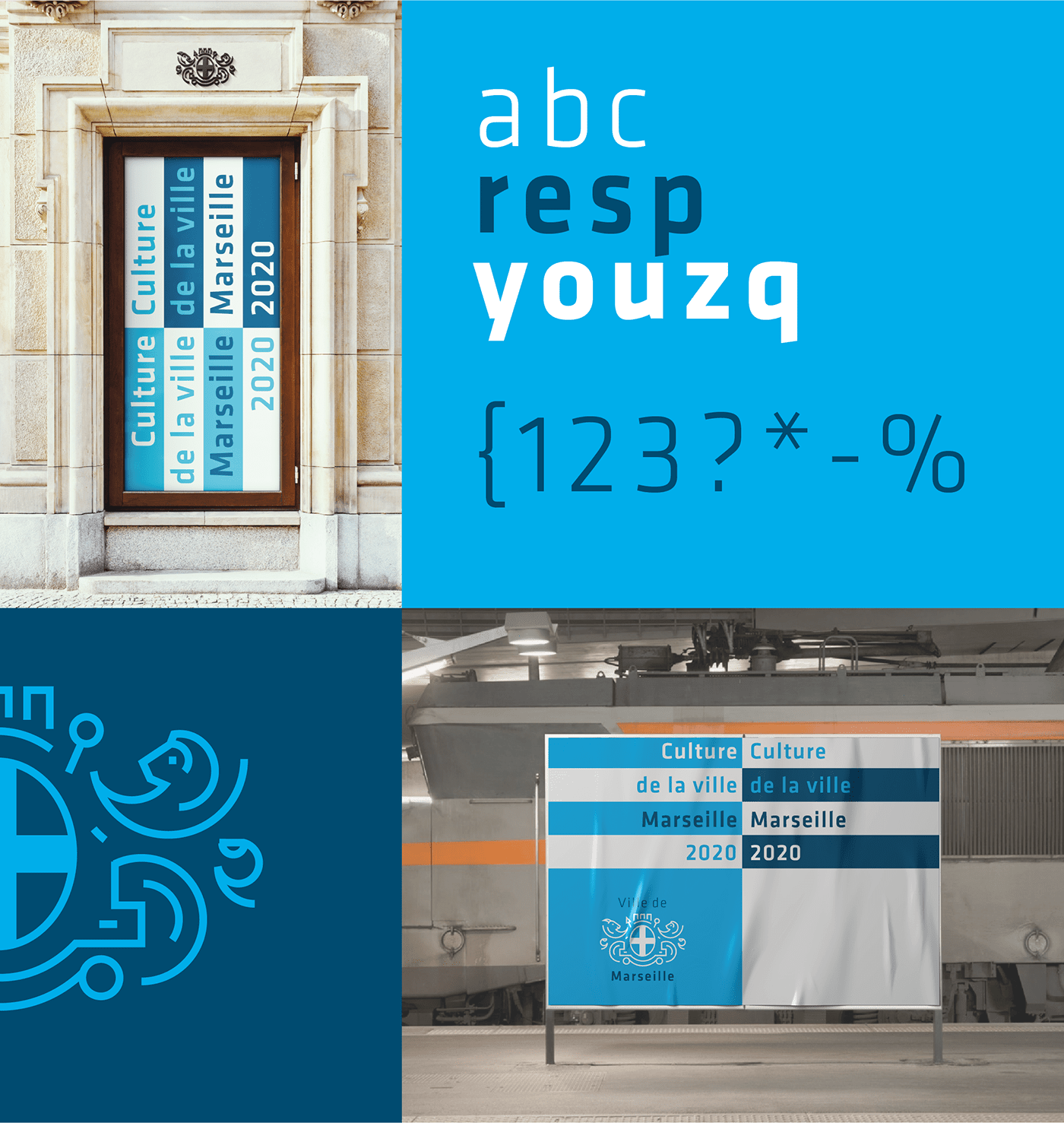
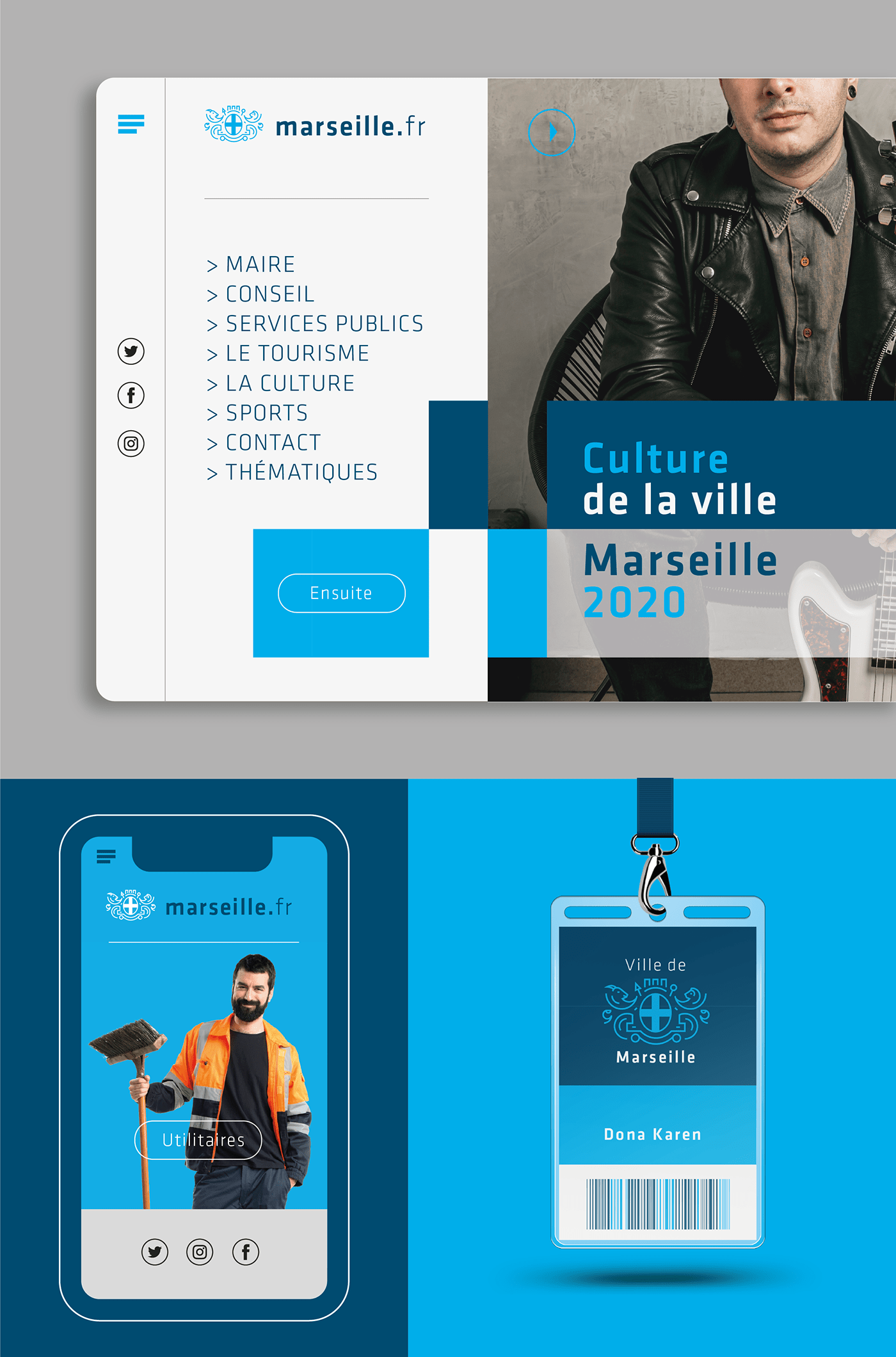
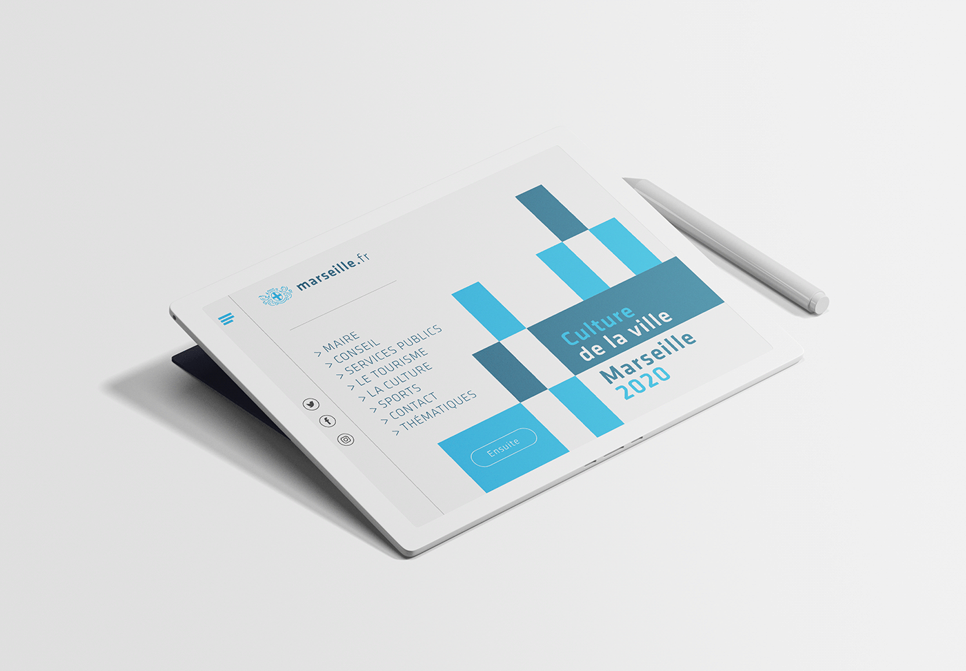
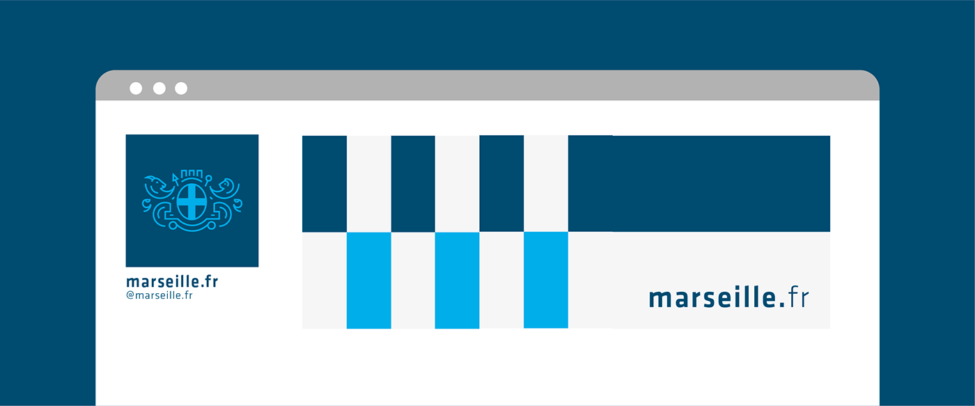
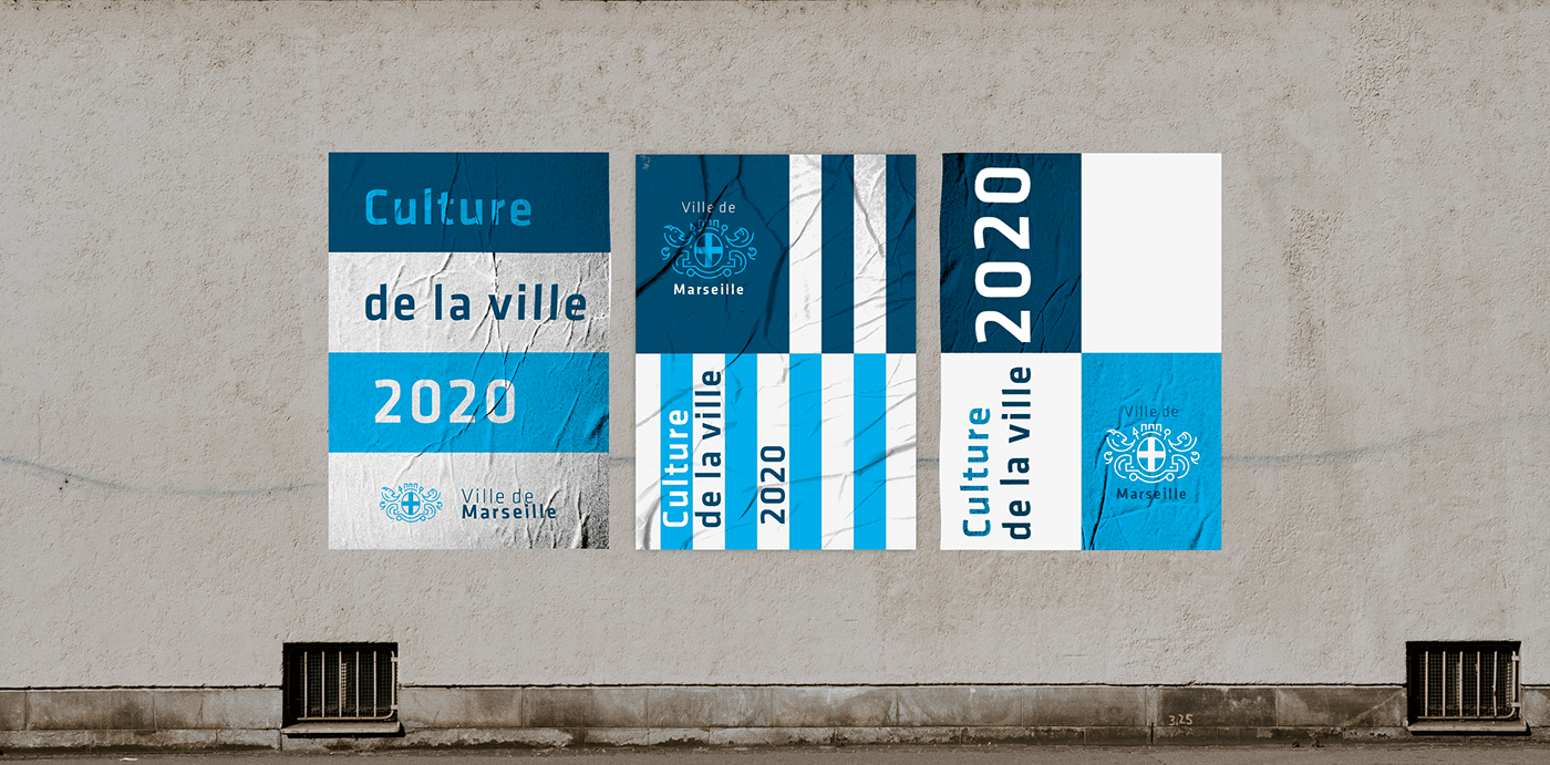
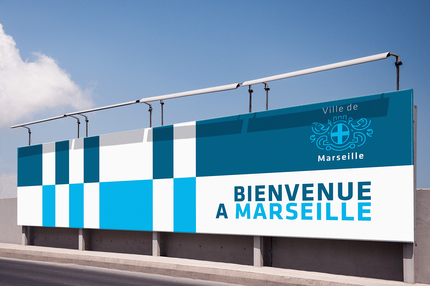
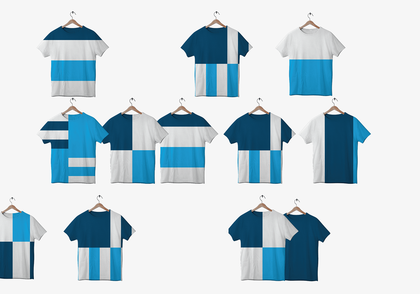
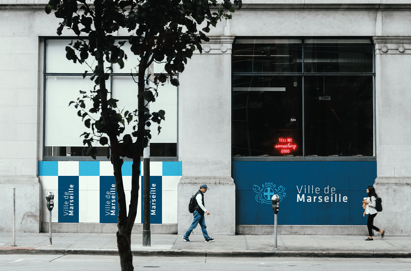
The main purpose of rebranding is to define the logo. The city used two logos, a coat of arms with an inscription and logos to illustrate the city's flag. The decision was to design a uniform and unique logo that originated from the old town coat of arms. The image of the coat of arms in the logo is simplistic and minimalist in design. The logo is now applicable to various versions of presentations, contemporary media and digital marketing. The corporate identity comes from the colors of the city and simple elements that can be used in many ways.
My main focus was on the visual and content communication. This will make it easier and more efficient to communicate with different publics.