This project is to rebrand the identity and packaging of Magellan’s Travel Gear. The purpose of the rebranding is to target a wider audience, which mainly focuses on travel enthusiasts from age 20 to 35, from beginners to experts.

The design of the new Magellan’s is inspired by the word “recording.” The logo design integrates the essence of stamps and the crown of a watch to symbolize the recording of the travel path and time as well as the look of a gear that generates excitement.


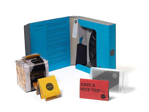
The different colors of the inside packaging are based on the product categories, including packing (bright red), electronics (bright green), travel comfort (celestial blue), clothing (pure white), personal care (lemon yellow), food & beverages (cosmic orange), and maps & books (chocolate brown).

The packaging forms offer an thrilling unveiling ceremony through the language of notebooks and journals. The graphics come from the idea of traditional camera films and railroad tracks, giving a classic yet contemporary style by using monochromatic neutral colors and a simple slab-serif font. The intimate language uses the idea of sticky notes, giving people a feeling of being cared for.


The inside of packaging has bright colors to contrast with the outside, giving a dramatic effect to the audience. The complex patterns are inspired by the currencies and passports, which create another level of exhilaration.


The packaging uses tear proof, waterproof RC (resin-coated) polypropylene card stock paper and offset lithography printing with spot UV varnishing for the glossy parts. Even though the material is synthetic and cannot be recycled, this packaging is made for reusing and collectable purposes


