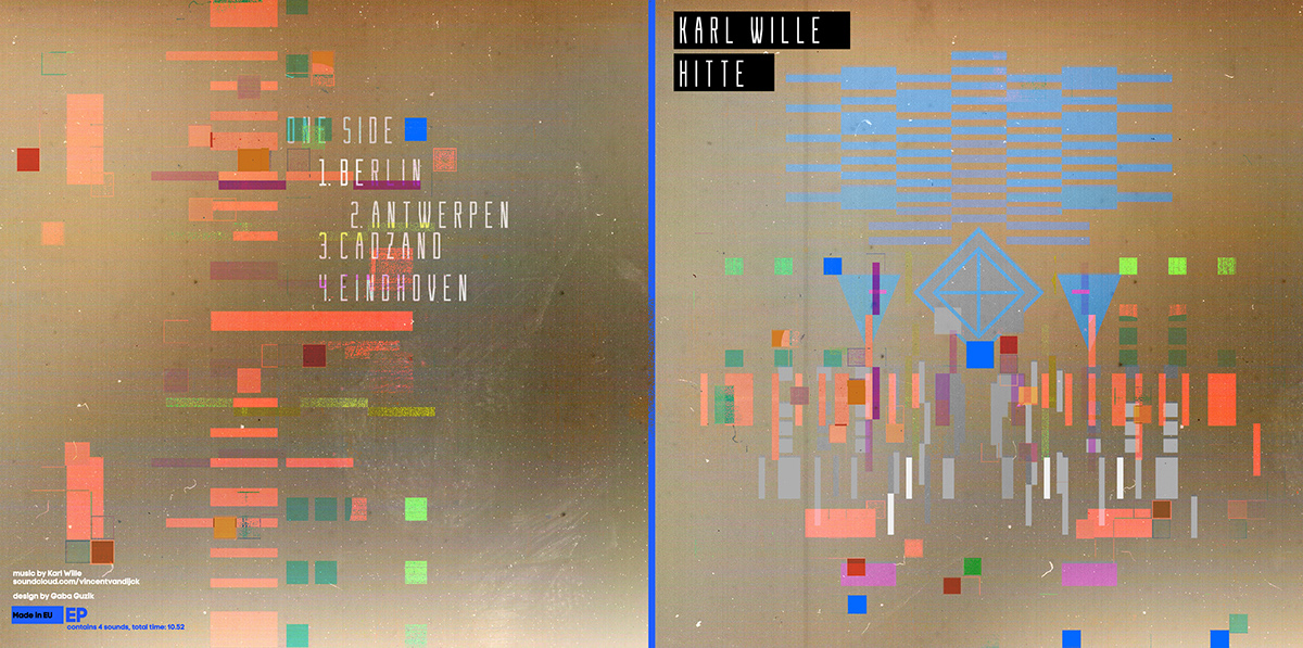
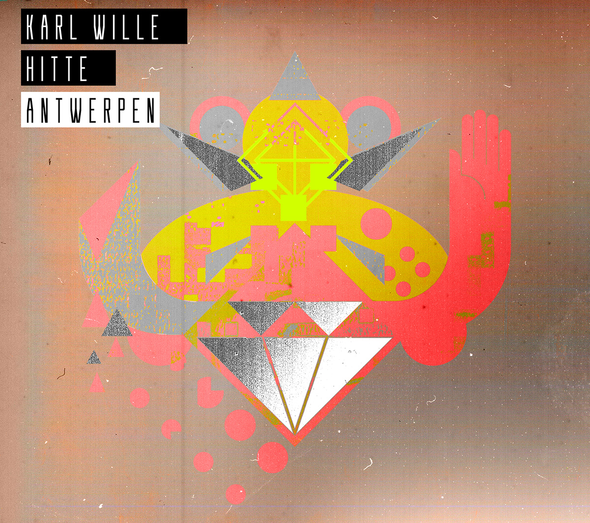
The title of album HITTE in Dutch means heat, while songs are named after different cities like Berlin, Antwerpen, Cadzand and Eindhoven.
Defining the graphical vibe of the album I wanted to get through building a specific, metaphor-based collage of geometric figures. I also decided to use a holographic foil, which in my opinion perfectly illustrates the mirage phenomenon that often occurs during the heat. All these elements relate also to the experimental-electronic music.
Illustrations refer to the characteristic symbols of cities, their architecture and general associations that came to my mind when I was thinking about these cities. Transparent vinyl reflects to the prism and clear summer air.
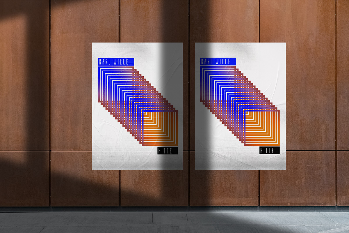
On the poster our attention is caught by a large element, which is a kind of introductory tunnel to the world of HITTE music.
Defining the graphical vibe of the album I wanted to get through building a specific, metaphor-based collage of geometric figures. I also decided to use a holographic foil, which in my opinion perfectly illustrates the mirage phenomenon that often occurs during the heat. All these elements relate also to the experimental-electronic music.
Illustrations refer to the characteristic symbols of cities, their architecture and general associations that came to my mind when I was thinking about these cities. Transparent vinyl reflects to the prism and clear summer air.
On the poster our attention is caught by a large element, which is a kind of introductory tunnel to the world of HITTE music.
Agency –––––
Self-employed
Self-employed
Client –––––
Karl Wille (Vincent Van Dijck)
Karl Wille (Vincent Van Dijck)