
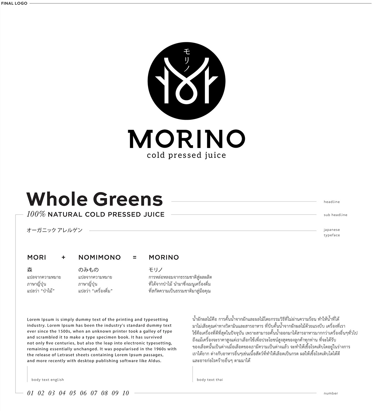
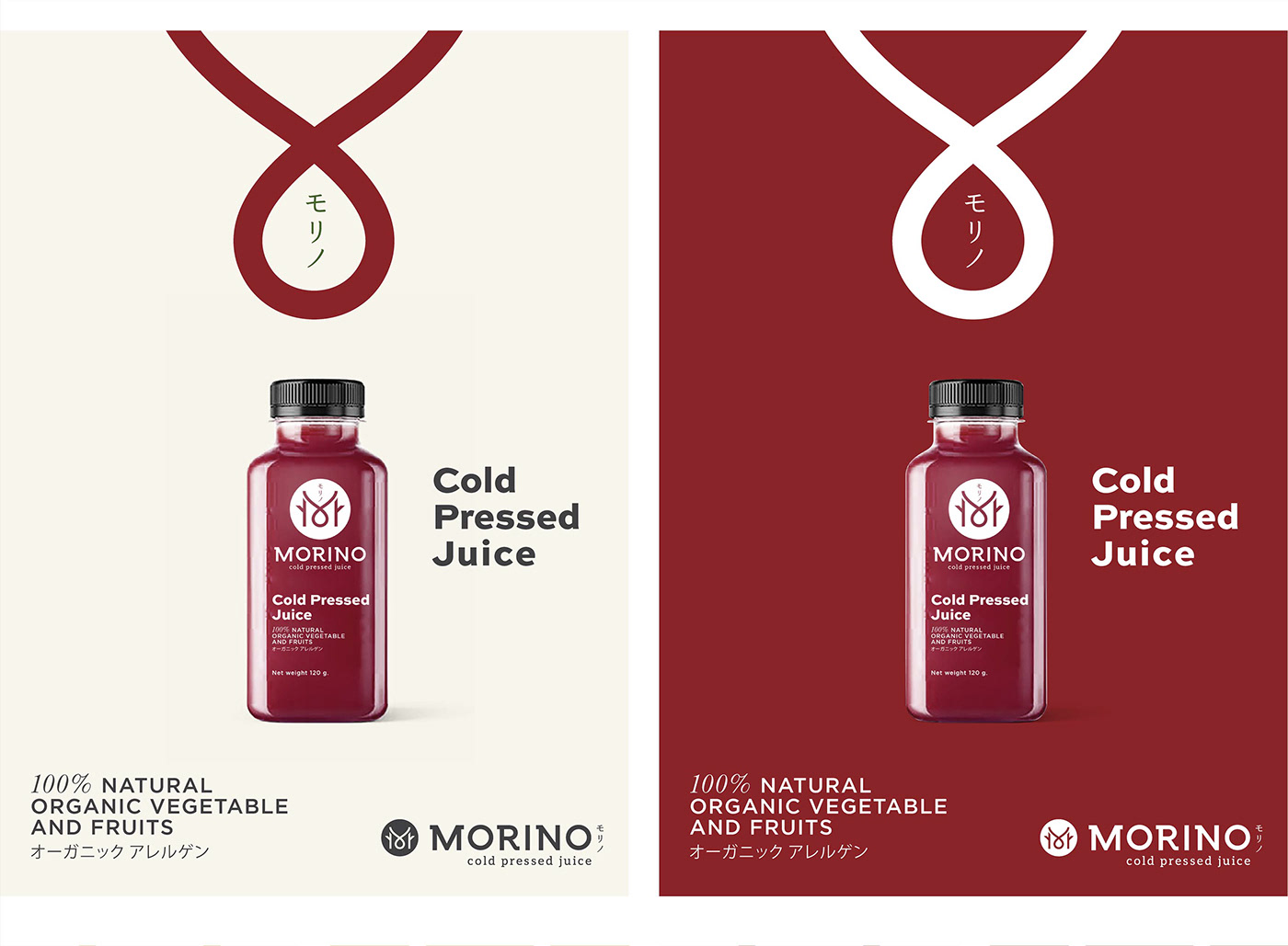
MORINO / COLD PRESSED JUICE / brand identity
brand naming :
The Portmanteau Word of " MORINO / モリノ " is the combination of the word " MORI / 森 = Forest " in Japanese and " NOMIMONO / のみもの = Drinks ".
This provides the deeper meaning of the new drink menu that purely created from nature and directly deliver to your hands.
brand concept :
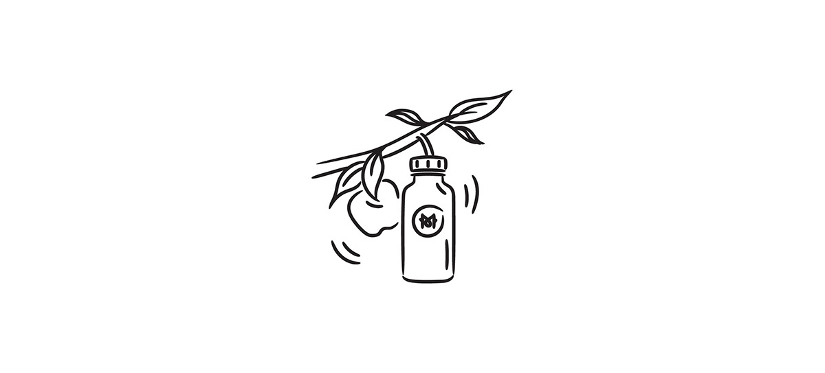
• Mysterious of fruit (nature) : the good benefits for your body is the nature's secret
• Juice Lab, Science : the mixture of nature and science which had been researched and tested to make sure the best we can get from nature
• Chakra Cycle : to the ultimate results that stimulate the natural flow of human force
• Chakra Cycle : to the ultimate results that stimulate the natural flow of human force
logo design :
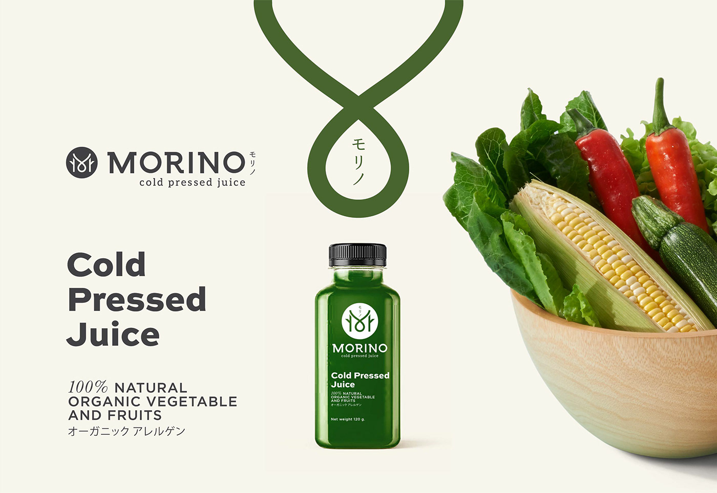
Water Drop + Forest Structure blended together via the letter " M " as linkage plus using Japanese lettering to portray the Japanese DNA origin.
Water Drop + Forest Structure blended together via the letter " M " as linkage plus using Japanese lettering to portray the Japanese DNA origin.
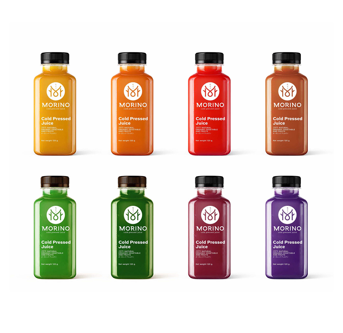
brand colours :
Combination of 6 elements = soil, water, wind, fire, nature, gold


AGENCY :
Andon Design Daily Co.,Ltd.
CREDIT :
Design Director by Pongtorn Wachirapoka
Logo Design by Nichaphat Pitayaratstiam
Exclusive for Andon Design Daily Co.,Ltd.
Copyright © 2017 Andon Design Daily Co.,Ltd.


