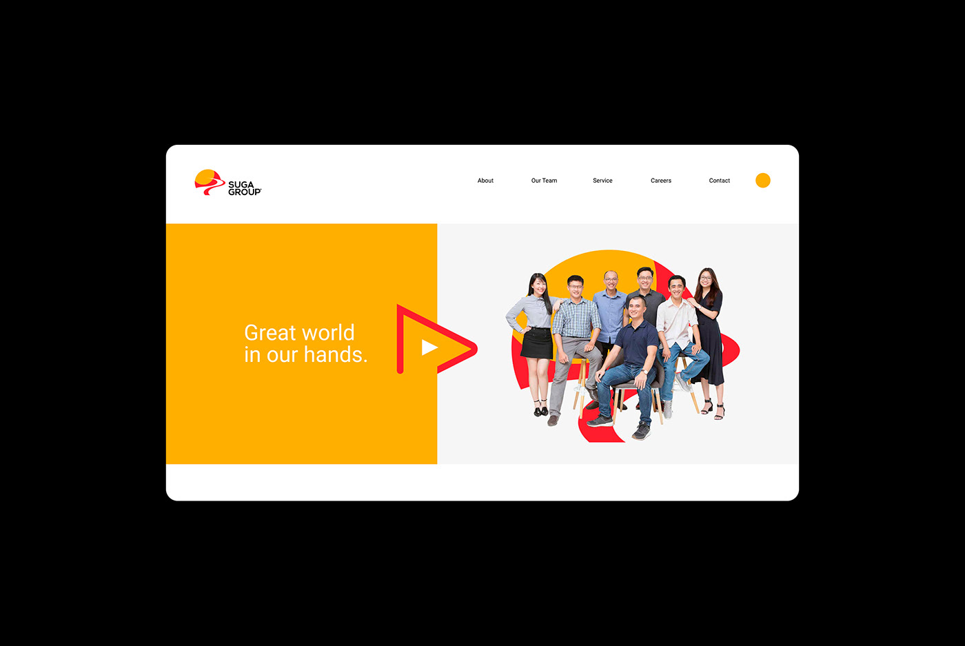
Suga Group
Redesign Branding
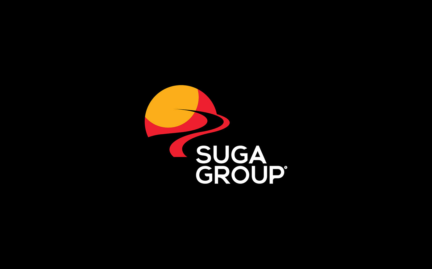
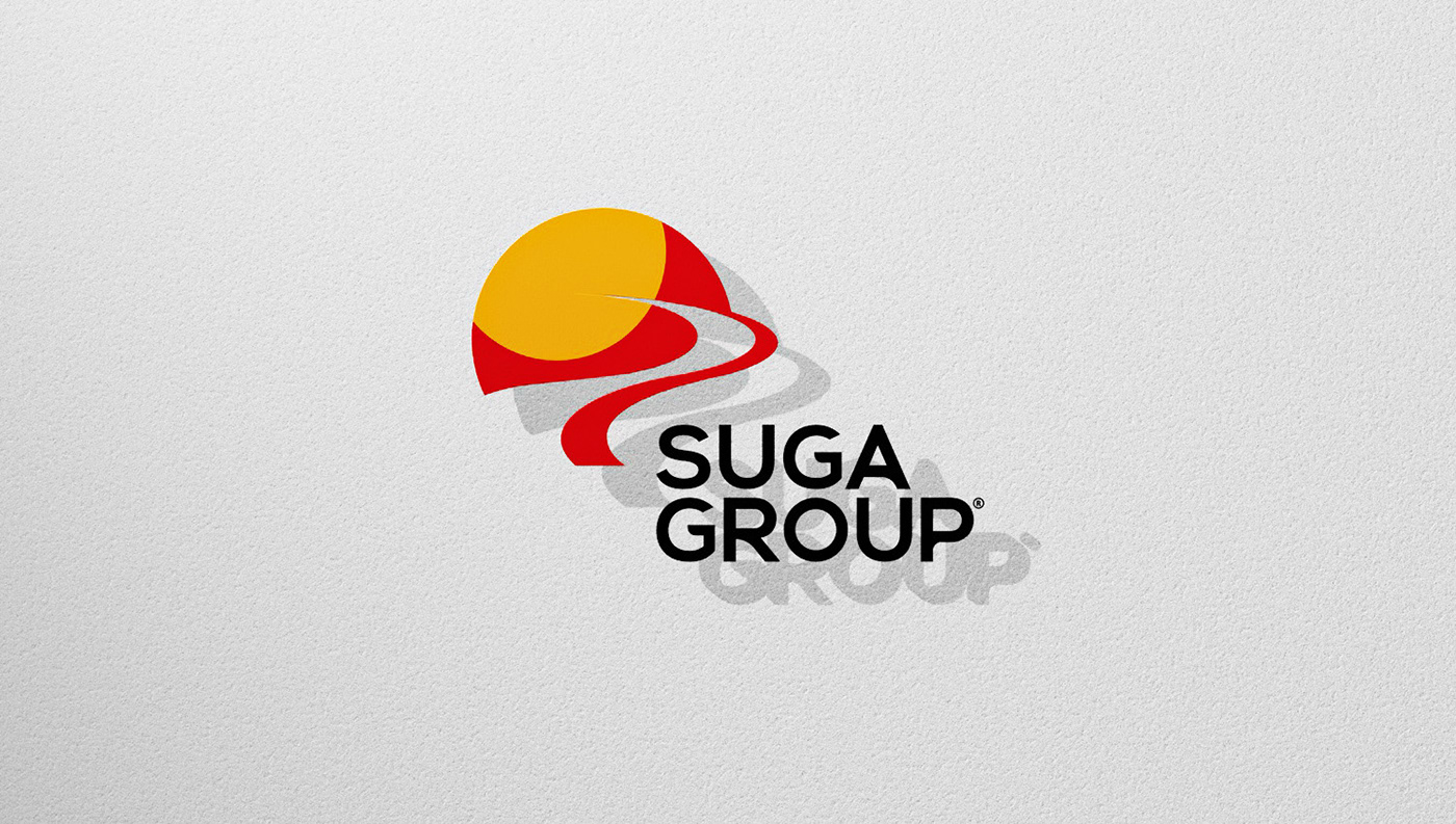
Suga is the abbreviation of Sun Gate, It is a symbol of light and hope, for conquest and ideal of success.
Suga Group was born in 2015 on the mission of providing products and services that satisfies the needs of partners and customers with optimal and comprehensive solutions on the most advanced technology platform, as well as bringing each individual’s life to the next level.
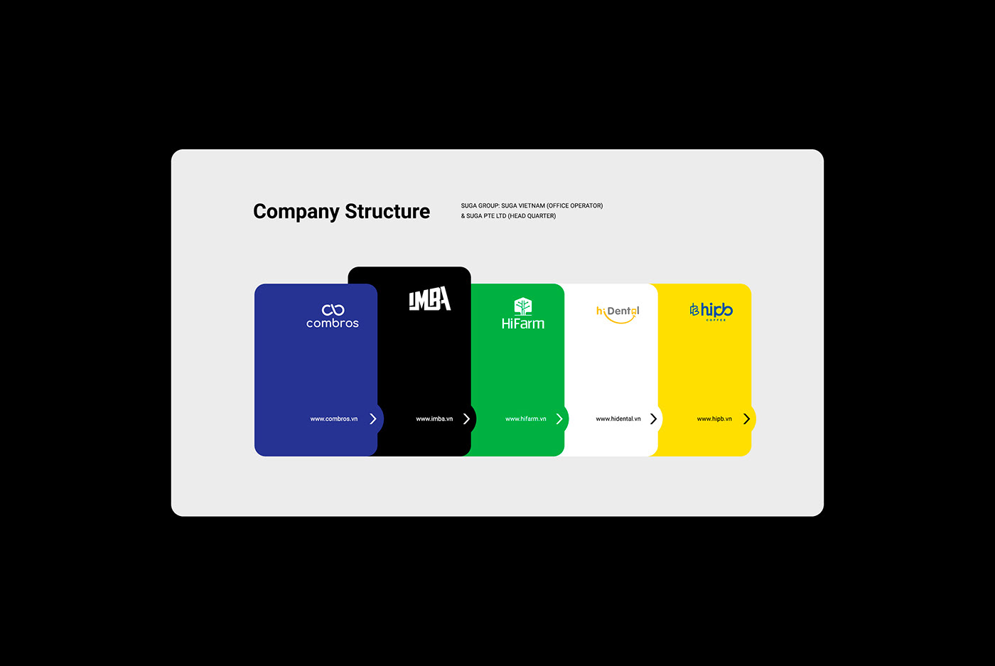
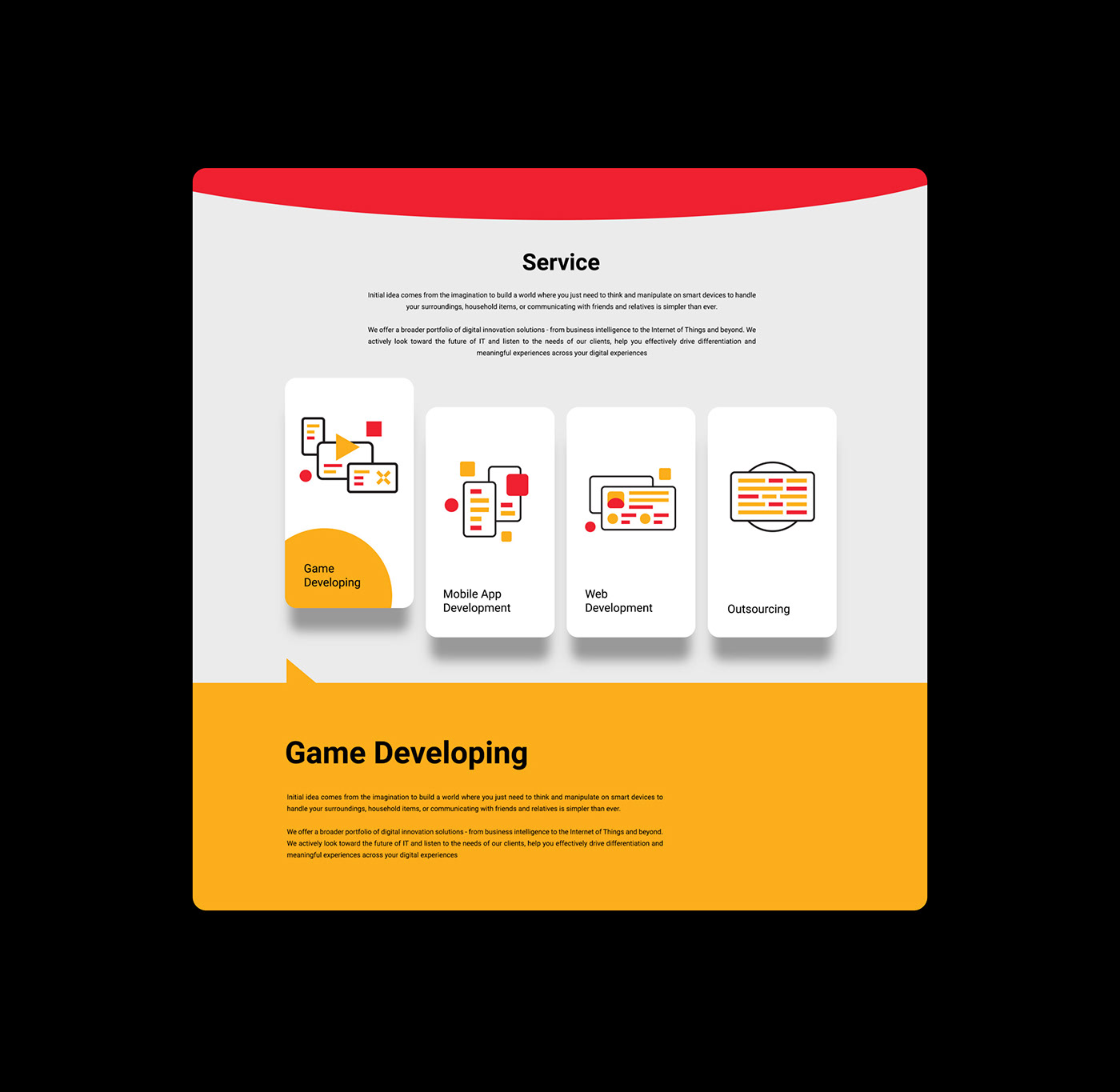
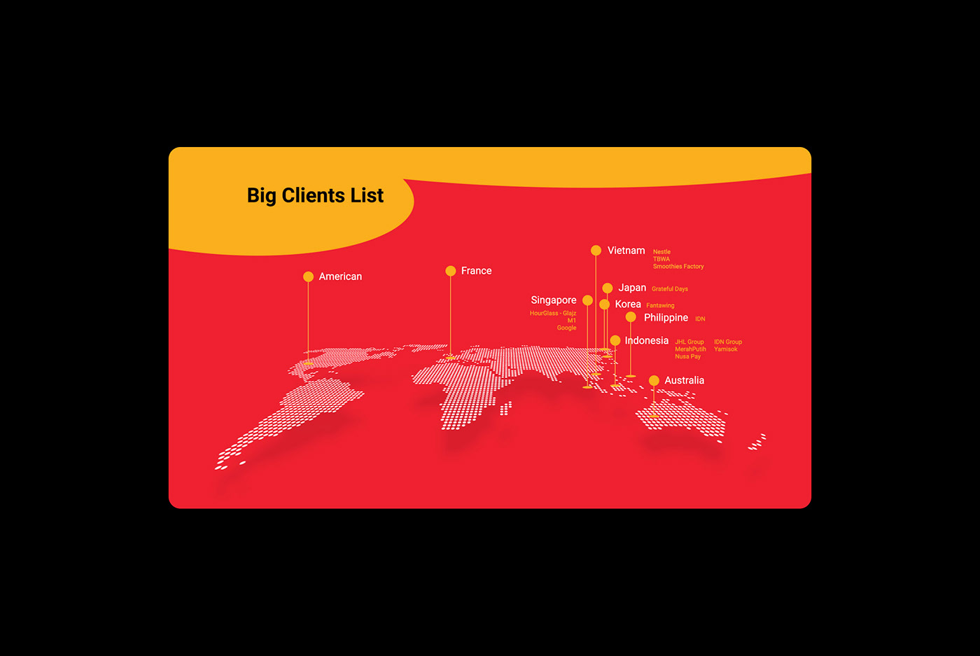
Suga Group locates throughout Vietnam with its head office in Singapore and 5 brands focusing on game developing, technologies, hi-tech agriculture, healthcare and catering. Suga Group have over 100 employees with more than 30 projects and has experience to work with over 25 clients all around the world. Together we create the world of Suga in the field of Information Technology, Manufacturing and Distributing intelligent software, devices.

The Objective
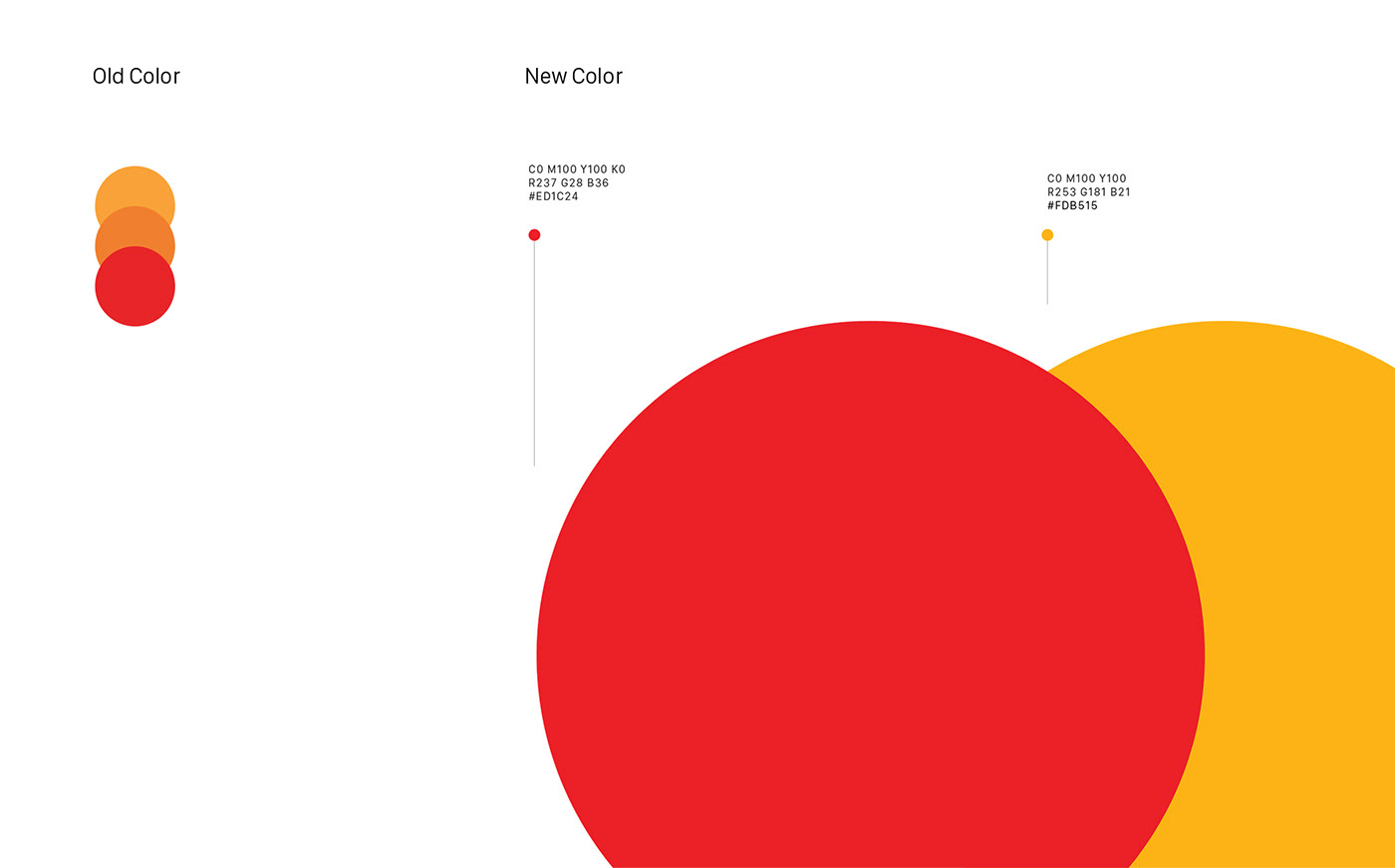
Redesigning the logo image and brand identity of Suga Group, inheriting the image of Sun Gate, redeveloping the brand color, modern, easy to apply but still brand value.
The Solution
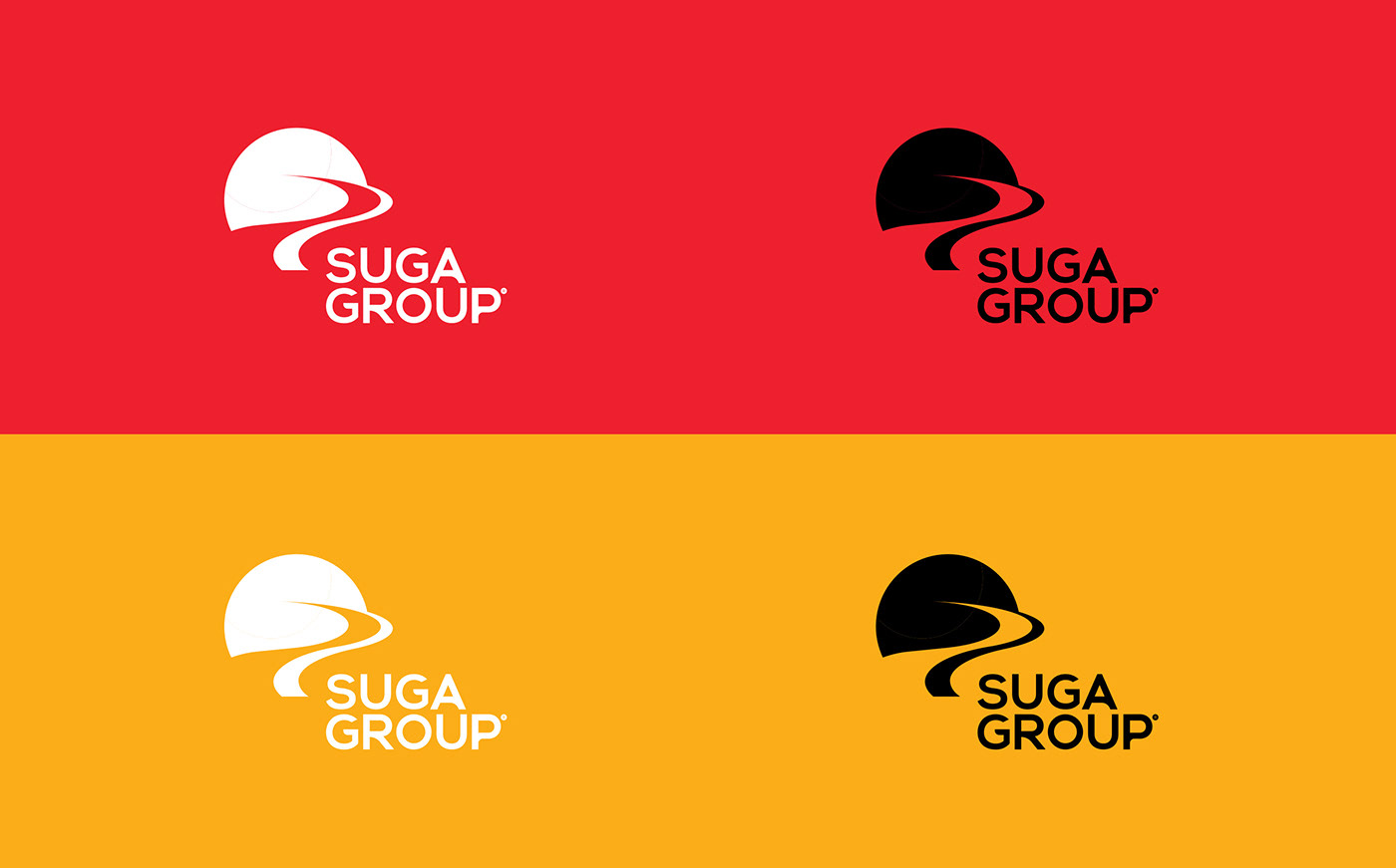
We redesigned the logo based on the spirit of the shape and colors of the old logo, re-standardized the shape of the logo, Redefined the simple color, simple symbols and typefaces, build a system of visual identification of colors, shapes and typeface on all elements & Identity design of Suga Group.

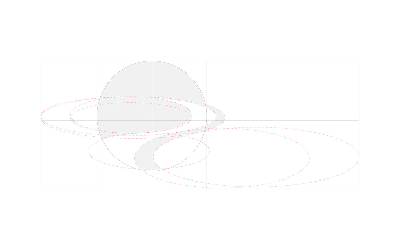


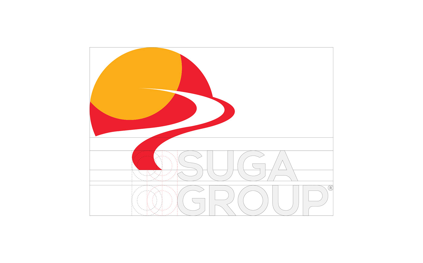


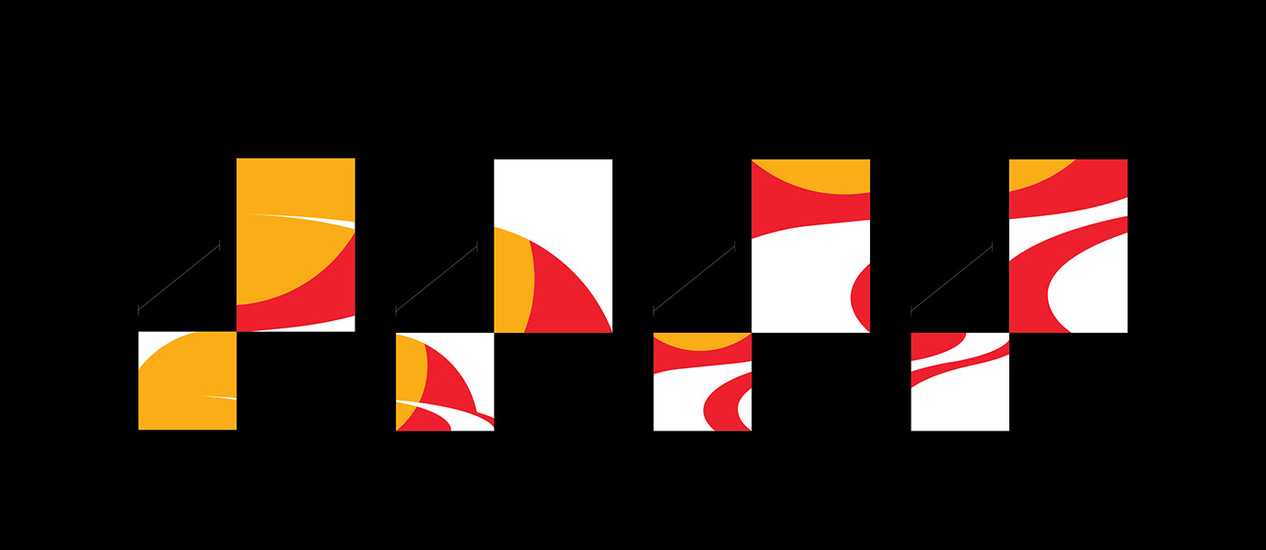
Visual breakdown from Logo
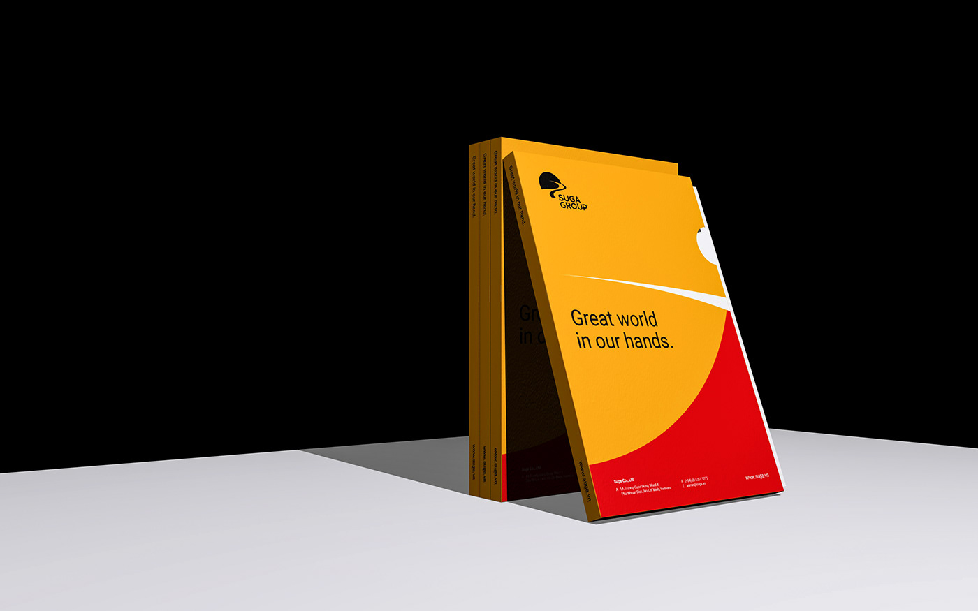
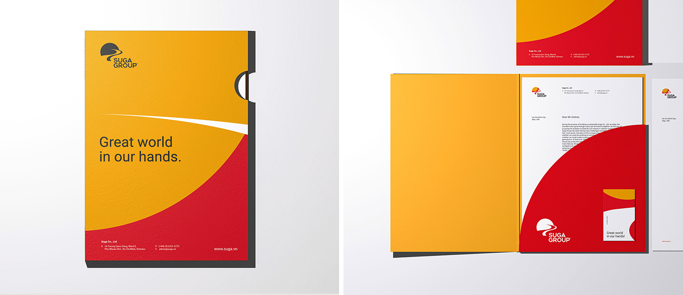
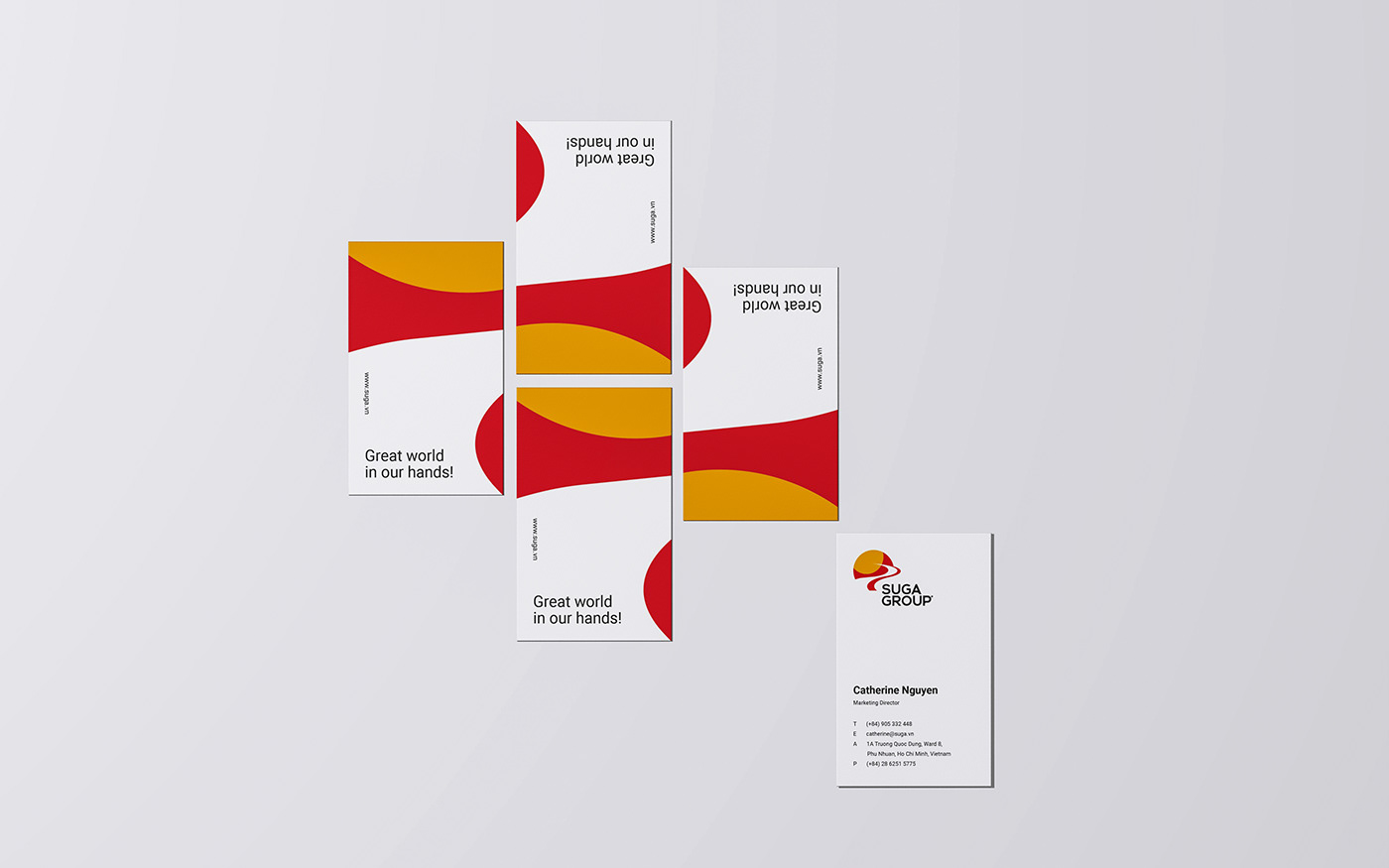
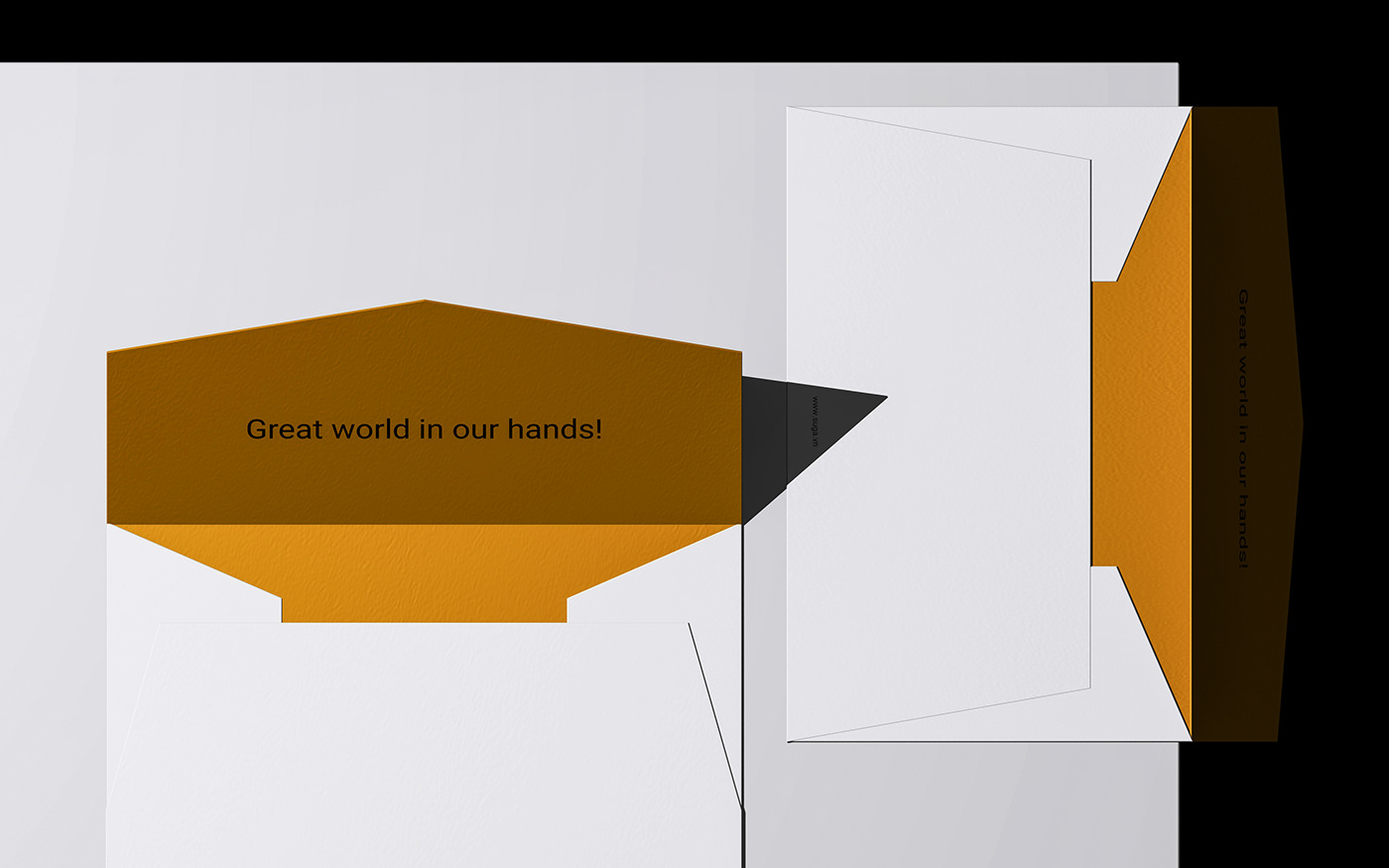
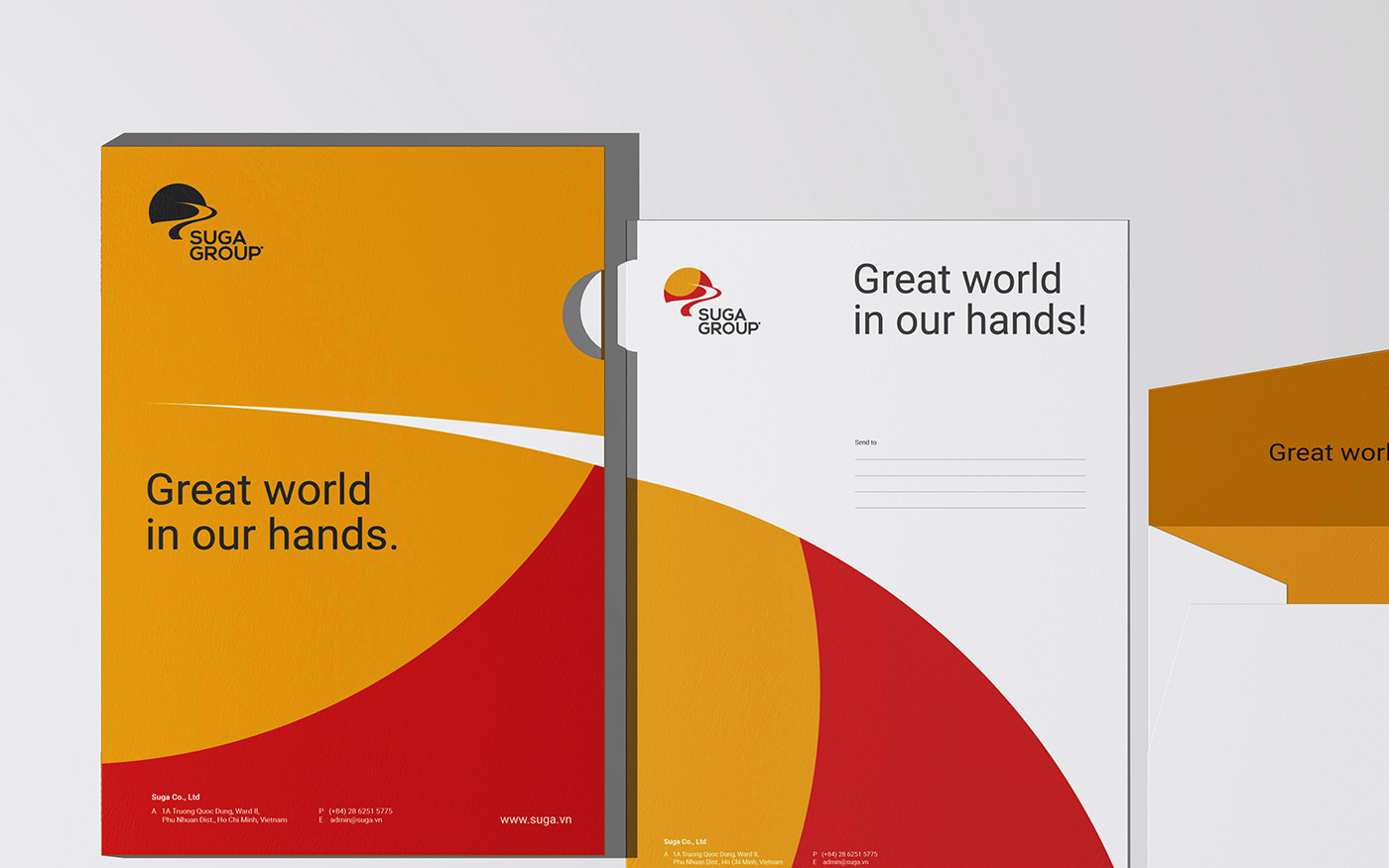
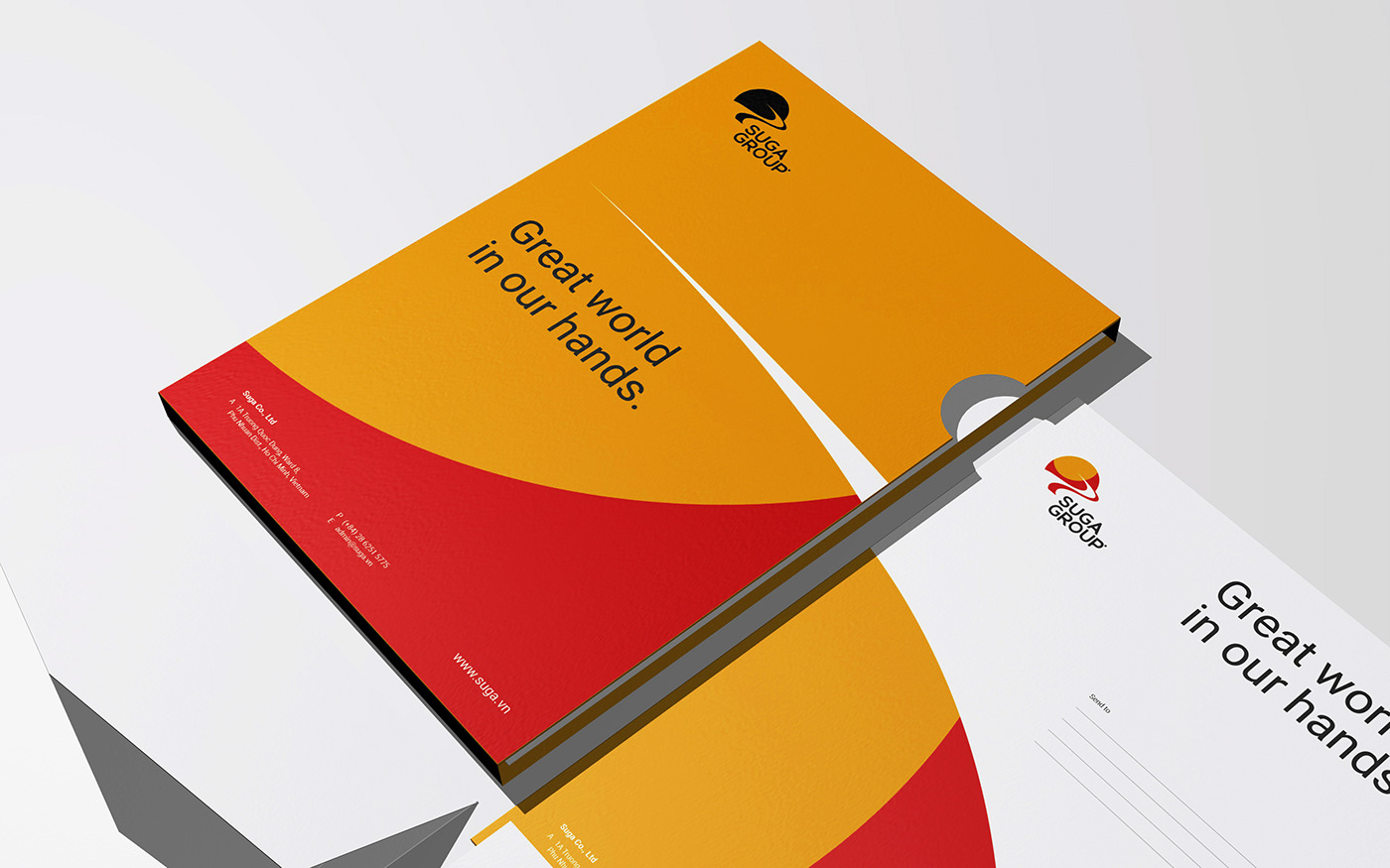
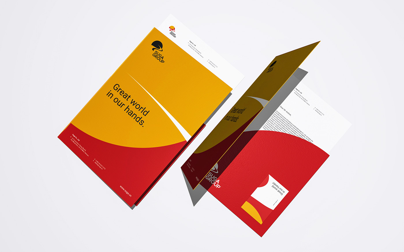
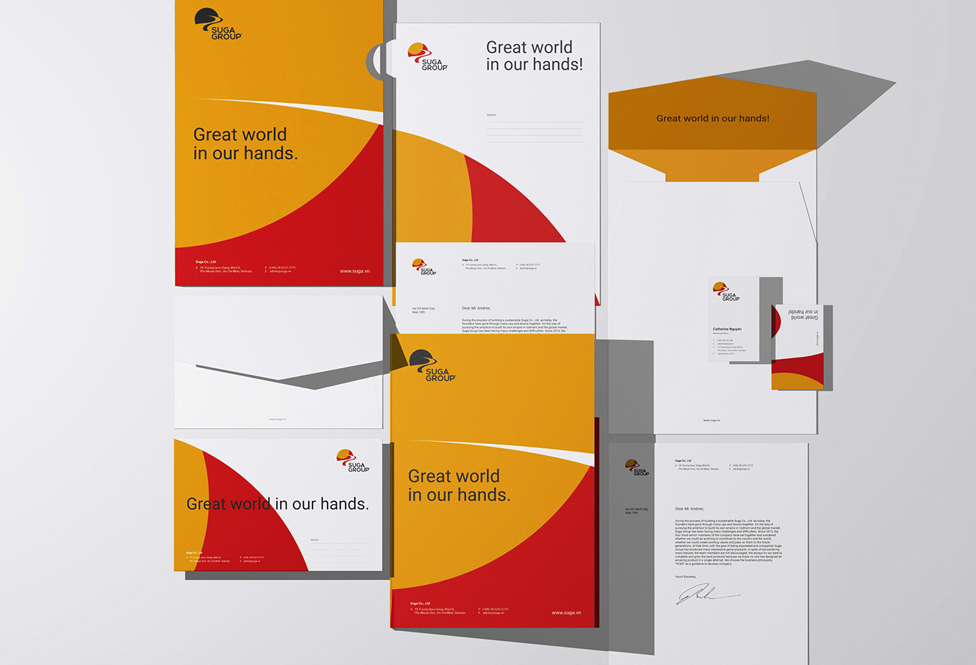
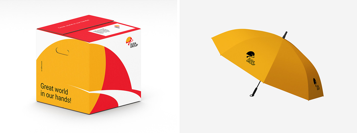
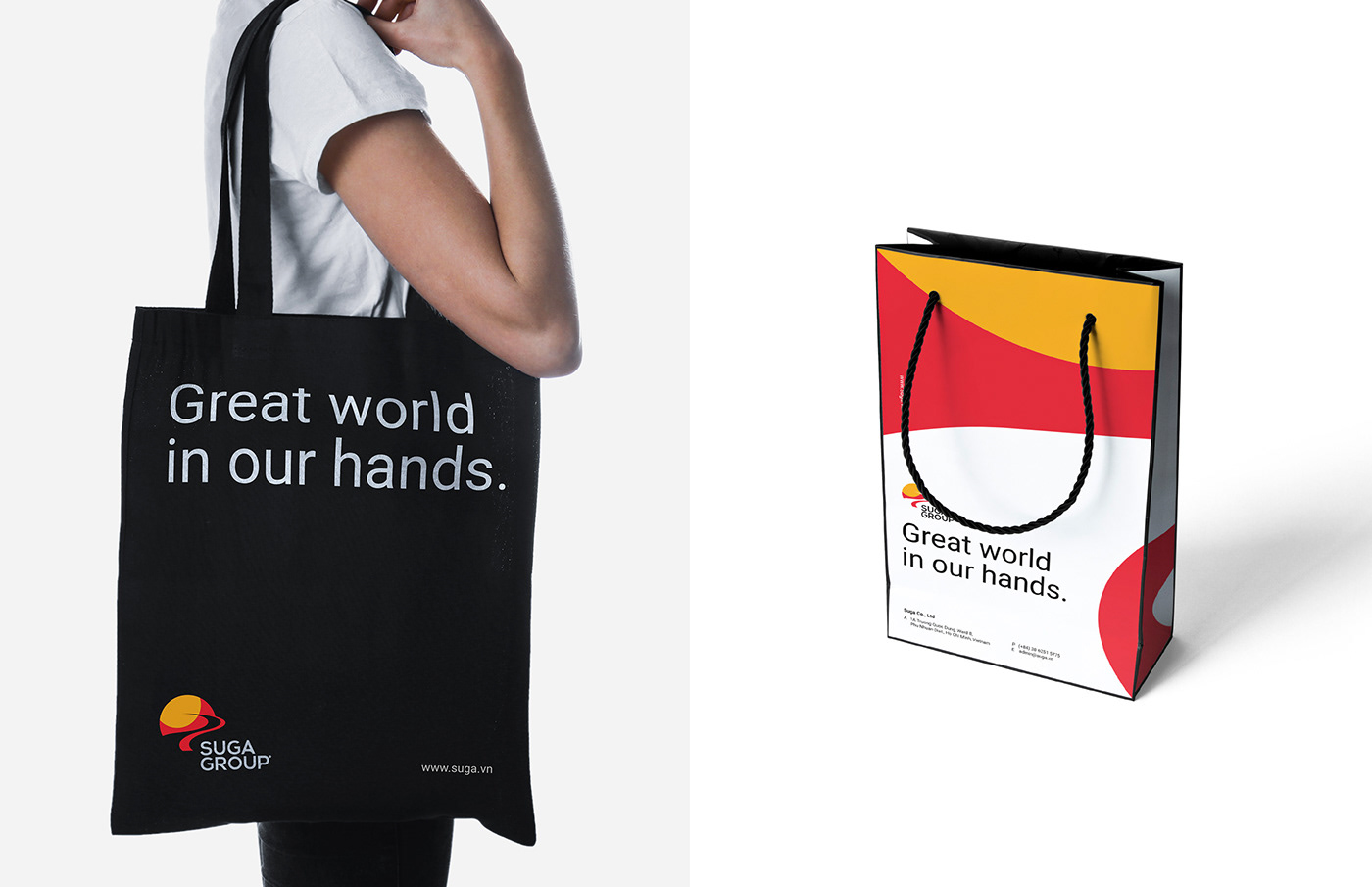
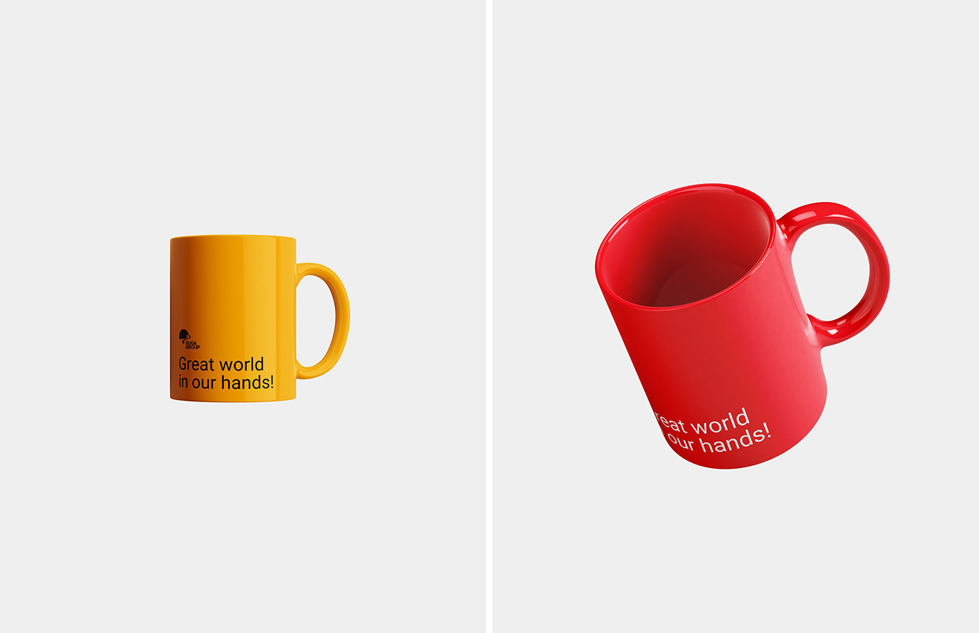
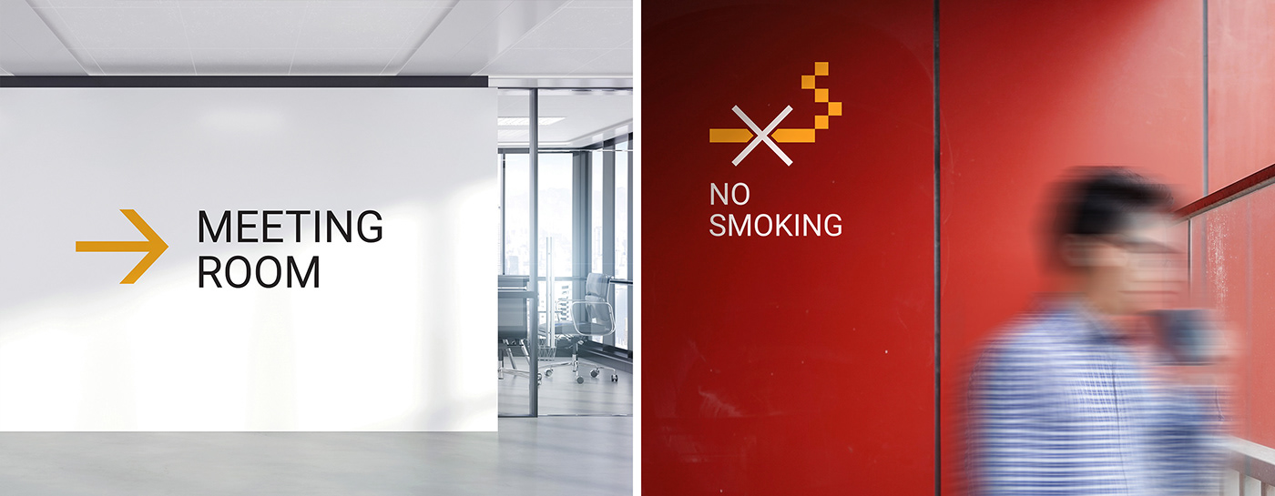
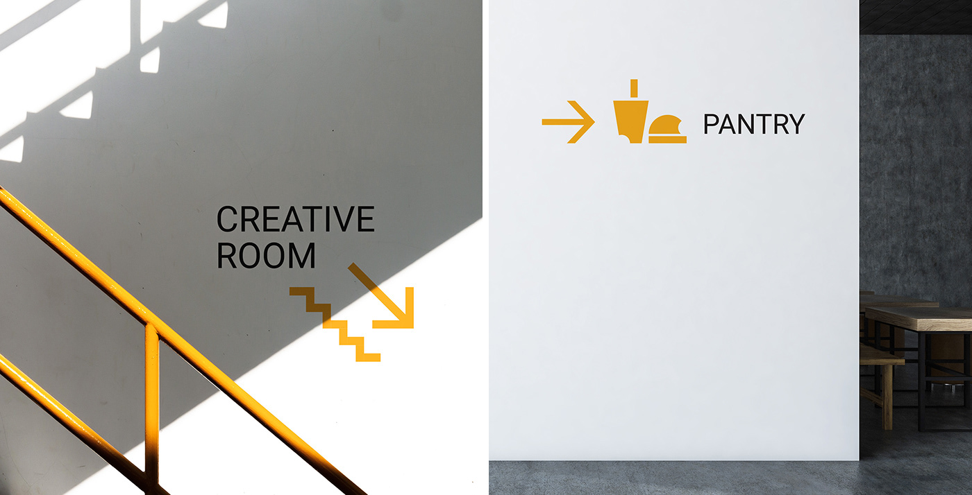
Visual Identity that is repeated throughout all publications and related to Suga Group to create consistency for the brand's design. So to avoid the boring and repetitive elements of the brand such as logo, slogan...on the brand designs of Suga Group in the old way, we developed a system of 4 Key Visual to receive from the Suga Group Logo.

From the 4 Key Visual above, we changed the layout and redistributed the identity image according to the specific vertical layout, removing unnecessary lines for easier application in publications.


Suga Group | Redesign Branding
Scope of Work: Logo Creative, Visual Identity, Website Design
Creative & Design: InSpace Creative
Graphic Designer: Sanh Nguyen, Phung Nguyen
Location: Ho Chi Minh City, Vietnam
Published: 2019
Thanks for your time.