


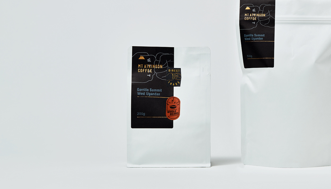
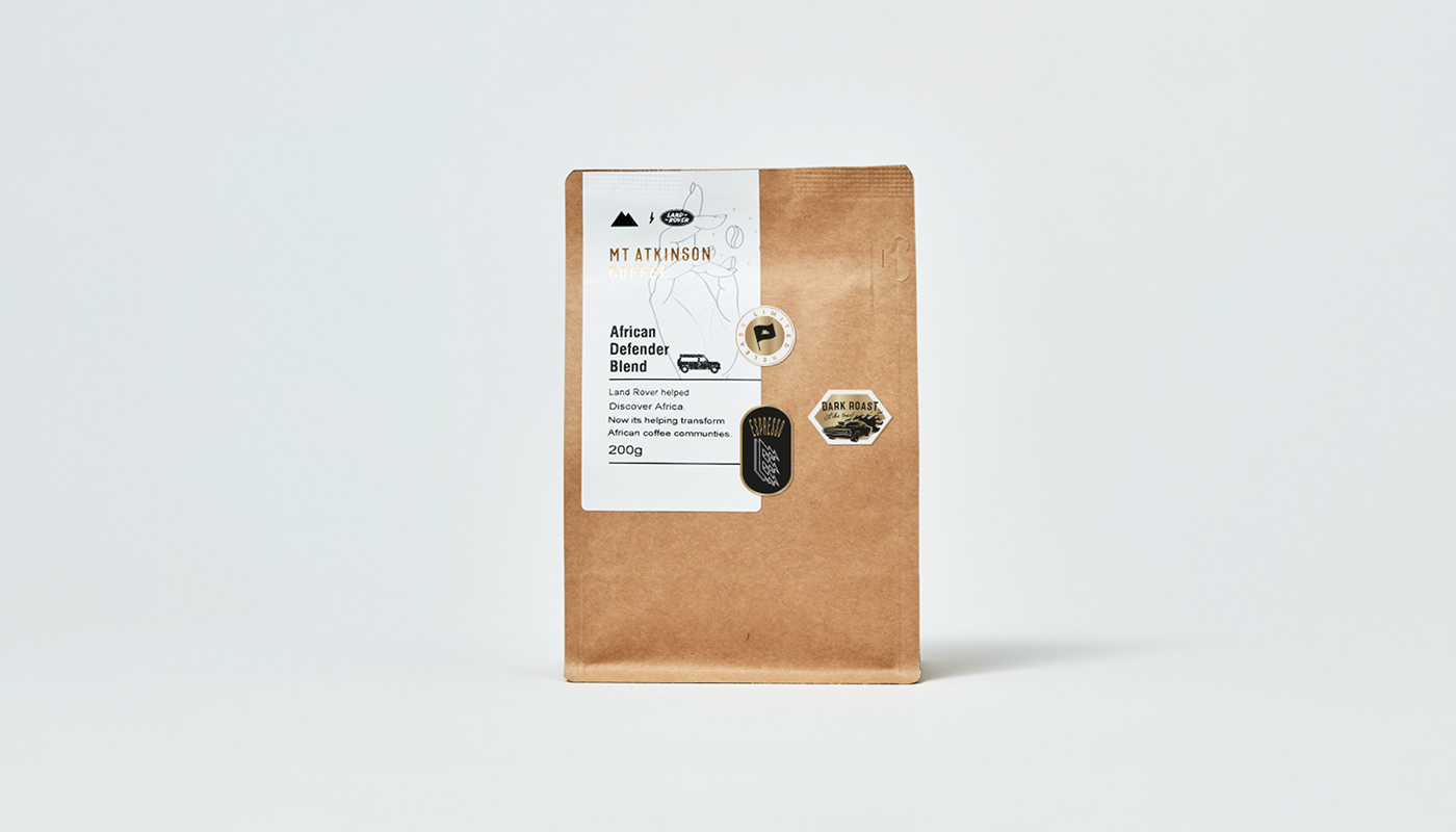
Mt Atkinson Coffee Roasters have been roasting and serving delicious coffee for over a decade. They have fiercely loyal customers and are a highly regarded brand by their local community. Overdue for a design facelift, enhanced direct trade story, playful illustration, cleaner packaging, and retail approach – it was time for a more refined way to connect with a greater audience.
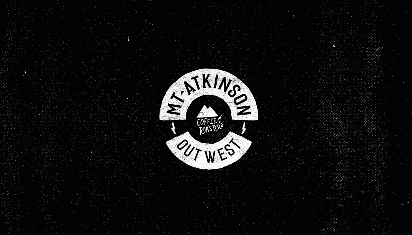
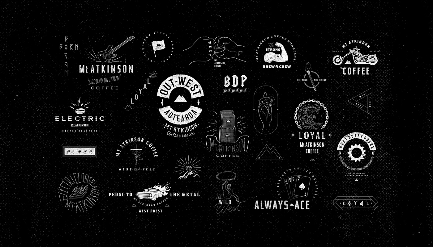
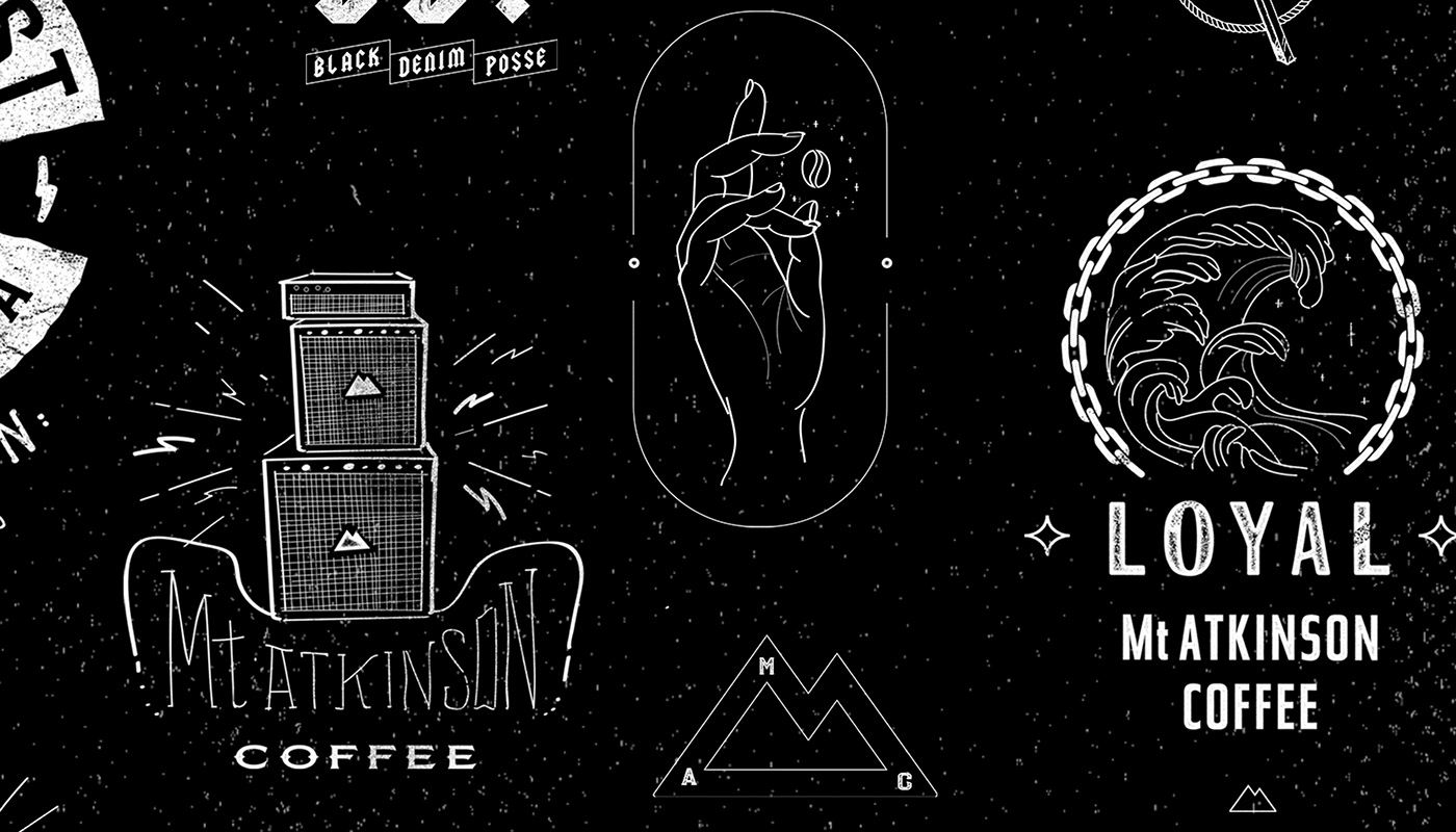
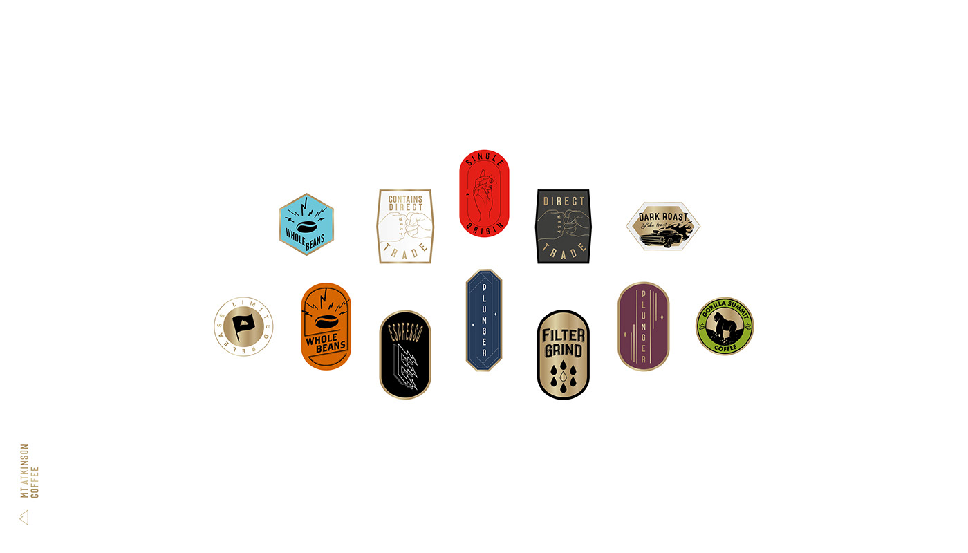
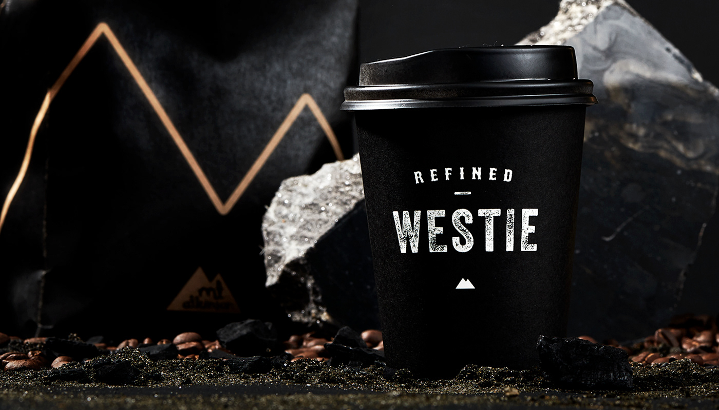
The core idea: Be the 'refined westie'. A 'diamond in the rough'. Essentially, two worlds colliding. Westie. A term used for 'rough around the edges', heavy metal listening, denim and leather toting, gang-patch wearing, motorbike riding - hipsters. Refined. Lovers of the finer things in life, nothing but the best. Combined, they become grit and gold. Matte and polish.
Elements of earth, charcoal, diamonds, marble and gold are metaphors for the gritty, earthy process of making then refining great coffee – while connecting to Mt Atkinson's West Auckland roots. The black iron-sand beaches, and weather beaten driftwood. A visceral, tangible, and playful expression for the everyday drinker and coffee connoisseur.
https://mtatkinson.co.nz


Creative Director. Nathan Chambers
Design Director. Danny Carlsen
Creative Strategy. Debby Giness
Photography. Luke Harvey
Web Developer. Fabian Simmen
Ceramics. Thea Ceramics
Agency. Stanley St


