Konrad Garten- & Landschaftsbau
The family-owned and master gardening and landscaping company Konrad has been considered solid and reliable by its clientele for over 30 years. Slow but steady growth ensured a familiar and stable customer base. However, the business had significant difficulty expanding its clientele from residential customers to larger, commercial projects, thus taking the next entrepreneurial step. With a generational change in the company, the desire and ambition arose to realign the brand strategic direction and, along with it, the company's image.
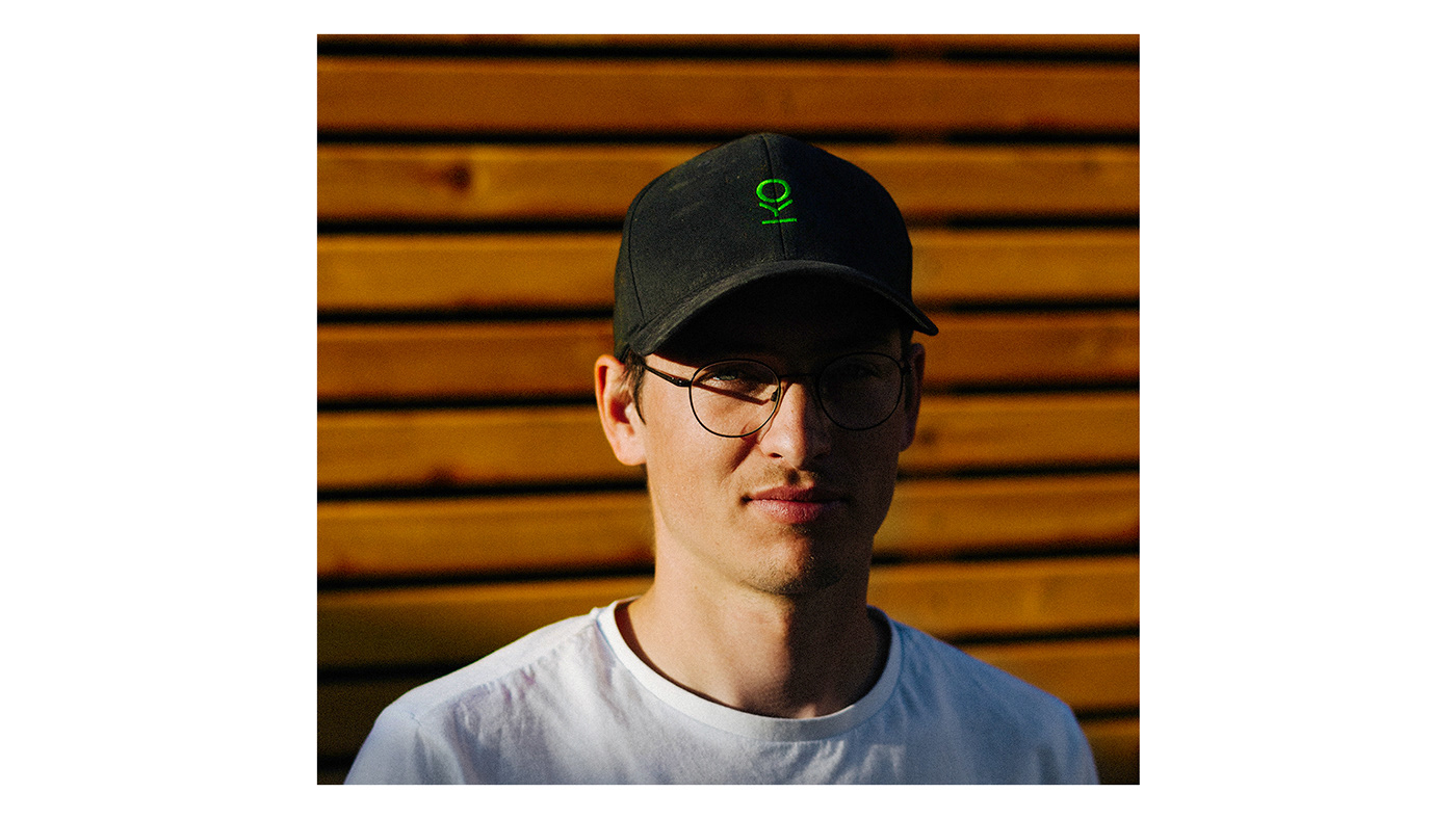
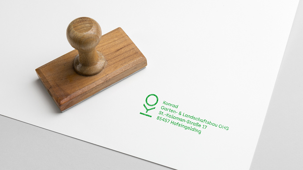
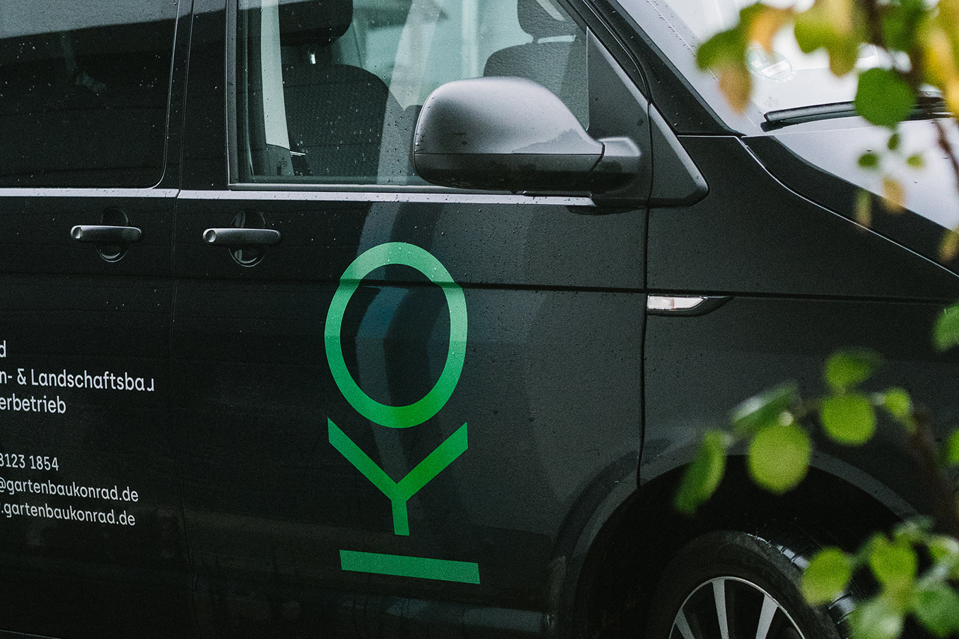
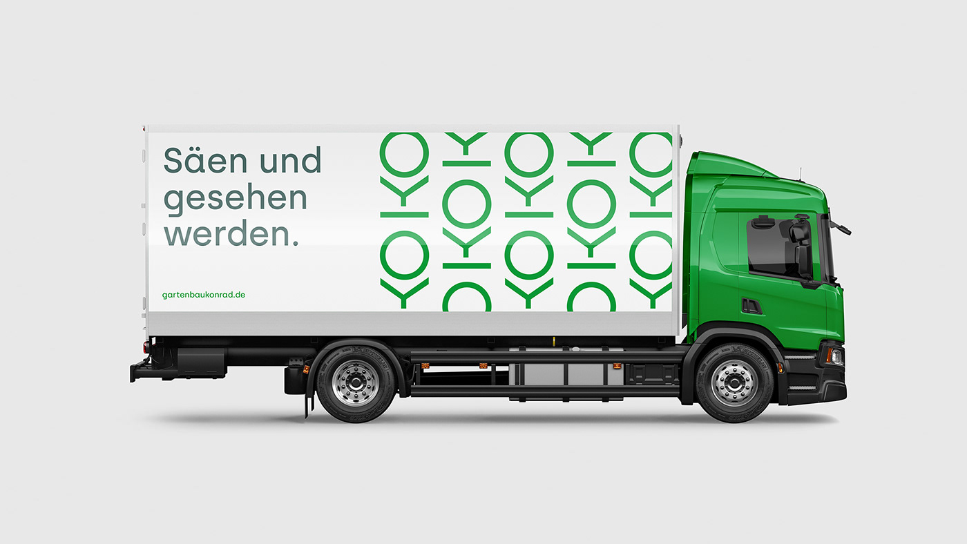
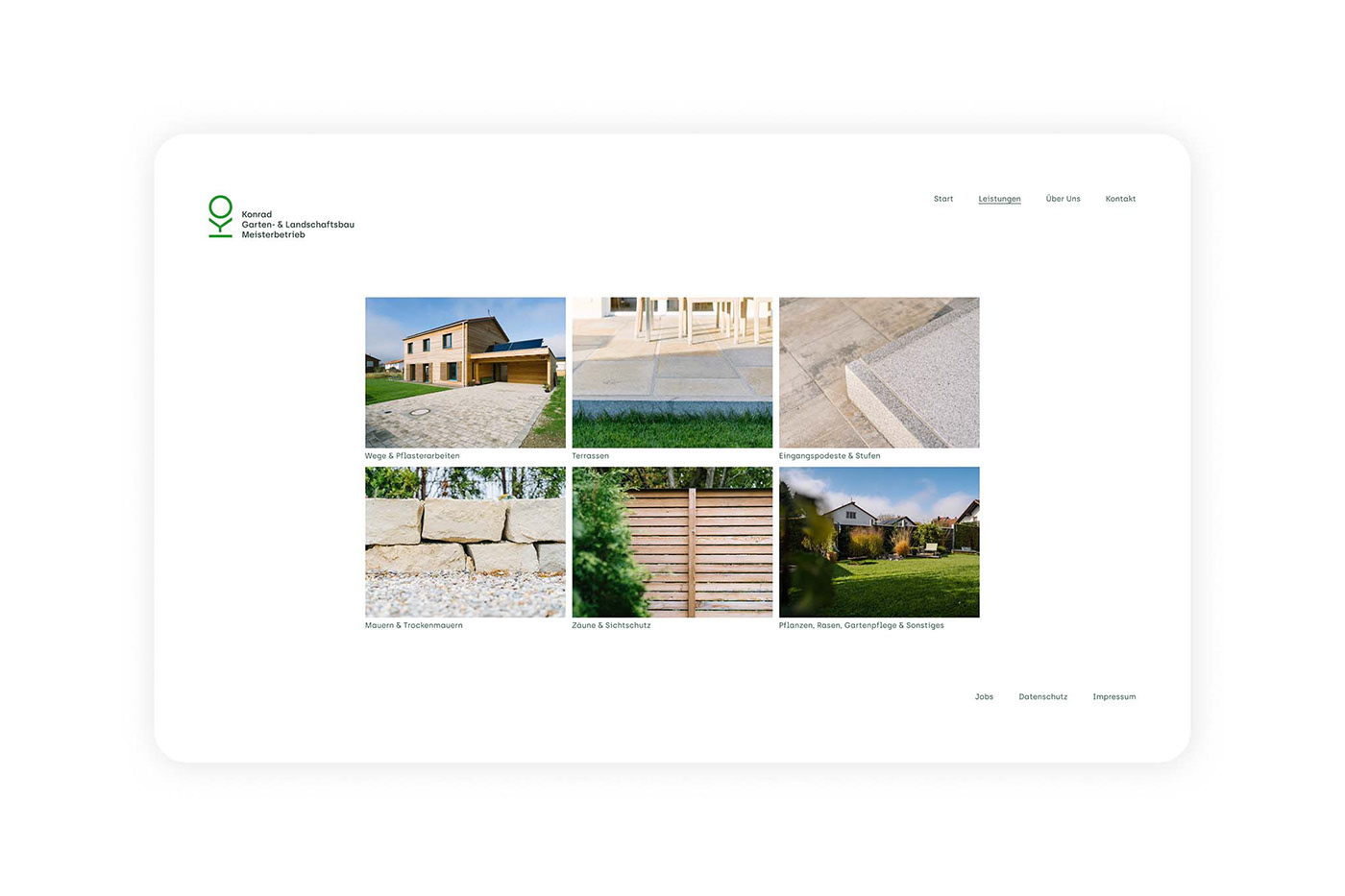
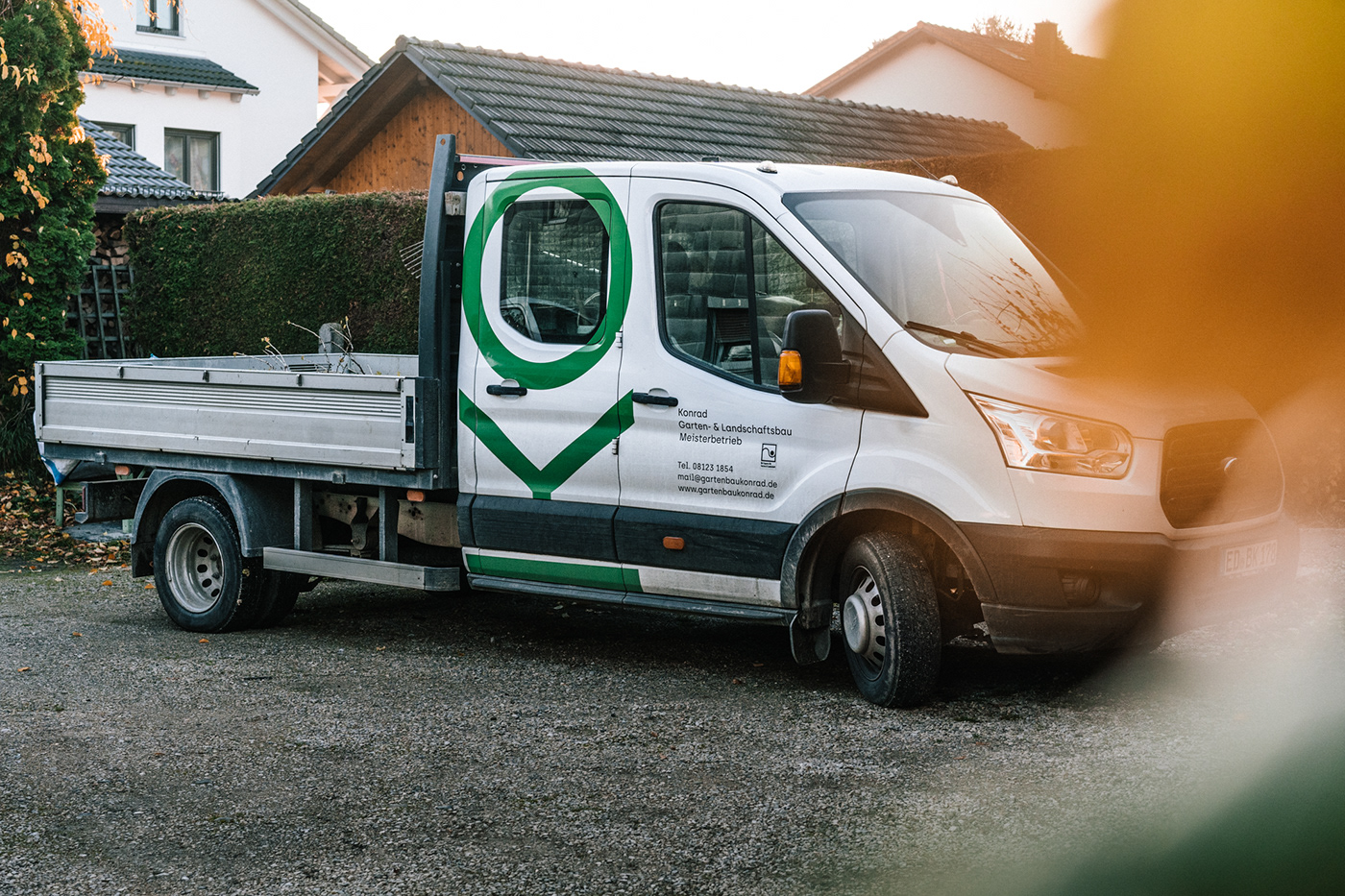
The task of the new brand identity is to address commercial clients such as architectural firms or municipal clients without upsetting the existing customer base. The result is a reduced yet light-footed brand communication with warm content, based on a lot of white space, a pragmatic typeface and a concise trademark. This trademark is based on the two initial letters of the family name, which are rotated by 90° to represent an abstracted sapling and a tree growing out of it. Through its simplicity and constructed character, the sign communicates reliability and the partnership aspect of accompanying projects from seedling to the maintenance of fully grown green spaces. It is self-contained, flexible in use and designed to grow with the business. The reduced, striking and clear design language clearly sets itself apart from the competition and aims, above all, to increase regional recognizability.