


Flying Space | BRANDING
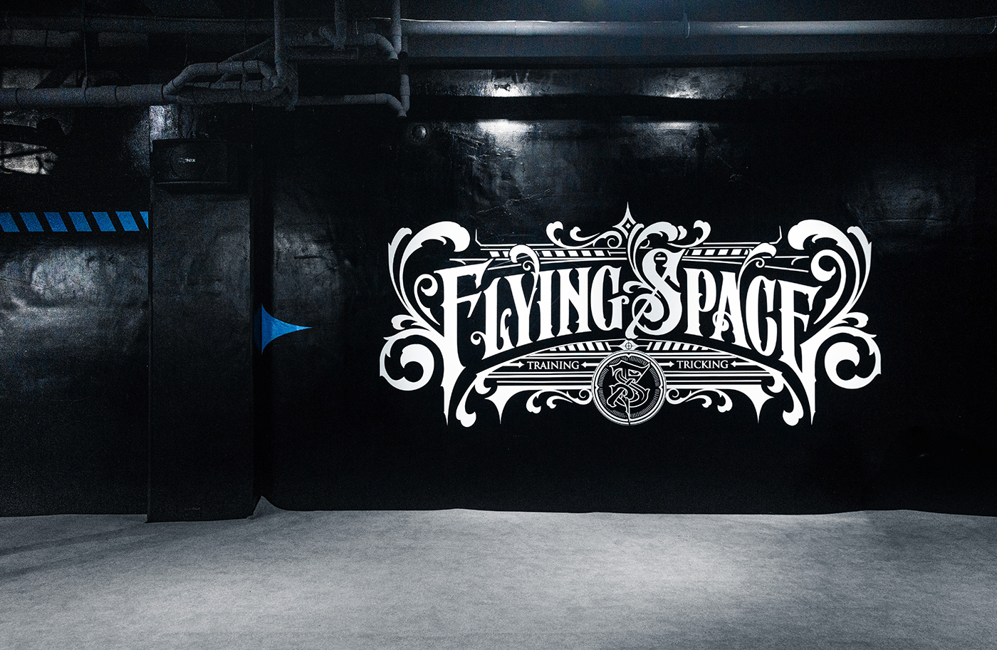
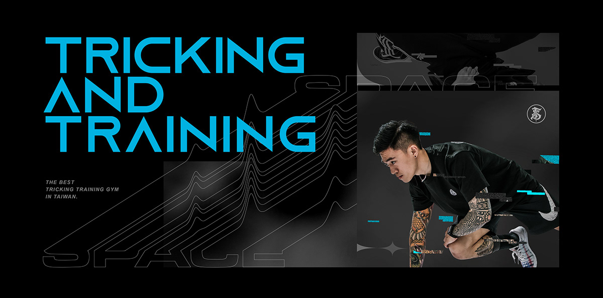
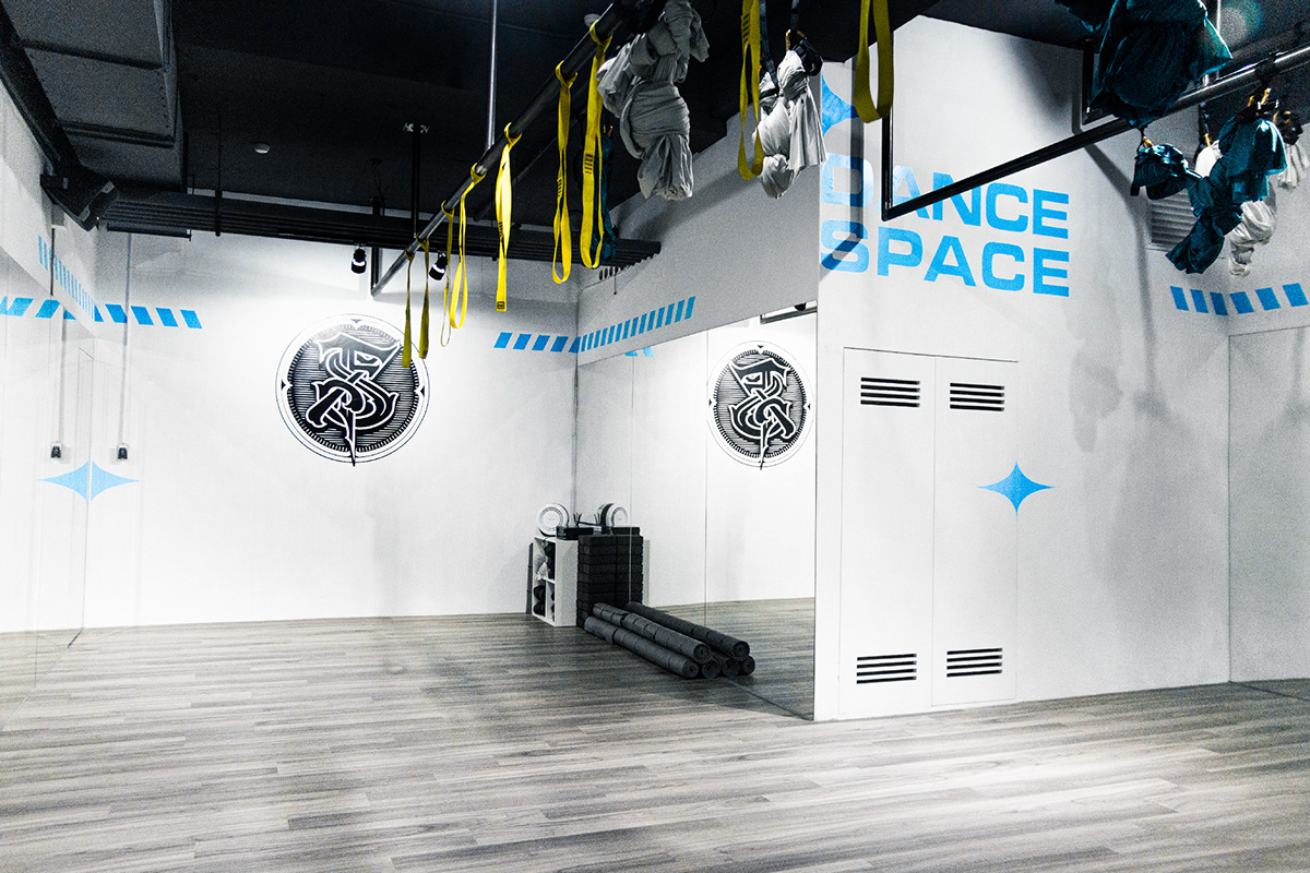
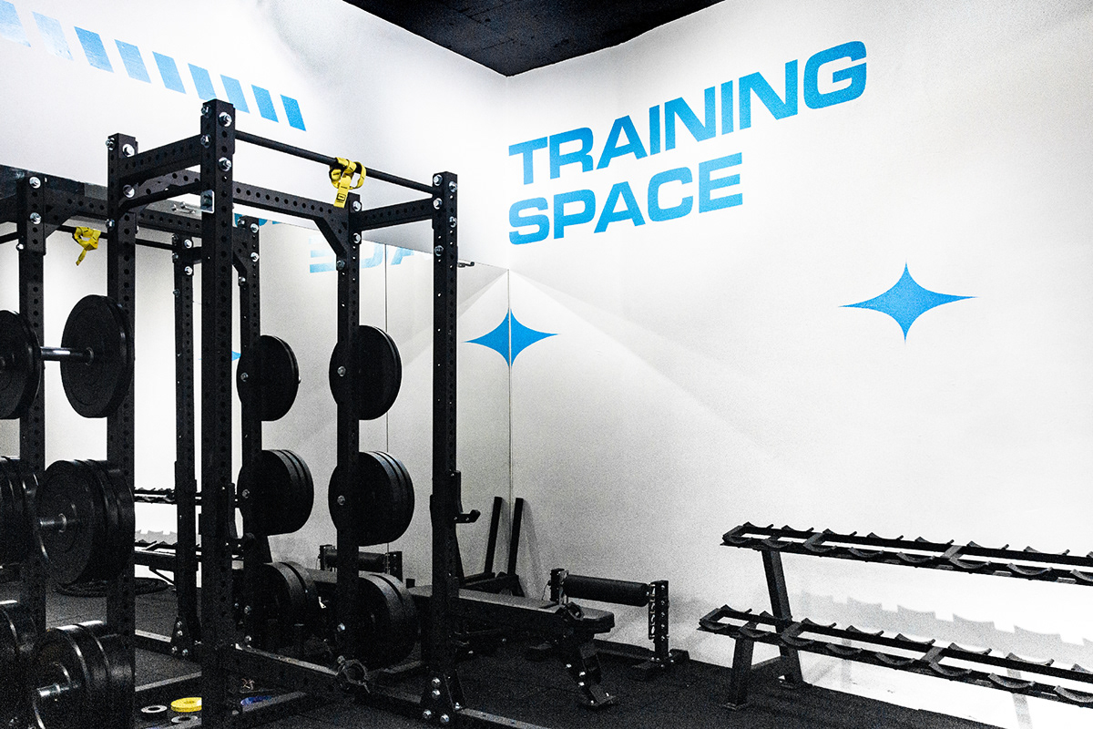
Flying Space is an extreme sports center located in Taipei, Taiwan. It offers diversified courses such as tricking, fitness, weight training, dancing, as well as great equipment and professional teachers.
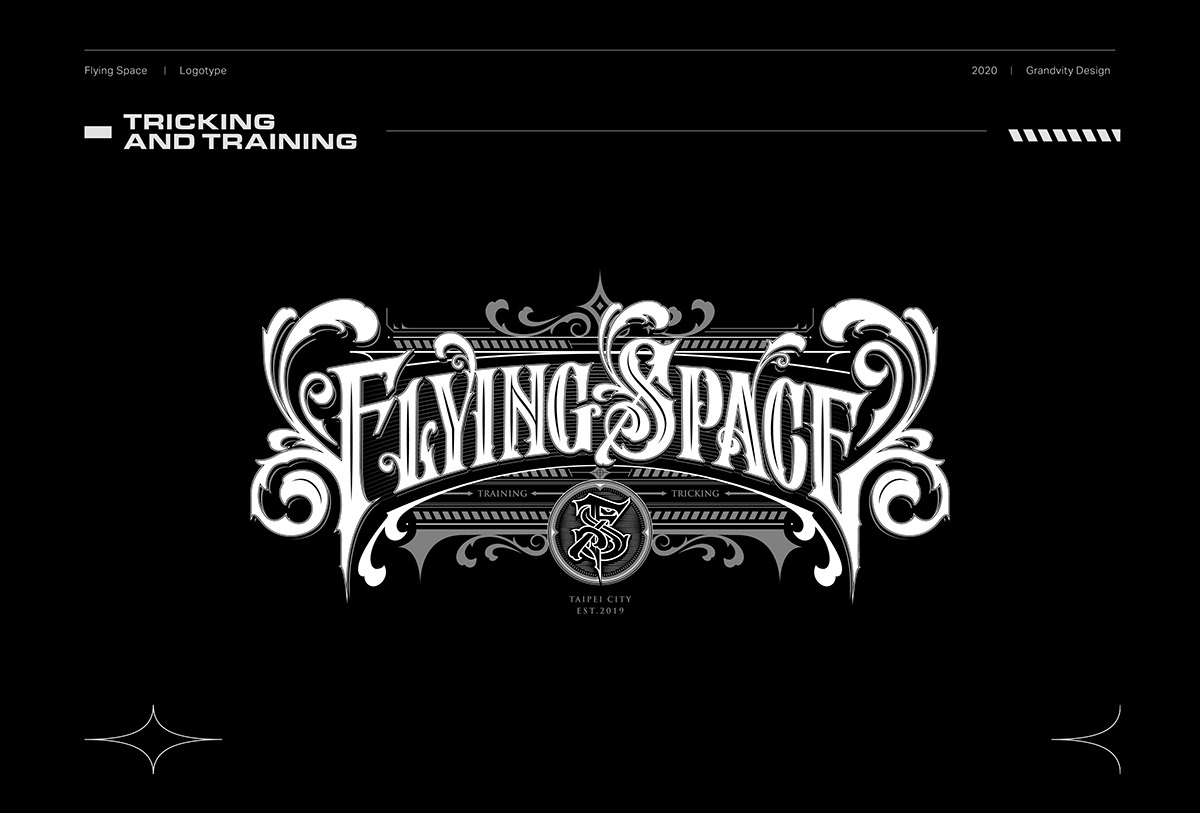
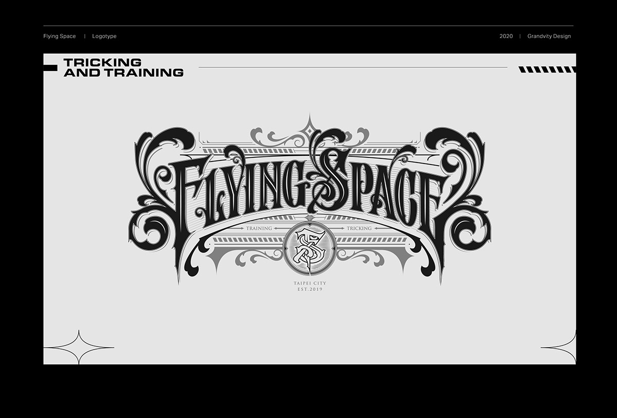
By incorporating Victorian Typography, the logotype conveys the magnificence and recklessness of extreme sports. The spiral shape on both sides of the logotype shows an image of turbine rotation. The trailing suffix symbolizes the idea of a jet going straight to the sky and breaking limits, leaving a flying trajectory.


In addition to the standard color settings for business card layout, a sky blue laser film is boldly embossed on the edge of black card, which is consistent with the brand's characteristics and also reflects the young and professional charm of the team.


Credits
Type | Branding
Year | 2018
Client | Flying Space
Year | 2018
Client | Flying Space
Production | Grandvity Design
Art Director | Noodlemaker
Project Manager | Grape Chiu
Typography Designer | Noodle Wang
Visual System Designer | Si Jia Sun
Portrait Photography | GoodGun
Interior Photographer | Si Jia Sun/Kaizer Zhuang
Namecard Photographer | Si Jia Sun
Interior Design | 多龍工務設計所
Art Director | Noodlemaker
Project Manager | Grape Chiu
Typography Designer | Noodle Wang
Visual System Designer | Si Jia Sun
Portrait Photography | GoodGun
Interior Photographer | Si Jia Sun/Kaizer Zhuang
Namecard Photographer | Si Jia Sun
Interior Design | 多龍工務設計所


