

—
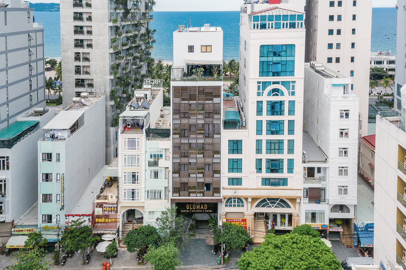
The Glomad Hotel is defined as a representation for boutique hotel concept aiming to served quality wanderlust with exploring and cool services. The place creates a true home for nomads as well as reflecting Đà Nẵng cultures among activities.
—
Concept
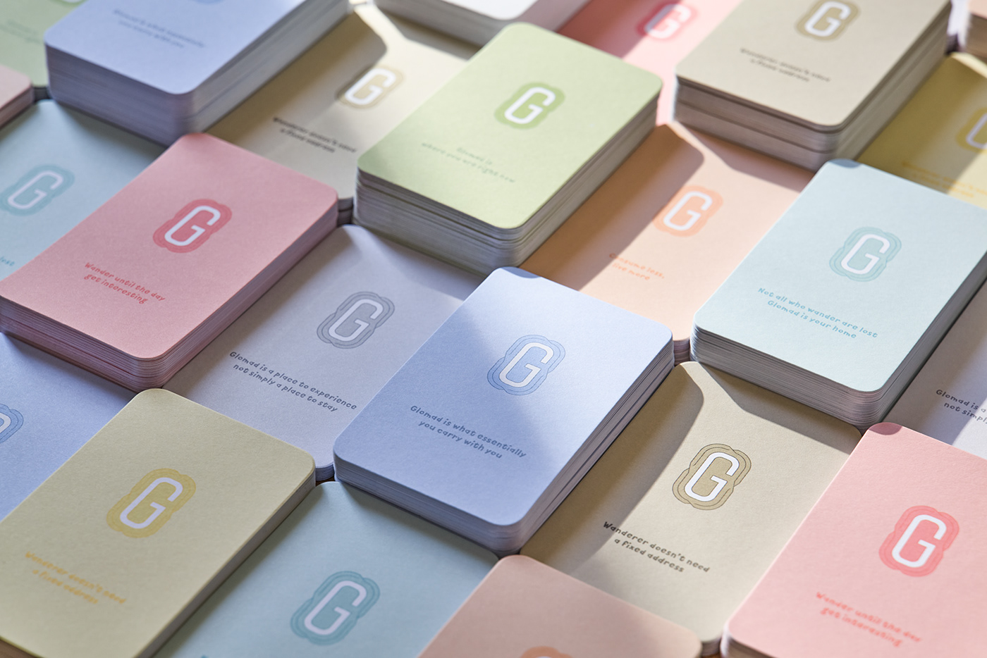
“Glomad” is a new word to represent a growing group of people who live a global nomadic lifestyle. Glomads are never at “home”, in the traditional sense of the word, but somehow always feel at home, which they define as any place they are or want to be. Therefore, the logo symbol G is inspired from the first viewport when traveling, the airplane window, combined with non-overlapping lines like airline routes. The logo symbol represents for the nonstop traveling routine of the glomad. The surrounding open lines means even though they come back to the same place, they will create a new experience every time. Also, we took great care in content details, creating a brand environment like Glomad is a travel friend will talk to you through collateral items.
—
Color Palette
From the minimal and high quality core service, black and gold was chosen to be primary. Secondary color palette was inspired from natural elements throughout any trips.


—
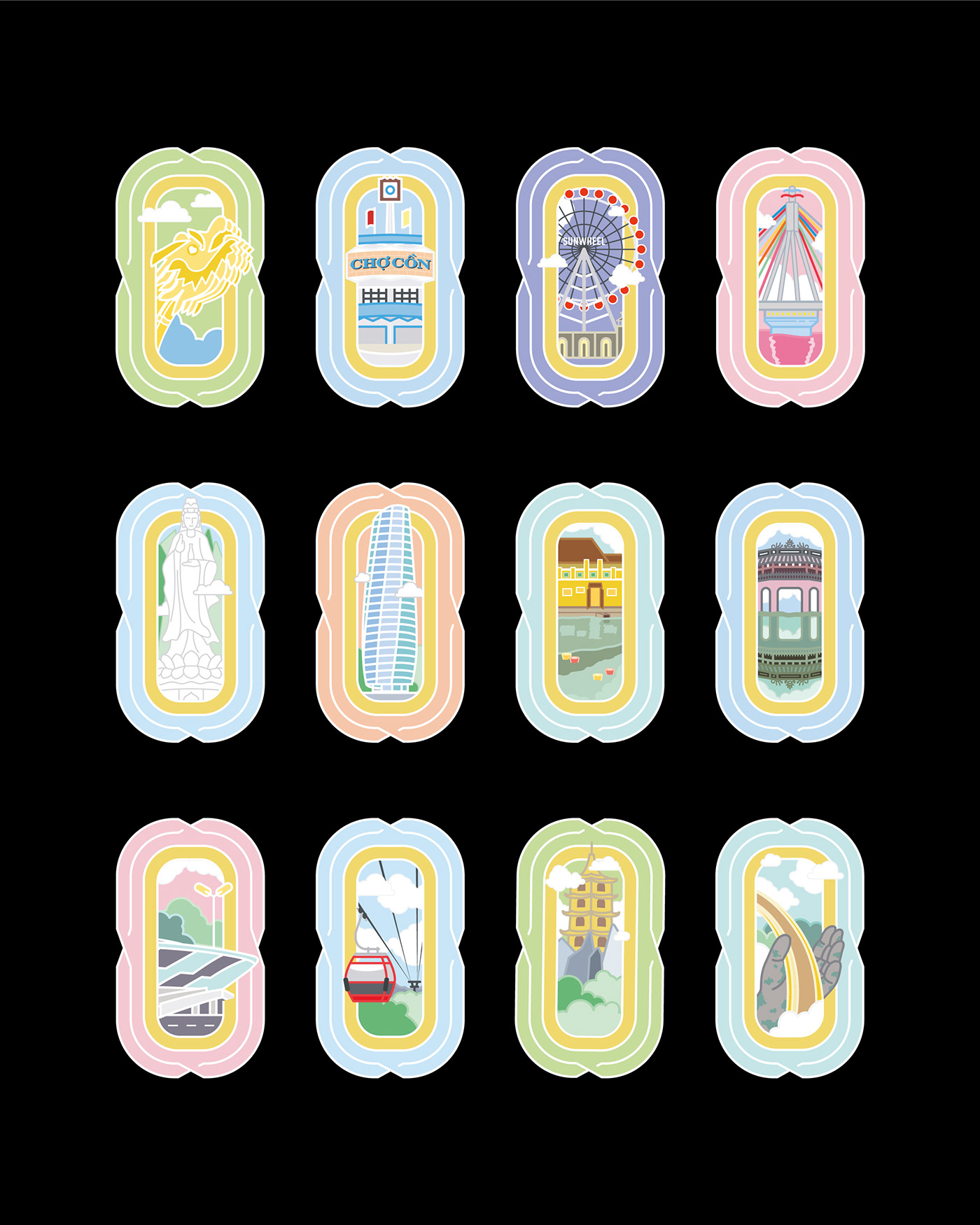
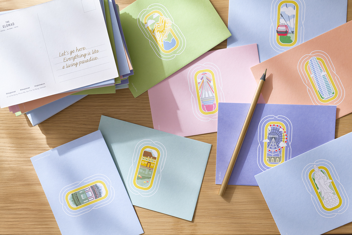
Visualization
Watching your arriving destination from airplane windows is always an exciting moment. And we want to imitate that imposing excitement into Glomad by art directing videography from drone view and creating a complete new illustration series of Đà Nẵng famous attractions, later then, applying into icon style and collateral items.
—
Icon System
Following up with brand visual hierarchy, familiar shapes from images and items when traveling was designed as background base for series of icon and could be used as stickers or badges later on.
—
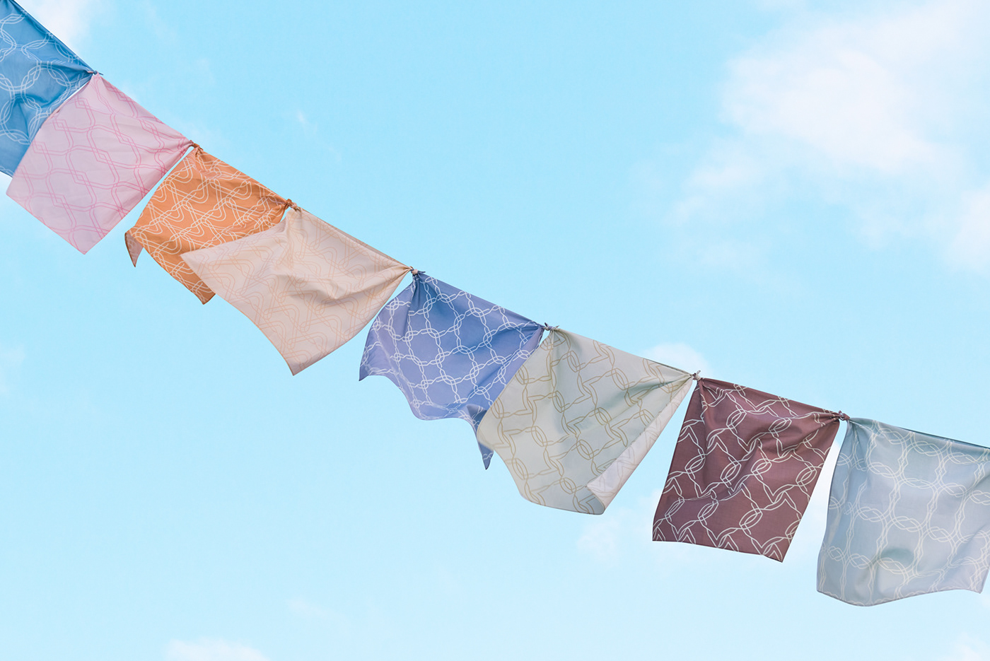
Pattern

—
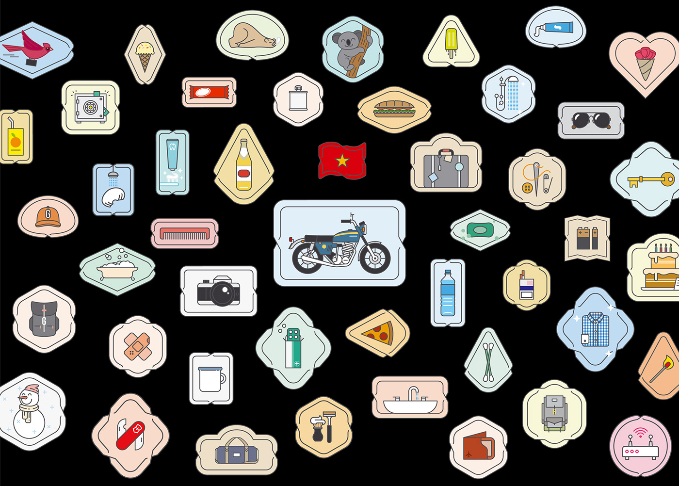
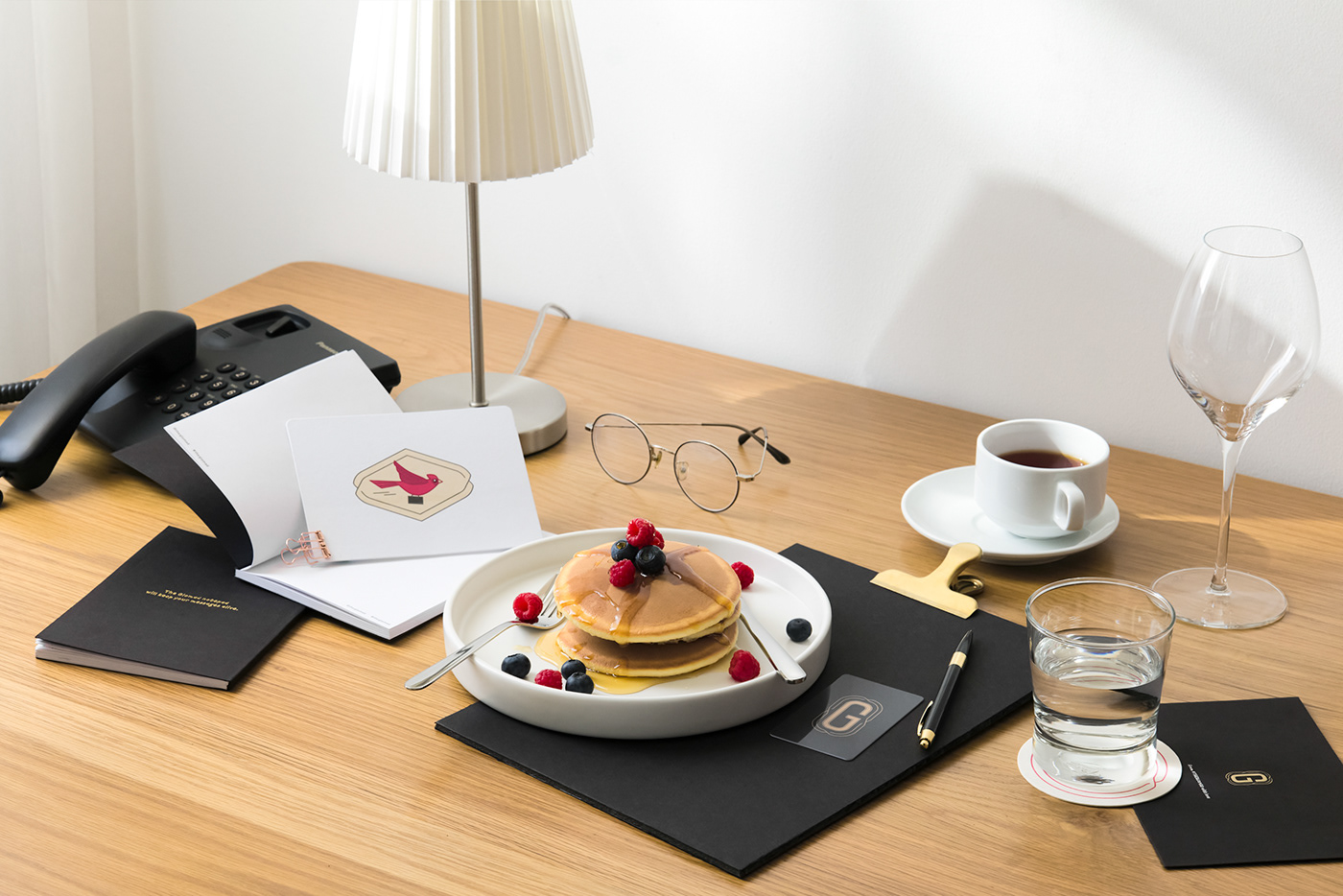
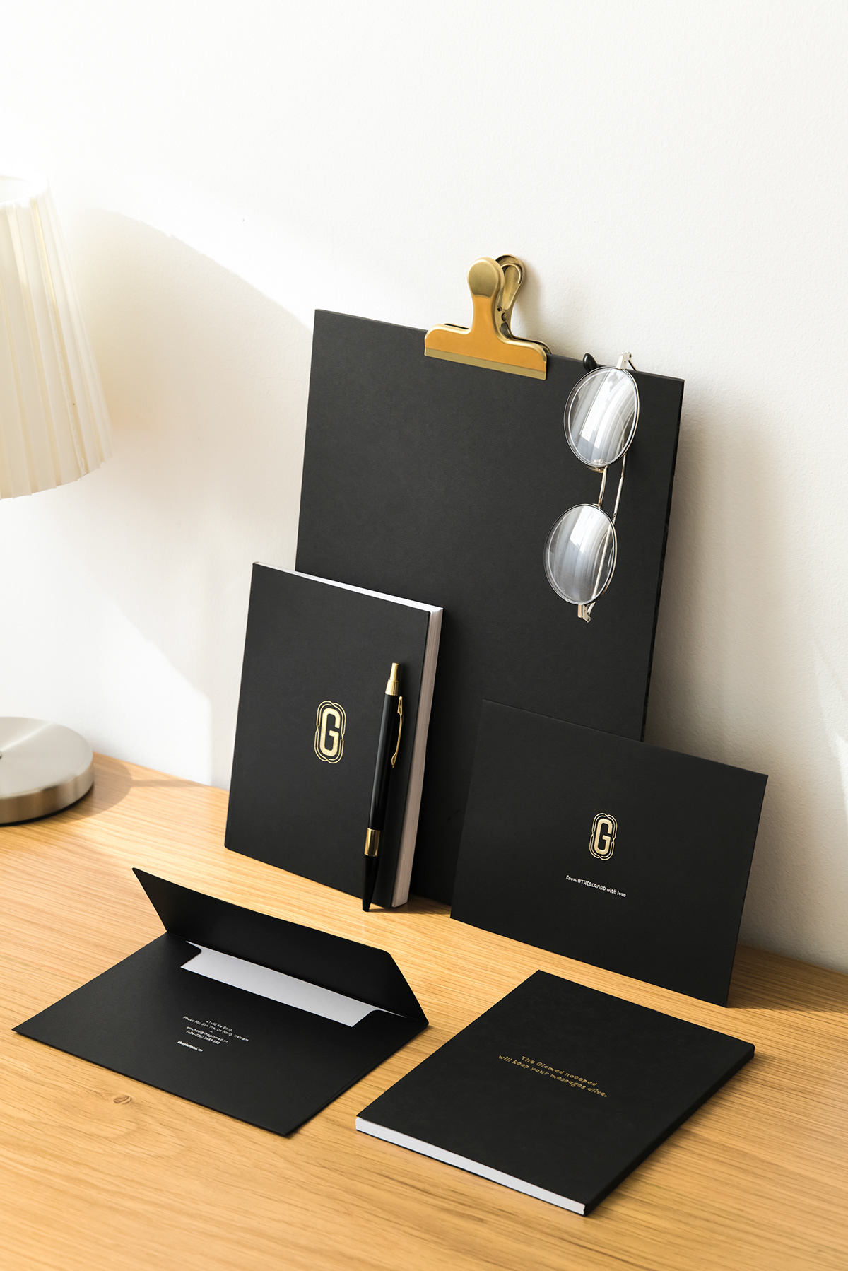
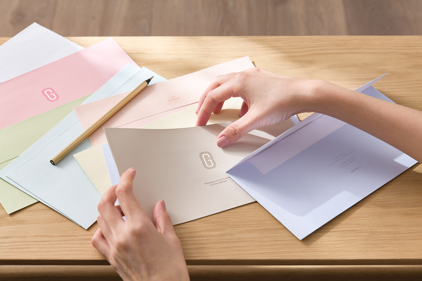
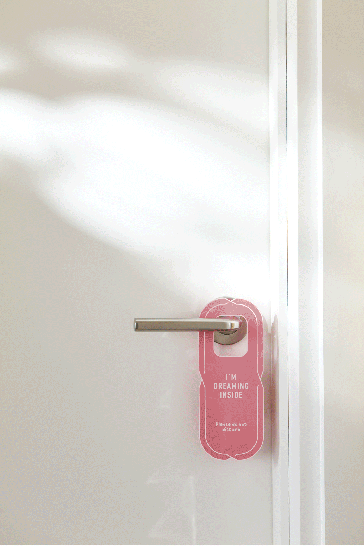
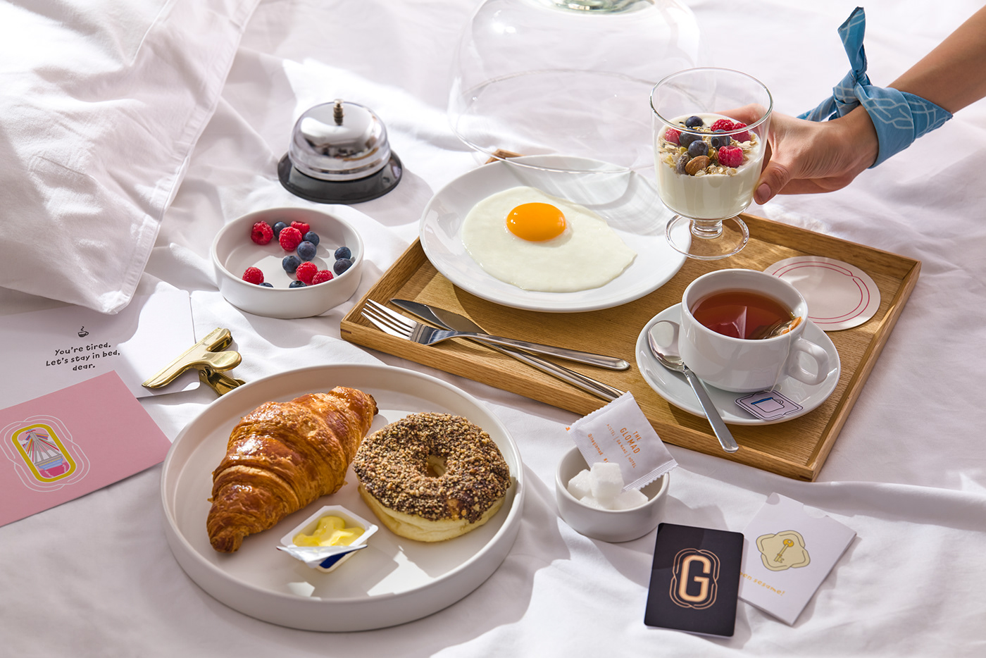
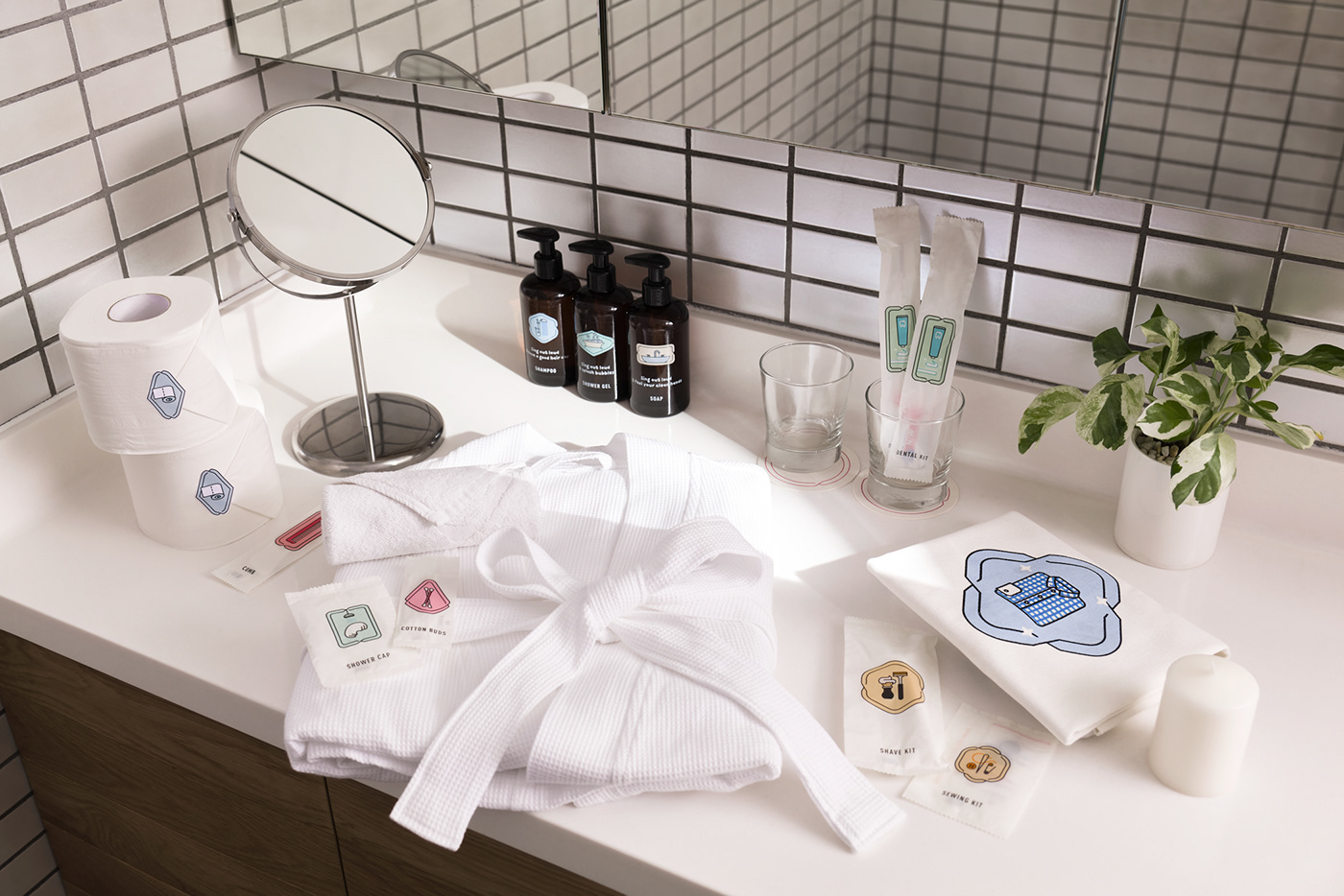
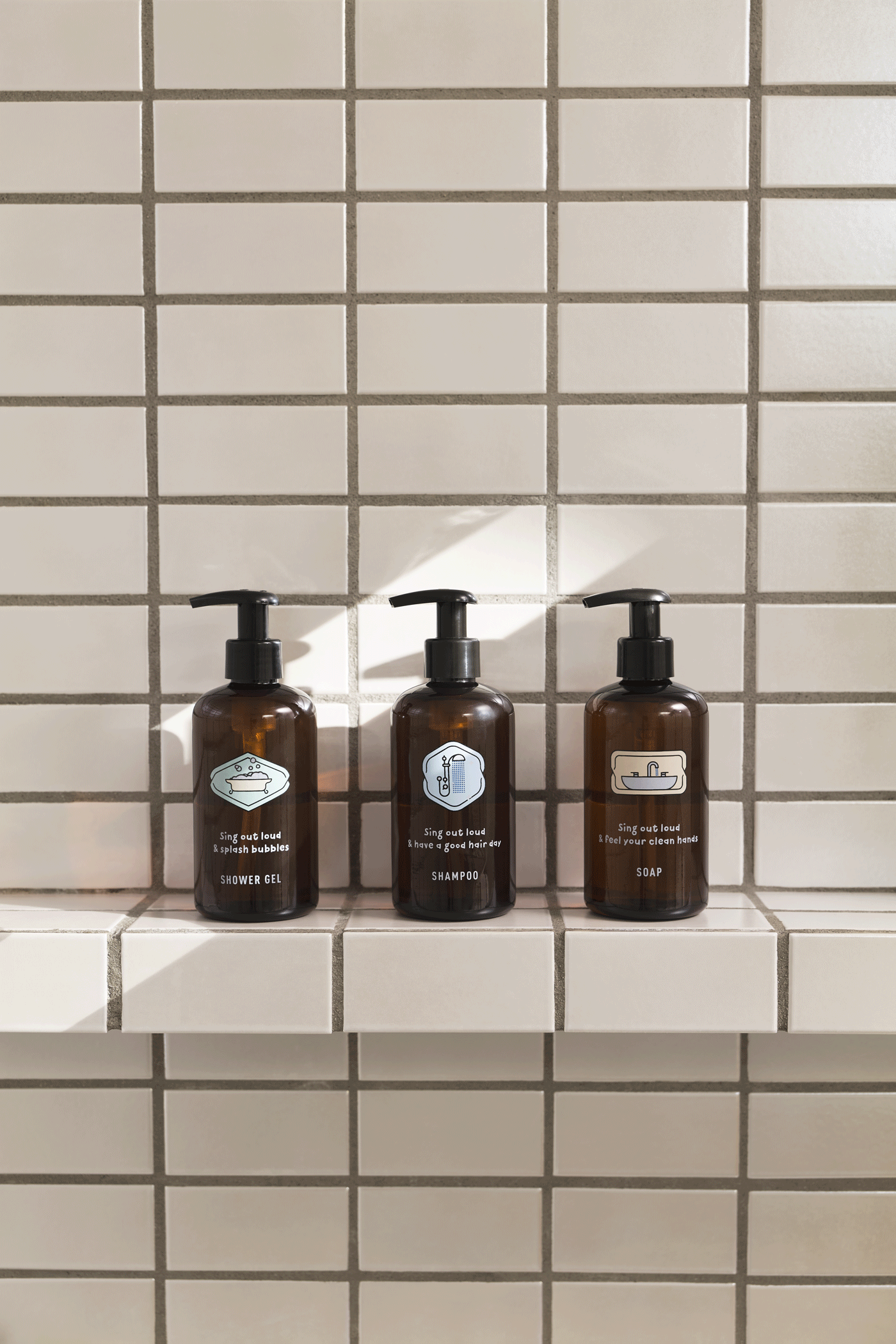
Collaterals
All collateral items including office's and service's are designed with fun and friendly content to interact more with customers, making Glomad as a travel friend will always be there for you.


—
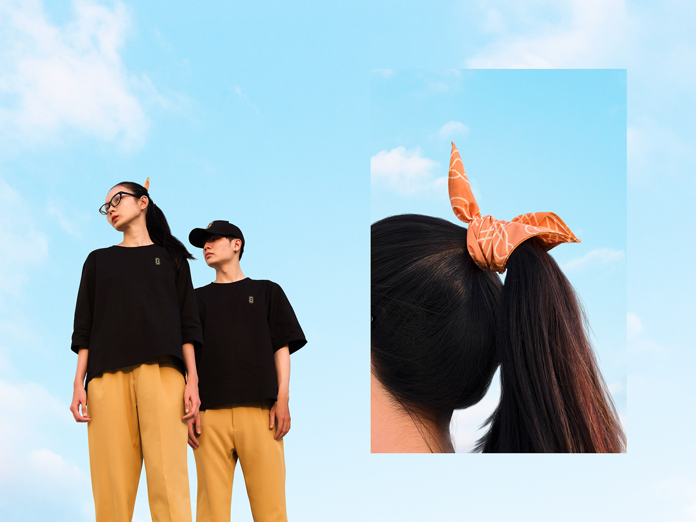
Uniform
Designed with oversized form with lightweight and breathable textile, uniform is purely minimal look with primarily black and yellow gold mixing with a dynamic series of pattern scarf for personalizing freestyle look.
—
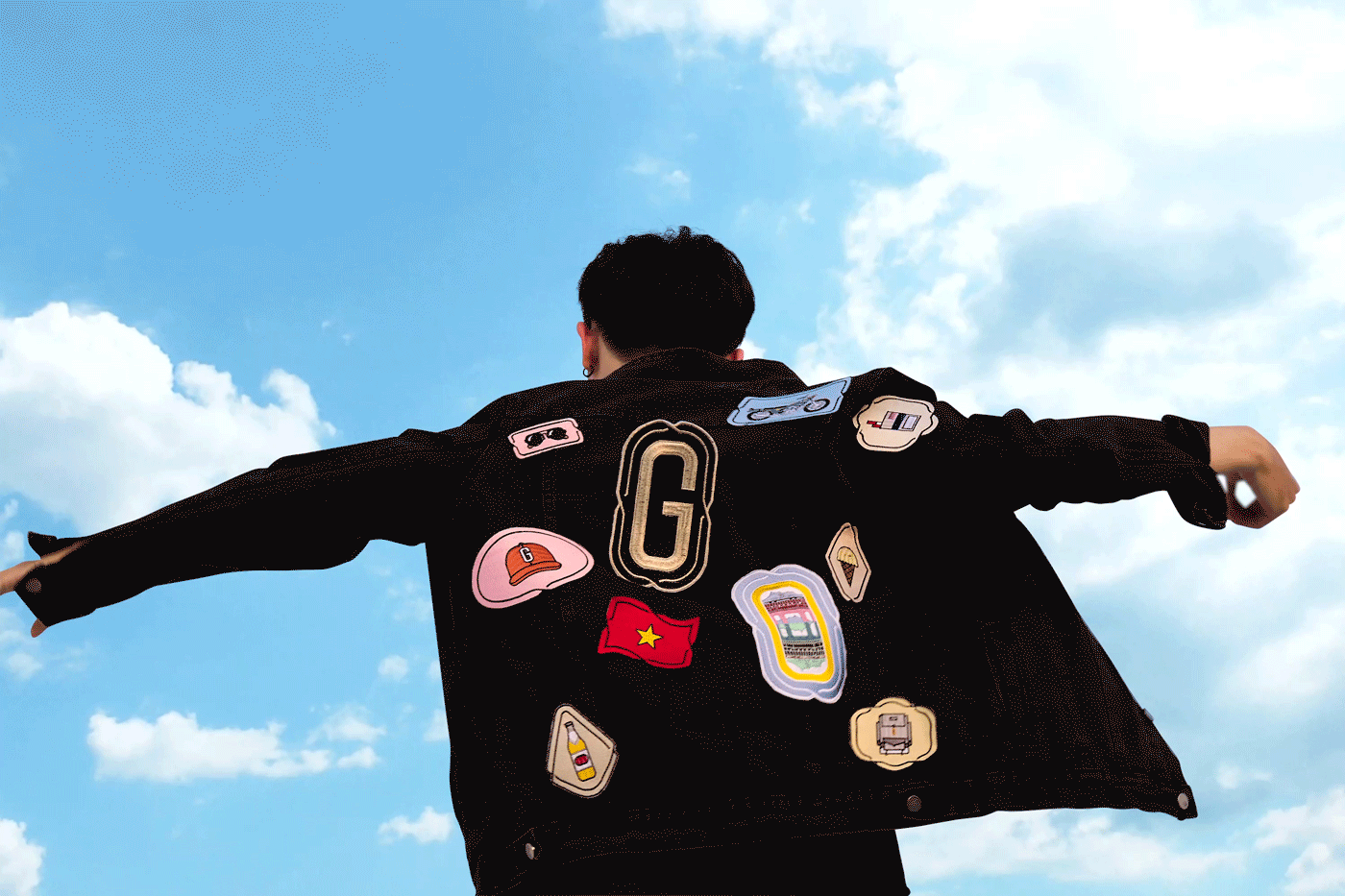
Merchandise
True wanderers collect things, it reminds memories and experiences of places they've been. For Glomad, we created a series from top to toe items for collecting including fabric badges, umbrella, scarves, suitcase stickers, totes and pins to be different from traditional souvenirs and could always be carried around with glomads easily.


—
Signage


—
Credits
Team
Design firm M — N Associates
Creative Director Duy — N
Designer M — Lan, Anh Nguyễn, Đức Ngô
Animator Anh Nguyễn
Project / Production Manager M — Lan
Producer Long Đỗ, Quân Nguyễn
Photography
Portfolio Photography Monkey Minh
Portfolio Stylist Thùy Dương
Digital Retoucher An Nguyễn
Digital Retoucher An Nguyễn
Interior Photography Hà Tiến Anh
Models Nam Nguyễn, Kay Thanh Đoàn
Uniform
Uniform Design Phi Phạm & M — N Associates
Scarf Production Cậu Bé Thỏ / Mùi Xoa
Brand Video
Film Documentary Trung Võ, Phú Hà
Film Documentary Trung Võ, Phú Hà
Concept / Editor Duy — N
Thanks for watching, if you liked it, appreciate below
Want to work with us?
Follow us
© M — N Associates 2016, Vietnam
All right reserved