Nuworld
Branding & Packaging
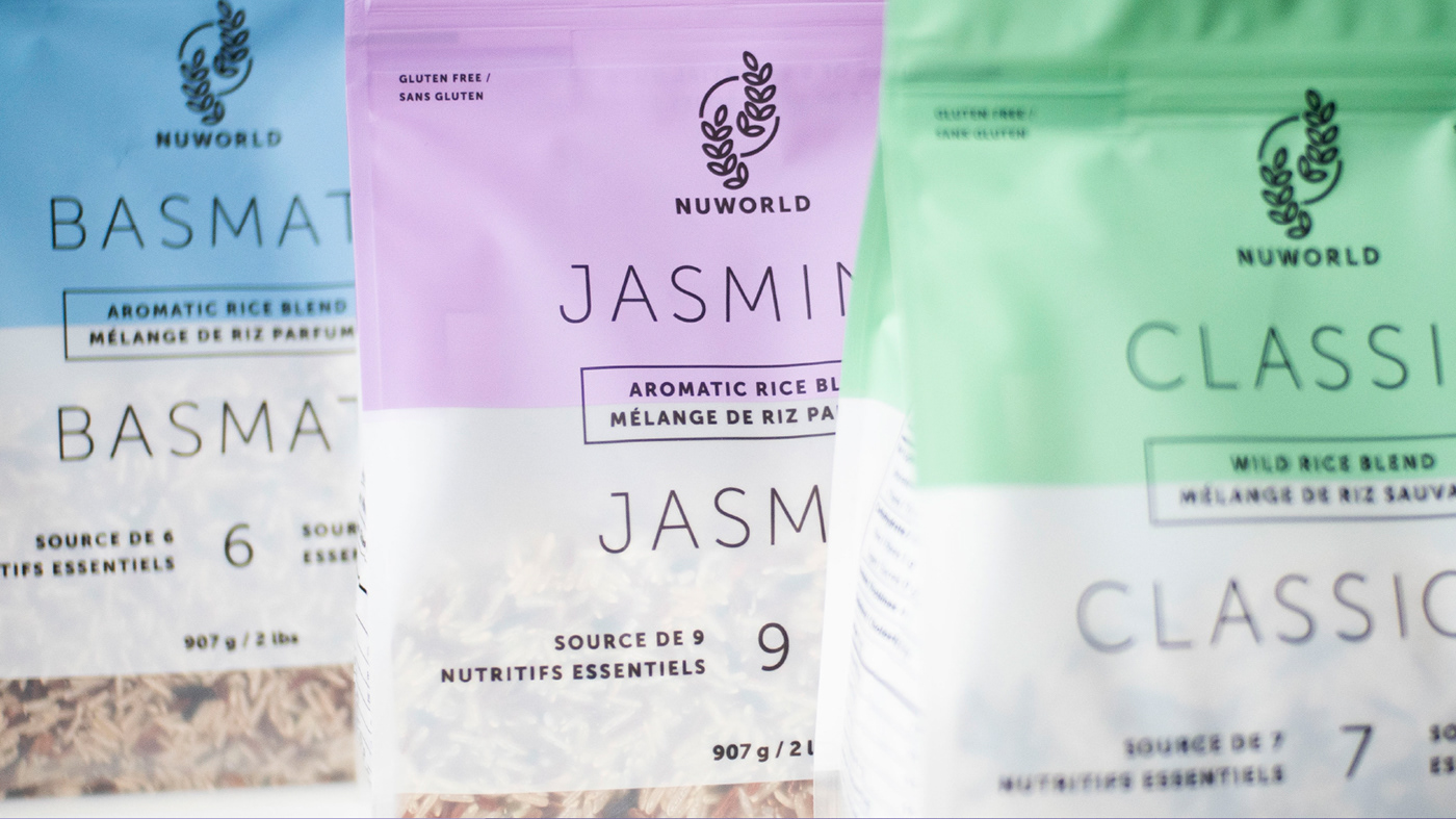
The project is to rebrand Nuworld, and its major line of products - the rice blends.
The client wanted to reference its products in the logo, hence we went for a modernized illustrative approach. The curved rice stalks help create an organic and natural vibe along with the circular lines in the background, which can be seen as the sun in the field of grains, or the world in “Nuworld”.
The packaging design also called for modernization. Originally sold in hard plastic containers, the pouches were introduced to be more environmentally friendly. The icons for the cooking instructions, created in the same style as the illustrative line art logo, along with the colour palette, are to give the brand a younger and fresher appearance.